In this article, we will have a look at how you can use an image with a transparent background on your Thrive Ultimatum ribbon, in order to create this effect and make it stand out from the remaining ribbon items:

This can be simply achieved in several easy steps.
Access Your Thrive Ultimatum campaign
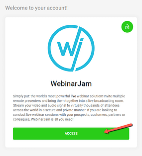
First of all, you need to access your Thrive Ultimatum dashboard:
Next, create a new campaign or edit an already existing one:
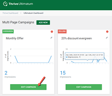
Set up your campaign using the options available here in this dashboard. For this example we are using an “Evergreen” campaign, that will be displayed on one of our pages:
Choose a Design
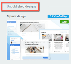
In the “Design” section you will be able to select one of the available designs for your campaign. Click on “New Design” in order to browse the list:
Select the “Bottom ribbon” from the list of design types:
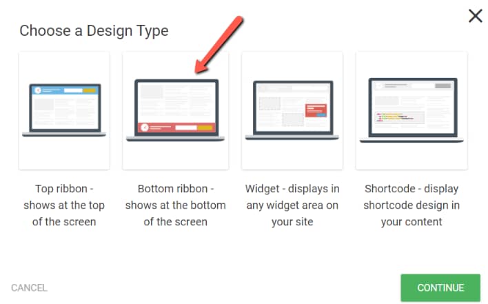
Now with your design type selected, you can proceed to the next step, which is customizing the design.
Customize the Design
First of all, click on the pencil icon in order to choose a template for your ribbon:
This will trigger the Thrive Architect editor and the template library:
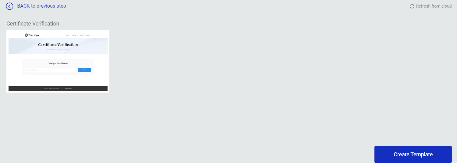
Once you select a template, it will instantly load on your screen and you can start bringing changes to it in order to match your campaign:

For this example, we have removed the countdown timer, and changed the text:

Add an Image to Your Ribbon
With your design almost ready, you can proceed to the next step, which is adding an image to your ribbon.
Note: We used a PNG image for this example, as this type of image has a transparent background.
Open the right sidebar list of elements and drag and drop an “Image” element onto your ribbon template:
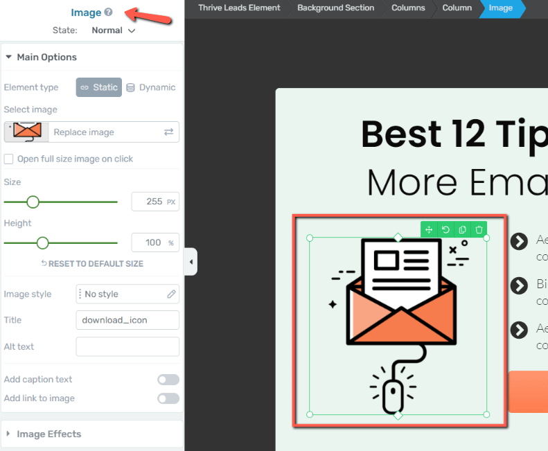
Select your image from the media library:
Now that your image has been added, you can do the remaining adjustments, in order to set its position.
With your “Image” element selected, open the “Layout & Position” section of the left sidebar:
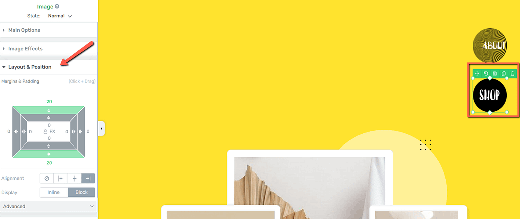
Here, we’ve added a negative value top margin in order to align the image to the bottom side of the banner, and, at the same time, make it stand out a be positioned a bit higher than the remaining ribbon items:

And we’ve also adjusted the side and bottom margins to place the image closer to the text:

You will have to make your own adjustments here, based on the type of image you are using.
If you want to find out more information about the “Layout & Position” section of the left sidebar, make sure to check out this article which explains in detail what each of these options does.
Important!
Your screen resolution is also an important factor to take into consideration when adjusting the margins of your image. In order to view exactly how the image would look like when the page is saved, make sure to collapse the left sidebar panel:

Also, feel free to use the “Preview” button in order to see how your changes are saved:
As the last step, we have also added a background color to our ribbon. To do that, look for the “Content Box” element within your breadcrumbs and select it:

This is the “Content Box” in which all your ribbon items are placed (the image, text, button, and so on).
Go to the “Background Style” section of the left sidebar and click on the color field available there:
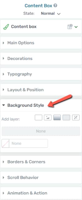
Now simply set a new color for your “Content Box”. Once everything is done, click on “Apply”:

Your ribbon template should be ready now, so you can go ahead and save and preview your changes. The end result should be similar to this:

This is how you can use Thrive Architect in order to achieve this cool effect on your image. Feel free to check out other tutorials and quick start guides available in our knowledge base, if you want to find out more about how to get the most out of our products and features.
I hope you found this tutorial useful. If so, don’t hesitate to rate it with a smile below 🙂