In this article, you’ll learn how to build a Mega Menu in Thrive Architect. A Mega Menu transforms a standard Custom Menu into a multi-column dropdown layout that can display organized groups of links, icons, images, and descriptions—ideal for sites with complex navigation needs.
Unlike most elements, the Mega Menu is not available in the element panel. You create one by converting an existing Custom Menu element into a Mega Menu directly on the canvas.
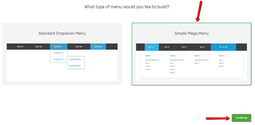
What Is a Mega Menu?
A Mega Menu is an expanded dropdown navigation pattern that displays menu items in a structured, multi-column grid or masonry layout. Instead of a narrow single-column dropdown, a Mega Menu can span the full width of the page and organize links into clearly defined columns with optional descriptions, icons, and images.
Mega Menus are commonly used for:
- E-commerce sites with multiple product categories
- Online course platforms with several course groups
- Content-heavy sites where visitors need quick access to many sections
- Any navigation that benefits from a visual, organized layout
Converting a Custom Menu to a Mega Menu
Since the Mega Menu is a hidden element, you cannot drag it from the element panel. Instead, you convert an existing Custom Menu element:
- Add a Custom Menu element to your page if you have not already. Drag it from the Building Blocks section of the element panel. When the template selection screen appears, you can choose from pre-designed menu templates as a starting point or skip to start with a blank menu.
- Select the Custom Menu element on the canvas.
- In the left sidebar, look for the option to convert the menu to a Mega Menu. Click the conversion option.
- The Custom Menu element will transform into a Mega Menu, and the left sidebar will update to show Mega Menu-specific controls.
Important: The conversion changes the element type. You will see new configuration options specific to the Mega Menu. To revert to a standard Custom Menu, you may need to delete the element and add a new Custom Menu.
Configuring the Mega Menu Dropdown
When you select the Mega Menu element and open a dropdown, the following controls become available in the left sidebar under the Mega Menu Dropdown section:
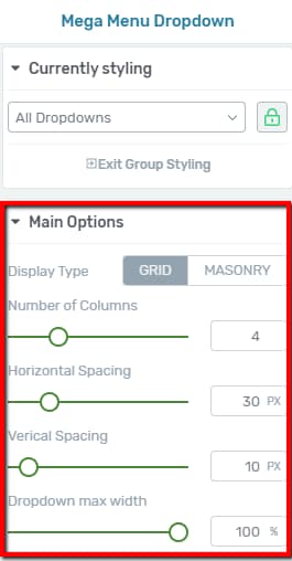
Display Type
Controls how the dropdown content is arranged:
- Grid — Items are arranged in a uniform grid where each column has equal width
- Masonry — Items are arranged in a masonry-style layout where columns can have varying heights
Number of Columns
A slider that controls how many columns appear in the mega menu dropdown:
- Default: 4 columns
- Range: 2 to 10 columns
Adjust this based on how many top-level categories or groups you want to display side by side. For most menus, 3 to 5 columns provides a clean, readable layout.
Horizontal Spacing
Controls the horizontal gap between columns in the dropdown:
- Range: 0 to 150px
Increase this value to add more breathing room between columns.
Vertical Spacing
Controls the vertical gap between rows of items in the dropdown:
- Range: 0 to 150px
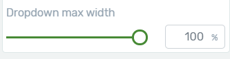
Dropdown Max Width (Desktop Only)
Controls the maximum width of the entire mega menu dropdown:
- Range: 0 to 2000px
Use this to constrain the dropdown to a specific width, or set it to a large value to allow the dropdown to span the full width of the page.
Note: The Dropdown Max Width setting is only available on desktop. On tablet and mobile devices, the dropdown will adapt to the available screen width automatically.
Configuring Mega Menu Columns
When you click on a specific column within the Mega Menu dropdown, the left sidebar displays column-level controls:
Show Menu Description
A toggle switch that controls whether a description text appears below the menu item label within the column:
- When enabled, each menu item in the column can display an optional description beneath its label
- When disabled, only the item labels are shown
Tip: Use menu descriptions to add brief context or summaries beneath each link. For example, a “Courses” link could have a description like “Browse all available online courses” to help visitors understand what they’ll find.
Configuring Individual Mega Menu Items
Click on any individual menu item inside the Mega Menu dropdown to access item-level controls:
Show When
Controls the visibility of the menu item based on the visitor’s login state:
- Always — The item is visible to all visitors (default)
- Logged in — The item only appears for logged-in users
- Logged out — The item only appears for visitors who are not logged in
This lets you create mega menu sections that are personalized based on whether the visitor has an account.
Display
Controls how the menu item presents its content:
- Text only — Shows only the menu item label
- Icon only — Shows only an icon (chosen from the icon picker)
- Icon and text — Shows both an icon and the label text
- Image only — Shows only an image
- Image and text — Shows both an image and the label text
Icon Picker and Color
When using Icon only or Icon and text display mode:
- Click the icon picker to browse and select an icon from the available icon library
- Use the color picker to set the icon color
Icon Size
A slider that controls the size of the icon:
- Range: 1 to 50px
Link Control
Click the link option to set the URL that the menu item navigates to when clicked. You can link to an internal page, an external URL, or a custom anchor.
Adding Third-Level Menu Items
Mega Menus support up to three levels of menu hierarchy. Third-level items appear as nested links beneath their parent second-level items, creating an additional layer of organization within each column.

To add third-level items:
- Select the Mega Menu element on the canvas and open the dropdown.
- Locate the second-level menu item that will serve as the parent.
- Add a new menu item beneath it and indent it to the third level by dragging it slightly to the right.
- The third-level item will appear nested under its parent, creating a clear visual hierarchy.
Third-level items inherit the same configuration options as other menu items, including Show when visibility, Display mode, icon settings, and link controls.
Tip: Use third-level items sparingly to keep your mega menu scannable. If you find yourself needing four or more levels, consider reorganizing your menu structure so that top-level categories are broader.
Adding Third-Level Items via WordPress Admin
You can also add third-level items through the WordPress admin area instead of the Thrive Architect editor:
- Go to Appearance > Menus in your WordPress dashboard.
- Create or select the menu you are using as the source.
- Add the desired pages, posts, or custom links to the menu.
- Drag the items into subordinate (third-level) positions by nesting them beneath their parent second-level items.
- Save the menu, then return to Thrive Architect and refresh the page to see the updated hierarchy.
This approach is useful when you have many items to add or when your content already exists as published pages or posts.
Group Editing
The Mega Menu element supports group editing, which lets you apply styles to multiple similar items at once. Select the Mega Menu element and click the group editing icon in the toolbar to access these groups:
- All Dropdown Columns — Edit the styling of all columns in the dropdown simultaneously
- All Menu Descriptions — Edit all description text elements at once
- All Menu Images — Edit all menu item images at once
- Second Level Items — Edit all second-level menu items simultaneously
- Third Level Items — Edit all third-level menu items simultaneously
Tip: Start by styling items at the group level for consistency, then override individual items only where you need visual differentiation.
Conditional Display Rules
In addition to the per-item Show When visibility settings, the Mega Menu element also supports Conditional Display rules at the element level. This allows you to control whether the entire mega menu is shown or hidden based on display conditions (e.g., user role, device type, or specific pages). To configure these rules, select the Mega Menu element and look for the Conditional Display option in the left sidebar or the element toolbar.
Note: Conditional Display rules apply to the entire menu element, while Show When controls visibility of individual menu items within the dropdown.
Mobile Behavior
On tablet and mobile devices, the Mega Menu typically collapses into a standard hamburger menu. The multi-column dropdown layout is replaced by a single-column, vertically stacked menu that visitors can expand and collapse by tapping the hamburger icon. All menu items, including second-level and third-level items, remain accessible in this collapsed format.
Tip: Use the responsive device switcher in Thrive Architect to preview how your Mega Menu behaves on smaller screens. Adjust spacing and font sizes on the mobile breakpoint if needed.
Frequently Asked Questions
Can I Drag a Mega Menu from the Element Panel?
No. The Mega Menu is a hidden element and does not appear in the element panel. You must first add a Custom Menu element and then convert it to a Mega Menu using the conversion option in the left sidebar.
What Is the Difference Between Grid and Masonry Display Types?
In Grid mode, all columns have equal width and items align in a strict grid. In Masonry mode, columns can have varying heights, and items stack more naturally—similar to a Pinterest-style layout.
Can I Use More Than 10 Columns?
No. The column slider supports a maximum of 10 columns. For most use cases, 3 to 5 columns provides the best balance of content density and readability.
How Do Third-Level Items Appear in the Dropdown?
Third-level items appear as nested links beneath their parent second-level item. They are indented to visually indicate their position in the hierarchy.
Can I Show Different Mega Menu Items to Logged-In and Logged-Out Users?
Yes. Each individual mega menu item has a Show when option that lets you set visibility to Always, Logged in, or Logged out. This works the same way as in the standard Custom Menu element.
Related Resources
- Custom Menu: How to Use the Custom Menu Element — Standard navigation menu with horizontal, vertical, and hamburger layouts
- Background Section: How to Use the Background Section Element — Container element for placing menus inside styled page sections
- Columns Element: How to Use the Columns Element — Multi-column layouts for organizing content
- Getting Started: Getting Started with Thrive Architect — Overview of the editor and element panel
That’s it! You’ve successfully learned how to build a Mega Menu in Thrive Architect. By converting a Custom Menu into a Mega Menu, you can create multi-column dropdown navigation with grid or masonry layouts, icon and image displays, three levels of hierarchy, conditional visibility, and group editing for consistent styling.