In this article, you’ll learn how to configure every custom field type available in the Lead Generation element. Each field type has its own configuration options, validation rules, and common use cases.
The Lead Generation element supports 14 field types, ranging from basic text inputs to file uploads, GDPR consent checkboxes, and Google reCAPTCHA. This reference covers how to add each field type to your form and configure its settings.
Adding a Custom Field to Your Form
Follow these steps to add any custom field:
- Select the Lead Generation element on the canvas.
- In the left sidebar, scroll to the Form fields section.
- Click Add new at the bottom of the fields list.
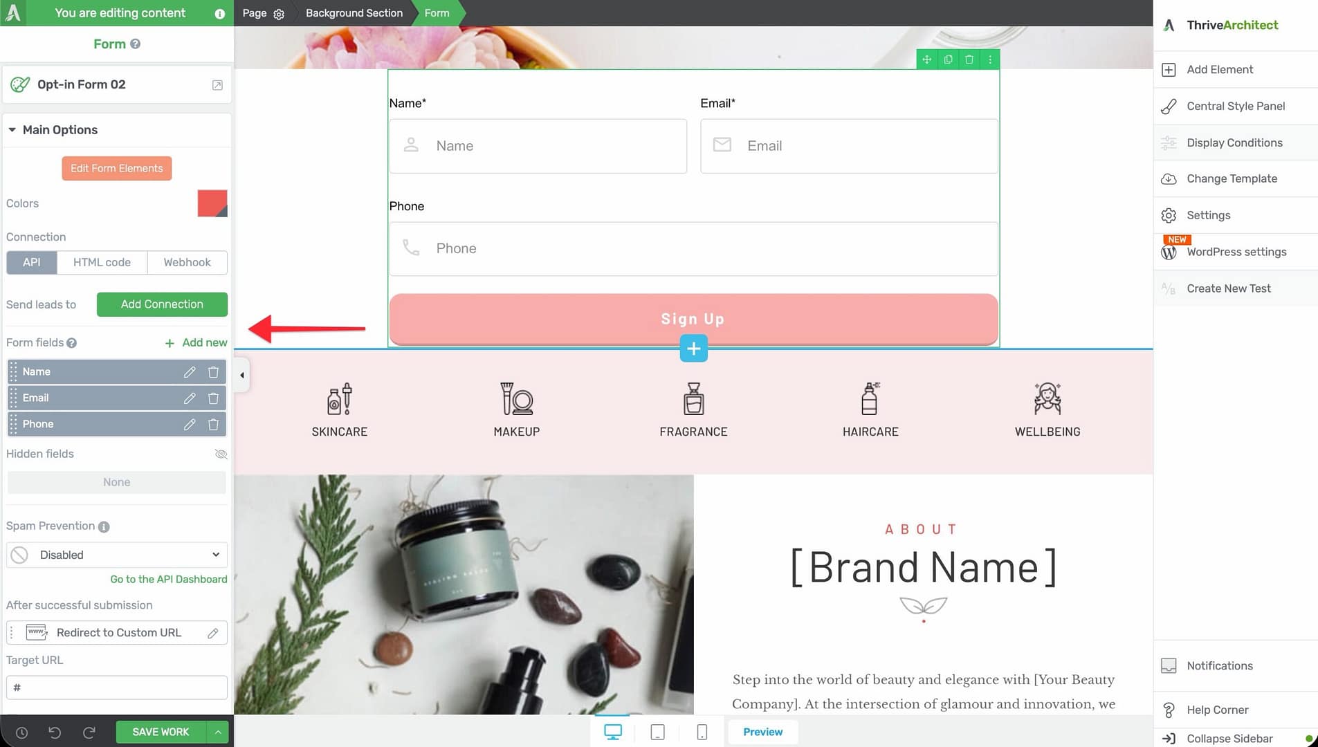
- Choose the field type you want to add from the list of available types.
- The field will appear on the form and in the fields list.
- Click the settings icon next to the field to configure its options.
Text Field
The Text field is a standard single-line input for collecting short text data such as names, company names, or job titles.
Configuration Options
- Label — The visible label displayed above or beside the field
- Placeholder — Hint text shown inside the field before the visitor types
- Required — Toggle to make this field mandatory
- Field mapping — Map to a corresponding field in your connected email service
Common Use Cases
- First name, last name, or full name
- Company name or job title
- Any single-line text data
Textarea Field
The Textarea field provides a multi-line text area for collecting longer responses such as messages, comments, or detailed answers.
Configuration Options
- Label — The visible label for the textarea
- Placeholder — Hint text shown before input
- Required — Toggle to make the field mandatory
- Rows — Control the visible height of the textarea (number of visible text rows)
Common Use Cases
- “Tell us about yourself” fields
- Message or comment boxes
- Open-ended survey responses
Dropdown Field
The Dropdown field presents a single-select dropdown menu where visitors choose one option from a predefined list.
Configuration Options
- Label — The visible label for the dropdown
- Placeholder — Default text shown before a selection is made (e.g., “Select an option”)
- Required — Toggle to make the field mandatory
- Options — Click Manage Options to add, edit, remove, and reorder the dropdown choices
Managing Multiple Options
To manage the options in a Dropdown field:
- Click the settings icon next to the Dropdown field.
- Click Manage Options to open the options editor.
- Click Add Option to add a new choice.
- Enter the Label (what the visitor sees) and the Value (what gets sent to your email service) for each option.
- Drag and drop options to reorder them.
- Click the delete icon next to an option to remove it.
Common Use Cases
- “How did you hear about us?” surveys
- Industry or department selection
- Product or service interest selection
Checkbox Field
The Checkbox field allows visitors to select one or more options from a list of choices. Unlike the Dropdown and Radio fields, multiple selections are permitted.
Configuration Options
- Label — The visible label for the checkbox group
- Required — Toggle to require at least one checkbox to be selected
- Options — Click Manage Options to add, edit, remove, and reorder checkbox choices
Common Use Cases
- “Select all that apply” questions
- Interest or topic selection
- Multi-category newsletter sign-up
Radio Field
The Radio field presents a list of options where the visitor can select exactly one choice. Options appear as radio buttons rather than a dropdown menu.
Configuration Options
- Label — The visible label for the radio group
- Required — Toggle to make a selection mandatory
- Options — Click Manage Options to add, edit, remove, and reorder radio button choices
Common Use Cases
- “Yes or No” questions
- Preference selection (e.g., “Morning, Afternoon, or Evening”)
- Single-choice survey questions
Hidden Field
The Hidden field is an invisible field that does not appear on the form to visitors. It captures data silently in the background and sends it along with the rest of the form submission.
Configuration Options
- Field Name — The internal name used to identify the hidden field in your email service or webhook payload
- Field Value — The value to be sent with the form submission. This can be:
– A static text value (e.g., “homepage-signup”) – A dynamic value from the URL (e.g., a UTM parameter) – A cookie value
Common Use Cases
- Tracking which page or campaign generated the lead
- Passing UTM parameters (utm_source, utm_medium, utm_campaign) to your email service
- Tagging subscribers by form location or offer type
URL Field
The URL field is a specialized text input that validates the entered value as a properly formatted URL.
Configuration Options
- Label — The visible label for the field
- Placeholder — Hint text (e.g., “https://yourwebsite.com”)
- Required — Toggle to make the field mandatory
Common Use Cases
- Collecting a visitor’s website address
- Application forms requiring a portfolio or LinkedIn URL
- Survey forms asking for resource links
GDPR Consent Field
The GDPR Consent field adds a checkbox with customizable consent text to your form. This field helps you comply with GDPR and other data privacy regulations by obtaining explicit consent before processing personal data.
Configuration Options
- Consent Text — The text displayed next to the checkbox. This should clearly explain what the visitor is consenting to (e.g., “I agree to receive marketing emails and accept the privacy policy”).
- Required — Toggle to require the visitor to check the consent box before submitting the form. For GDPR compliance, this should typically be set to required.
- Link to Privacy Policy — You can include a hyperlink within the consent text pointing to your privacy policy page.
Common Use Cases
- GDPR-compliant email opt-in forms
- Forms that require explicit consent for data processing
- Newsletter sign-ups in the European Union
File Upload Field
The File Upload field allows visitors to attach files to their form submission. This is useful for collecting resumes, portfolio samples, or supporting documents.
Configuration Options
- Label — The visible label for the upload field
- Required — Toggle to make a file attachment mandatory
- Allowed File Types — Restrict the types of files visitors can upload
- Maximum File Size — Set a maximum file size limit for uploads
Supported File Types
The following file types are supported for upload:
- Documents: PDF, DOC, DOCX, XLS, XLSX, PPT, PPTX, TXT, CSV, RTF, ODT
- Images: JPG, JPEG, PNG, GIF, BMP, SVG, WEBP, ICO
- Audio: MP3, WAV, OGG, M4A, WMA, AAC, FLAC
- Video: MP4, AVI, MOV, WMV, FLV, MKV, WEBM
- Archives: ZIP, RAR, 7Z, TAR, GZ
Common Use Cases
- Job application forms requiring resume uploads
- Support forms with screenshot or log file attachments
- Creative submission forms for portfolio samples
Country Field
The Country field provides a pre-populated dropdown menu containing a list of countries. Visitors select their country from the list rather than typing it manually.
Configuration Options
- Label — The visible label for the field
- Placeholder — Default text shown before a selection is made (e.g., “Select your country”)
- Required — Toggle to make the field mandatory
Common Use Cases
- International sign-up forms
- Shipping address collection
- Audience segmentation by geography
State Field
The State field provides a dropdown menu of states or provinces. When paired with the Country field, the State field can dynamically update its options based on the selected country.
Configuration Options
- Label — The visible label for the field
- Placeholder — Default text shown before a selection is made
- Required — Toggle to make the field mandatory
Common Use Cases
- Forms requiring a full address (paired with Country)
- Regional segmentation for marketing campaigns
- Event registration forms with location-based information
Date-Time Field
The Date-Time field provides a date picker, time picker, or combined date-time picker that allows visitors to select a date and/or time from an interactive calendar interface.
Configuration Options
- Label — The visible label for the field
- Placeholder — Hint text (e.g., “Select a date”)
- Required — Toggle to make the field mandatory
- Date Format — Choose the format for date display (e.g., MM/DD/YYYY, DD/MM/YYYY)
- Time Format — Choose 12-hour or 24-hour time format
- Enable Date — Toggle to include date selection
- Enable Time — Toggle to include time selection
Common Use Cases
- Appointment booking forms
- Event registration with preferred date/time
- Scheduling consultation calls
Number Field
The Number field is a specialized input that only accepts numeric values. It includes increment and decrement controls for easy value adjustment.
Configuration Options
- Label — The visible label for the field
- Placeholder — Hint text (e.g., “Enter a number”)
- Required — Toggle to make the field mandatory
- Minimum Value — Set the lowest allowed number
- Maximum Value — Set the highest allowed number
- Step — Set the increment/decrement step value (e.g., 1, 5, 10)
Common Use Cases
- Quantity selection fields
- Budget or salary range inputs
- Age or number-of-employees fields
reCAPTCHA Field
The reCAPTCHA field integrates Google reCAPTCHA into your form to prevent spam and bot submissions. This is a verification challenge, not a data collection field.
Configuration Options
- reCAPTCHA Type — Choose between reCAPTCHA v2 (checkbox challenge) and reCAPTCHA v3 (invisible score-based verification)
- Site Key — Your Google reCAPTCHA site key (configured in the Thrive Dashboard)
- Secret Key — Your Google reCAPTCHA secret key (configured in the Thrive Dashboard)
Setup Steps
- Go to the Google reCAPTCHA admin console and register your site.
- Copy the Site Key and Secret Key provided by Google.
- In your WordPress dashboard, navigate to Thrive Dashboard > API Connections.
- Find Google reCAPTCHA and enter your Site Key and Secret Key.
- Save the connection.
- Add the reCAPTCHA field to your Lead Generation form.
Related Resources
- Lead Generation Overview: How to Use the Lead Generation Element — Adding forms, connection types, and layout options
- Advanced Techniques: How to Use Advanced Lead Generation Techniques — Tagging, Smart Complete, 2-step opt-ins, and more
- Styling Guide: How to Use Animations, Hover, and Scroll Effects — Add visual effects to your forms
That’s it! You’ve successfully learned how to configure every custom field type available in the Lead Generation element. Use these fields to build forms tailored to your specific data collection needs, from simple email sign-ups to complex multi-field application forms.