In this article, you’ll learn how to create an off-canvas side menu in Thrive Architect. An off-canvas menu slides in from the side of the screen when triggered, giving your site a modern, app-like navigation experience that’s especially effective on mobile devices.
An off-canvas side menu is not a separate element — it’s built using the Custom Menu element set to Hamburger mode with the Off Screen display option. This means you can create a full slide-in navigation panel without any custom code, all from within the Thrive Architect editor.
How Off-Canvas Navigation Works
The off-canvas menu is achieved through a specific combination of settings on the Custom Menu element:
- The Custom Menu element is set to the Hamburger menu type.
- The Menu display option is set to Off screen right or Off screen left.
- When a visitor clicks the hamburger trigger icon, a menu panel slides in from the selected side of the screen.
- The panel overlays the page content, and an optional background overlay dims the rest of the page.
- Clicking the Close Menu Icon or the overlay dismisses the panel.
This approach keeps your header clean and compact while giving visitors full access to your site navigation on demand.
Adding the Custom Menu Element
Follow these steps to add a Custom Menu element to your page:
- Open your page or post in the Thrive Architect editor.
- Click the green plus (+) icon in the right sidebar to open the element panel.
- Type Custom Menu in the search field at the top of the panel.
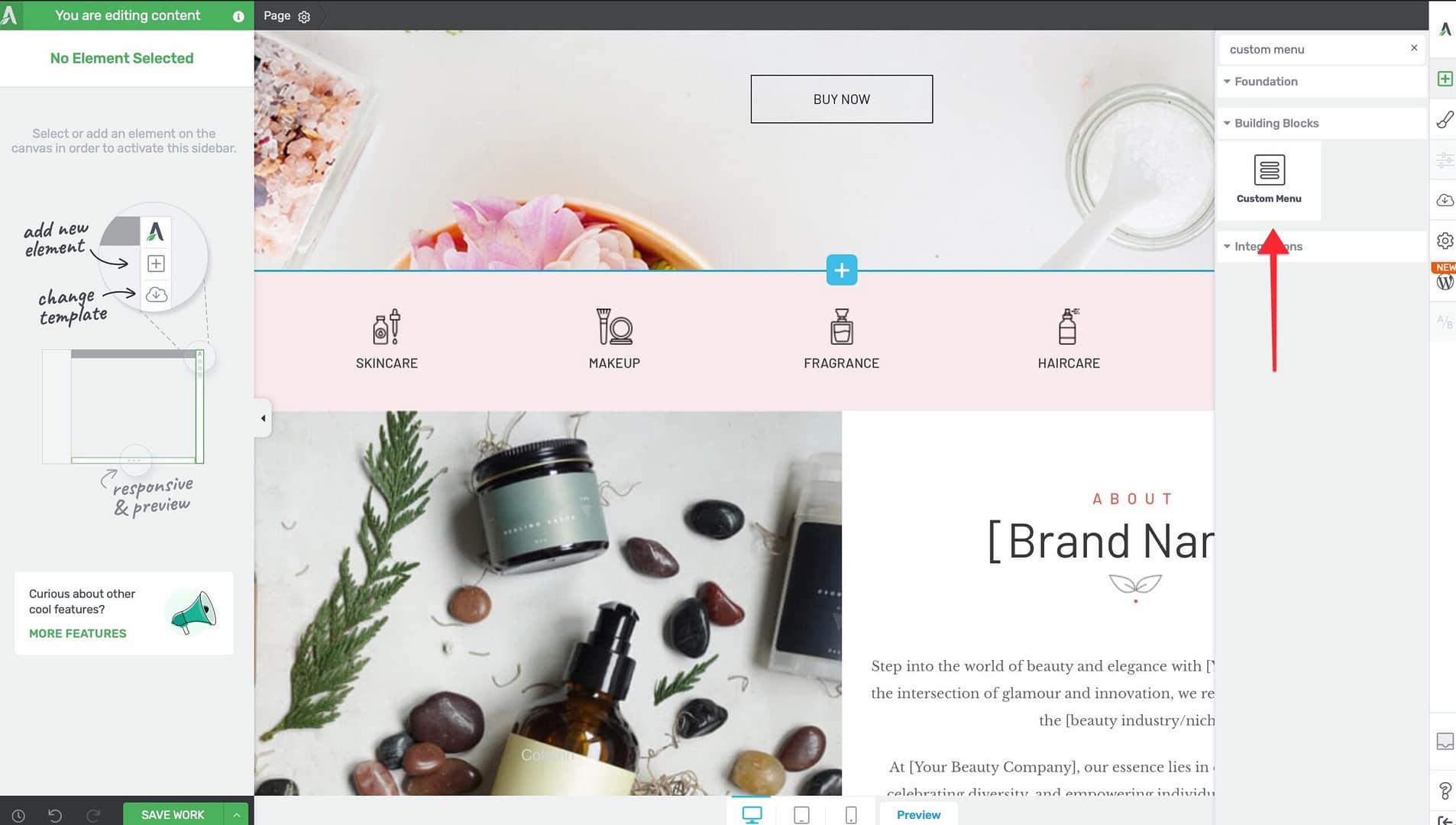
- Alternatively, scroll down to the Navigation section in the element list to find the Custom Menu element.
- Drag the element from the panel and drop it onto your page canvas — typically inside a header or top section.
A default Custom Menu element will appear on the canvas, ready for configuration.
Selecting a WordPress Menu
Before configuring the off-canvas behavior, assign a WordPress menu to the element:
- Click on the Custom Menu element on the canvas to select it.
- In the left sidebar, locate the Menu Source dropdown.
- Select the WordPress menu you want to display from the dropdown list.
Switching to Hamburger Mode
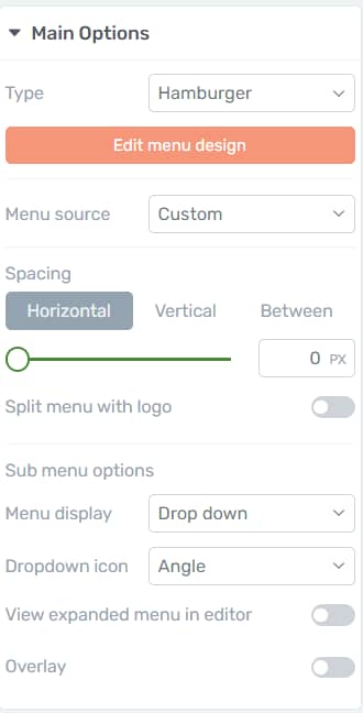
To enable the off-canvas behavior, you need to switch the menu type to Hamburger:
- With the Custom Menu element selected, look for the Menu type option in the left sidebar.
- Select Hamburger from the available menu types.
The menu will now collapse behind a hamburger trigger icon. The full menu items will no longer display inline — instead, they appear when the trigger icon is clicked.
Configuring Off-Screen Display
Once the menu is set to Hamburger mode, configure the display to slide in from the side:
- In the left sidebar, locate the Menu display option.
- Choose one of the off-screen options:
- Off screen right — The menu panel slides in from the right edge of the viewport.
- Off screen left — The menu panel slides in from the left edge of the viewport.
As an alternative, you can also choose Full screen display, which expands the menu to cover the entire viewport instead of sliding in from one side.
Customizing the Hamburger Trigger Icon
The hamburger trigger icon is what visitors click to open the off-canvas menu. To customize it:
- Click on the hamburger trigger icon on the canvas to select it.
- In the left sidebar, choose from 5 available icon styles — these range from the classic three-line hamburger to variations with different line weights and spacing.
- Adjust the icon size, color, and spacing using the standard styling options.
Styling the Menu Box
The Menu Box is the sliding panel that contains your menu items. Select it by clicking on the menu panel area when it’s open in the editor, then configure the following sub-element controls:
Maximum Width
- Controls how wide the off-canvas panel extends across the screen.
- Default: 1024px
- Range: 100 to 2000px
- Adjust using the Maximum Width slider in the left sidebar.
Horizontal Position
- Controls the horizontal alignment of the menu content within the panel.
- Options: Left, Center, or Right.
Minimum Height
- Sets the minimum height of the menu panel.
- Default: 80
- Range: 1 to 1000 (px or vh units)
- Adjust using the Minimum Height slider.
Vertical Position
- Controls the vertical alignment of the menu content within the panel.
- Options: Top, Center, or Bottom.
You can also style the Menu Box with:
- Background — Set a solid color, gradient, or image background for the panel.
- Borders — Add borders around the menu panel or individual sides.
- Box Shadow — Apply a shadow to give the panel depth and separation from the page content.
Configuring the Close Menu Icon
When the off-canvas menu is open, a Close Menu Icon appears inside the panel so visitors can dismiss it. This is a dedicated sub-element with the class .tcb-icon-close-offscreen.
To customize the close icon:
- Open the off-canvas menu in the editor by clicking the hamburger trigger.
- Click on the Close Menu Icon (the X icon) inside the panel to select it.
- Adjust the icon’s size, color, position, and spacing using the standard styling options in the left sidebar.
Enabling the Background Overlay
The background overlay is a semi-transparent layer that covers the rest of the page when the off-canvas menu is open, drawing focus to the menu panel:
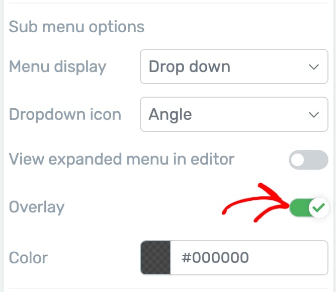
- With the Custom Menu element selected in Hamburger mode, locate the Overlay toggle in the left sidebar.
- Enable the Overlay toggle to activate the background overlay.
- Click the Overlay color option to set the overlay’s color and opacity.
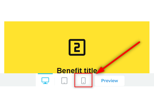
Mobile-Specific Design Considerations
Off-canvas menus are primarily designed for mobile and tablet visitors, but they work on all screen sizes. Keep these best practices in mind:
- Use responsive breakpoints — You can configure the Custom Menu to display as a regular horizontal menu on desktop and switch to Hamburger mode on tablet and mobile breakpoints. Select the element, switch to the desired breakpoint, and change the menu type for that breakpoint only.
- Keep the menu simple — On mobile, visitors expect a streamlined menu. Avoid deeply nested submenus and keep the top-level items to 5-7 entries.
- Test touch targets — Ensure menu items and the close icon are large enough to tap comfortably on touchscreens.
- Consider the panel width — On mobile, a maximum width of 80-90% of the viewport width (roughly 300-350px) works well. On tablets, you can go wider.
- Preview across breakpoints — Use the responsive preview in Thrive Architect to test how the off-canvas menu looks and behaves on different screen sizes.
Step-by-Step: Creating an Off-Canvas Menu from Scratch
Here is the complete workflow to build an off-canvas side menu:
- Open your page in the Thrive Architect editor.
- Drag the Custom Menu element into your header or top section.
- In the left sidebar, select your WordPress menu from the Menu Source dropdown.
- Set the Menu type to Hamburger.
- Set the Menu display to Off screen right (or Off screen left, depending on your preference).
- Click the hamburger trigger icon on the canvas and choose your preferred icon style from the 5 available options.
- Style the trigger icon’s color and size to match your site’s design.
- Click the trigger icon in the editor to open the off-canvas panel.
- Select the Menu Box and adjust the Maximum Width, Minimum Height, Horizontal Position, and Vertical Position to your liking.
- Style the Menu Box background, borders, and shadow.
- Select the Close Menu Icon and adjust its size, color, and position.
- Enable the Overlay toggle and set the overlay color and opacity.
- Switch to the Tablet and Mobile breakpoints and fine-tune the panel width and spacing for smaller screens.
- Click Save Work to save your changes.
Frequently Asked Questions
Can I Use Off-Canvas Navigation on Desktop Too?
Yes. The off-canvas menu works on all screen sizes. However, on desktop it’s common to display a standard horizontal menu and reserve the hamburger off-canvas menu for tablet and mobile. You can set different menu types per breakpoint.
What Is the Difference Between Off-Screen and Full-Screen Display?
The Off screen option slides a panel in from the left or right, covering only part of the page. The Full screen option expands the menu to cover the entire viewport. Off-screen is better for navigation-focused menus, while full-screen works well for dramatic, design-forward presentations.
Can I Add Other Elements Inside the Menu Panel?
The off-canvas menu panel displays your WordPress menu items. The styling is controlled through the Menu Box sub-element and the menu item styling options. For more complex layouts inside a slide-in panel, consider using a page-level lightbox triggered by a button.
Related Resources
- Custom Menu Element: How to Use the Custom Menu Element — Full guide to the Custom Menu element and all its menu types
- Header Design: How to Use Headers and Footers on Landing Pages — Adding navigation to landing page headers
- Responsive Design: Getting Started with Thrive Architect — Working with responsive breakpoints in the editor
That’s it! You’ve successfully learned how to create an off-canvas side menu in Thrive Architect. By using the Custom Menu element in Hamburger mode with the Off Screen display option, you can build a sleek slide-in navigation panel that keeps your pages clean and provides a smooth, modern experience for mobile and desktop visitors alike.