In this article, you’ll learn how to create templates that look great on all devices—desktop, tablet, and mobile—using the responsive editing tools in Thrive Theme Builder.
Why Mobile Responsiveness Matters
Most website visitors browse on mobile devices. Templates that don’t adapt to smaller screens can lead to poor user experience, lower engagement, and reduced search rankings. Thrive Theme Builder provides built-in responsive tools so you can design for all screen sizes.
Responsive Breakpoints
Thrive Theme Builder supports three device breakpoints:
- Desktop — Screens 1024px and wider (≥1024px).
- Tablet — Screens between 768px and 1023px.
- Mobile — Screens 767px and narrower (≤767px).
You can preview and edit your template at each breakpoint directly in the editor.
Switching Between Device Views
To preview and edit your template at different breakpoints:
- In the Thrive Theme Builder editor, look for the device icons at the bottom of the editor.
- Click the desktop, tablet, or mobile icon to switch views.
- The editor resizes to simulate the selected device width.

- Make adjustments as needed—changes made at a specific breakpoint only apply to that device size and smaller.
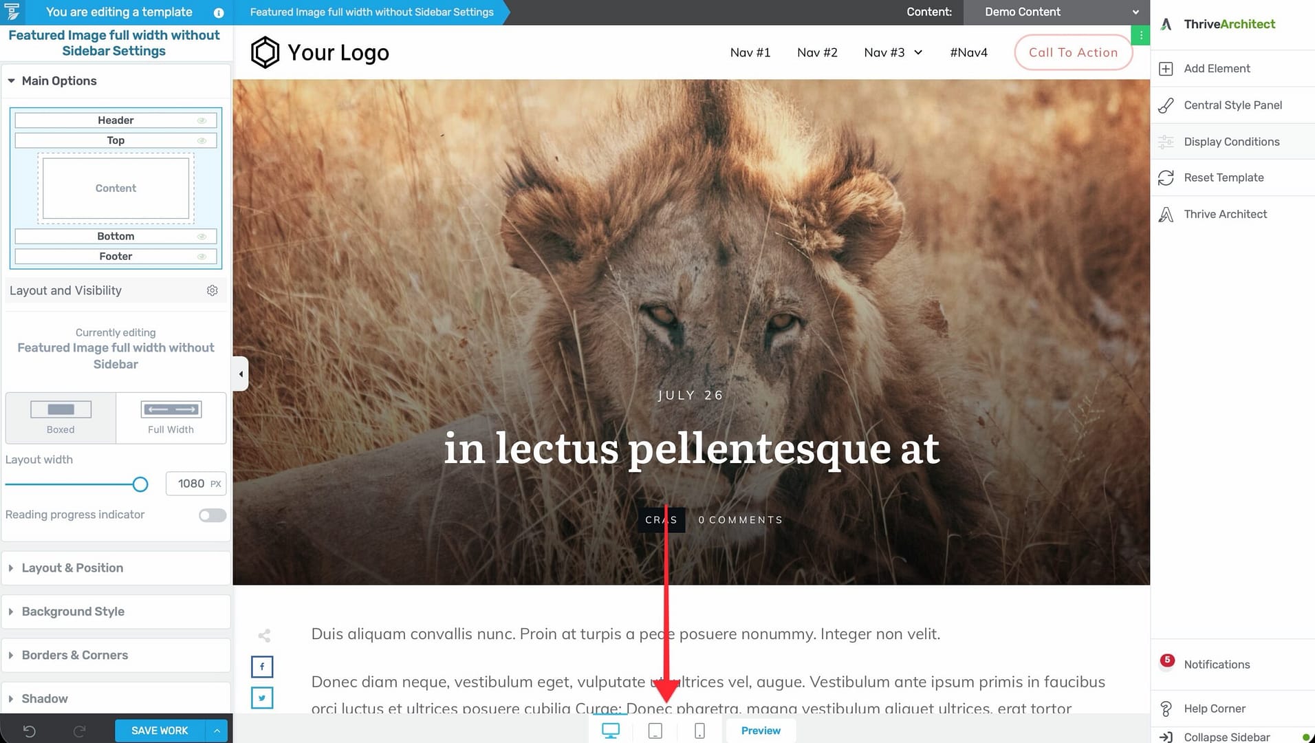
The Responsive Options
When you select an element or section, the left sidebar includes a Responsive options group. Use these settings to control how the element behaves at different screen sizes.
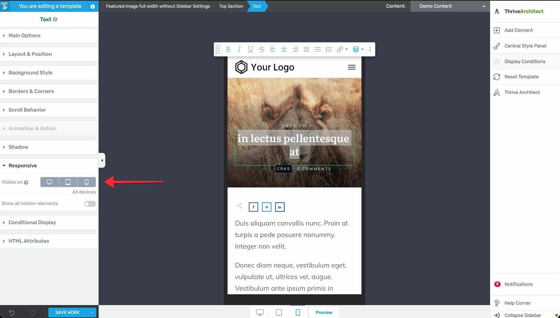
Hiding Elements on Specific Devices
You can hide any element on specific devices:
- Select the element in the editor.
- In the left sidebar, open the Responsive section.
- Toggle the visibility for each device breakpoint (desktop, tablet, mobile).
For example, you might hide a large hero image on mobile to improve load times, or hide a sidebar on tablet to give the content more space.
Adjusting Element Properties Per Breakpoint
Some element properties can be configured differently for each breakpoint:
- Font sizes — Use smaller text on mobile.
- Padding and margins — Reduce spacing on smaller screens.
- Column layouts — Stack columns vertically on mobile instead of side-by-side.
- Image sizes — Display smaller images on mobile devices.
Switch to the target breakpoint (e.g., mobile) before making these adjustments. Changes at a smaller breakpoint do not affect the larger breakpoints.
Responsive Design Tips
Design Desktop First, Then Adjust
- Build your template at the desktop breakpoint first.
- Switch to tablet view and adjust anything that doesn’t look right.
- Switch to mobile view and make final adjustments.
This approach works well because styles cascade down—desktop styles apply to tablet and mobile unless overridden.
Column Stacking
Multi-column layouts automatically stack vertically on smaller screens. However, you may need to adjust:
- The order in which columns stack.
- Padding and margins between stacked columns.
- Whether certain columns should be hidden on mobile.
Typography Scaling
Check your heading and body text sizes on mobile. Headings that look great on desktop can overwhelm a mobile screen. Reduce heading sizes at the mobile breakpoint to keep text readable and proportional.
Touch Targets
Make sure buttons and links are large enough to tap on mobile devices. Small, closely spaced links frustrate mobile users. Keep interactive elements at least 44px × 44px on mobile.
Testing Your Responsive Template
- Use the device preview icons in the editor to check each breakpoint.
- Save the template and preview it on actual devices or using your browser’s developer tools.
- Test with different content lengths—short and long posts, pages with and without images—to make sure the layout adapts.
Related Resources
- Using the Thrive Theme Builder Editor: Learn about the editor tools and interface.
- Template Settings & Defaults: Learn how to configure template settings.
- Understanding the Content Area, Content Wrapper & Layout Container: Learn about the structural elements of a template.