In this article, you’ll learn how to customize the layout of your Thrive Theme Builder templates using the Layout Container and Template Settings.
Accessing Layout Settings
There are two ways to access the layout settings:
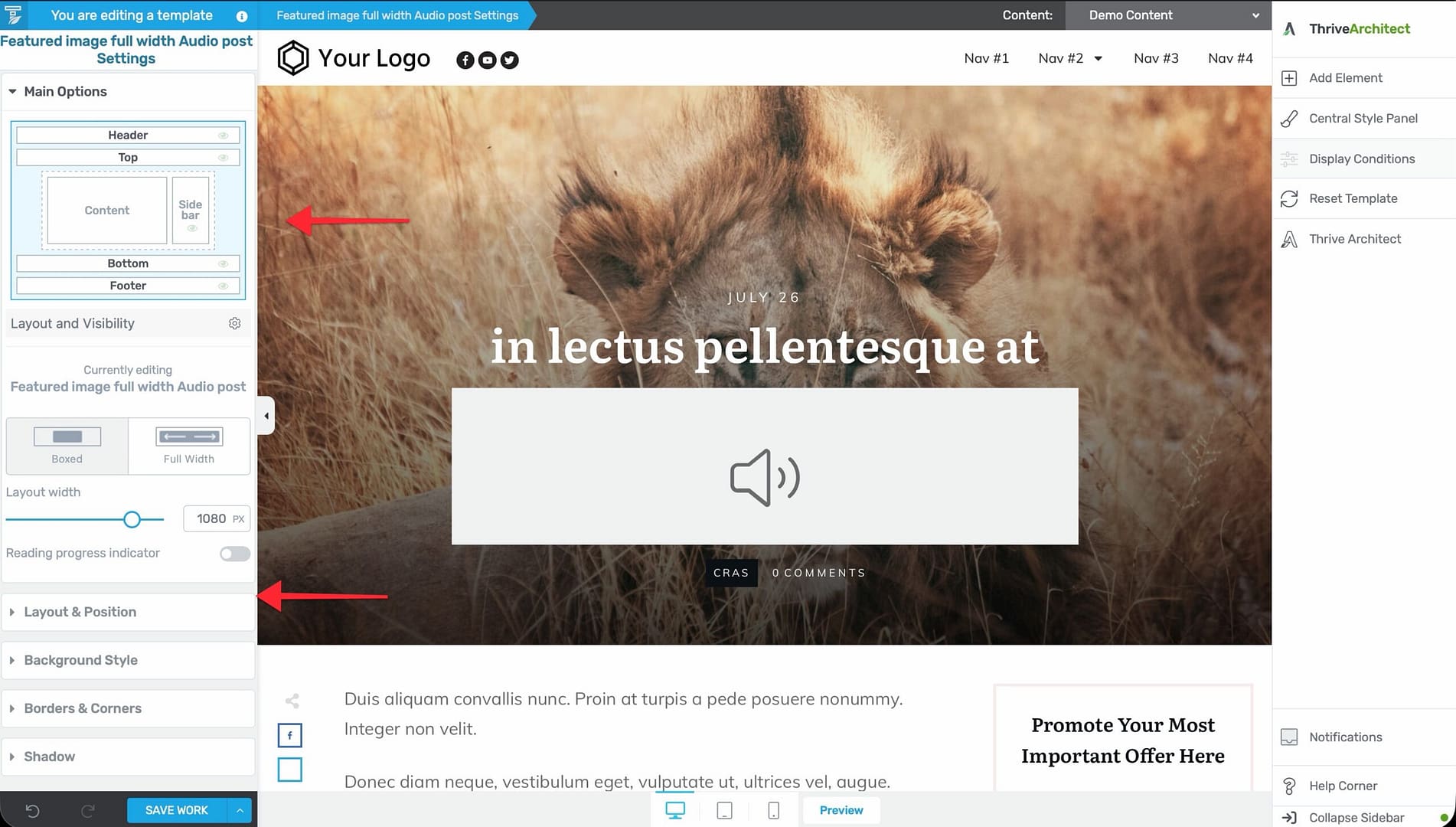
On First Open
When you click Edit on a template, the Template Settings automatically display in the left sidebar. These settings include the layout options.
During Editing
If you’ve already started editing and need to return to layout settings:
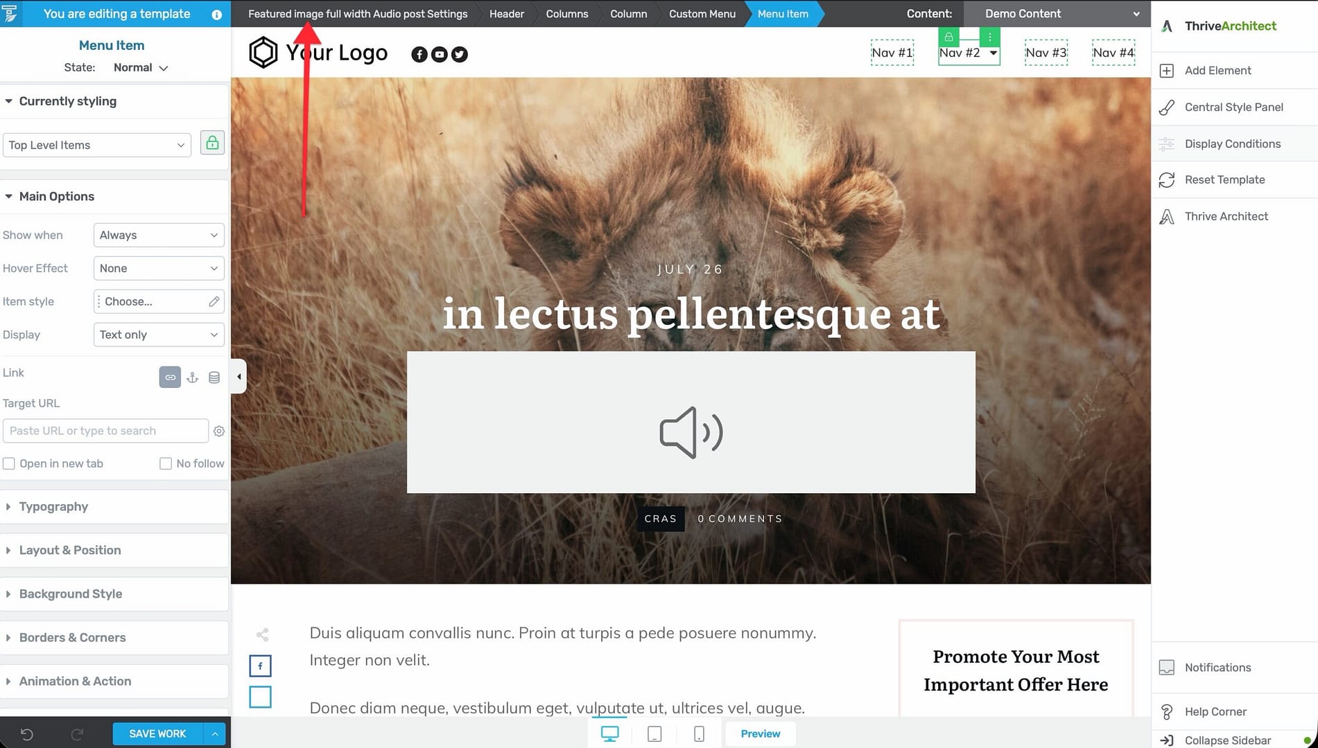
- Look at the breadcrumbs at the top of the editor.
- Click the first breadcrumb item (your template name with “Template Settings”).
- The Template Settings reappear in the left sidebar.
Layout Container Options
The Layout Container is the outermost structural layer of the template. Its settings control the overall page structure.
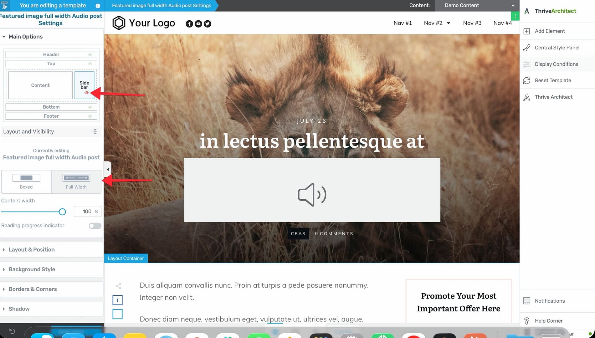
Content Width
Set the maximum width of the template’s content area. This determines how wide the content (including sidebar) can be, regardless of the browser window size.
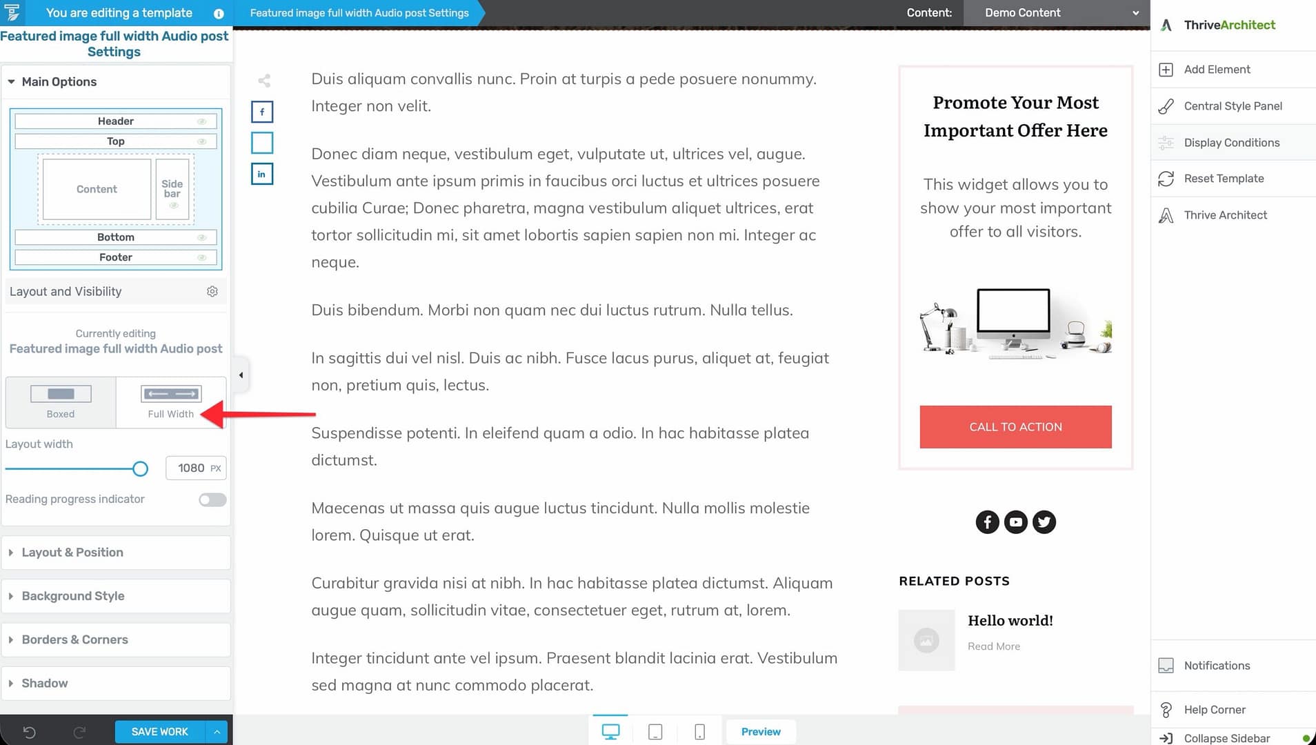
- Full-width — Content extends to the full width of the browser window.
- Boxed Fixed width — Content is constrained to a specific pixel width, centered on the page.
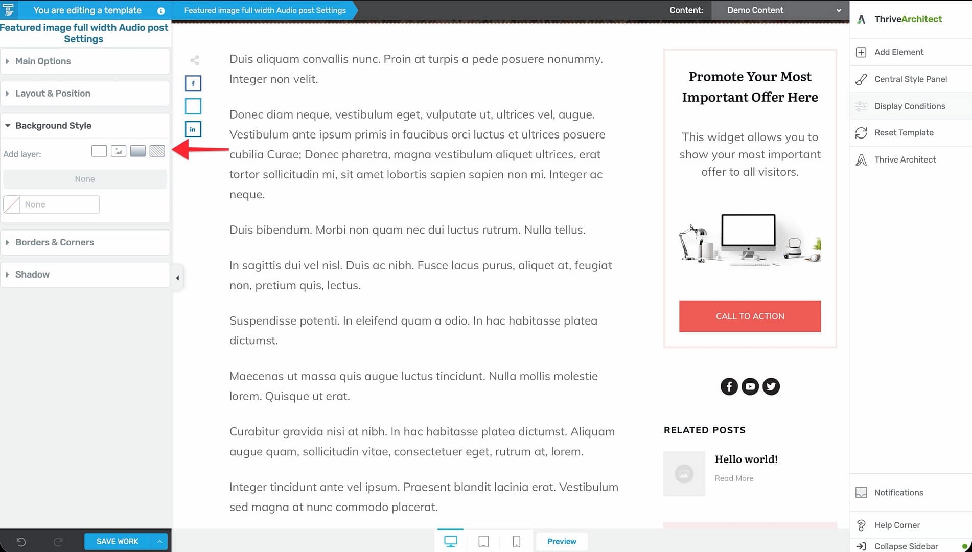
Background
Set a background color, gradient, or image that extends behind the entire template layout.
Sidebar Configuration
Sidebar settings are controlled from the Content Wrapper (not the Layout Container). Select the Content Wrapper via the breadcrumbs to access:
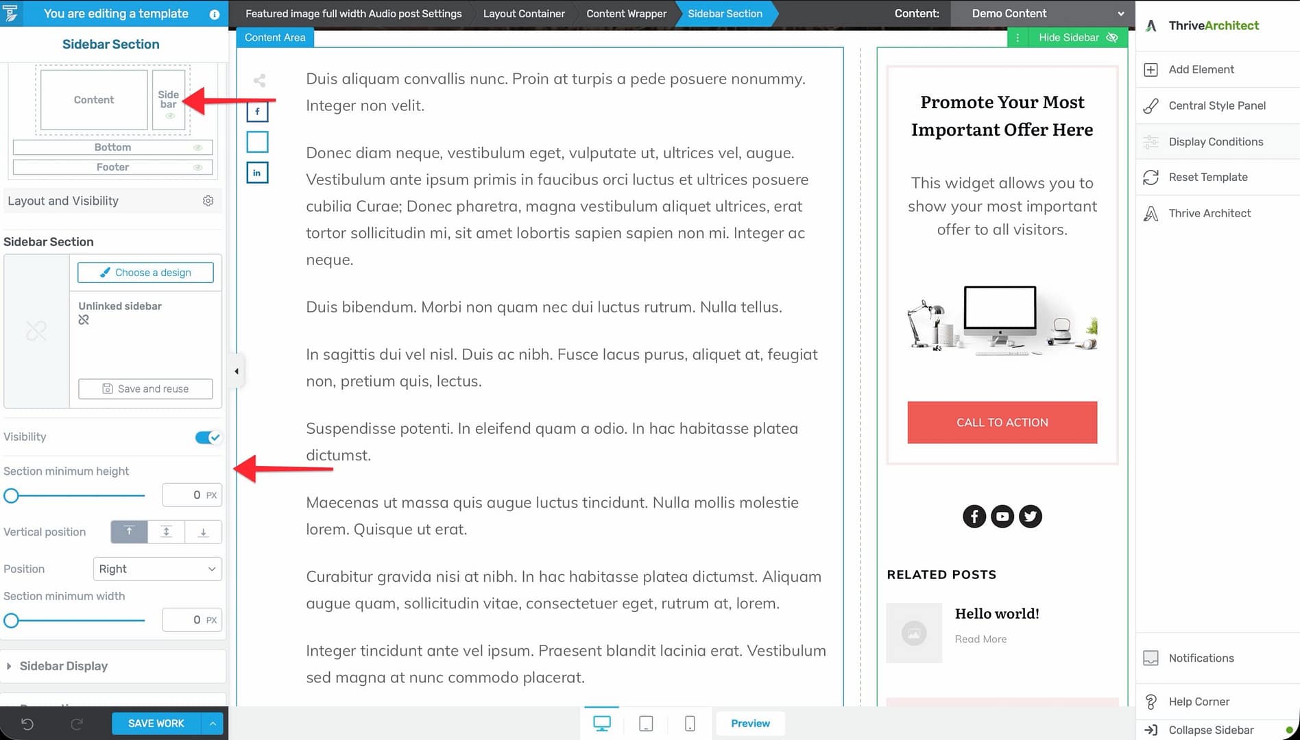
- Show/Hide sidebar — Toggle the sidebar on or off for this template.
- Sidebar position — Place the sidebar on the left or right side.
- Gutter width — Control the spacing between content and sidebar.
Template Layout Patterns
Full-Width, No Sidebar
Best for homepages, landing pages, and pages where you want maximum design control.
- Open the template in the editor.
- In the Template Settings (left sidebar), set the layout to full-width.
- Hide the sidebar.
Content with Right Sidebar
The most common layout for blog posts and content pages.
- Open the template in the editor.
- Set the sidebar position to right.
- Adjust the content width and gutter spacing as needed.
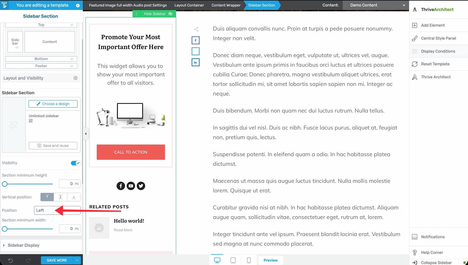
Content with Left Sidebar
Less common, but useful for certain design preferences.

- Open the template in the editor.
- Set the sidebar position to left.
- Adjust spacing as needed.
Boxed Layout
Content is centered within a defined maximum width, with the background extending beyond.
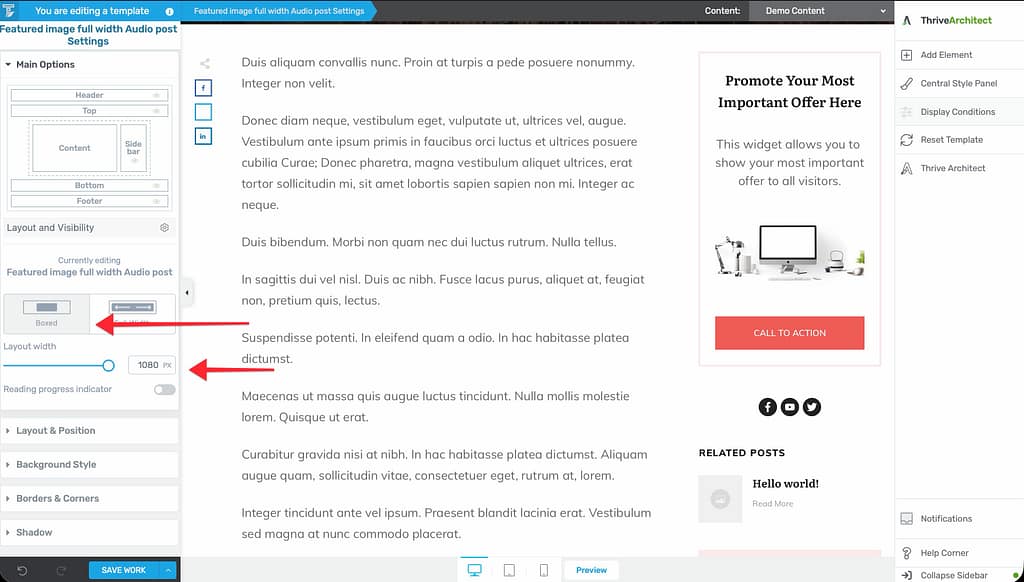
- Open the template in the editor.
- Set a fixed content width (e.g., 1200px).
- The content area is centered, and the background extends to the full browser width.
Adjusting Layout Per Template
Each template can have its own layout configuration. For example:
- Your homepage template might use a full-width layout with no sidebar.
- Your blog post template might use a right sidebar layout.
- Your archive template might use a full-width layout with a grid post list.
Layout settings are independent per template—changing the layout on one template does not affect others.
Related Resources
- Understanding the Content Area, Content Wrapper & Layout Container: Learn about the structural elements of a template.
- Using the Content and Sidebar Sections: Learn how to customize the content and sidebar areas.
- Template Settings & Defaults: Learn how to configure template settings.