In this article, you’ll learn how to set up a Table of Contents element in Thrive Architect. This element automatically generates a clickable list of headings from your page content, helping visitors navigate long articles, tutorials, and documentation pages with ease.
The Table of Contents element scans your page for heading elements (H1 through H6), builds a structured list, and provides smooth-scroll navigation to each section. You can also make it sticky so it stays visible as visitors scroll, and you can collapse it into a compact toggle for a cleaner layout.
Adding the Table of Contents Element
Follow these steps to add a Table of Contents element to your page:
- Open your page or post in the Thrive Architect editor.
- Click the green plus (+) icon in the right sidebar to open the element panel.
- Type Table of Contents in the search field at the top of the panel.
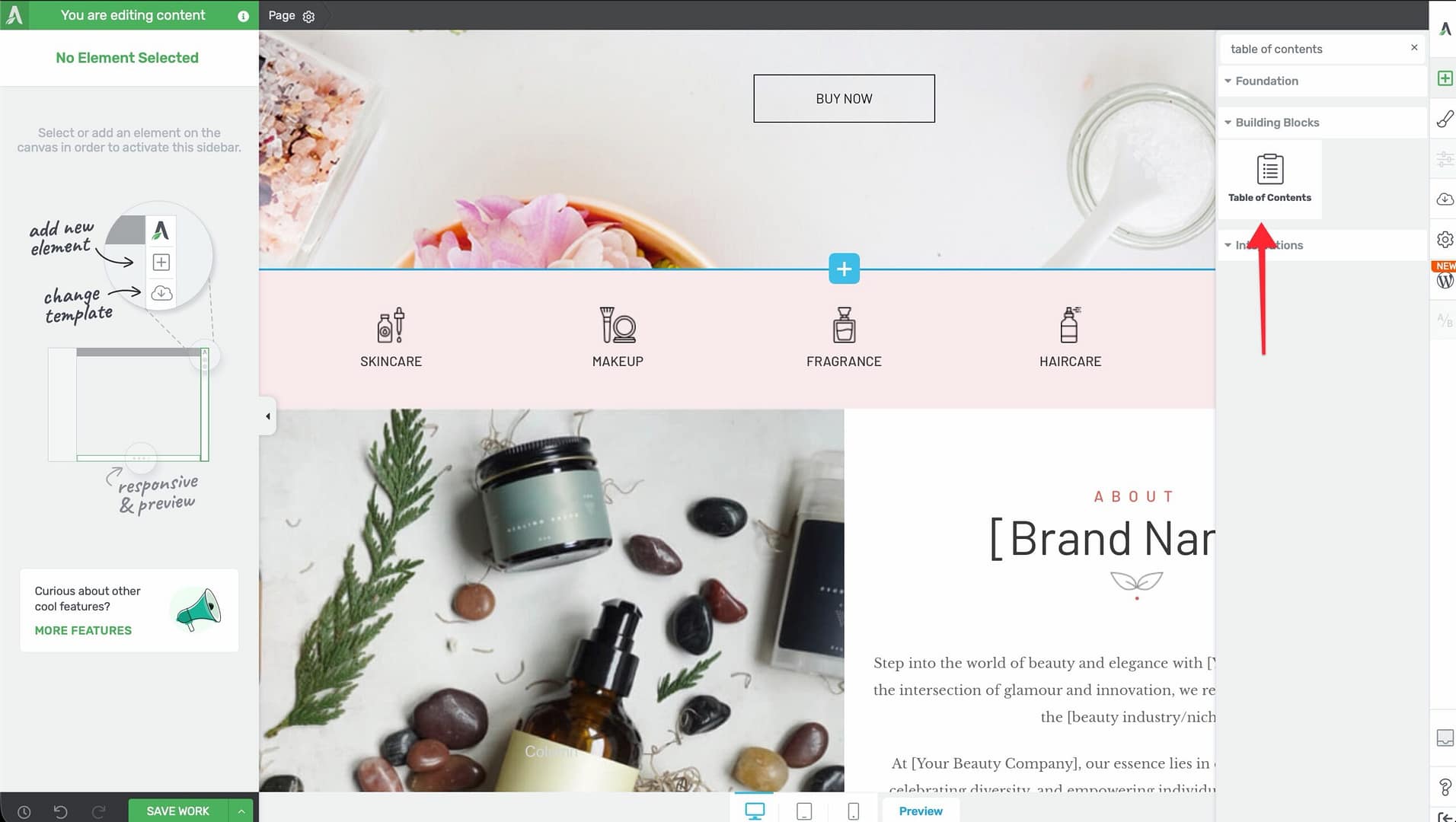
- Alternatively, scroll down to the Building Blocks section in the element list to find the Table of Contents element.
- Drag the element from the panel and drop it onto your page canvas — typically near the top of your content area, below the introduction.
A default Table of Contents element will appear on the canvas with the CSS class .tve-toc, ready for configuration.
Choosing a Template
When you first add the Table of Contents element, a template selection screen appears. You can choose from several pre-designed templates with different visual styles, colors, and layouts. Select a template to use it as a starting point, then customize it further using the options in the left sidebar. You can also skip template selection to start with a default layout.
Editing the Table of Contents
After placing the element, you’ll see two important controls at the top of the left sidebar:
- Edit table of contents button — Opens the full configuration panel where you can select which headings to include, set the numbering style, and adjust other options.
- Update table sync link — Click this to re-scan the page and refresh the Table of Contents with any heading changes you’ve made since the last sync. Use this after adding, removing, or renaming headings on your page.
You can also click directly on the ToC title text on the canvas to edit it inline. By default, the title is “Table of Contents,” but you can change it to any text you like (e.g., “In This Article” or “Quick Navigation”).
Selecting Which Headings to Include
Control which heading levels appear in the Table of Contents:

- Click the Edit table of contents button in the left sidebar.
- In the Headings section, you’ll see checkboxes for each heading level: H1, H2, H3, H4, H5, and H6.
- Check or uncheck each level to include or exclude it from the table.
Setting the Column Layout
The Columns option controls how the heading list is arranged:
- 1 — All headings display in a single column (default, best for sidebars or narrow layouts).
- 2 — Headings split into two columns.
- 3 — Headings split into three columns.
When using multiple columns, you can enable the Distribute evenly switch (enabled by default) to balance the number of items across columns. When disabled, items fill each column sequentially before wrapping to the next.
Configuring the Highlight Mode
The Highlight mode option controls how the currently visible section is indicated in the Table of Contents as visitors scroll through the page:
- Off — No highlighting. The Table of Contents remains static as visitors scroll.
- Current heading — Highlights only the heading that corresponds to the section currently in view.
- Current section — Highlights the heading and all sub-headings within the current section.
- Progressive — Highlights all headings from the top down to the current position, showing the visitor’s overall progress through the page.
Note: The highlight styling is controlled through the element’s design options. Select the highlighted state to customize its color, font weight, and other properties.
Item State Styling

The Table of Contents supports three styling states for list items:
- Normal — The default appearance of heading links.
- Hover — The appearance when a visitor moves their cursor over a heading link.
- Active — The appearance of the heading link that corresponds to the section currently in view (works in conjunction with the highlight mode setting above).
Use the state selector at the top of the element options to switch between states and customize colors, typography, and other visual properties for each.
Color Palette Presets

At the top of the left sidebar options, you’ll find color palette presets. Click on a palette to instantly apply a coordinated color scheme across the entire Table of Contents, including the title, heading links, background, borders, and active/hover states. This provides a quick way to theme the element to match your page design.
Setting the List Type and Numbering
The List type (also called Numbering) option controls how items are prefixed in the Table of Contents:
- None — No numbers or icons. Headings display as plain text links.
- Numbered at top level — Only the top-level headings receive sequential numbers (1, 2, 3, etc.). Sub-headings appear without numbers.
- Numbered at all levels — All heading levels receive hierarchical numbering (1, 1.1, 1.2, 2, 2.1, etc.).
- Icons at top level — Only the top-level headings display an icon prefix. Sub-headings appear without icons.
- Icons at all levels — All heading levels display an icon prefix.
When you select an icon-based option, you can choose the icon to display from the icon library.
Configuring Indent Size
The Indent size slider controls how much sub-headings are indented relative to their parent headings:
- Default: 30px
- Range: 0 to 200px
A larger indent makes the hierarchy clearer, while a smaller indent keeps the table compact. For tables with only two heading levels, 20-30px is usually sufficient.
Controlling Smooth Scroll Animation
By default, clicking a heading in the Table of Contents triggers a smooth scroll animation to that section on the page. You can disable this with the Disable smooth scroll animation switch.
Important: The tooltip for this option recommends disabling smooth scroll for pages with lazy-loaded content. Lazy loading changes the page height as images and other elements load in, which can cause the smooth scroll to land at the wrong position. If your page uses lazy loading, consider turning smooth scroll off.
Making the Table of Contents Collapsible
The Allow table to be collapsed switch (enabled by default) lets visitors expand and collapse the Table of Contents, keeping the page tidy:
- Enable the Allow table to be collapsed switch in the left sidebar.
- Configure the following sub-options that appear when collapsible is enabled:
Default State
- Collapsed — The Table of Contents starts in a closed state, showing only the header/title. Visitors click to expand it.
- Expanded — The Table of Contents starts fully open (default). Visitors can click to collapse it.
Dropdown Animation
Choose how the table expands and collapses:
- None — Instant show/hide with no animation.
- Slide — The table slides open and closed vertically.
- Fade — The table fades in and out.
Animation Speed
Control how fast the dropdown animation plays:
- Slow — A slower, more deliberate animation.
- Medium — A balanced animation speed (default).
- Fast — A quick animation for a snappier feel.
Tip: The Slide animation at Medium speed is a solid default choice. It provides a clear visual cue that the table is expanding without feeling sluggish.
Adjusting Text Size and Line Spacing
Text Size
The Text size slider controls the font size of the heading links in the table:
- Default: 16px
- Range: 1 to 100 (px or em units)
Line Spacing
The Line spacing control adjusts the vertical distance between heading items. Increase this for a more open, airy layout, or decrease it for a more compact table.
Modifying and Reordering Headings
The Modify Headings section in the left sidebar gives you direct control over which headings appear and in what order:

- Click the Edit table of contents button to open the configuration panel.
- Scroll to the Modify Headings section.
- You’ll see a reorderable list of all detected headings from your page.
- Drag headings to reorder them — the Table of Contents will display headings in the order you set here, regardless of their position on the page.
- To rename a heading in the Table of Contents, click on its text in the list and type a new label. This changes only the display text in the ToC — the actual heading on the page remains unchanged.
- To hide or show a heading, click the visibility toggle (eye icon) next to it. Hidden headings will not appear in the Table of Contents but remain on the page.
- Click the Sync button to re-scan the page and pull in any new or changed headings.
Note: Reordering, renaming, and hiding headings here only affects their display in the Table of Contents. It does not move, rename, or remove the actual heading elements on your page.
Using Group Editing
The Table of Contents element supports group editing for the following item types, allowing you to style multiple items at once:
- Heading levels 1, 2, 3 — Edit the styling (color, typography, spacing) of all headings at a specific level simultaneously.
- Icon levels 1, 2, 3 — Edit the icon styling for all entries at a specific depth when using icon-based list types.
- Number levels 1, 2, 3 — Edit the number styling for all entries at a specific depth when using numbered list types.
- Dividers — Edit the styling of divider lines between heading items.
To use group editing, select one item within a group, then enable Group Editing in the left sidebar. Any styling changes you make will apply to all items in that group.
Making the Table of Contents Sticky
A sticky Table of Contents stays visible as visitors scroll, making it easy to jump between sections at any time. This is achieved using the Layout & Position options:
Setting Up a Sticky Table of Contents
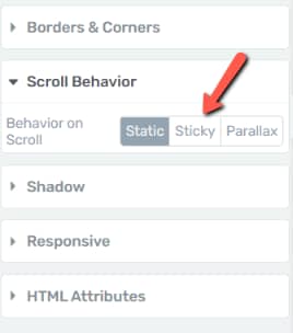
- Select the Table of Contents element on the canvas.
- In the left sidebar, navigate to the Layout & Position section.
- Set the Position to one of the following:
- Sticky — The element scrolls normally with the page until it reaches the top of the viewport, then “sticks” in place as the visitor continues scrolling. Once the visitor scrolls past the element’s parent container, it unsticks and scrolls away.
- Fixed — The element is removed from the normal document flow and stays in a fixed position on the screen at all times, regardless of scrolling.
- Set the Offset from top value to control how far from the top edge of the viewport the element sticks. A value of 10-20px prevents the element from touching the very top of the screen.
- Optionally, assign an Element ID to another element further down the page (e.g., a footer section or a “Related Resources” heading). When the sticky Table of Contents scrolls to the point where that element comes into view, it will automatically unstick and stop following the scroll. This prevents the ToC from overlapping content at the bottom of the page. To set this up, select the target element, go to its HTML Attributes section, and add an ID. Then reference that ID in the sticky Table of Contents settings.
Tip: For most use cases, Sticky positioning is preferred over Fixed. Sticky positioning keeps the element in the normal document flow until it needs to stick, which avoids layout shifts. Fixed positioning can overlap other content and requires more careful placement.
Best Practices for Sticky Table of Contents Placement
- Use a sidebar layout — Place the Table of Contents in a sidebar column (using the Columns element) and make it sticky. This keeps the table visible alongside your main content without obstructing it.
- Set an appropriate offset — If your site has a sticky header, set the offset from top to be at least the height of the header plus a small buffer, so the Table of Contents doesn’t hide behind the header.
- Keep it compact — A sticky table works best when it doesn’t take up too much vertical space. Use the collapsible option or limit the heading levels included to keep it short.
Responsive Considerations for Sticky Table of Contents on Mobile
- Disable sticky on mobile — On small screens, a sticky Table of Contents can take up too much viewport space and obstruct the content. Consider switching the position back to Relative (the default) on the Mobile breakpoint.
- Use collapsed default on mobile — If you keep the Table of Contents on mobile, set the Default State to Collapsed so it takes up minimal space until the visitor expands it.
- Test across breakpoints — Use the responsive preview in Thrive Architect to verify that the sticky behavior works well on tablet and mobile without covering essential content.
Frequently Asked Questions
Why Isn’t the Table of Contents Showing Any Headings?
The Table of Contents scans for heading elements (H1-H6) on the page. If no headings are detected, the table will appear empty. Make sure you have heading elements on the page (not just bold text) and click the Update table link to sync.
Can I Exclude a Specific Heading from the Table?
Yes. In the Modify Headings section, you can remove individual headings from the reorderable list. This excludes them from the Table of Contents without affecting the heading on the page itself.
Does the Table of Contents Work with Thrive Theme Builder Templates?
Yes. You can add a Table of Contents element to a Thrive Theme Builder template (for example, a blog post template), and it will dynamically generate a heading list based on each post’s content.
Why Does Smooth Scroll Land at the Wrong Position?
This typically happens on pages with lazy-loaded content (images, videos, or iframes that load as you scroll). Because lazy loading changes the page height after the initial load, the scroll calculation can be off. Disable smooth scroll using the Disable smooth scroll animation switch to resolve this.
Related Resources
- Toggle Element: How to Use the Toggle Element — Collapsible sections for FAQ-style content
- Columns Element: How to Use the Columns Element — Create a sidebar layout to hold a sticky Table of Contents
- Content Box: How to Use the Content Box Element — Container element for wrapping the Table of Contents
- Getting Started: Getting Started with Thrive Architect — Overview of the editor and element panel
That’s it! You’ve successfully learned how to set up a Table of Contents in Thrive Architect. With heading selection, column layouts, highlight modes, collapsible behavior, and sticky positioning, you can create a navigation aid that helps visitors find exactly what they need on long-form pages.