In this article, you’ll learn how to use background styles in Thrive Architect. The Background Style panel lets you apply solid colors, images, gradients, patterns, video backgrounds, and visual effects to any supported element — giving you full creative control over how your page sections and containers look.
Background styling is available for all Thrive Architect elements that support backgrounds, including the Background Section, Content Box, Columns, Block, and more. Each background type offers its own set of customization options, from simple color fills to complex multi-layer gradient and image combinations.
Accessing the Background Style Panel
To access the background styling options for any element:
- Open your page in the Thrive Architect editor.
- Click the plus (+) icon in the right sidebar to add an element, or click an existing element on the page to select it.
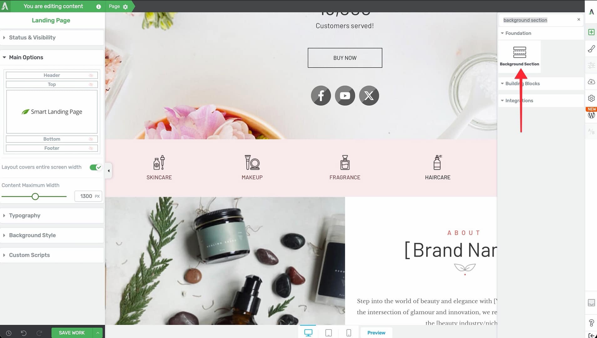
- Find Background section element and drag it to your page.
- With the element selected, locate the Background Style section in the left sidebar panel.
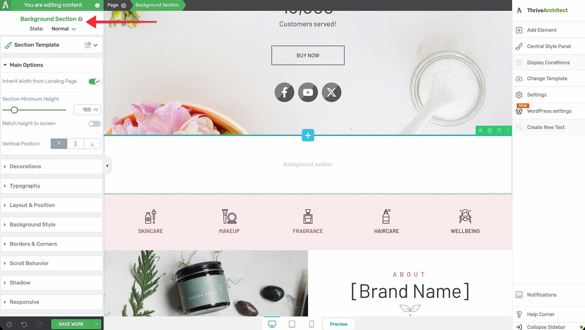
- Click on Background Style to expand it and view the available options.
Under the Background Style section, you will see the following background type options:
- Solid — A single, flat color fill
- Image — A static or dynamic image background
- Gradient — A color transition between two or more colors
- Pattern — A repeating decorative pattern
- Background Effect — Visual filters and adjustments applied to the background
Below these options, you will also find a background color picker and a video background toggle for elements that support video backgrounds.
Solid Background Styling
The solid background option applies a single, flat color to the entire background of the selected element. This is the simplest and most commonly used background type.
To apply a solid background color:
- Select the element on the page.
- Open the Background Style section in the left sidebar.
- Click the Solid option beside the background layer controls.
- A color picker will appear. Select the color you want to apply by clicking in the color spectrum, entering a hex code, adjusting the RGB/HSL sliders, or choosing a color from your saved My Colors, Global Colors, or Theme Colors.
- Adjust the opacity slider if you want the background color to be semi-transparent.
- Click the Apply button to save the background color to the element.
Tip: If you are using a Thrive Theme Builder template, the color picker may show an option to Unlink from theme color if the element’s color is currently linked to a theme-level setting. Unlinking allows you to set an independent color for that specific element.
Using Global and Favorite Colors
When selecting a color in the color picker, you can save frequently used colors for quick access:
- Favorite Colors — Saved colors that appear in your My Colors section for quick reuse. You must manually apply a favorite color each time.
- Global Colors — Saved colors marked with a small triangle indicator. Changing a global color in one location automatically updates it everywhere that global color is used across your site.
To save a color as global or favorite, select the color in the picker and click the plus (+) icon under My Colors, then choose Global or Favorite.
Image Background Styling
The image background option lets you set a static or dynamic image as the element’s background. This is ideal for hero sections, content boxes with background imagery, and decorative page areas.
To add an image background:
- Select the element on the page.
- Open the Background Style section in the left sidebar.
- Click the Image option.
- A popup will appear with two tabs: Static and Dynamic.
Static Image Background
Under the Static tab, you get the following options:
- Choose Image — Click to open the WordPress media library and select or upload an image to use as the background.
- Static Background Image — When enabled, the image itself will not move when visitors scroll down the page (also known as a fixed or parallax-like attachment). When disabled, the image scrolls normally with the rest of the page content.
- Image Display — Controls how the image is sized and positioned within the element. The available display modes are:
Image Display Modes
- Default — Keeps the image at its original, native size. If the image is smaller than the element, empty space will remain. If the image is larger, it may extend beyond the element’s boundaries.
- Cover — Scales the image to be as large as possible, filling the entire element without stretching. If the image’s aspect ratio differs from the element, the image will be cropped either horizontally or vertically to eliminate empty space. The image will span the maximum width of the element. A drag handle appears on the image, allowing you to reposition it vertically to focus on the most important area.
- Contain — Scales the image to fit entirely within the element without cropping. The full image is always visible, but empty space may appear on the sides if the aspect ratios do not match. You can drag the image left or right to reposition it within the element.
- Percentage — Allows you to set an exact percentage for both the width and height of the image, giving you precise manual control over how large the image appears within the element.
Additional Image Options (Default and Percentage Modes)
When you select Default or Percentage as the image display mode, additional options become available:
- Repeat — Controls whether the image repeats to fill empty space within the element:
– No Repeat — The image appears only once – Repeat Vertically — The image tiles vertically to fill the element’s height – Repeat Horizontally — The image tiles horizontally to fill the element’s width – Repeat Both — The image tiles in both directions to fill the entire element
- Width and Height — Sliders or manual input fields that let you set the exact percentage dimensions of the image.
- Positioning Square — A 3×3 grid of dots (9 positions total) that lets you anchor the image to a specific position within the element. Click any dot to set the image’s alignment point — for example, top-left, center, or bottom-right.
Dynamic Image Background
Under the Dynamic tab, you can set the background image to be pulled dynamically from a content source rather than selecting a static file. This is especially useful in Thrive Theme Builder templates or dynamic content displays.
Available dynamic image sources include:
- Featured Image — The featured image of the current post or page
- Author Image — The avatar or profile image of the post’s author
- User Image — The profile image of the currently logged-in user
- Custom Field — An image stored in a custom field attached to the post or page
Just like static background images, you can configure the image display mode and static scroll behavior for dynamic images. The image will automatically update based on the content being displayed.
Gradient Background Styling
The gradient background option applies a smooth color transition between two or more colors. Gradients add visual depth and interest to sections and containers without requiring an image file.
To apply a gradient background:
- Select the element on the page.
- Open the Background Style section in the left sidebar.
- Click the Gradient option.
- The gradient editor will appear with controls for orientation, angle, and color stops.
Gradient Orientation Types
- Linear — Creates a gradient that transitions along a straight line. You can set the angle of the gradient (in degrees) to control the direction of the color transition — for example, 0 degrees for bottom-to-top, 90 degrees for left-to-right, or 45 degrees for a diagonal transition.
- Radial — Creates a gradient that radiates outward from a central point in a circular or elliptical pattern. Radial gradients are useful for spotlight effects, vignettes, and circular background highlights.
Working with Color Stops
The gradient editor displays a color bar with two or more color stops (small markers along the bar). Each color stop represents a color at a specific position in the gradient.
To customize the gradient:
- Click a color stop to select it, then use the color picker to change its color.
- Drag a color stop left or right along the bar to change its position and control where the color transition occurs.
- Add a new color stop by clicking on an empty area of the gradient bar. A new stop will be added at that position, allowing you to create multi-color gradients.
- Remove a color stop by dragging it away from the bar.
- Adjust the angle (for linear gradients) using the angle input field or by dragging the angle dial.
Saving Gradients as Global
After creating a gradient, you can save it for reuse across your site:
- Click the plus (+) icon under My Gradients.
- Choose Global to make the gradient a global gradient, or Favorite to save it as a personal favorite.
- Global gradients (indicated by a small triangle on the gradient swatch) can be edited once and the changes will automatically propagate to every element using that gradient.
To use a saved global gradient on another element, select the element, open the Background Style panel, choose Gradient, and click the desired gradient from the My Gradients section.
To edit a global gradient, click it under My Gradients, then click the pen icon beside the gradient name. Make your changes and click the checkmark to save. The update applies everywhere the gradient is used.
To unlink a global gradient from a specific element (so changes to the global gradient no longer affect that element), click the unlink icon beside the gradient name after selecting it.
To rename or delete a global gradient, click the three dots beside the gradient name and choose Rename or Delete.
Note: Deleting a global gradient from the gradient list does not remove the gradient from elements where it was already applied. Those elements retain their gradient appearance, but the gradient is no longer linked and will behave as a regular, independent gradient going forward.
Pattern Background Styling
The pattern background option applies a repeating decorative pattern to the element’s background. Patterns are useful for adding subtle texture or visual interest without using a full image.
To apply a pattern background:
- Select the element on the page.
- Open the Background Style section in the left sidebar.
- Click the Pattern option.
- Browse the available pattern library and click a pattern to select it.
- Use the color picker to choose the color for the pattern.
- Click the Apply button to save.
Patterns tile automatically across the entire element. The color you select applies to the pattern’s foreground design, while the element’s existing background color (if any) serves as the background behind the pattern.
Background Effects
The Background Effects option lets you apply visual filters and adjustments to the background, giving you fine-tuned control over the appearance of the background layer without modifying the original image or color.
To access background effects:
- Select the element on the page.
- Open the Background Style section in the left sidebar.
- Locate the Background Effect controls.
The available background effects are:
- Opacity — Controls the transparency of the background. Lower values make the background more transparent, allowing content or colors behind it to show through.
- Grayscale — Converts the background to shades of grey. A value of 100% produces a fully black-and-white background.
- Brightness — Increases or decreases the overall lightness of the background. Values above 100% make the background brighter; values below 100% make it darker.
- Contrast — Increases or decreases the difference between light and dark areas in the background. Higher contrast makes the background more vivid and dramatic.
- Blur — Applies a Gaussian blur to the background. Higher values produce a more blurred, out-of-focus appearance. This is useful for creating frosted-glass effects or softening a busy background image so that foreground text remains readable.
- Sepia — Applies a warm, brownish tone to the background, creating a vintage or nostalgic appearance.
- Invert — Reverses the colors of the background. A value of 100% produces a fully inverted (negative) image.
- Saturate — Increases or decreases the color intensity of the background. Higher values produce more vivid, vibrant colors; lower values produce muted, desaturated tones.
- Hue Rotation — Shifts all the colors in the background around the color wheel by the specified degree. A 180-degree rotation produces complementary colors.
Adjust each effect using the provided slider or by entering a numerical value. Multiple effects can be combined simultaneously. After configuring the desired effects, click Apply to save.
Choosing a Background Color
In addition to the background style options (solid, image, gradient, pattern), there is a separate background color option available below the main background style controls.
To set a background color:
- Click the color swatch field (which may display None if no color is set).
- A color picker will appear where you can select or enter any color.
- The selected color acts as the base background layer underneath any other background style you have applied.
This is useful when you want to combine a semi-transparent image or gradient with an underlying solid color. For example, you could set a dark background color and overlay a semi-transparent image to create a darkened, moody background effect.
Setting a Video Background
Thrive Architect supports video backgrounds for certain container elements, primarily the Background Section. A video background plays a looping video behind the element’s content, creating a dynamic, engaging visual experience.
To enable a video background:
- Select the Background Section element on the page.
- Open the Background Style section in the left sidebar.
- Locate the Video Background toggle and click it to enable video background.
- A Source dropdown will appear. Select the video hosting platform or source:
- YouTube — Enter the YouTube video URL
- Vimeo — Enter the Vimeo video URL
- Wistia — Enter the Wistia video URL or embed code
- Uploaded Video — Select a video file from your WordPress media library
- Externally Hosted Video — Enter the direct URL to a video file hosted on an external server
- VooPlayer/SpotLightr — Enter the VooPlayer or SpotLightr embed code
- Bunny.net Stream — Enter the Bunny.net stream URL
- Paste the video URL or select the video file, then configure any additional settings.
Note: Video backgrounds play automatically, are muted by default, and loop continuously. They are intended as a decorative background element, not as a primary video player. On mobile devices, video backgrounds may not autoplay due to browser restrictions, so it is recommended to set a fallback background image or color for mobile views.
Combining Multiple Background Layers
Thrive Architect allows you to layer multiple background styles to create rich, complex visual effects. For example, you can combine:
- A solid color as the base layer
- A semi-transparent gradient overlay on top
- A background image with reduced opacity beneath the gradient
- Background effects such as blur or brightness applied to the image layer
To create layered backgrounds:
- Set your primary background style (e.g., an image).
- Add a background color with some transparency.
- Apply background effects to adjust the visual appearance.
Experimenting with transparency (opacity) values is key to creating effective layered backgrounds. A common technique is to use a dark or light color overlay at 50-70% opacity on top of a background image to improve text readability while preserving the visual interest of the image.
Frequently Asked Questions
Can I Use Different Backgrounds for Desktop, Tablet, and Mobile?
Yes. Switch to the desired device view using the device switcher in the bottom toolbar, then change the background style settings. Changes made in a specific device view only affect that device and smaller devices (following the cascading rule). This is especially useful for replacing a background image with a lighter or smaller image on mobile to improve load times.
Why Does My Background Image Look Blurry?
This usually happens when the image resolution is too low for the element size. Ensure your background image is at least as large as the element’s display dimensions. For full-width background sections, use images that are at least 1920px wide for sharp display on high-resolution screens.
What Is the Difference Between Background Style and Background Color?
The Background Style options (Solid, Image, Gradient, Pattern) set the primary visual layer. The separate Background Color option underneath provides an additional base color layer. The background color appears behind the background style, so it is only visible when the style layer is transparent or semi-transparent.
Can I Apply a Background to Any Element?
Most Thrive Architect elements support the Background Style panel. However, some inline elements (like text links or inline icons) may not have background style options. Container elements such as Background Section, Content Box, Columns, Block, and Styled Box offer the most comprehensive background controls.
Related Resources
- Global Colors and Gradients: How to Use Global Colors, Gradients, and Styles — Save and reuse colors and gradients across your site
- Layout and Position: How to Use Layout and Position Options — Control element sizing, spacing, and positioning
- Responsive Design: How to Use Responsive Design Options — Customize backgrounds and styles per device
- Background Section Element: How to Use the Background Section Element — Create full-width sections with advanced background options
That’s it! You’ve successfully learned how to use background styles in Thrive Architect. With solid colors, images, gradients, patterns, video backgrounds, and visual effects at your disposal, you can create visually compelling page designs that capture your visitors’ attention and reinforce your brand identity.