In this article, you’ll learn how to use global colors, gradients, dynamic colors, and group styling in Thrive Architect. These features give you centralized control over your design palette, so you can maintain a consistent look across your entire site and update colors everywhere with a single change.
Global colors and gradients let you define reusable color presets that are shared across all elements on your page. Dynamic colors adapt automatically based on context, and group styling lets you apply the same style to multiple elements simultaneously. Together, these tools form the backbone of an efficient, scalable design workflow.
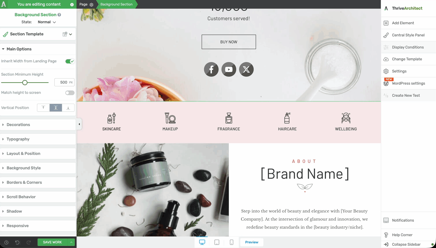
Understanding the Color Picker
Before diving into global colors and gradients, it helps to understand the color picker interface in Thrive Architect. Every time you click on a color option for any element, the color picker panel opens in the left sidebar.
Color Picker Layout
The color picker is organized into several sections:
- Solid tab — Select a single, flat color using the color spectrum, opacity slider, or direct input
- Gradient tab — Build a gradient with two or more color stops (covered in detail in the Global Gradients section below)
- My Colors section — Displays your saved global color presets for quick access
- Hex/RGB input — Enter a precise hex code (e.g.,
#FF5733) or RGB values (e.g.,rgb(255, 87, 51)) directly - Opacity slider — Adjust the transparency of the selected color from 0% (fully transparent) to 100% (fully opaque)
Working with Global Colors
Global colors are named color presets that you create once and reuse across your entire page or site. When you edit a global color, every element that uses that color updates automatically. This is the most efficient way to maintain a consistent color scheme and make site-wide color changes.
Creating a Global Color
Follow these steps to create a new global color:
- Select any element on the canvas that has a color property (such as a text element, button, or background section).
- Click on any color option in the left sidebar to open the color picker.
- Choose the color you want using the color spectrum, hex input, or RGB values.
- Click the Save as Global Color button (or the + icon) in the My Colors section of the color picker.
- Enter a descriptive name for the color (e.g., “Brand Blue”, “CTA Orange”, or “Dark Background”).
- Click Save to confirm.
The color now appears in your My Colors section and is available across all elements on your site.
Applying a Global Color to an Element
To apply a saved global color to any element:

- Select the element on the canvas.
- Click on the color property you want to change (e.g., Font Color, Background, or Border Color).
- In the color picker, look at the My Colors section at the top.
- Click on the global color swatch you want to apply.
The element will immediately adopt the selected global color. A small link icon appears next to the color swatch, indicating that this element is linked to the global color preset.
Editing a Global Color
When you need to update a global color (for example, changing your brand color from blue to teal), follow these steps:
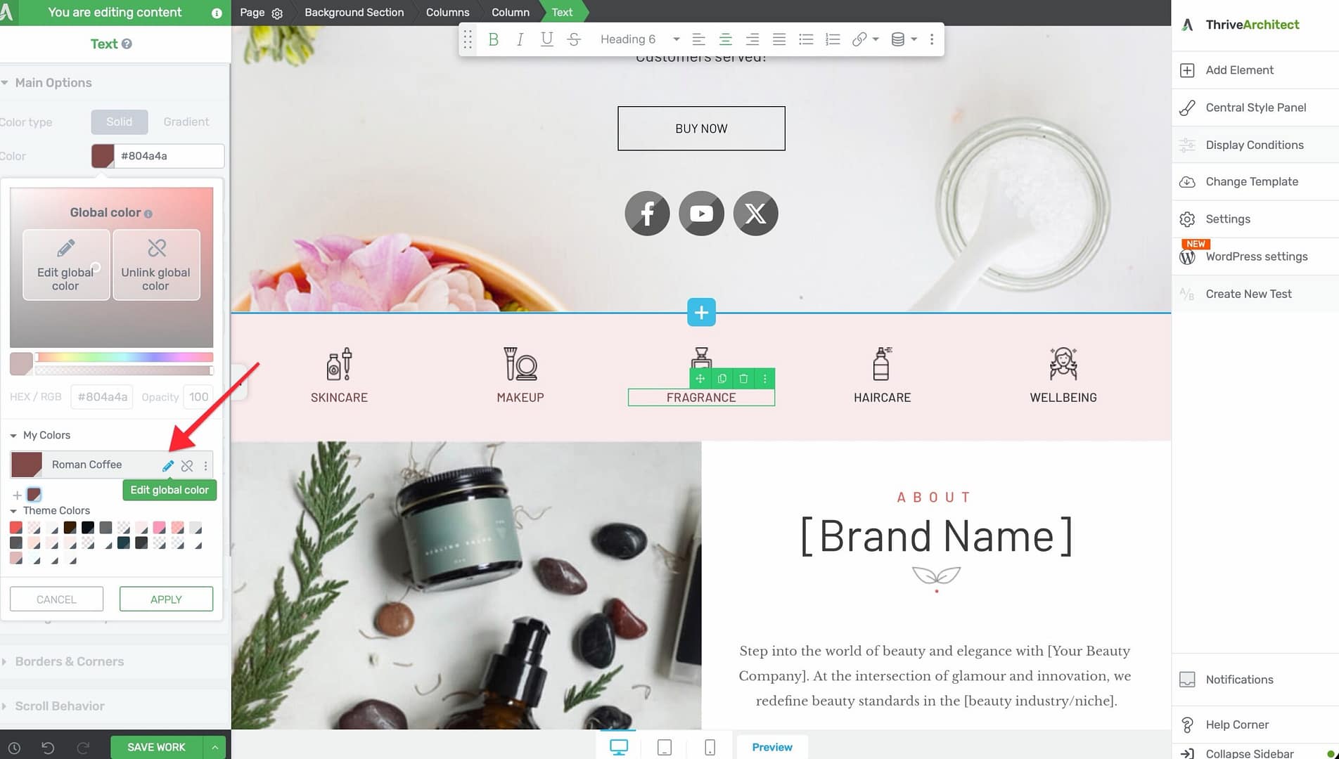
- Open the color picker on any element.
- In the My Colors section, locate the global color you want to edit.
- Click the edit icon (pencil) next to the color swatch.
- Adjust the color using the color spectrum, hex input, or opacity slider.
- Click Save to apply the changes.
Deleting a Global Color
To remove a global color you no longer need:
- Open the color picker on any element.
- In the My Colors section, locate the color you want to delete.
- Click the edit icon (pencil) next to the color swatch.
- Click the Delete button.
- Confirm the deletion when prompted.
Working with Global Gradients
Global gradients work the same way as global colors, but instead of a single flat color, you define a gradient with multiple color stops, direction, and type. Global gradients are ideal for backgrounds, buttons, text overlays, and any element where you want a smooth color transition.
Creating a Global Gradient
Follow these steps to create a gradient preset:
- Select any element on the canvas.
- Click on a color property in the left sidebar to open the color picker.
- Switch to the Gradient tab at the top of the color picker.
- Configure your gradient:
- Gradient type — Choose Linear (colors transition along a straight line) or Radial (colors radiate outward from a center point)
- Direction/Angle — For linear gradients, set the angle (0–360 degrees) to control the direction of the color transition
- Color stops — Click on the gradient bar to add color stops. Each stop defines a color at a specific position along the gradient. Drag stops to reposition them, or click on a stop to change its color
- Opacity — Adjust the opacity of individual color stops for transparency effects
- Click the Save as Global Gradient button (or the + icon) in the gradient presets area.
- Enter a descriptive name for the gradient.
- Click Save.
Applying a Global Gradient
To apply a saved gradient preset to any element:
- Select the element on the canvas.
- Click on a color property to open the color picker.
- Switch to the Gradient tab.
- Browse your saved gradient presets in the My Gradients section.
- Click on a gradient preset to apply it immediately.
Editing a Global Gradient
To modify an existing gradient preset:
- Open the color picker on any element and switch to the Gradient tab.
- In the My Gradients section, click the edit icon (pencil) next to the gradient you want to update.
- Adjust the gradient type, direction, color stops, or opacity as needed.
- Click Save to apply the changes globally.
All elements using this gradient will update automatically, just like global colors.
Using Dynamic Colors
Dynamic colors in Thrive Architect are colors that change automatically based on context. Unlike static global colors (which are always the same value), dynamic colors adapt depending on the page, element state, or user interaction.
What Are Dynamic Colors?
Dynamic colors are useful when you want an element’s color to respond to conditions, such as:
- Hover states — A button background changes color when the user hovers over it
- Active/visited states — A link changes color after it has been clicked
- Template contexts — A color adjusts based on which template or page the element appears on
- Light/dark variations — Colors that automatically generate lighter or darker versions of a base color
Accessing Dynamic Colors
To use dynamic colors:
- Select an element on the canvas.
- Click on a color property to open the color picker.
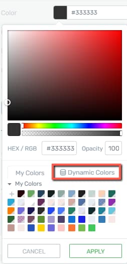
- Look for the Dynamic Color option or the dynamic color icon in the color picker panel.
- Click on it to reveal the available dynamic color options.
How Dynamic Colors Work
When you assign a dynamic color to an element, the color value is calculated at render time based on the defined rules. This means:
- The element displays the appropriate color automatically without manual updates
- If the base color changes (e.g., you edit a global color that feeds a dynamic color), the dynamic variations update accordingly
- You can preview dynamic color changes directly in the editor by switching between states (e.g., Normal vs. Hover)
Dynamic Colors with ACF Color Picker
If you use Advanced Custom Fields (ACF), you can connect an ACF Color Picker field to Thrive Architect’s dynamic color system. This lets each post or page define its own color value through a custom field, which Thrive Architect then applies automatically.

Follow these steps to set up and use an ACF Color Picker as a dynamic color source:
- In ACF, create a new field with the field type set to Color Picker and assign it to your desired post type (e.g., posts, pages, or a custom post type).
- Open a post or page in the WordPress editor and set a color value in the ACF Color Picker field you just created.
- Open the same post or page in Thrive Architect and select the element you want to style.
- Click on a color property to open the color picker, then navigate to the Dynamic Colors tab.
- Select your ACF field from the list of available dynamic color sources.
- Set a default/fallback color that displays when the dynamic color is unavailable (e.g., on pages where the ACF field has not been filled in or does not exist).
- Save your template or page.
- To change the color for a specific post, edit the post in WordPress and update the ACF Color Picker field value — the color in Thrive Architect updates automatically on the front end.
- The fallback color ensures that pages without the ACF field still display a consistent design.
- This approach is especially useful for dynamic templates (e.g., blog post templates) where each post needs a unique accent color.
Using Group Styling
Group styling in Thrive Architect lets you apply the same style to multiple elements at once. Instead of styling each element individually, you can link several elements together so that a change to one automatically updates all the others.
How Group Styling Works
When you apply a group style, you are creating a shared style definition that multiple elements subscribe to. The key concepts are:

- Linked elements — All elements in the group share the same style properties (colors, fonts, spacing, borders, etc.)
- Lock toggles — Individual properties within a group style can be locked or unlocked, controlling which properties are shared and which can be customized per element
- Unlinking — You can unlink an individual element from the group at any time, making it independent again
Applying a Group Style
Follow these steps to apply group styling:
- Select the first element you want to style on the canvas.
- Configure its styling (colors, typography, borders, etc.) to your liking.
- In the left sidebar, look for the Group Styling option (typically found under the element’s general options or in the styling section).
- Click Create Group Style and give the group a descriptive name.
- Select additional elements on the canvas that you want to add to the group.
- For each additional element, go to the Group Styling option and choose the group you just created from the dropdown list.
All elements in the group will now adopt the shared style.
Group Styling UI Details
When working with group styling, the following UI indicators and controls help you understand what you are editing:
- The Currently Styling dropdown at the top of the left sidebar shows which group or individual item you are editing.
- Elements that support group styling include: Tabs, Toggle, Styled List, Table, Block, Post List, Countdown, Custom Menu, Lead Generation, Pricing Table, and others with repeating sub-elements.
- A green border around an element indicates it is part of a group and changes will apply to all grouped items.
- A red border indicates the element has been unlinked from the group and can be styled independently.
- To unlink an item, click the lock icon next to the style property you want to customize individually.
- When done editing group styles, click Exit Group Styling or Done at the bottom of the sidebar.
Editing a Group Style
To update the shared style for a group:
- Select any element that belongs to the group.
- Make your styling changes (e.g., change the background color, font size, or border width).
- The changes will automatically propagate to all other elements in the group.
Using Lock Toggles
Lock toggles give you fine-grained control over which properties are shared within a group style:

- Locked (linked) — The property is shared across all group members. Changing it on one element changes it on all.
- Unlocked (independent) — The property can be customized individually on each element without affecting the others.
To toggle a lock:
- Select an element in the group.
- In the left sidebar, find the property you want to lock or unlock.
- Click the lock icon next to the property.
- When the lock is closed, the property is shared. When the lock is open, the property is independent.
Unlinking an Element from a Group Style
To remove an element from a group style and make it fully independent:
- Select the element on the canvas.
- Go to the Group Styling option in the left sidebar.
- Click the Unlink button (or choose Remove from Group).
- The element retains its current styling but is no longer connected to the group. Future group changes will not affect it.
Best Practices for Global Colors and Styles
Follow these recommendations to get the most out of Thrive Architect’s color and style management tools:
- Define your color palette early — Before you start building pages, create global colors for your primary brand color, secondary color, accent color, background colors, and text colors. This saves significant time later.
- Use meaningful names — Name global colors by purpose (e.g., “Header Background”, “CTA Button”) rather than by appearance (e.g., “Blue”, “Light Gray”). This makes them easier to identify and update.
- Leverage group styles for repeated patterns — If you have multiple testimonial cards, pricing boxes, or feature blocks that should look the same, use group styling to keep them in sync.
- Lock only what needs to be shared — When using group styling, lock only the properties that should be consistent across the group. Leave element-specific properties (like text content or width) unlocked.
- Test gradient performance — Complex gradients with many color stops can occasionally affect page rendering speed. Use two to three color stops for most gradients and reserve complex gradients for accent areas.
Frequently Asked Questions
Can I Use Global Colors Across Multiple Pages?
Yes. Global colors created in Thrive Architect are available across all pages and posts on your site. When you edit a global color, the change applies everywhere the color is used.
What Happens If I Delete a Global Color That Is in Use?
The elements using the deleted global color will retain their current color value, but the color becomes a local (non-global) value. It will no longer update when you change other global colors.
Can I Convert a Local Color to a Global Color?
Yes. Open the color picker on any element, select the color you want to save, and click the Save as Global Color button to convert it into a reusable preset.
How Many Color Stops Can I Add to a Gradient?
There is no strict limit. You can add as many color stops as you need by clicking on the gradient bar. However, for best performance and visual clarity, two to four stops are recommended.
Can I Apply a Group Style to Different Element Types?
Group styling works best when applied to elements of the same type (e.g., all buttons or all content boxes). Applying a group style across different element types may produce unexpected results because different elements support different properties.
Related Resources
- Layout Fundamentals: How to Use the Background Section Element — Full-width sections with background styling
- Typography: How to Use Typography and Fonts — Font and text styling controls
- Borders and Shadows: How to Use Borders, Shadows, and Decorations — Visual effects for element edges and depth
- Landing Pages: How to Get Started with Landing Pages — Building complete page layouts with global styles
That’s it! You’ve successfully learned how to use global colors, global gradients, dynamic colors, and group styling in Thrive Architect. By centralizing your color management and linking elements through group styles, you can maintain a consistent design across your entire site and make sweeping visual changes with just a few clicks.