In this article, you’ll learn how to create and customize headings in Thrive Architect. Headings help structure your content, improve readability, and play a critical role in search engine optimization.
Unlike many page builders, Thrive Architect does not have a separate Heading element. Instead, headings are created by converting a Text element into a heading using the Paragraph dropdown in the top toolbar in the Advanced section. This means all the powerful text styling controls—fonts, colors, gradients, highlights, and animations—are available for headings as well.
Creating a Heading
Follow these steps to create a heading on your page:
- Open your page or post in the Thrive Architect editor.
- Click the green plus (+) icon in the right sidebar to open the element panel.
- Type Text in the search field at the top of the panel.
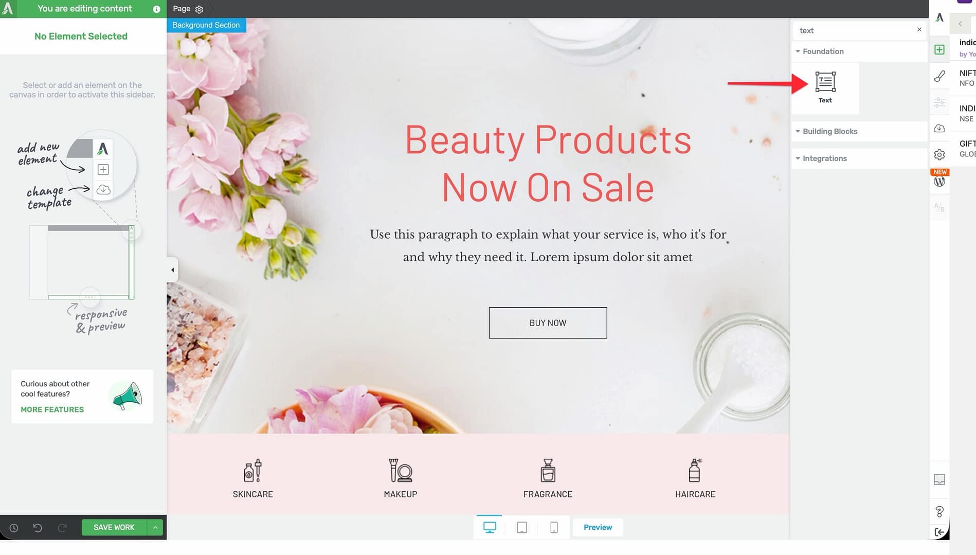
- Drag the Text element from the panel and drop it onto your page canvas.
- Type your heading text into the element.
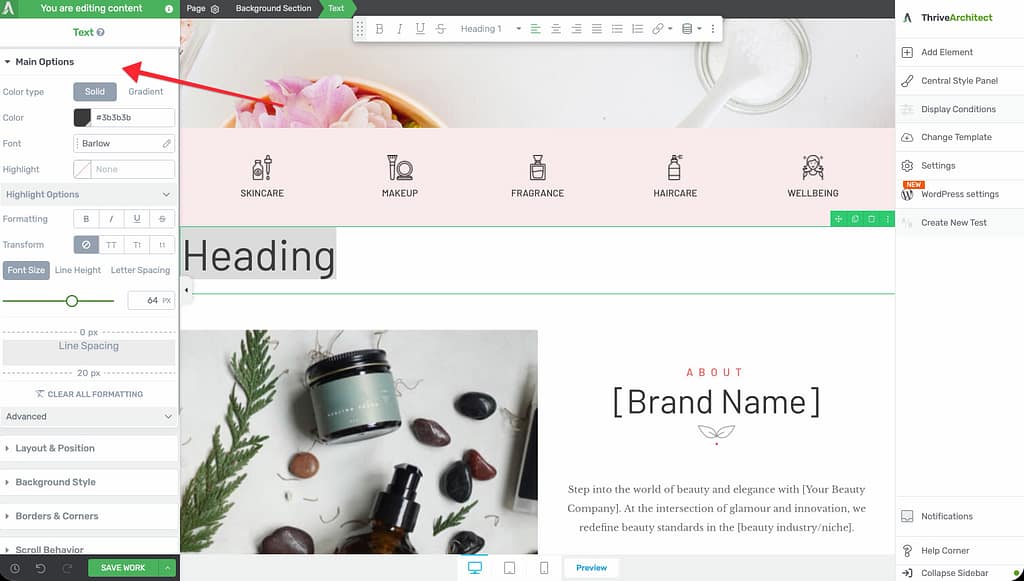
- Toggle the Paragraph dropdown in the top toolbar to On. The text will now render as a heading tag instead of a paragraph.
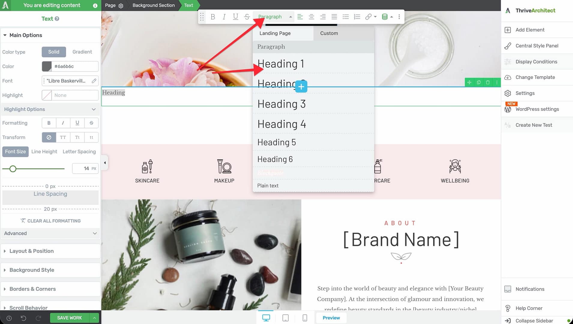
- Use the Heading Rename dropdown to select the heading level: H1 through H6.
Choosing the Right Heading Level
The Heading Rename dropdown lets you select from six heading levels:
- H1 — The primary page title. Use only one H1 per page for proper SEO structure.
- H2 — Major section headings. Use these to divide your content into main topics.
- H3 — Sub-section headings within an H2 section.
- H4 — Further subdivisions within an H3 section.
- H5 — Rarely used; for very detailed content hierarchies.
- H6 — The smallest heading level; typically used for fine-grained subdivisions or labels.
Styling Your Headings
Since headings are powered by the Text element, all standard text styling options are available:
Font Color
- Solid — Select a single color for your heading text
- Gradient — Apply a multi-color gradient effect across the heading characters
Font Face
Choose from system fonts, Google Fonts, or custom fonts uploaded through the Thrive Dashboard.
Font Size, Line Height, and Letter Spacing
- Font Size — Default: 16px. Range: 1–100px (or em units). Headings typically use larger font sizes than body text—common sizes are 24–48px for H1 and 18–32px for H2.
- Line Height — Default: 1em. Range: 1–200em (or px units). Adjust to control the vertical spacing between lines in multi-line headings.
- Letter Spacing — Default: auto. Range: 0–100px (or em units). Slight positive letter spacing can improve readability for uppercase headings.
Text Transform
Apply automatic capitalization to your heading:
- None — Display text as typed
- Uppercase — Convert all characters to uppercase
- Lowercase — Convert all characters to lowercase
- Capitalize — Capitalize the first letter of each word
Font Background (Highlight)
Apply a highlight effect behind your heading text. Expand the Highlight Options section to configure:
- Highlight Type, Stroke Width, Position, and Animation settings
- Device Highlight Status to enable or disable the highlight per device type
Heading Alt Text
The Heading Alt Text field in the Advanced section allows you to provide alternative text for the heading. This text is used by screen readers and assistive technologies to describe the heading’s purpose to users who cannot see the visual content.
Tip: Use descriptive alt text that conveys the meaning of the heading, especially when the heading text itself is short or abstract (for example, a heading that simply says “Ready?”).
Additional Styling and Design Options
Beyond text-specific controls, headings support the same design options as all Text elements:
- Background — Add a background color, gradient, or image behind the heading container
- Borders & Corners — Set border width, style, color, and corner radius
- Shadow — Add a box shadow to the heading container
- Layout & Position — Control margins, padding, alignment, and positioning
- Animation — Apply entrance animations when the heading scrolls into view
- Scroll Effects — Add parallax or other scroll-triggered behaviors
- Conditional Display — Show or hide the heading based on visitor criteria
- Responsive — Override font size, spacing, and visibility per device type
Common Use Cases
Page Title (H1)
Create a prominent page title:
- Add a Text element at the top of your page or inside a hero Background Section.
- Type your page title.
- Expand the Advanced section and enable the Paragraph dropdown in the top toolbar.
- Set Heading Rename to H1.
- Increase the Font Size to 36–48px.
- Optionally apply a Gradient font color or Text Transform to uppercase.
Section Headings (H2)
Divide your page into clear sections:
- Add a Text element at the beginning of each content section.
- Enable the Paragraph dropdown in the top toolbar and set it to H2.
- Use a consistent Font Face, Font Size, and Font Color across all H2 headings for a cohesive look.
Tip: Use global styles to ensure all your H2 headings share the same styling. If you update the global style, every heading using it will update automatically.
Sub-Headings Within Sections (H3 and Below)
For detailed content with multiple sub-topics:
- Add a Text element below each H2 section heading.
- Enable the Paragraph dropdown in the top toolbar and set it to H3.
- Use a slightly smaller Font Size than your H2 to visually communicate the hierarchy.
Frequently Asked Questions
Where Is the Heading Element in the Element Panel?
There is no separate Heading element. To create a heading, add a Text element and enable the Paragraph dropdown in the top toolbar in the Advanced section of the left sidebar.
Can I Change a Heading Back to a Paragraph?
Yes. Select the heading, expand the Advanced section, and toggle the Paragraph dropdown in the top toolbar back to Off. The element will revert to rendering as a paragraph tag.
How Many H1 Headings Should I Use Per Page?
Best practice is to use exactly one H1 heading per page. Multiple H1 tags can confuse search engines about the primary topic of the page.
Do Heading Styles Carry Over to Other Pages?
If you save a heading’s style as a global style, it will be available across all pages on your site. Individual heading styles apply only to the specific element.
Related Resources
- Text Element: How to Use the Text Element in Thrive Architect — Full guide to text styling, gradients, and TypeFocus
- Typography: How to Use Typography and Fonts — Manage custom fonts and global text styles
- SEO Best Practices: How to Get Started with Thrive Architect — Page structure and content fundamentals
That’s it! You’ve successfully learned how to create and style headings in Thrive Architect using the Text element’s Paragraph dropdown. Properly structured headings improve both the user experience and search engine visibility of your pages.