In this article, you’ll learn how to use the Layout and Position options in Thrive Architect. These options give you detailed control over element sizing, spacing, alignment, display mode, and advanced positioning — allowing you to fine-tune the exact placement and dimensions of any element on your page.
The Layout & Position panel is available for every Thrive Architect element. It provides controls for margins, padding, width, height, alignment, display type, and advanced settings including float, z-index, position, and overflow. Whether you need to center an element, set a fixed width, overlap elements using absolute positioning, or control how overflowing content behaves, this panel has you covered.
Accessing the Layout and Position Panel
To open the Layout and Position options for any element:
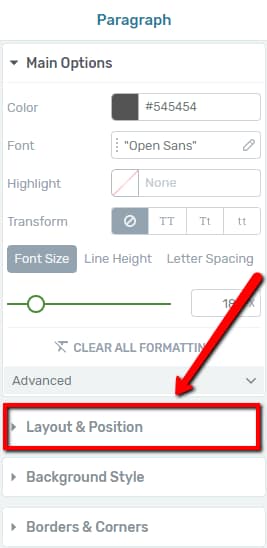
- Open your page in the Thrive Architect editor.
- Click on the element you want to configure. The element’s options will appear in the left sidebar.
- Locate the Layout & Position section in the left sidebar and click on it to expand the panel.
The panel opens to reveal several sections: Margins & Padding, Width & Height, Alignment & Display, and an expandable Advanced section at the bottom.
Margins and Padding
Margins and padding are the two primary spacing controls in the Layout and Position panel. Understanding the difference between them is essential for precise element placement.
Understanding Margins
Margins control the space between two elements — the external spacing around an element. You can increase or decrease the top, bottom, left, and right margins independently.
To adjust margins:
- Click on the element to select it.
- Open the Layout & Position section in the left sidebar.
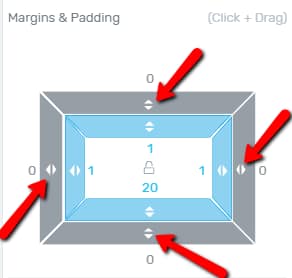
- In the Margins & Padding area, locate the outer box (the exterior rectangle).
- Click on a specific arrow along the outer box and drag it to increase or decrease the margin on that side, or type a value manually in the field next to the arrow.
Margins accept both positive and negative values. A negative margin pulls the element closer to or overlapping with adjacent elements, which can be useful for creative layouts.
Understanding Padding
Padding controls the space inside an element — the internal spacing between the element’s border and its content. Just like margins, you can adjust the top, bottom, left, and right padding independently.
To adjust padding:
- In the Margins & Padding area, locate the inner box (the interior rectangle).
- Click on a specific arrow along the inner box and drag it, or enter a value manually to change the padding on that side.
Increasing padding pushes the content inward, making the element appear larger. This is especially useful for buttons, content boxes, and background sections where you want to create breathing room around the text or inner elements.
Color Coding for Margins and Padding
Thrive Architect uses a color-coded visual indicator system so you can instantly see which margins and padding values are active:
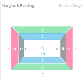
- Grey — The margin or padding on that side is not used (no value applied, or the value is zero)
- Pink — The margin or padding on that side has a negative value
- Green — This color is specifically used for margins. If a margin is applied to a side with a value above zero, that side will appear green.
- Blue — This color is specifically used for padding. If padding is applied to a side with a value above zero, that side will appear blue.
This color coding makes it easy to visually identify which sides have active spacing and whether any negative values are in play, without needing to inspect each value individually.
Width and Height
The Width & Height section allows you to control the exact dimensions of your element. By default, most elements have their width set to Max width: auto and their height set to Min height: auto, meaning they expand naturally to fit their content.
Fixed, Minimum, and Maximum Settings
Each dimension (width and height) has two fields. The first field lets you choose between three constraint modes:
- Fixed — Sets an exact, unchanging dimension for the element. The element will maintain this precise width or height regardless of its content. If the content exceeds the fixed dimension, it may overflow the element’s boundaries without changing the element’s size.
- Min (Minimum) — Sets the smallest allowed dimension. The element will be at least this size but can grow larger if the content requires more space.
- Max (Maximum) — Sets the largest allowed dimension. The element will not exceed this size, but can be smaller if the content does not fill the space.
To select a constraint mode:
- Click the Width or Height label area in the Layout and Position panel.
- Choose between Fixed, Min, or Max from the available options.
Tip: When you define a Fixed value, keep in mind that it must be at least equal to the Min value and not exceed the Max value. Setting conflicting values can lead to unexpected layout behavior.
Entering Values and Choosing Units
The second field is where you enter the actual value and choose the unit for the selected constraint mode. By default, this field is set to auto.
To set a custom value:
- Click in the value field and drag up or down to adjust the value, or type a number manually (input option).
- Click the unit label (e.g., PX) to open a dropdown with the available unit options.
The available units are:
- PX — Pixels. A fixed unit that represents exact screen pixels. Best for precise, absolute sizing.
- % — Percentages. The element’s size is calculated as a percentage of its parent container’s size. Ideal for responsive designs that need to adapt to different screen widths.
- VW — Viewport Width. A value of 1 VW equals 1% of the browser window’s total width. Useful for creating elements that scale with the browser window.
- VH — Viewport Height. A value of 1 VH equals 1% of the browser window’s total height. Useful for full-height sections or elements that should scale vertically with the viewport.
To reset the value back to the default automatic size, click the x icon next to the value field. This sets the dimension back to auto.
Centering an Element Using Width
One common centering technique is to combine a fixed or max width with alignment:
- Set the element’s Max Width to a specific value (e.g., 800px or 60%).
- In the Alignment section, select the Center alignment option.
The element will be constrained to the specified max width and centered horizontally within its parent container.
Width and Height in Main Options vs. Layout and Position
Some elements, such as the Content Box and Background Section, have width and height options in both their Main Options and the Layout & Position panel. When both sets of options exist, the values must match — changing the value in one location will automatically update the other.
For certain elements like the Video element, the width and height options have been moved entirely from the Main Options to the Layout & Position panel. In these cases, use the Layout and Position panel to adjust the element’s dimensions, including setting a Fixed width and height to control the exact size.
Alignment and Display
Alignment
The alignment options control how the element is positioned horizontally within its parent container. By default, no alignment is selected (represented by a crossed-out circle icon).
The available alignment options are:
- Left — Aligns the element to the left side of its container
- Center — Centers the element horizontally within its container
- Right — Aligns the element to the right side of its container
- None (default) — The element follows the normal document flow without explicit horizontal alignment
To set alignment, simply click the desired alignment icon in the Alignment row.
Display
The display setting determines how the element occupies space in the page layout. There are two display modes:
- Block — This is the default display state. A block-level element occupies the entire width of the row it is in. Each block element starts on a new line, stacking vertically.
- Inline — An inline element occupies only the space required by its content, not the full row width. If you place multiple inline elements one after another, they will appear side by side on the same row rather than stacking vertically.
Switching an element to Inline display mode is useful when you want to place multiple elements next to each other horizontally without using a columns layout — for example, placing two buttons side by side or aligning an icon next to a text element.
Advanced Settings
The Advanced section contains more technical layout options for users who need fine-grained control over element positioning and behavior. To access these settings:
- Open the Layout & Position panel for your element.
- Scroll to the bottom of the panel and click the downwards pointing arrow to expand the Advanced section.
Note: The Advanced settings may display different options depending on the element type. For example, Text and Image elements show the Position option, Background Section elements show the Overflow option, and Content Box and Columns elements show both Position and Overflow.
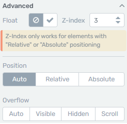
The Advanced section contains up to four options: Float, Z-index, Position, and Overflow.
Float
The Float option allows you to position one element in relation to another element that sits next to it. When activated, the element is pulled out of the normal document flow and placed to the left or right, allowing surrounding content to wrap around it.
To activate Float:
- In the Advanced section, locate the Float option.
- Click the checkmark icon to enable it.
Enabling Float automatically activates the Relative position option as well, providing Horizontal and Vertical position fields. You can adjust these values by dragging the arrows in the corresponding fields or by entering numerical values manually. As you adjust the values, you will see the element change its position on the page in real time.
Float is particularly useful for wrapping text around images, creating sidebar-style layouts within content areas, or positioning decorative elements alongside main content.
Z-Index
The Z-index option controls the stacking order of elements when they overlap. When two or more elements are layered on top of each other, the element with the higher Z-index value will be displayed in front.
To set a Z-index value:
- In the Advanced section, locate the Z-index field.
- Enter a numerical value. Elements with higher values appear in front of elements with lower values.
Important: The Z-index property only works on elements that have Relative or Absolute positioning. If your element is still in the default Auto position, the Z-index value will have no effect.
A common approach is to set a Z-index value of 10 or higher for the element you want to bring to the front. For example, if you have an image element and a columns element overlapping, set the element you want in front to a Z-index of 10 while leaving the other at its default value.
Position
The Position option allows you to control how an element is placed in relation to other elements on the page. There are three position modes:
Auto (Default)
Auto is the default position state for every element. The element follows the normal document flow, appearing in the order it was placed on the page. No additional position controls are shown when Auto is selected.
Relative
Selecting Relative allows you to offset the element from its normal position without removing it from the document flow. Two input fields appear:
- Horizontal — Moves the element left (negative value) or right (positive value) from its default position
- Vertical — Moves the element up (negative value) or down (positive value) from its default position
Adjust these values by dragging the arrows up and down in the fields, or by entering a numerical value directly. The element shifts on the canvas in real time as you make changes.
Relative positioning is ideal when you want to nudge an element slightly from its natural position without affecting the layout of surrounding elements. The space originally occupied by the element is preserved in the document flow.
Absolute
Selecting Absolute removes the element from the normal document flow entirely and positions it relative to its nearest positioned parent container (or the page itself if no parent is positioned).
When you select Absolute positioning, two additional controls appear:
- Corner selector — A grid of four corner positions: top left, top right, bottom left, and bottom right. Click the corner where you want to anchor the element.
- Offset fields — After selecting a corner, two input fields appear that let you fine-tune the element’s position by entering pixel values or dragging the arrows.
Absolute positioning is powerful for overlaying elements on top of each other, creating badge-style decorations on images, placing elements at specific corners of a container, or building complex layered designs.
Tip: When using absolute positioning, make sure the parent container has a defined height or is itself positioned (relative or otherwise). Otherwise, the absolutely positioned element may appear relative to the entire page rather than the intended container.
Fixed (Sticky) Position
Some elements also support Fixed positioning, which pins the element to a specific position in the browser viewport. The element remains visible at that position even as the user scrolls the page. This is commonly used for sticky headers, floating call-to-action buttons, or persistent notification bars.
Overflow
The Overflow option determines how content that exceeds the boundaries of an element is handled. This option is available for container elements such as Background Section, Content Box, and Columns.
There are four overflow modes:
- Auto (default) — The browser decides how to handle overflow. In most cases, the element expands to fit its content, but scrollbars may appear if the content exceeds a fixed dimension.
- Visible — The overflowing content renders outside the element’s box and is fully visible. The element’s boundaries do not clip the content.
- Hidden — Only the content that fits within the element’s box is visible. Any content that extends beyond the element’s boundaries is clipped and hidden from view.
- Scroll — A scrollbar appears on the element, allowing visitors to scroll within the element to view all the content. This is useful for creating scrollable content areas within a fixed-height container.
When to Use Each Overflow Setting
- Use Visible when you intentionally want content or decorative elements to extend beyond a container’s edges — for example, an image that overlaps a section boundary.
- Use Hidden when you want to create a clean, cropped appearance — for example, hiding part of a large background image or preventing child elements from spilling outside a card layout.
- Use Scroll when you have a fixed-height container with more content than can fit — for example, a terms and conditions box or a scrollable product list within a limited space.
Percentage vs. Pixel Values: When to Use Each
Choosing the right unit for your width, height, margins, and padding values has a significant impact on how your design responds to different screen sizes.
- Pixels (PX) — Use pixels when you need exact, predictable dimensions that do not change. Pixel values are ideal for small UI elements like icon sizes, specific border widths, or precise spacing between tightly arranged elements.
- Percentages (%) — Use percentages when you want the element to scale proportionally with its parent container. Percentage widths are essential for responsive layouts, ensuring elements adapt smoothly as the browser window resizes.
- Viewport units (VW/VH) — Use viewport units when you want the element to scale with the browser window itself, regardless of the parent container. Full-width hero sections or full-height landing page sections benefit from viewport units.
Best practice: For most content layouts, use percentage-based widths with pixel-based margins and padding. This combination gives you responsive element sizing while maintaining consistent spacing.
Frequently Asked Questions
Can I Set Different Layout Values for Desktop, Tablet, and Mobile?
Yes. Thrive Architect supports per-device overrides for Layout and Position values. Switch to the desired device view using the device switcher in the bottom toolbar, then adjust the margins, padding, width, height, or other Layout and Position values. The changes apply only to that device and any smaller devices (following the cascading rule).
What Happens If I Set Conflicting Min and Max Values?
If you set a minimum value that is larger than the maximum value (e.g., Min Width: 800px, Max Width: 600px), the browser will use the minimum value as the priority. To avoid unexpected behavior, always ensure your minimum value is smaller than your maximum value.
How Do I Reset All Layout Values to Default?
To reset a specific value, click the x icon next to the value field to return it to auto. To reset margins and padding, set each side to 0 or use the x icon if available. There is no single button to reset all Layout and Position values at once — each property must be reset individually.
How Do I Make an Element Full Width?
To make an element span the full width of its container, set the Width to Fixed and enter 100% as the value. Alternatively, for elements like the Background Section, use the Full Width option available in the element’s Main Options.
Related Resources
- Responsive Design: How to Use Responsive Design Options — Control per-device styling, visibility, and breakpoints
- Background Styles: How to Use Background Styles — Customize backgrounds with colors, gradients, images, and video
- Background Section: How to Use the Background Section Element — Create full-width page sections with advanced styling
- Content Box: How to Use the Content Box Element — Build flexible containers with layout and position controls
- Columns: How to Use the Columns Element — Create multi-column layouts with advanced positioning
That’s it! You’ve successfully learned how to use the Layout and Position options in Thrive Architect. By mastering margins, padding, width, height, alignment, display modes, and advanced settings like float, z-index, position, and overflow, you can achieve precise control over every element’s size and placement on your page.