In this article, you’ll learn how to use responsive design options in Thrive Architect. These options let you preview and customize how your page looks on desktop, tablet, and mobile devices — giving you per-device control over visibility, styling, and layout.
Responsive design ensures that your pages look great on every screen size. Thrive Architect provides a built-in device switcher, per-device styling overrides, and element visibility controls so you can fine-tune your design for each device without writing a single line of CSS.
Understanding the Device Preview Switcher
The device preview switcher is located in the bottom toolbar of the Thrive Architect editor. It provides three device modes:
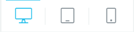
- Desktop — The default editing view, representing screens 1025px and wider
- Tablet — Simulates a tablet viewport, representing screens between 769px and 1024px
- Mobile — Simulates a mobile phone viewport, representing screens 768px and narrower
To switch between device modes:
- Open your page in the Thrive Architect editor.
- Locate the device icons in the bottom toolbar (a monitor, tablet, and phone icon).
- Click the Desktop, Tablet, or Mobile icon to switch to that device view.
The editor canvas will resize to reflect the selected device width, allowing you to see how your content reflows and stacks at that breakpoint.
Understanding the Cascading Rule
Thrive Architect uses a cascading system for responsive styling that follows a top-down approach:
- Desktop changes cascade down — Any styling change you make on the desktop view will automatically apply to tablet and mobile views (unless those views have their own overrides).
- Tablet changes cascade down to mobile only — Styling changes made in the tablet view will affect the mobile view, but will not change the desktop view.
- Mobile changes do not cascade up — Any styling change made in the mobile view stays on mobile only. It will not affect tablet or desktop views.
This cascading behavior means you should design your page on desktop first, then switch to tablet to make adjustments, and finally switch to mobile for the smallest screen. This workflow ensures that your base styles propagate correctly and you only need to override what looks different on smaller screens.
Practical Example of Cascading
- On Desktop, you set a heading font size to 48px. This applies to all three devices.
- On Tablet, you change the heading font size to 36px. This applies to tablet and mobile only — desktop stays at 48px.
- On Mobile, you change the heading font size to 24px. This applies to mobile only — tablet stays at 36px, and desktop stays at 48px.
Per-Device Styling Overrides
Most styling options in Thrive Architect support per-device overrides. When you switch to a different device view using the device switcher, the changes you make apply only to that device (and any smaller devices, following the cascading rule).
The properties that support per-device overrides include:
- Font size, line height, and letter spacing
- Margins and Padding
- Width and Height
- Text alignment
- Element visibility (show or hide)
- Background settings
- Column layouts (stacking behavior)
To apply a per-device override:
- Switch to the desired device view using the device switcher in the bottom toolbar.
- Select the element you want to modify.
- Change any styling property in the left sidebar. The change will apply to the current device and any smaller devices.
Per-Device Element Visibility
You can completely hide or show elements on specific devices. This is useful for displaying different content or layouts depending on the visitor’s screen size — for example, showing a simplified navigation on mobile or hiding a large hero image on smaller screens.
To hide an element on a specific device:
- Select the element you want to hide.
- Switch to the device view where you want to hide the element (for example, Mobile).
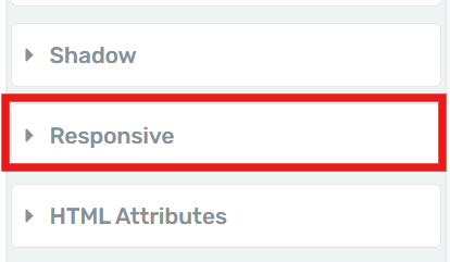
- In the left sidebar, look for the Responsive section (or scroll down to find the visibility controls).
- Toggle the visibility to Hidden for the current device.
The element will appear with a strikethrough or faded overlay in the editor, indicating it is hidden on that device. It will still be visible when you switch back to devices where it is not hidden.
Common Visibility Scenarios
- Hide a large sidebar on mobile — Switch to Mobile view, select the sidebar column, and set it to hidden.
- Show a mobile-only CTA button — Add a button, hide it on Desktop and Tablet, and keep it visible only on Mobile.
- Display different images per device — Add multiple image elements, then use visibility toggles to show the appropriate image on each device.
Page Preview vs. Mobile Preview
It is important to understand the difference between the editor’s device preview and how your published page actually renders on a mobile device.
Editor Device Preview
- The editor’s device switcher resizes the canvas to simulate different screen widths.
- It accurately shows how elements reflow, stack, and resize at different breakpoints.
- Some browser-specific behaviors (such as address bar resizing, touch interactions, and native font scaling) are not replicated.
Published Page on a Real Device
- On a real mobile device, the browser’s viewport, address bar, and system UI all affect the available screen space.
- Touch interactions, scroll behavior, and native zoom may differ from what you see in the editor.
- Some CSS properties (like fixed background attachment) behave differently on mobile browsers.
Fixing Background Images on Mobile
Background images can sometimes appear incorrectly on mobile devices due to differences in how mobile browsers handle certain CSS properties. Here are the most common issues and their solutions:


Background Attachment: Fixed vs. Scroll
The fixed background attachment (parallax effect) is not supported on most mobile browsers. When a background image is set to Fixed, mobile browsers will often either:
- Ignore the fixed property and display the image as scrolling
- Zoom in on the image, making it appear blurry or cropped
To fix this:
- Switch to the Mobile device view using the device switcher.
- Select the section or element with the background image.
- In the Background Style options, change the Attachment setting from Fixed to Scroll.
Important: This is one of the most common responsive issues. If your background image looks broken on mobile, check the attachment setting first.
Background Size: Cover vs. Contain
- Cover — The image scales to cover the entire element, potentially cropping parts of the image. This is generally the best option for full-width backgrounds.
- Contain — The image scales to fit entirely within the element, potentially leaving empty space. This works well for decorative images where you want the entire image visible.
On mobile, the aspect ratio of the screen is much taller and narrower than on desktop. This means:
- Cover may crop the sides of a landscape image significantly on mobile.
- Contain may leave large gaps above and below a landscape image on mobile.
To address this, consider:
- Switching to Mobile view and adjusting the background position to focus on the most important part of the image.
- Using a different, portrait-oriented image for the mobile view.
- Adjusting the element’s minimum height on mobile to better match the image proportions.
Mobile-Specific Background Image
If a background image simply does not work well on mobile regardless of settings, you can set a different background image for the mobile view:
- Switch to the Mobile device view.
- Select the element with the background image.
- In the Background Style options, change the image source to a mobile-optimized version.
- This change will only apply to the mobile view, leaving the desktop and tablet backgrounds unchanged.
Best Practices for Responsive Design
Follow these guidelines to create pages that look great across all devices:
- Design desktop first, then refine — Start with your desktop layout, then switch to tablet and mobile to make adjustments. The cascading system works best with this workflow.
- Test with real content — Placeholder text may not reveal responsive issues. Use realistic content lengths and image sizes during design.
- Simplify on mobile — Consider hiding non-essential elements on mobile to reduce visual clutter and improve load times.
- Use percentage-based widths — Elements with percentage-based widths adapt more smoothly to different screen sizes than those with fixed pixel widths.
- Check font sizes — Text that looks great at 18px on desktop may be too small on mobile. Increase body text to at least 16px on mobile devices.
- Avoid fixed backgrounds on mobile — As noted above, the fixed attachment property does not work reliably on mobile browsers. Use scroll instead.
- Preview on actual devices — The editor preview is helpful, but always verify your final design on real phones and tablets.
Frequently Asked Questions
Do Responsive Changes Affect My Desktop Design?
No. Changes made in the tablet or mobile views do not cascade upward. Your desktop design remains unchanged regardless of what you adjust on smaller device views.
Can I Use Different Images for Different Devices?
Yes. Switch to the desired device view, select the image element, and change the image source. The new image will only appear on that device (and smaller devices, if not overridden).
Why Does My Page Look Different on My Phone Than in the Editor?
The editor’s device preview simulates screen widths, but it does not replicate all mobile browser behaviors. Differences in font rendering, scroll behavior, viewport handling, and CSS support can cause minor variations. Always test on real devices for the most accurate preview.
Can I Undo a Per-Device Override?
Yes. Switch to the device view where you made the override, select the element, and reset the property to its default value. The element will then inherit the value from the next larger device, following the cascading rule.
Related Resources
- Layout: How to Use Layout and Position Options — Control element display, width, height, margins, and positioning
- Background Styles: How to Use Background Styles — Customize backgrounds with colors, gradients, images, and video
- Background Section: How to Use the Background Section Element — Create full-width page sections
- Landing Pages: How to Get Started with Landing Pages — Understanding landing page layout and settings
That’s it! You’ve successfully learned how to use responsive design options in Thrive Architect. By using the device preview switcher, per-device styling overrides, and element visibility controls, you can ensure your pages look polished and professional on desktop, tablet, and mobile devices.