In this article, you’ll learn how to configure the scroll behavior of your header in Thrive Theme Builder. Scroll behavior controls what happens to the header as visitors scroll down the page.
Accessing Scroll Behavior Options
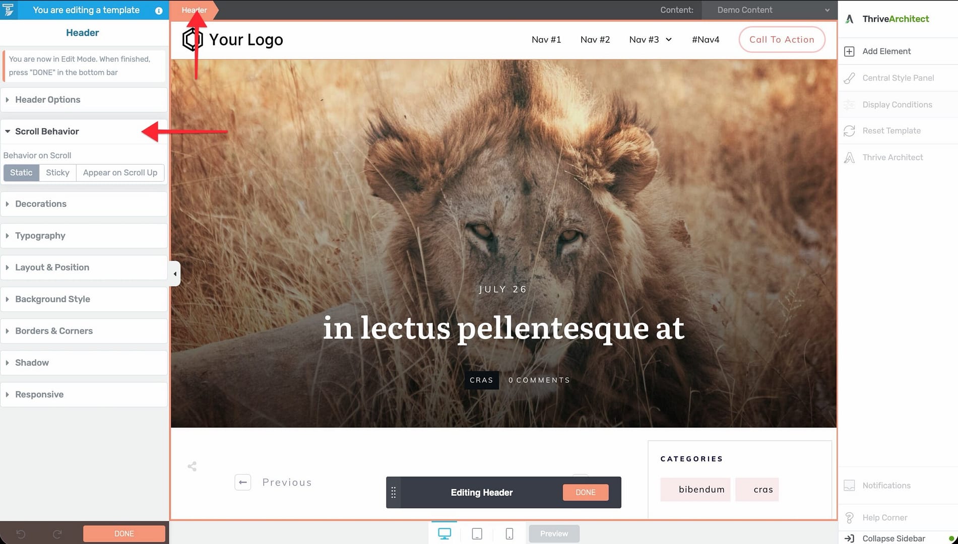
- Open a template in the Thrive Theme Builder editor.
- Click on the header section of the template to select it.
- In the left sidebar, expand the Scroll Behavior section.
The scroll behavior options are available when editing headers in both Thrive Theme Builder templates and landing pages.
Available Scroll Behavior Options
Static (Default)
The header scrolls normally with the rest of the page. As visitors scroll down, the header moves off-screen.
This is the simplest option and works well for sites where the header doesn’t need to remain visible at all times.
Sticky
The header stays fixed at the top of the viewport as visitors scroll down. It remains visible at all times, providing constant access to navigation and branding.
When enabled, the sticky header:
- Stays at the top of the page as the visitor scrolls.
- Maintains its full height and design by default.
- Can optionally stop being sticky at a specific point (e.g., after the main content area or at a specific element).
Appear on Scroll Up
The header hides when visitors scroll down but reappears when they scroll up. This is a common pattern on mobile-friendly sites—it saves screen space while scrolling through content but makes navigation instantly accessible when the visitor reverses direction.
Configuring Sticky Behavior
When you enable sticky behavior on a header, additional options become available:
Sticky Until
Control when the header stops being sticky:
- End of parent container — The header stays sticky until the end of its parent container, then scrolls away.
- End of page — The header remains sticky throughout the entire page.
- It reaches another element — The header stays sticky until a specific element on the page is reached. You can select the target element.
Distance from the Top of the Screen
Control the distance between the sticky header and the top of the viewport. This is useful if you have other fixed elements (like a WordPress admin bar) that the header should not overlap.
Design Considerations
Content Overlap
When a header is set to sticky, it overlaps the content below it. The page automatically adjusts by adding padding at the top to prevent the header from covering the first section of content.
Performance
Sticky headers use JavaScript for scroll detection. On content-heavy pages with many elements, this is lightweight and shouldn’t affect performance. However, avoid making multiple sections sticky simultaneously, as this can cause layout complexity.
Mobile Behavior
Consider how the sticky header behaves on mobile:
- Sticky headers take up valuable screen space on small devices.
- The “appear on scroll up” option is often a better choice for mobile because it provides navigation access without permanently occupying screen space.
- You can configure different scroll behavior for different breakpoints.
Best Practices
- Use “appear on scroll up” for mobile — This balances navigation access with content visibility on smaller screens.
- Keep sticky headers compact — If your header is sticky, consider reducing its height to minimize the space it occupies.
- Test with long pages — Verify that the sticky behavior works correctly on pages with varying content lengths.
- Check z-index conflicts — Sticky headers use a high z-index. If other elements (modals, popups) appear behind the header, you may need to adjust z-index values.
Related Resources
- Using the Header Section: Learn how to build and customize headers.
- Using the Thrive Theme Builder Editor: Learn about the editor tools and interface.
- Creating Mobile Responsive Templates: Learn how to design for all devices.