In this article, you’ll learn how to use the Background Section element in Thrive Architect. This element creates full-width page sections that span the entire browser width, making it the primary building block for structuring your page layout.
The Background Section element is the foundation of most page designs in Thrive Architect. Each section acts as a horizontal band across the page, and you stack multiple sections vertically to build your complete layout. You can customize each section’s background with colors, gradients, images, or videos, and control how content is positioned within it.
Adding a Background Section to Your Page
Follow these steps to add a Background Section to your page:
- Open your page or post in the Thrive Architect editor.
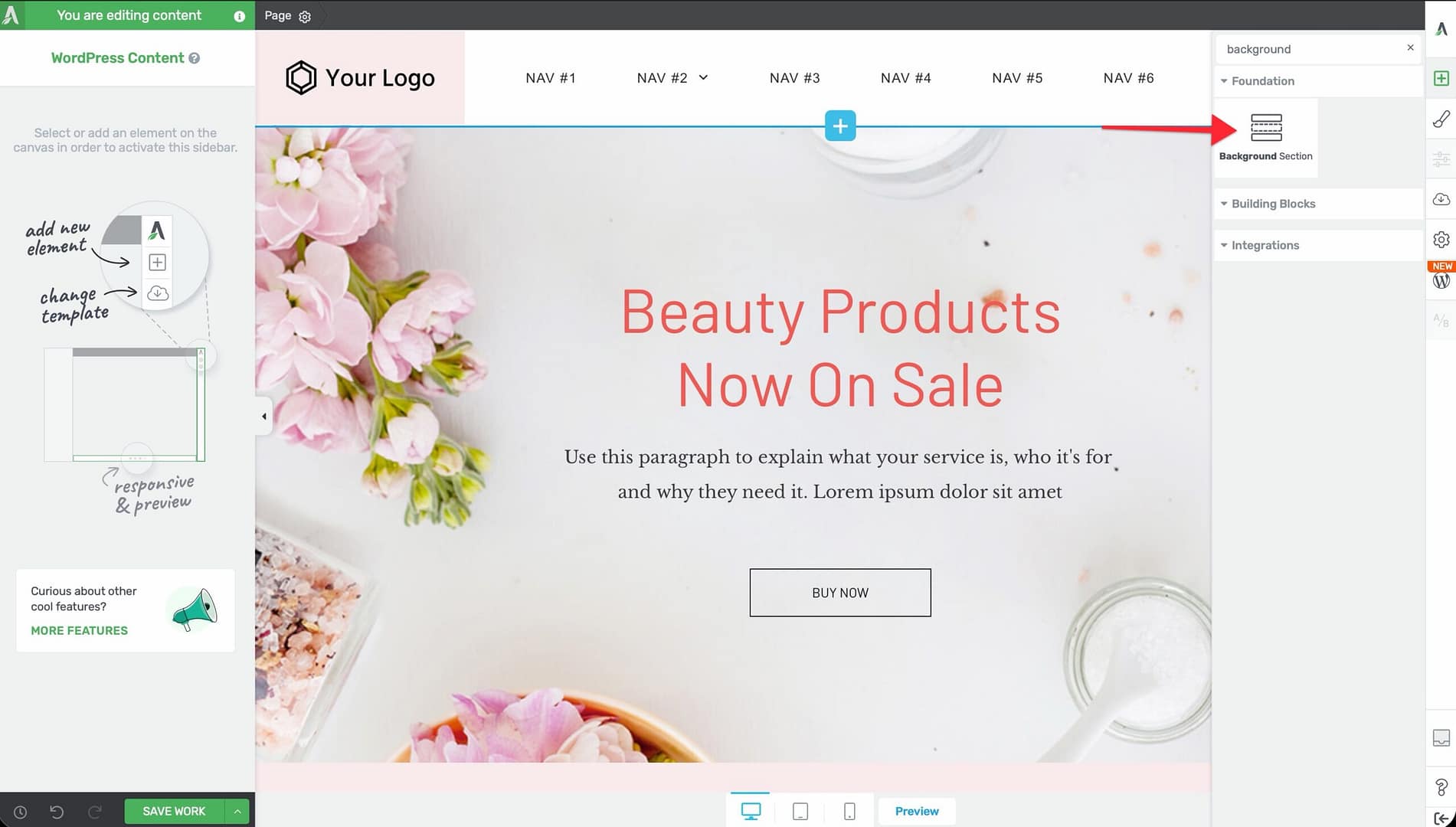
- Click the green plus (+) icon in the right sidebar to open the element panel.
- Type Background Section in the search field at the top of the panel.
- Drag the element from the panel and drop it onto your page canvas.
- The section will appear as a full-width horizontal band across the page with a default height.
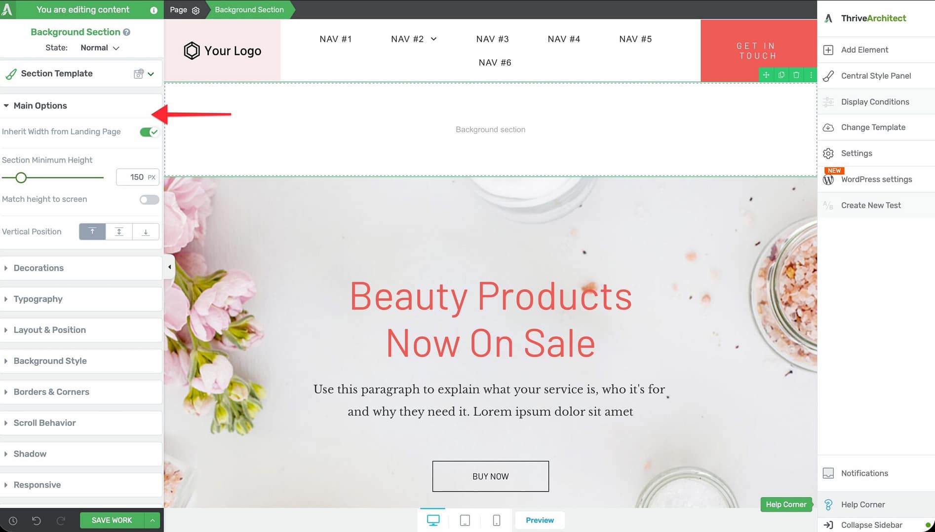
Once added, click on the section to select it. The section’s options will appear in the left sidebar.
Main Options
When you select a Background Section, the following options appear in the left sidebar:
Content Maximum Width
Controls the maximum width of the inner content area within the section.
- Default: 1024px
- Range: 100–2000px
- Drag the slider or type a value to adjust
This determines how wide your content (text, images, columns) will be inside the section, even though the section background spans the full page width.
Content Covers Entire Screen Width
A toggle switch that determines whether the section background stretches across the full browser width.
- Default: Enabled
- When enabled, the section background extends to both edges of the browser window
- When disabled, the section respects the page’s maximum width setting
Section Minimum Height
Sets the minimum height of the section.
- Default: 1024px
- Range: 1–1000px (or vh units)
- The section will grow taller if its content requires more space, but it won’t shrink below this value
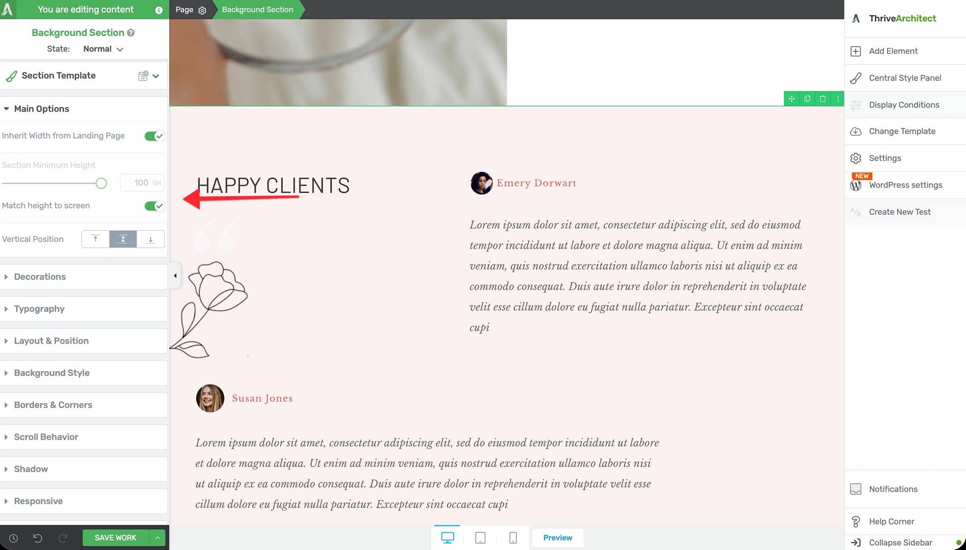
Match Height to Screen
A toggle switch that sets the section height to match the visitor’s browser viewport height.
- When enabled, the section will always fill the entire visible screen area
- This is useful for creating hero sections, full-screen introductions, or immersive content blocks
Vertical Position
Controls where the content inside the section is positioned vertically:
- Top — Content aligns to the top of the section
- Center — Content is vertically centered within the section
- Bottom — Content aligns to the bottom of the section
This is especially useful when the section height is larger than its content, such as when Match Height to Screen is enabled.
Stretch to Fit Screen Width
A toggle switch that forces the section to stretch across the full screen width.
- Default: Enabled
- Useful when working inside a page layout that has constrained widths
Inherit Width from Landing Page
A toggle switch that appears only on landing pages. When enabled, the section’s content maximum width inherits the value set in the landing page’s global settings instead of using its own Content Maximum Width slider.
- This ensures all sections on a landing page share a consistent content width
- Changing the landing page’s content width will automatically update all sections that have this option enabled
Note: This option is not available on normal pages or posts—only on landing pages.
Background Styling Options
Background Sections support a full range of background styling options. Click on the Background Style section in the left sidebar to access these:
- Solid Color — Pick a single background color using the color picker
- Gradient — Create a linear or radial gradient with multiple color stops
- Image — Set a background image with options for size, position, repeat, and attachment (parallax)
- Video — Embed a video background using a URL from YouTube, Vimeo, or a self-hosted file
- Pattern/None — Use a decorative pattern or no background at all
Tip: Combine a semi-transparent color overlay with a background image to improve text readability while keeping the visual impact of the image.
Additional Styling and Design Options
Beyond the main options, the Background Section element supports:
- Shadow — Add an inner or outer box shadow to create depth between sections
- Borders & Corners — Set border width, style, color, and corner radius for each side independently
- Typography — Set default text styling for all content within the section
- Decoration — Add visual decorations like top/bottom dividers (shape dividers) to create visual transitions between sections
- Scroll Effects — Apply parallax scrolling, fade-in, or other scroll-triggered animations
- Conditional Display — Show or hide the section based on visitor criteria (logged-in status, device type, etc.)
- Hover State — Define how the section looks when a visitor hovers over it
- Group Styling — Apply consistent styling across multiple selected elements
- Shared/Global Styles — Save a section’s style as a global style and reuse it across your site for a consistent look
Common Use Cases
Hero Sections
Create a full-screen hero section at the top of your page:
- Add a Background Section to the top of your page.
- Enable Match Height to Screen to make it fill the viewport.
- Set Vertical Position to Center.
- Add a background image or video.
- Drop a heading, subheading, and call-to-action button inside the section.
Alternating Content Bands
Build a professional page layout by alternating section backgrounds:
- Add multiple Background Section elements stacked vertically.
- Alternate between light and dark background colors.
- Use Decoration (shape dividers) to create smooth transitions between sections.
- Keep a consistent Content Maximum Width across all sections for a clean look.
Parallax Scrolling Effects
Create depth and visual interest with parallax backgrounds:
- Add a Background Section with a background image.
- Open Scroll Effects and enable the parallax option.
- Adjust the parallax speed to control how fast the background moves relative to the content.
Background Section vs. Content Box
The Background Section and Content Box elements serve different purposes:
- Background Section — A full-width page section designed to span the entire browser width. Default height is 1024px. Used as the primary layout building block for creating horizontal bands across the page.
- Content Box — A smaller, self-contained container with a default height of 80px. Comes with 15 preset styles and a Master Color option. Used for grouping content within a section.
In most cases, you’ll place Content Boxes (and other elements like Columns) inside Background Sections to build your layout.
Responsive Design Tips
- Use vh units for the Section Minimum Height to create sections that scale proportionally with screen size
- Test Match Height to Screen on mobile devices—very tall sections may require extra scrolling on smaller screens
- Use the device preview buttons in the bottom toolbar to check how your sections look on desktop, tablet, and mobile
- Consider reducing the Content Maximum Width on tablet and mobile for better readability
Frequently Asked Questions
Can I Nest a Background Section Inside Another Background Section?
No. Background Sections are top-level page elements and cannot be nested inside one another. Use a Content Box or Columns element inside a Background Section to create nested content areas.
How Do I Change the Order of Background Sections?
You can drag and drop Background Sections in the element breadcrumb bar at the bottom of the editor, or use the drag handle that appears when you hover over the top edge of a section.
Can I Make a Background Section Transparent?
Yes. Set the background style to None or use a solid color with the opacity set to 0%. This is useful when you want a section to act purely as a layout container.
Related Resources
- Columns: How to Use the Columns Element — Divide your section into multiple columns
- Content Box: How to Use the Content Box Element — Add styled content containers within sections
- Block Element: How to Use the Block Element — Landing page-specific section element
- Landing Pages: How to Get Started with Landing Pages — Understanding landing page layout and settings
That’s it! You’ve successfully learned how to use the Background Section element in Thrive Architect. This element is the foundation of your page structure, giving you full-width sections with powerful background, styling, and layout controls.