In this article, you’ll learn how to use the Block element in Thrive Architect. This element is a specialized version of the Background Section designed specifically for building landing page layouts using modular, stackable blocks.
The Block element extends the Background Section with landing page-specific features. When you’re building a landing page, Blocks are the primary structural units—each one represents a distinct section of your page (hero, features, testimonials, pricing, footer, etc.). Blocks display an “Add a Block / or drag an element into the page” placeholder when first added, making it easy to get started with pre-built block templates or custom content.
Block Element vs. Background Section
Before diving into the details, it’s helpful to understand how the Block element relates to the Background Section:
| Feature | Block Element | Background Section |
|---|---|---|
| Purpose | Landing page structure | General page structure |
| Available On | Landing pages | All pages and posts |
| Inherits From | Background Section (all options) | N/A (base element) |
| Landing Page Width Inheritance | Yes | Yes (on landing pages) |
| Shared/Global Styles | No | Yes |
| Group Styling | Yes | Yes |
| Block Templates | Yes (pre-built blocks) | No |
The Block element inherits all of the Background Section’s layout and styling options while adding landing page-specific functionality like block templates and landing page width inheritance.
Adding a Block to Your Landing Page
Follow these steps to add a Block element to your landing page:
- Open your landing page in the Thrive Architect editor.
- Click the green plus (+) icon in the right sidebar to open the element panel.
- Type Block in the search field at the top of the panel.
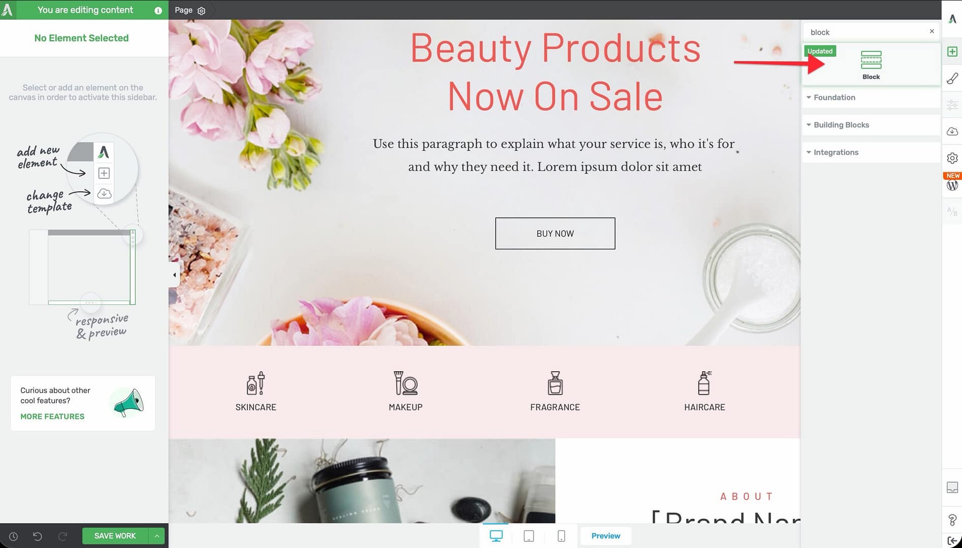
- Drag the element from the panel and drop it onto your landing page canvas.
- Click the Add a Block link in the placeholder to browse pre-built block templates, or start dragging elements directly into the block.
A placeholder will appear on the page with the message: “Add a Block / or drag an element into the page”.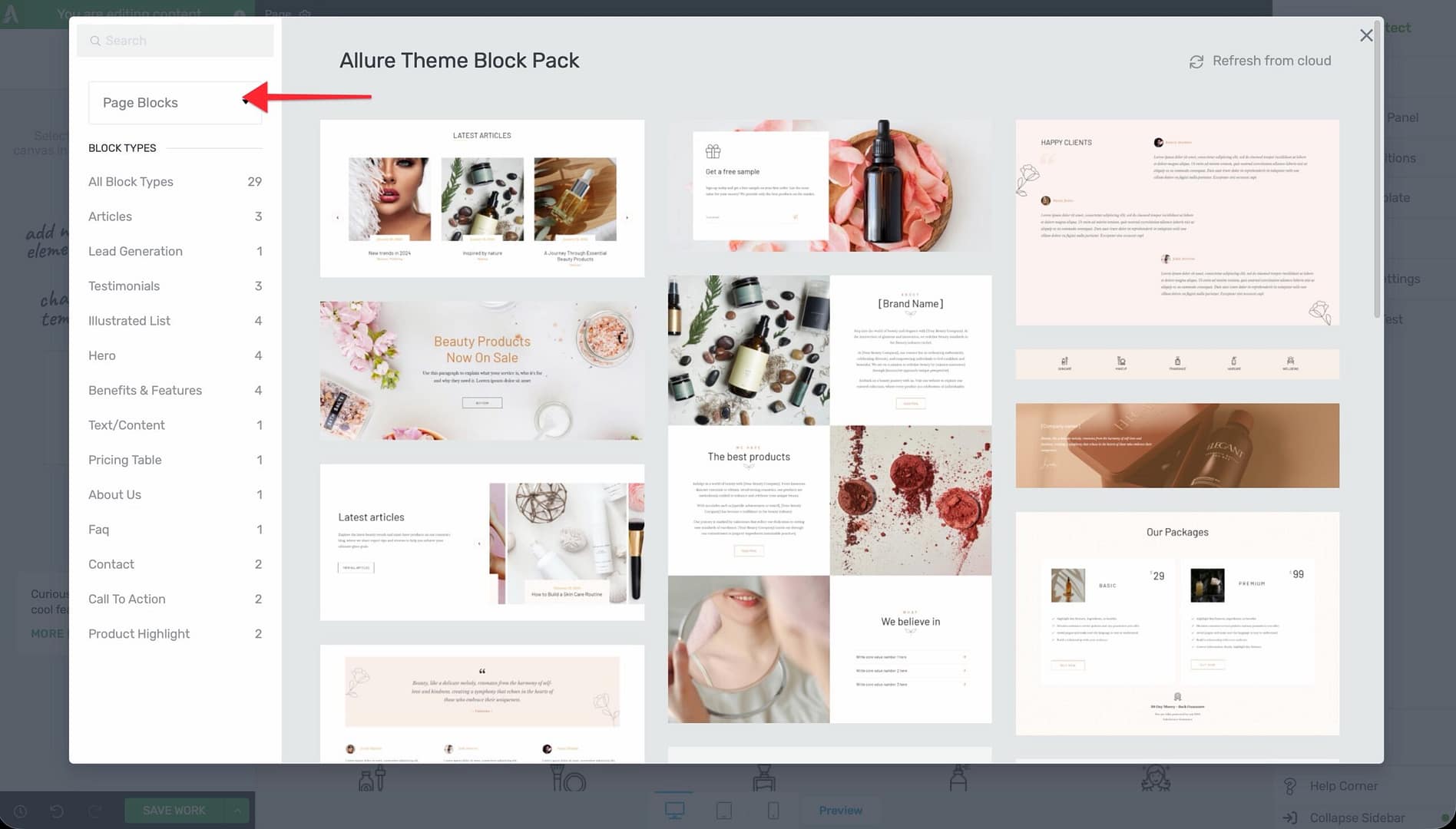
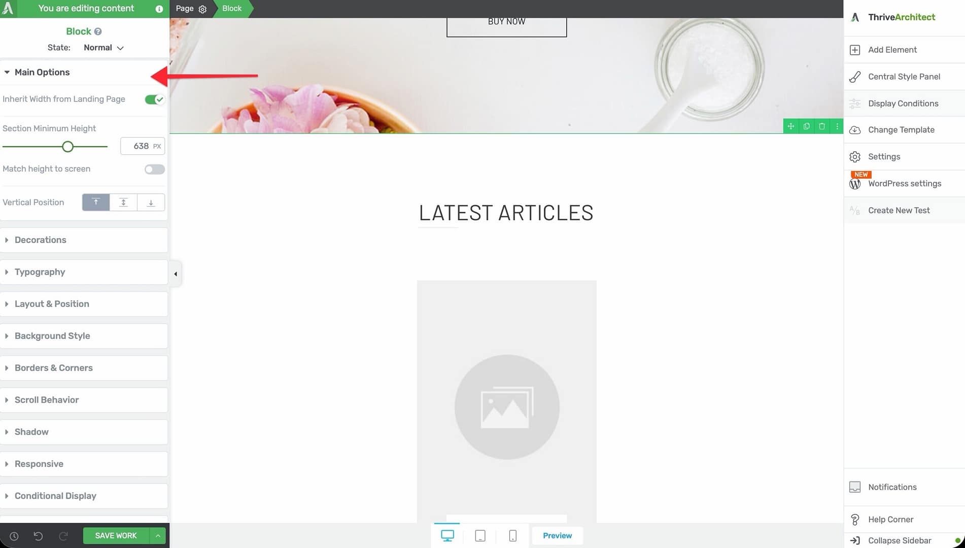
Main Options
The Block element inherits all options from the Background Section. When you select a Block, the following options appear in the left sidebar:
Inherit Width from Landing Page
A toggle switch that syncs the block’s content width with the landing page’s global content width setting.
- When enabled, the block uses the content width defined in the landing page settings
- When disabled, the block uses its own Content Maximum Width value
- This ensures all blocks on a landing page share a consistent content width without manual adjustments
Content Maximum Width
Controls the maximum width of the inner content area within the block.
- Available when Inherit Width from Landing Page is disabled
- Default: Matches the landing page’s content width
- Range: 100–2000px
Content Covers Entire Screen Width
A toggle switch that determines whether the block background extends to the full browser width.
- When enabled, the block background stretches edge to edge
- The inner content still respects the Content Maximum Width setting
Section Minimum Height
Sets the minimum height of the block.
- Range: 1–1000px (or vh units)
- The block will grow taller if its content requires more space
Match Height to Screen
A toggle switch that sets the block height to match the visitor’s browser viewport.
- Ideal for hero blocks and full-screen introductory sections
Vertical Position
Controls where content inside the block is positioned vertically:
- Top — Content aligns to the top
- Center — Content is vertically centered
- Bottom — Content aligns to the bottom
Stretch to Fit Screen Width
A toggle switch that forces the block to stretch across the full screen width.
Background and Styling Options
The Block element supports the same background and styling options as the Background Section:
- Background Style — Solid color, gradient, image, video, or pattern
- Shadow — Inner or outer box shadows
- Borders & Corners — Border width, style, color, and corner radius
- Typography — Default text styling for the block’s content
- Decoration — Shape dividers and visual decorations at the top and bottom edges
- Scroll Effects — Parallax, fade-in, and other scroll-triggered animations
- Conditional Display — Show or hide the block based on visitor criteria
- Hover State — Define hover appearance for interactive effects
- Group Styling — Apply consistent styling to multiple blocks at once
Working with Block Templates
Block templates are one of the key advantages of using the Block element. They provide professionally designed, pre-built sections that you can add to your landing page and customize:
Adding a Block Template
- Add a Block element to your landing page (or click the placeholder’s Add a Block link).
- The block template browser will open, showing categories of pre-built blocks.
- Browse by category (headers, hero, features, content, testimonials, pricing, CTA, footers, etc.).
- Click on a template to preview it, then click Insert to add it to your page.
- The block will be populated with the template’s content, which you can then edit.
Replacing Default Images from a Block
When you insert a block template, it comes with placeholder images. To replace them:
- Click on the image you want to replace.
- In the left sidebar, click the Replace Image button (or click directly on the image overlay).
- Choose a new image from your media library or upload one.
- Adjust the image size, position, and alt text as needed.
Common Use Cases
Building a Complete Landing Page
Use Blocks to assemble a full landing page from top to bottom:
- Add a Block for the header/navigation area.
- Add a Block for the hero section with a headline, subheadline, and CTA button.
- Add a Block for the features or benefits section.
- Add a Block for social proof (testimonials or logos).
- Add a Block for pricing or an offer.
- Add a Block for the final CTA.
- Add a Block for the footer.
Enable Inherit Width from Landing Page on all blocks to maintain a consistent layout width.
Hero Section with Full-Screen Height
Create an impactful first impression:
- Add a Block at the top of your landing page.
- Enable Match Height to Screen to fill the entire viewport.
- Set Vertical Position to Center.
- Add a background image or video.
- Drop a heading, subheadline, and button inside the block.
Alternating Content Sections
Create visual variety by alternating block styles:
- Add multiple Blocks stacked vertically.
- Alternate between light and dark background colors.
- Use Decoration (shape dividers) between blocks for smooth visual transitions.
- Keep Inherit Width from Landing Page enabled on all blocks for consistent content alignment.
Responsive Design Tips
- Use the device preview buttons in the bottom toolbar to check how each block looks on desktop, tablet, and mobile
- Blocks with Match Height to Screen may create very tall sections on mobile—test and consider using a fixed minimum height on smaller devices
- Background images set with “cover” sizing will crop differently on each device size—preview all breakpoints
- Shape dividers in the Decoration section scale automatically but may need height adjustments on mobile
Frequently Asked Questions
Can I Use Block Elements on a Normal Page?
The Block element is designed for landing pages. On normal pages and posts, use the Background Section element instead—it provides the same layout options without the landing page-specific features.
Can I Save a Block as a Template?
You can save the entire block’s content as a Content Template using right-click > Save as Template. This saves the block and all its child elements for reuse on other landing pages.
What Happens If I Disable Inherit Width from Landing Page?
The block will use its own Content Maximum Width value instead of the landing page’s global setting. This lets you create blocks that are wider or narrower than the rest of the page—useful for full-width testimonial sections or narrow CTA bands.
Related Resources
- Background Section: How to Use the Background Section Element — The base element that Block extends
- Landing Pages: How to Get Started with Landing Pages — Creating and configuring landing pages
- Landing Page Templates: How to Use Landing Page Templates — Full-page templates vs. individual blocks
- Columns: How to Use the Columns Element — Add multi-column layouts inside blocks
That’s it! You’ve successfully learned how to use the Block element in Thrive Architect. Blocks are the primary building units for landing pages, giving you all the layout power of Background Sections combined with landing page-specific features like block templates and width inheritance.