In this article, you’ll learn how to use the Columns element in Thrive Architect. This element lets you divide your page content into multiple side-by-side columns, creating flexible multi-column layouts for text, images, and other elements.
The Columns element is one of the most frequently used layout tools in Thrive Architect. Whether you’re building a feature comparison, a pricing table layout, or simply placing an image next to text, columns give you precise control over horizontal content arrangement—including responsive behavior on mobile devices.
Adding Columns to Your Page
Follow these steps to add a Columns element to your page:
- Open your page or post in the Thrive Architect editor.
- Click the green plus (+) icon in the right sidebar to open the element panel.
- Type Columns in the search field at the top of the panel.
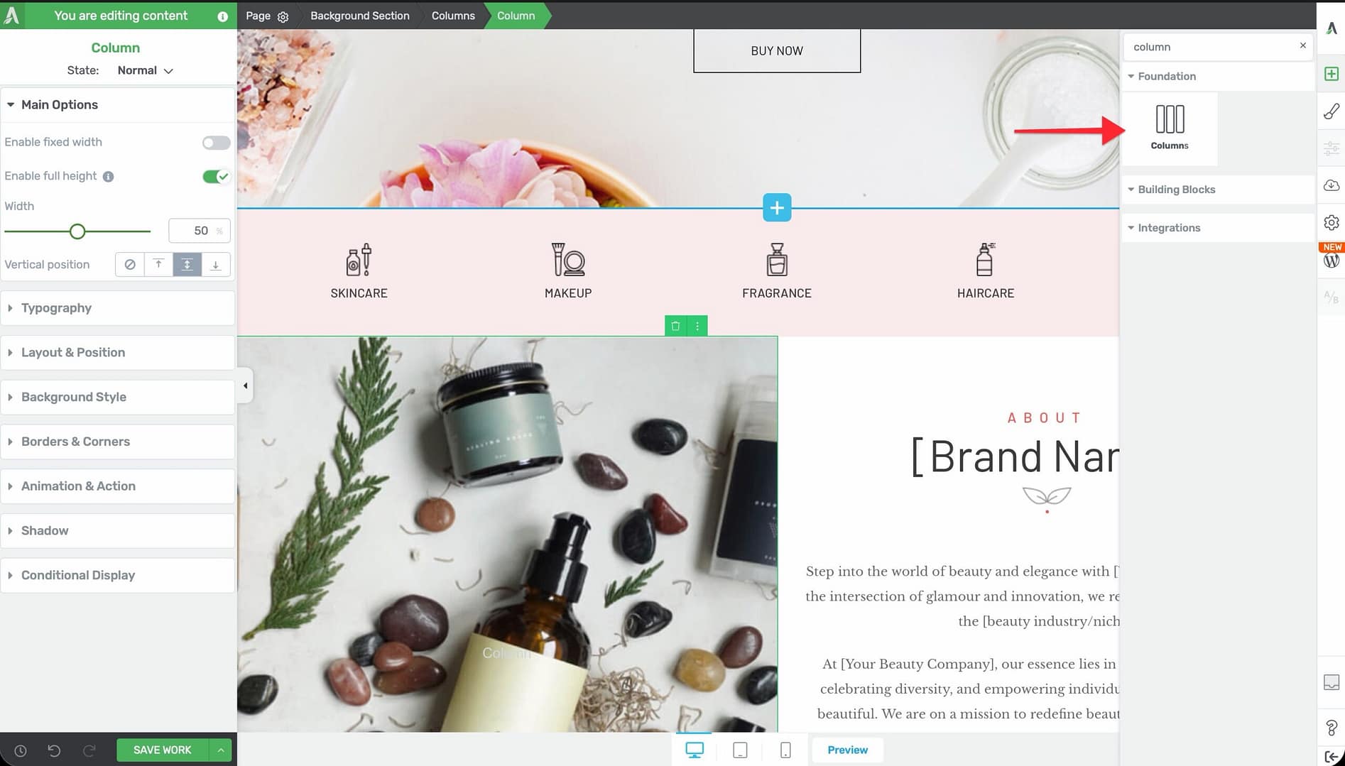
- Drag the element from the panel and drop it onto your page canvas inside a Background Section or other container.
- A column layout selector will appear, letting you choose a predefined layout (for example, 2 equal columns, 3 equal columns, 1/3 + 2/3, etc.).
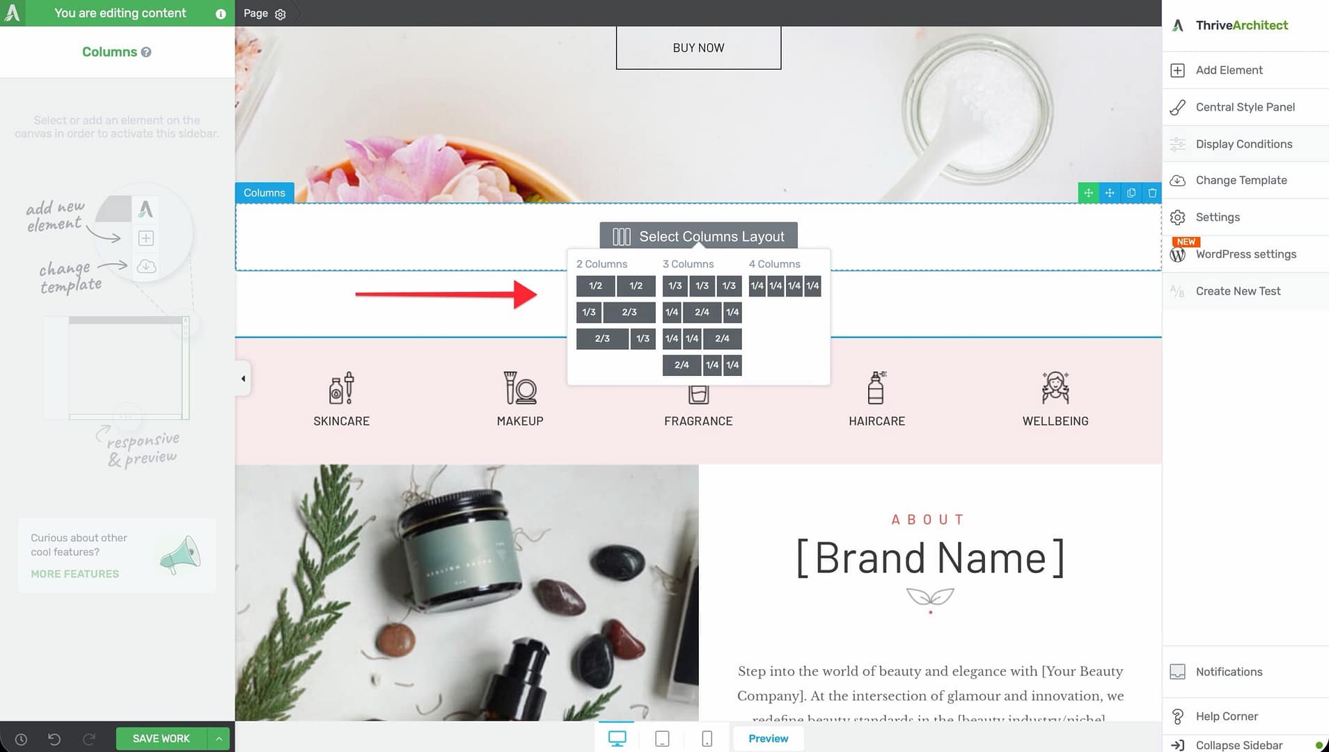
- Click your preferred layout to insert the columns.
Once added, each column acts as an independent container—you can drag any element into any column.
Main Options
When you select a Columns element, the following options appear in the left sidebar:
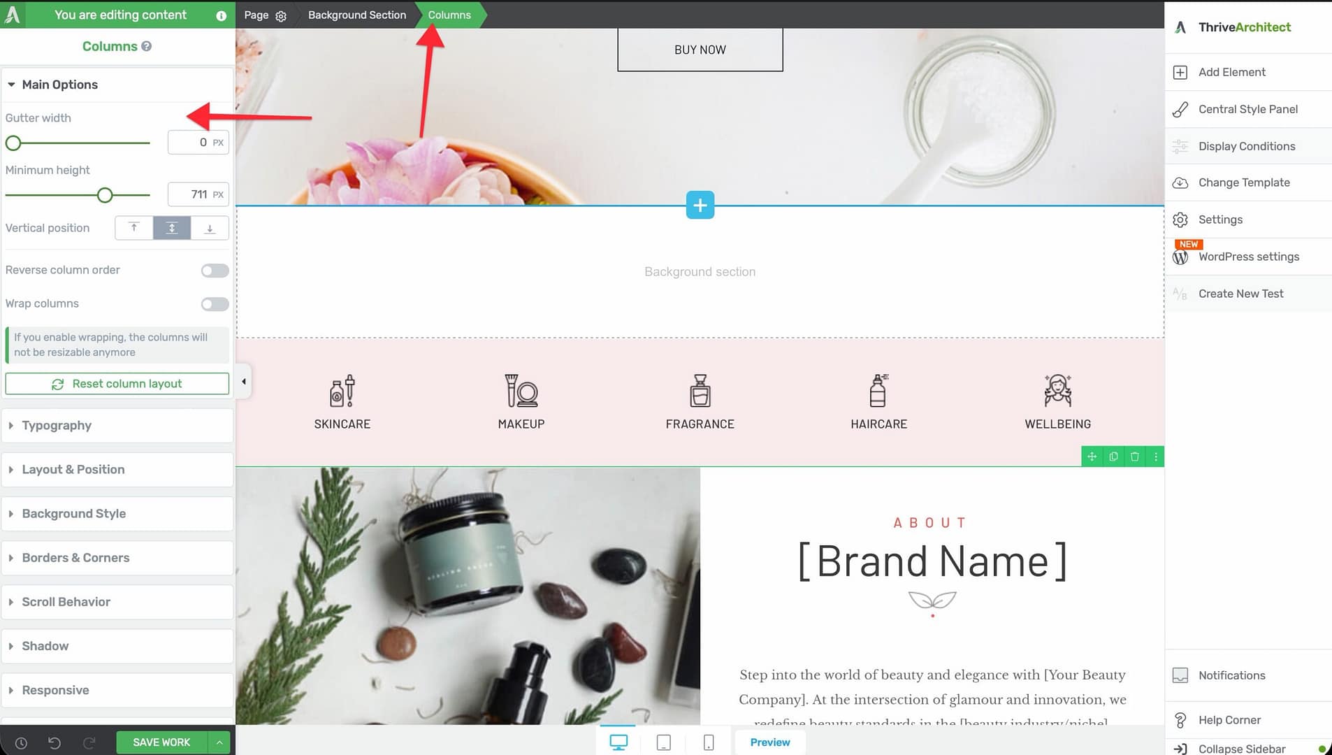
Gutter Width
Controls the horizontal spacing between adjacent columns.
- Default: 15px
- Range: 0–200px
- Set to 0 for columns that touch each other with no gap, or increase for more breathing room
Minimum Height
Sets the minimum height for the entire Columns element.
- Range: 1–1000px (or vh units)
- All columns within the element share this minimum height
- Individual columns can exceed this height if their content requires more space
Vertical Position
Controls where content is positioned vertically within the columns:
- Top — Content aligns to the top of each column
- Center — Content is vertically centered
- Bottom — Content aligns to the bottom
This applies globally to all columns in the element. Individual columns can override this setting (see Per-Column Controls below).
Reverse Column Order
A toggle switch that reverses the visual order of the columns.
- When enabled, the last column appears first and the first column appears last
- Useful for creating alternate left-right layouts where you want text on the left on desktop but on the right on mobile (or vice versa)
Wrap Columns
A toggle switch that controls whether columns wrap to the next line when they can’t fit side by side.
- Default: Enabled
- When enabled, columns will stack vertically when the available width is too narrow to display them side by side
Important: If you enable wrapping, the columns will not be resizable anymore. The column widths will be calculated automatically based on the available space and the column breakpoint setting.
Column Breakpoint
Controls the minimum width at which a column will remain on the same row before wrapping to the next line.
- Default: 250px
- Range: 40–700px
- This setting determines when columns wrap on smaller screens
- A lower value means columns will stay side by side on narrower screens; a higher value means they’ll stack sooner
Tip: Set the column breakpoint to match the minimum readable width of your column content. For text-heavy columns, a value of 300–400px works well. For icon-based columns, you can go as low as 100–150px.
Stretch to Fit Screen Width
A toggle switch that makes the Columns element span the full width of the screen, regardless of the parent container’s width.
Per-Column Controls
Each individual column within the Columns element has its own set of options. Click on a specific column to access these:
Vertical Position
Overrides the global vertical position for this specific column:
- None — Uses the global setting from the Columns element
- Top — Content aligns to the top
- Center — Content is vertically centered
- Bottom — Content aligns to the bottom
Enable Fixed Width
A toggle switch that locks the column to a specific width instead of using a percentage-based flexible layout.
- When enabled, a Width slider appears (range: 30–1500px or %)
- The column will maintain this width regardless of browser resizing
- Other columns in the row will adjust to fill the remaining space
Enable Full Height
A toggle switch that forces the column to match the height of the tallest column in the row.
- Useful for creating equal-height columns where backgrounds or borders need to align
Width
Sets the width of the column when Enable Fixed Width is active.
- Range: 30–1500px (or %)
- You can also drag the column divider on the canvas to resize columns visually
Resetting Column Layout
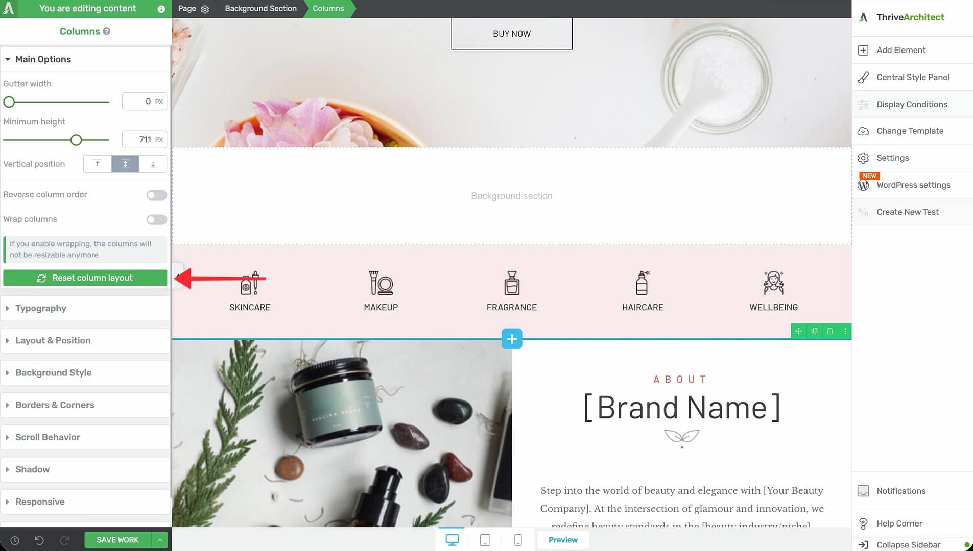
If you’ve manually adjusted column widths and want to start over, use the Reset Column Layout button in the left sidebar. This restores all columns to equal widths based on the number of columns present.
Mobile Responsive Behavior
The Columns element is designed to work seamlessly across all device sizes. Here’s how responsive behavior works:
Automatic Column Stacking
When Wrap Columns is enabled, columns automatically stack vertically on smaller screens based on the Column Breakpoint value. This ensures your content remains readable on mobile devices without manual adjustments.
Device-Specific Overrides
Use the device preview buttons in the bottom toolbar (desktop, tablet, mobile) to:
- Adjust column widths for each device size independently
- Change the gutter width for smaller screens
- Modify the minimum height to prevent excessive whitespace on mobile
- Use Reverse Column Order to change the reading order on mobile devices
Best Practices for Responsive Columns
- Test your column layouts on all three device sizes before publishing
- Avoid placing too many columns side by side on mobile—two columns is typically the maximum that works well on phone screens
- Use the Column Breakpoint slider to fine-tune exactly when columns wrap
- Consider using Reverse Column Order when the visual hierarchy should differ between desktop and mobile
Common Use Cases
Feature Grid
Create a grid of features with icons and descriptions:
- Add a Columns element with 3 equal columns.
- In each column, add an Icon element, a Heading, and a Text element.
- Set Vertical Position to Top so content aligns at the top of each column.
- Set the Column Breakpoint to around 300px so columns stack on narrow screens.
Text and Image Side by Side
Place an image next to a text block:
- Add a Columns element with a 2-column layout (for example, 1/2 + 1/2 or 1/3 + 2/3).
- Drop an Image element in one column and a Text element in the other.
- Enable Full Height on both columns to align their heights.
- Use Reverse Column Order if you want the image on the left on desktop but below the text on mobile.
Pricing Table Layout
Build a side-by-side pricing comparison:
- Add a Columns element with 3 equal columns.
- In each column, add a Content Box with the plan details.
- Set the Gutter Width to 20–30px for visual separation.
- Enable Full Height on each column so all pricing cards are the same height.
Frequently Asked Questions
Can I Add More Than 3 Columns?
Yes. Thrive Architect supports up to 6 columns in a single Columns element. You can add columns by right-clicking within the element and selecting the option to add a column.
How Do I Make Columns Equal Height?
Enable Full Height on each individual column. This forces all columns to match the height of the tallest column in the row.
Why Can’t I Resize My Columns?
If Wrap Columns is enabled, manual column resizing is disabled. The column widths are calculated automatically based on the available space. To resize columns manually, disable Wrap Columns first.
Related Resources
- Background Section: How to Use the Background Section Element — The parent container for most column layouts
- Content Box: How to Use the Content Box Element — Add styled containers inside columns
- Landing Pages: How to Get Started with Landing Pages — Page layout fundamentals
That’s it! You’ve successfully learned how to use the Columns element in Thrive Architect. With its flexible layout options, per-column controls, and responsive wrapping behavior, the Columns element gives you everything you need to create professional multi-column page layouts.