In this article, you’ll learn how to customize the content section, content wrapper, and sidebar section of your Thrive Theme Builder templates—including sidebar display types, off-screen sidebars, and custom triggers.
The Content Section
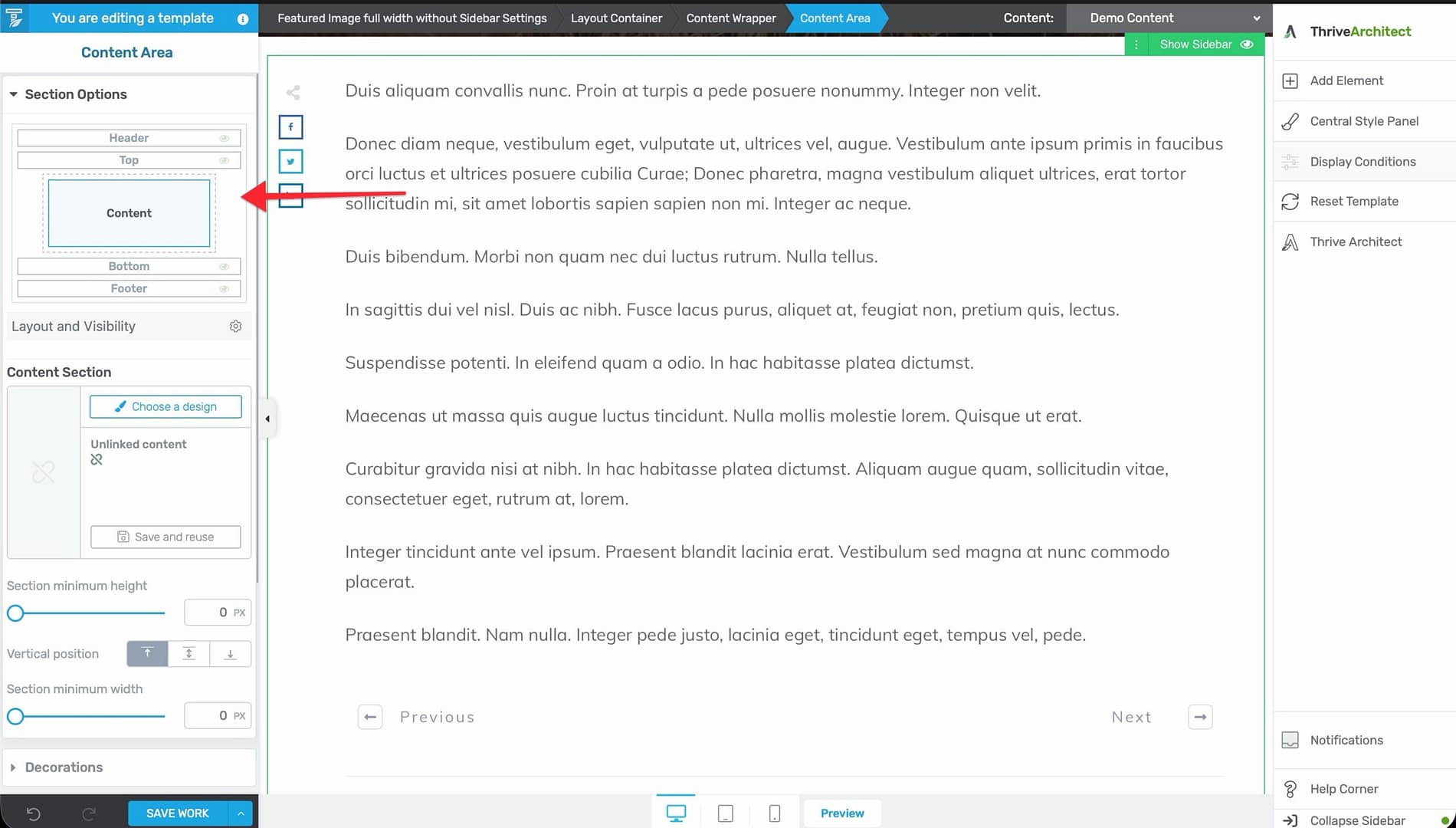
The content section is the main area of your template where page or post content appears. When a visitor views a page, the content they created in the WordPress editor is rendered inside this section.
Accessing the Content Section
- Open a template in the Thrive Theme Builder editor.
- In the left sidebar, go to Main Options and click Content to select the content section.
- The content section highlights, and its configuration options appear in the left sidebar.
Content Section Options
- Background — Set a background color or image behind the content area.
- Padding — Adjust spacing inside the content section.
- Width — Control the width of the content area within the template.
The Content Wrapper
The Content Wrapper is the container that holds both the content section and the sidebar section. It controls the relationship between these two areas.
Accessing the Content Wrapper
- In the editor, select any element within the content or sidebar area.
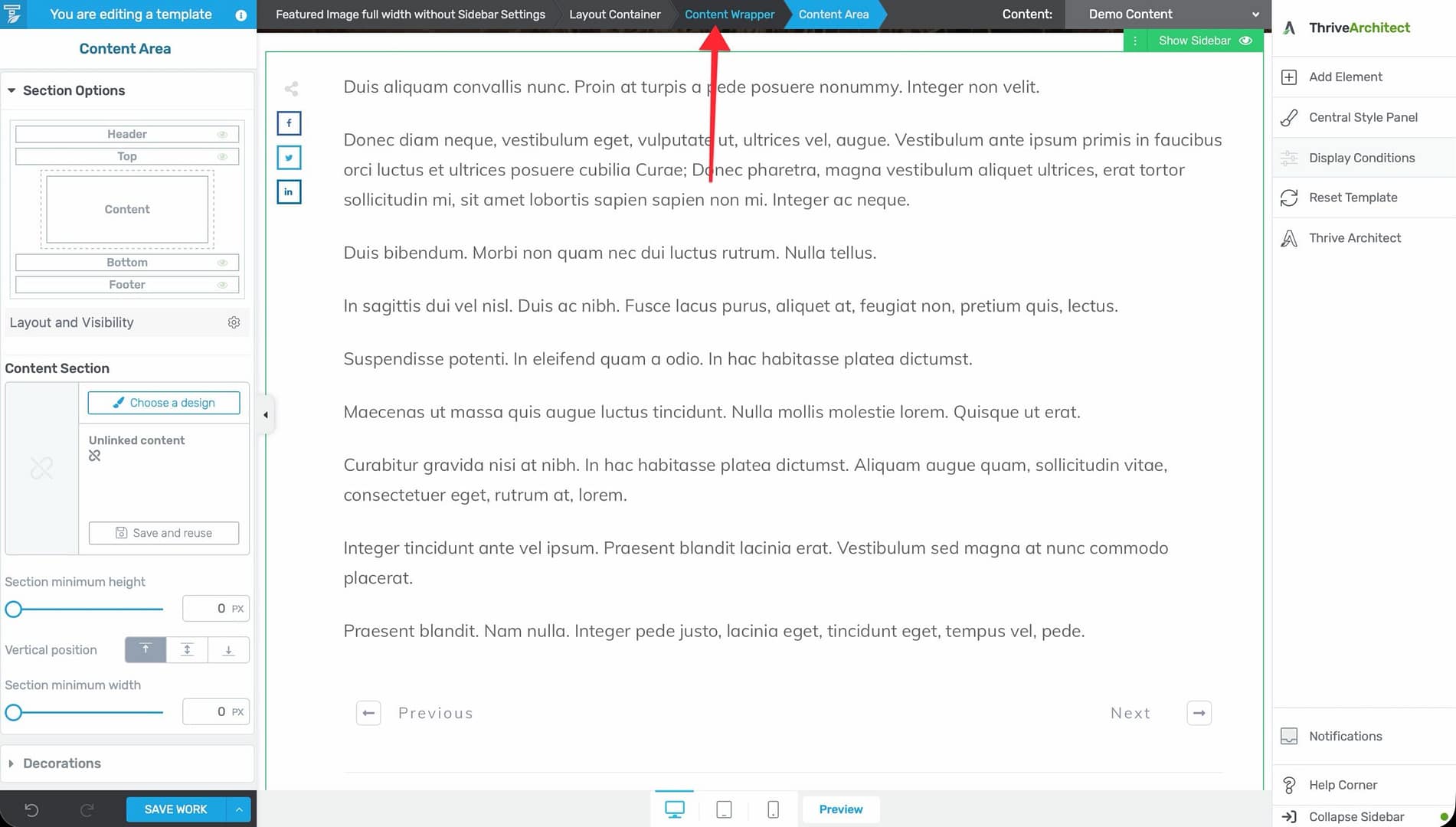
- Look at the breadcrumbs at the top of the editor.
- Click Content Wrapper in the breadcrumbs.
- The wrapper’s configuration options appear in the left sidebar.
Content Wrapper Options
- Sidebar position — Place the sidebar on the left or right side of the content.
- Sidebar visibility — Show or hide the sidebar entirely.
- Gutter width — Control the spacing between the content area and sidebar (adjustable from 0 to 240px, default 20px).
- Maximum width — Set the maximum width of the content-plus-sidebar area.
- Responsive display — Configure how the wrapper behaves on different devices.
The Sidebar Section
The sidebar provides a secondary content area alongside the main content. It’s commonly used for navigation, widgets, newsletter signups, and supplementary information.
Accessing the Sidebar Section
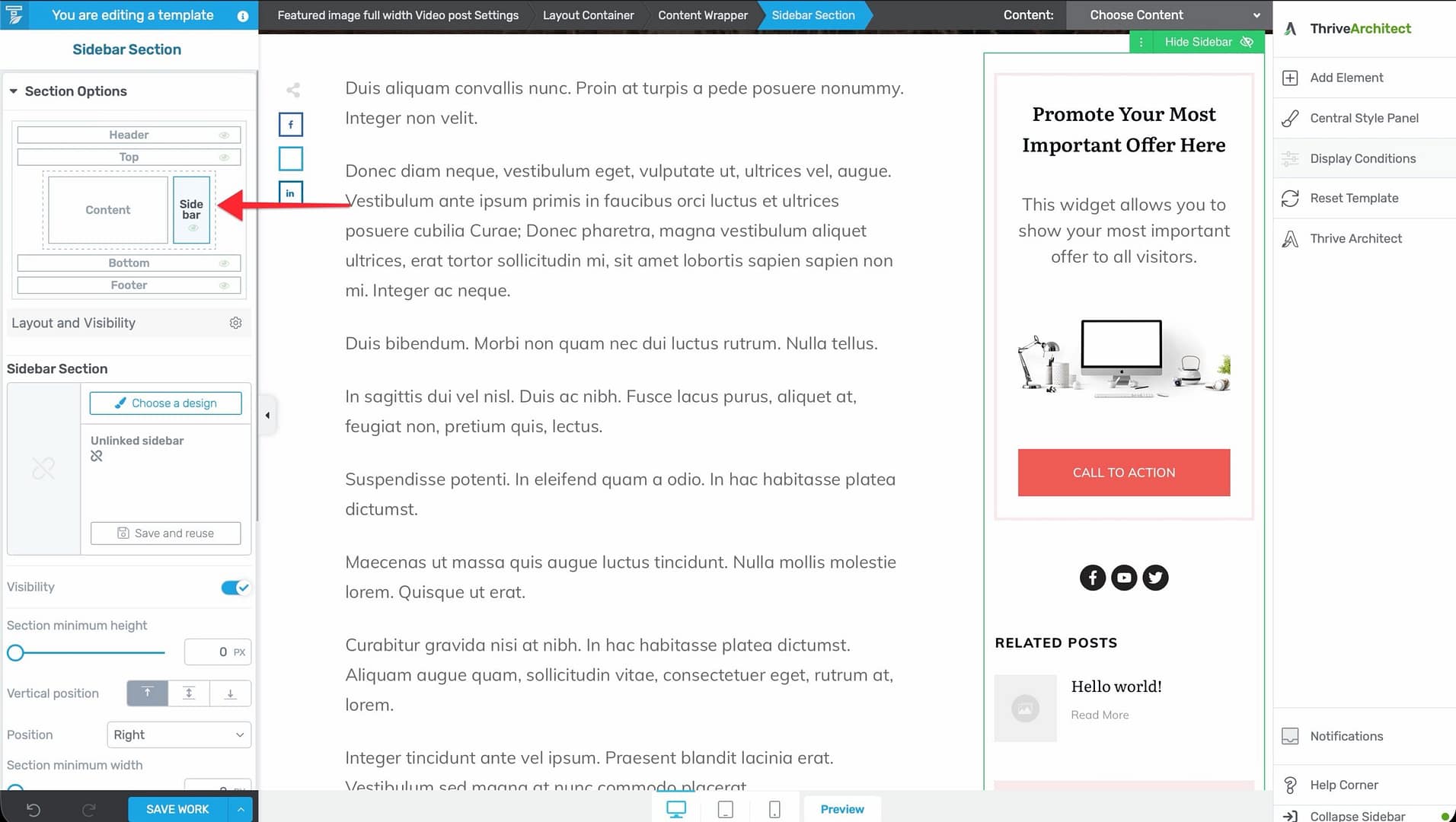
- In the editor, go to Main Options in the left sidebar and click Sidebar.
- The sidebar section highlights, and its configuration options appear.
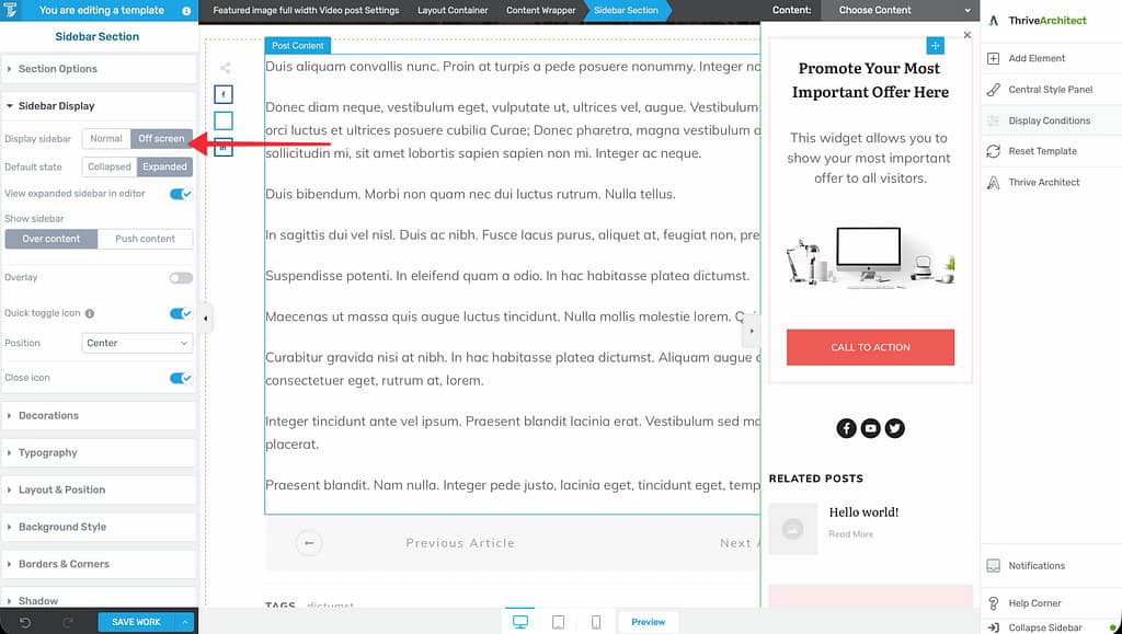
Sidebar Display Types
The sidebar supports two display modes:
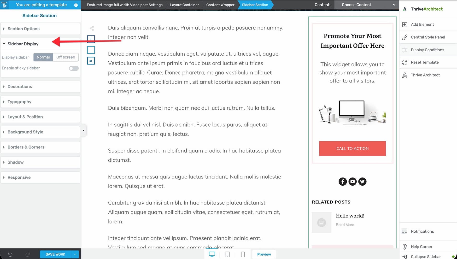
Normal
The sidebar displays inline alongside the content. This is the standard layout for blog posts and content-heavy pages.
Within the Normal display type, you can enable Sticky behavior using a toggle checkbox. When enabled, the sidebar stays fixed in the viewport as visitors scroll through the content. Sticky behavior is configured per device (desktop, tablet, mobile) using the device switcher at the bottom of the editor.
Sticky sidebar options:
- Distance from top or bottom — Control the offset when the sidebar becomes sticky.
- Scroll until — Configure when the sidebar stops being sticky: End of main container, End of page, or It reaches another element.
Off-Screen
The sidebar is hidden off-screen and slides in when triggered. This is useful for mobile-friendly designs where screen space is limited.
Off-screen sidebar options:
- Show sidebar — Choose between Over content (sidebar slides over the content) or Push content (sidebar pushes the content aside).
- Default state — Whether the sidebar starts as Expanded or Collapsed when the page loads.
- Overlay — Configure an overlay color that appears behind the sidebar when it’s open.
- Close button — An automatically added close icon for dismissing the sidebar.
The Sidebar Trigger
When you enable an off-screen sidebar, a default trigger icon is automatically added to your template. Visitors click this trigger to open and close the sidebar.
Customizing the Default Trigger
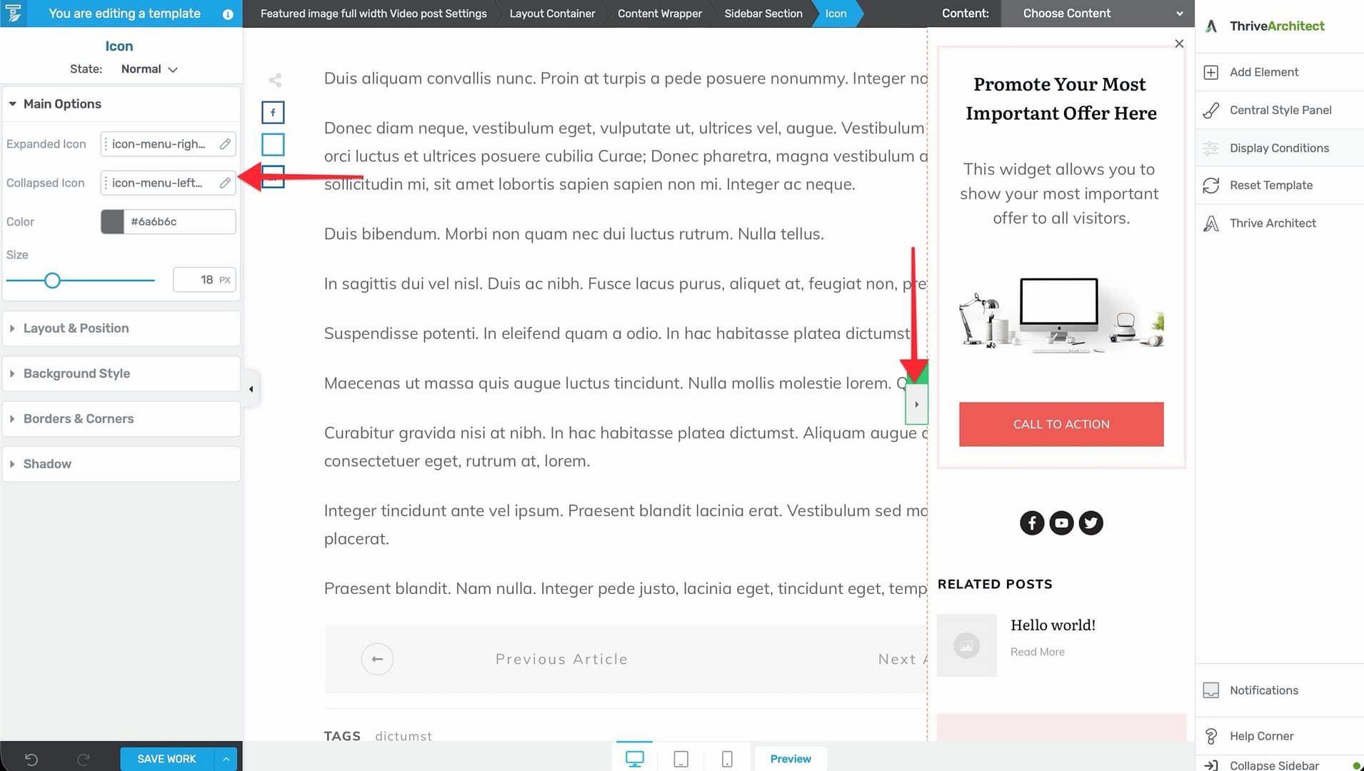
- In the editor, click on the sidebar trigger icon that appears on the template.
- Configure the trigger in the left sidebar:
- Expanded icon — The icon displayed when the sidebar is open.
- Collapsed icon — The icon displayed when the sidebar is closed.
- Icon color — Customize the icon color.
- Icon size — Adjust the size (5–50px).
Adding Content to the Sidebar
Using the Widget Area Element
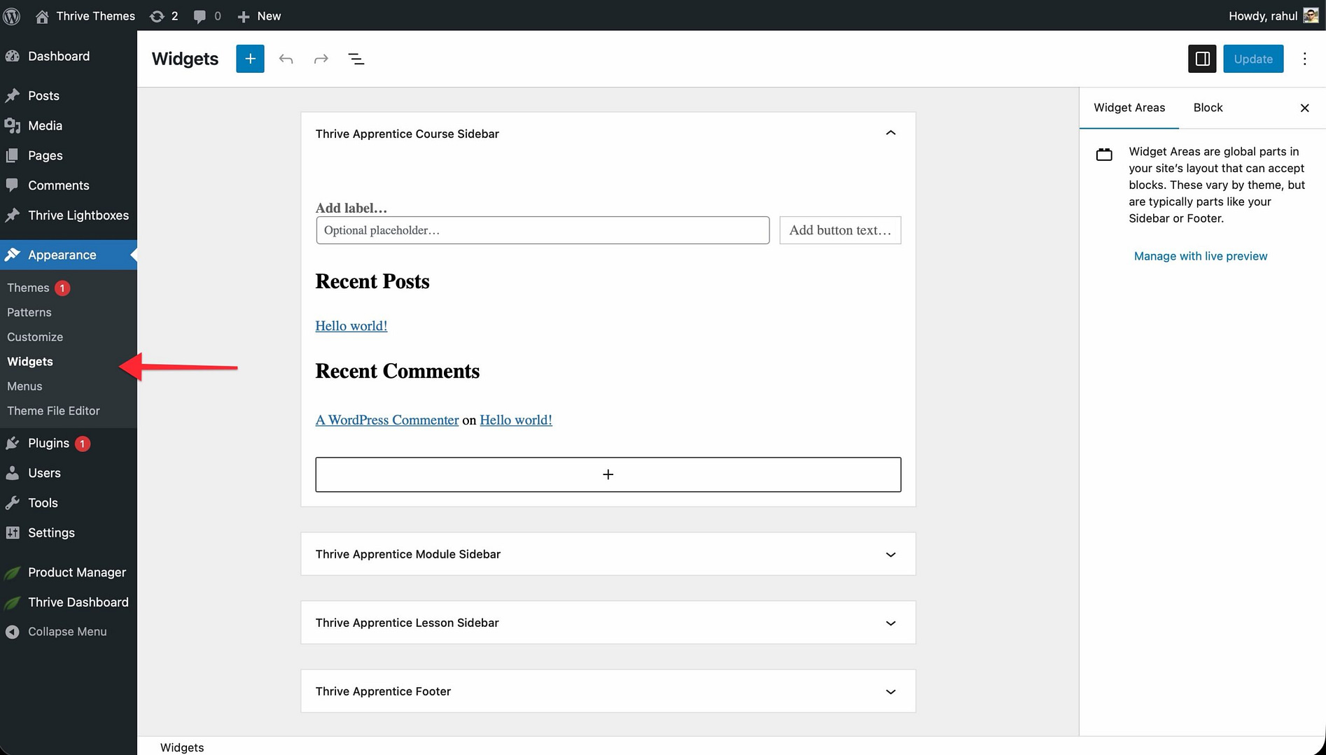
- Add a Widget Area element to the sidebar section.
- Configure which WordPress widgets to display through Appearance > Widgets in the WordPress admin.
Using the Post List Element
Add a Post List element to the sidebar to display your latest articles, popular posts, or a custom post query.
Using a Newsletter Opt-In
To add a newsletter signup form to the sidebar:
- Create a Widget-type opt-in form in Thrive Leads.
- Add a Widget Area element to the sidebar.
- Configure the widget area to display the Thrive Leads widget.
Best Practices
- Use sidebars on content pages — Blog posts, archive pages, and documentation pages benefit from sidebars with navigation and supplementary content.
- Skip sidebars on landing pages — Landing pages should typically be full-width to keep the focus on the call to action.
- Use off-screen sidebars on mobile — Full sidebars can take up too much space on mobile screens. Configure the sidebar as off-screen on mobile while keeping it visible on desktop.
- Keep sidebar content focused — Limit the sidebar to 3–5 items (e.g., search, categories, newsletter, recent posts). An overloaded sidebar distracts from the main content.
Related Resources
- Using the Header Section: Learn how to customize the header.
- Customizing the Template Layout: Learn how to customize the template layout.
- Understanding the Content Area, Content Wrapper & Layout Container: Learn about the structural elements of a template.