In this article, you’ll learn how to use the Content Box element in Thrive Architect. This element creates a styled container for grouping content together, complete with preset styles, a master color system, and background options.
The Content Box is a versatile container element that you place inside Background Sections, Columns, or other layout elements. Unlike a Background Section (which spans the full page width), a Content Box is a smaller, self-contained block designed for grouping related content—such as a call-to-action, a testimonial, a feature highlight, or an info card.
Adding a Content Box to Your Page
Follow these steps to add a Content Box to your page:
- Open your page or post in the Thrive Architect editor.
- Click the green plus (+) icon in the right sidebar to open the element panel.
- Type Content Box in the search field at the top of the panel.
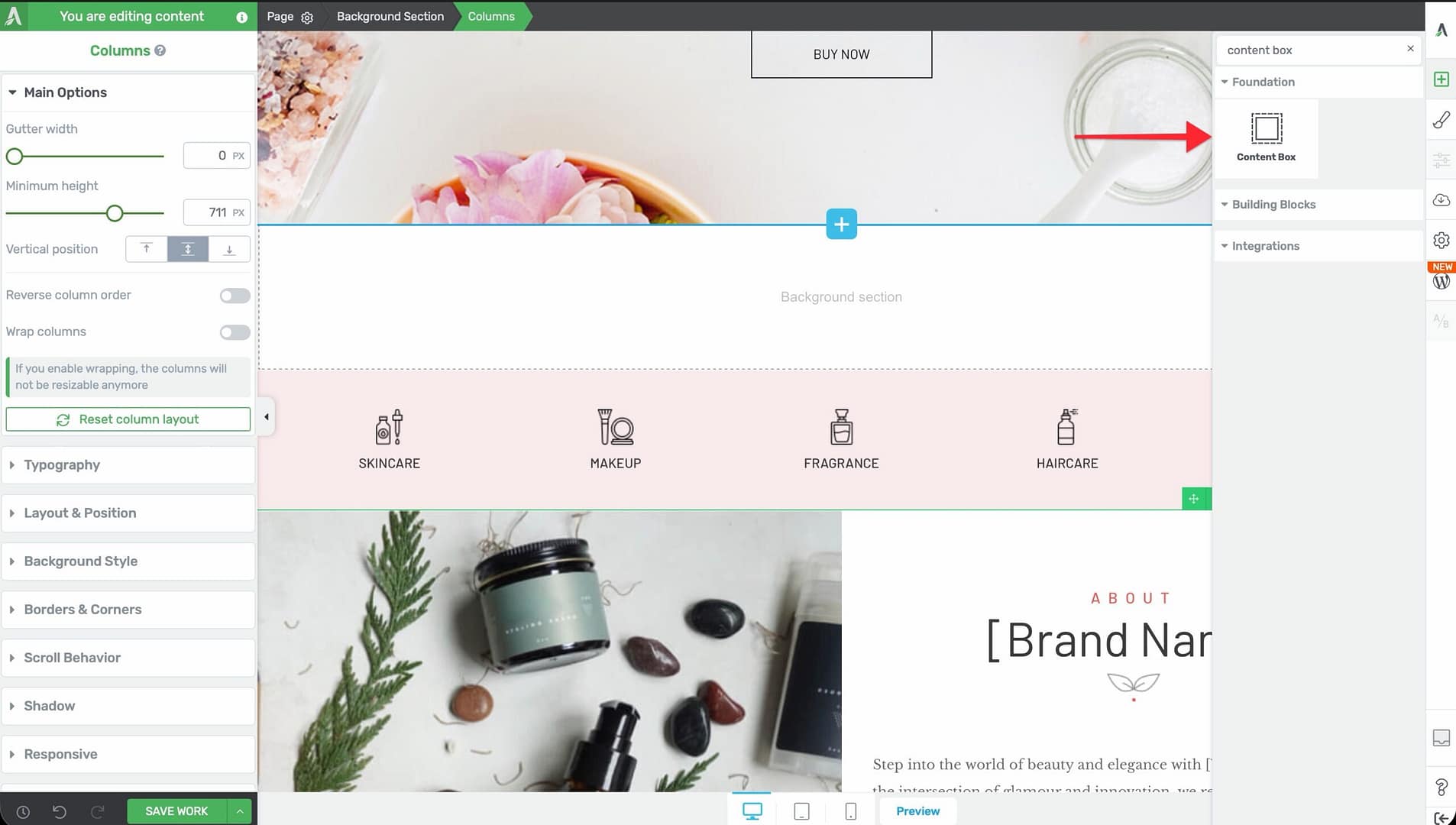
- Drag the element from the panel and drop it onto your page canvas—typically inside a Background Section or Column.
- An empty Content Box will appear with a default background style. You can now drag other elements (text, images, buttons) into it.
Main Options
When you select a Content Box, the following options appear in the left sidebar:
Content Box Styles
A dropdown menu with 15 preset style variations.
- Options range from Content box 1 through Content box 15
- Each preset applies a different combination of background, border, shadow, and corner settings
- Select a preset as a starting point, then customize individual properties as needed
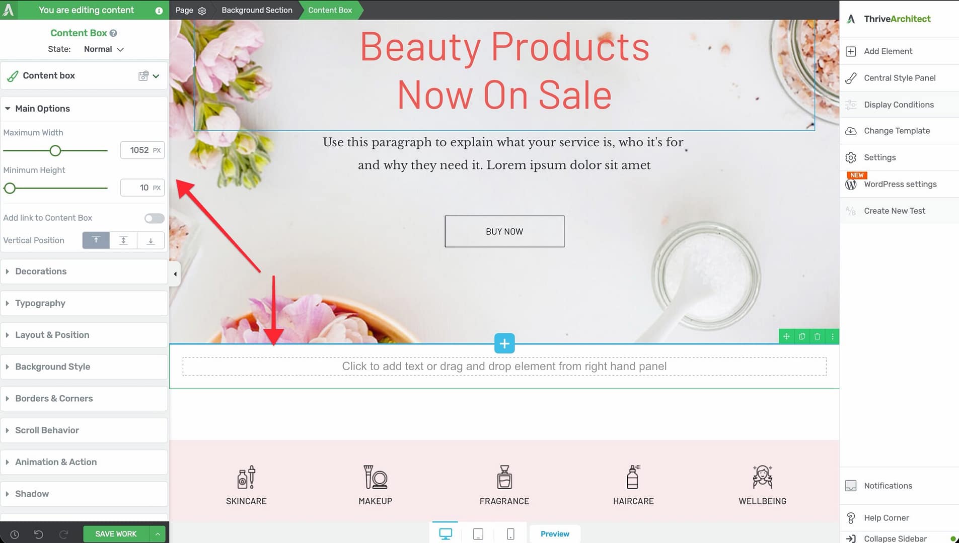
Maximum Width
Controls the maximum width of the Content Box.
- Default: 1024px
- Range: 100–2000px
- The Content Box won’t stretch beyond this value, even if the parent container is wider
Minimum Height
Sets the minimum height of the Content Box.
- Default: 80px
- Range: 1–1000px (or vh units)
- The Content Box will grow taller if its content requires more space, but it won’t shrink below this value
Master Color
A color picker that controls the primary color of the Content Box.
- Changing the Master Color updates the shadow, background, and border colors simultaneously
- This gives you a quick way to theme a Content Box without adjusting each property individually
- You can override individual color properties after setting the Master Color
Vertical Position
Controls where the content inside the box is positioned vertically:
- Top — Content aligns to the top of the box
- Center — Content is vertically centered
- Bottom — Content aligns to the bottom
This is useful when the Content Box is taller than its content—for example, when using a large Minimum Height or when columns force equal heights.
Add Link to Content Box
A toggle switch that wraps the entire Content Box in a clickable link.
- When enabled, a URL field appears where you can enter the destination link
- The entire box becomes clickable—visitors can click anywhere on it (not just on buttons or text links inside it)
- Useful for creating clickable cards, feature blocks, or navigation tiles
Background Image
The Background Image section provides controls for adding a background image to the Content Box:
- Click Replace Image to upload or select an image from your media library
- Configure image position, size, repeat, and attachment options
- Combine with a semi-transparent color overlay for text readability
Additional Styling and Design Options
Beyond the main options, the Content Box element supports a full range of styling controls:
- Borders & Corners — Set border width, style, color, and corner radius for each side independently
- Background Style — Choose from solid color, gradient, image, or video backgrounds
- Shadow — Add inner or outer box shadows for depth and visual separation
- Typography — Set default text properties for all content within the box
- Decoration — Add visual decorations and dividers
- Scroll Effects — Apply parallax, fade-in, or other scroll-triggered animations
- Conditional Display — Show or hide the Content Box based on visitor criteria
- Hover State — Define how the box appears when a visitor hovers over it (useful for interactive cards)
- Group Styling — Apply consistent styling across multiple Content Boxes
- Shared/Global Styles — Save and reuse a Content Box style across your site
Content Box vs. Background Section
These two container elements serve different purposes:
| Feature | Content Box | Background Section |
|---|---|---|
| Purpose | Smaller styled container for grouping content | Full-width page section for page structure |
| Default Height | 80px | 1024px |
| Preset Styles | 15 presets (Content box 1–15) | None |
| Master Color | Yes | No |
| Full-Width | No (constrained by parent) | Yes (spans browser width) |
| Typical Use | Cards, callouts, feature blocks | Hero sections, content bands |
In most designs, you’ll place Content Boxes inside Background Sections to create structured, styled content areas within your full-width page sections.
Common Use Cases
Call-to-Action Block
Create a prominent CTA that stands out from the surrounding content:
- Add a Content Box inside a Background Section.
- Select a preset style (for example, Content box 3 for a bordered look).
- Set the Master Color to match your brand’s primary color.
- Add a Heading, a short Text paragraph, and a Button inside the box.
- Enable the Hover State to add a subtle color shift when visitors hover over the box.
Feature Cards in a Grid
Build a row of feature cards using Columns and Content Boxes:
- Add a Columns element with 3 equal columns inside a Background Section.
- Drop a Content Box into each column.
- Add an Icon, Heading, and Text element inside each Content Box.
- Apply the same Global Style to all three Content Boxes for a consistent look.
- Enable Add Link to Content Box on each box to make the entire card clickable.
Testimonial Block
Highlight a customer testimonial with a styled container:
- Add a Content Box with a light background color and subtle shadow.
- Add a Text element with the testimonial quote.
- Add an Image element (circular) for the customer photo.
- Add a second Text element for the customer name and title.
- Set Vertical Position to Center for a balanced look.
Info or Alert Box
Create a styled info box for tips, warnings, or important notes:
- Add a Content Box and set the Master Color to blue (info), yellow (warning), or red (alert).
- Reduce the Maximum Width to 600–800px to keep it compact.
- Add an Icon and a Text element inside the box.
- The Master Color will automatically apply a coordinated background, border, and shadow.
Frequently Asked Questions
Can I Nest Content Boxes Inside Each Other?
Yes. You can place a Content Box inside another Content Box to create layered layouts. However, keep nesting to a minimum to avoid overly complex structures that are harder to manage on mobile.
How Do I Copy a Content Box Style to Other Boxes?
Use Shared/Global Styles. Style one Content Box, then save it as a global style. Apply that global style to other Content Boxes across your page or site. Any changes to the global style will update all boxes that use it.
Can I Animate a Content Box?
Yes. Use the Scroll Effects options to add fade-in, slide-in, or parallax animations that trigger as the visitor scrolls the box into view. You can also use the Hover State to create interactive effects.
Related Resources
- Background Section: How to Use the Background Section Element — Full-width page sections for overall layout
- Columns: How to Use the Columns Element — Multi-column layouts for placing Content Boxes side by side
- Block Element: How to Use the Block Element — Landing page-specific section element
- Styling: Getting Started with Thrive Architect — Editor overview and element styling basics
That’s it! You’ve successfully learned how to use the Content Box element in Thrive Architect. With 15 preset styles, a Master Color system, and full background and hover controls, the Content Box is your go-to element for creating styled content containers throughout your pages.