In this article, you’ll learn how to use the Number Counter and Fill Counter elements in Thrive Architect. These animated counting elements let you showcase statistics, percentages, and milestones with eye-catching animated transitions that activate as visitors scroll down the page.
The Number Counter displays an animated number that counts from a starting value to an end value, complete with prefix, suffix, and label options. The Fill Counter shows a circular dial that fills to a specified percentage. Both elements are ideal for displaying stats, achievements, and progress indicators on sales pages, about pages, and dashboards.
Part 1: The Number Counter Element
What Is the Number Counter?
The Number Counter element displays an animated number that counts up (or down) from a starting value to an end value when it scrolls into view. It is commonly used for statistics such as “500+ Happy Customers” or “99% Satisfaction Rate.”
Key characteristics of the Number Counter element:
- Animates between a Starting value and an End value
- Supports decimal precision from 0 to 3 decimal places
- Configurable Decimal character (Point or Comma) and Thousands divider (None, Comma, Point, or Space)
- Optional Prefix and Suffix text inputs (for example, “$” or “%”)
- Optional Label with configurable position (Top, Bottom, or Both)
- Adjustable Size from 10px to 100px
- Four Speed presets: Slow (4007ms), Default (2507ms), Fast (1007ms), and Custom
- Includes a Preview animation button to test the counting effect inside the editor
Adding the Number Counter to a Page
Follow these steps to add a Number Counter element to your page:
- Open your page or post in the Thrive Architect editor.
- Click the green plus (+) icon in the right sidebar to open the element panel.
- Type Number Counter in the search field at the top of the panel.
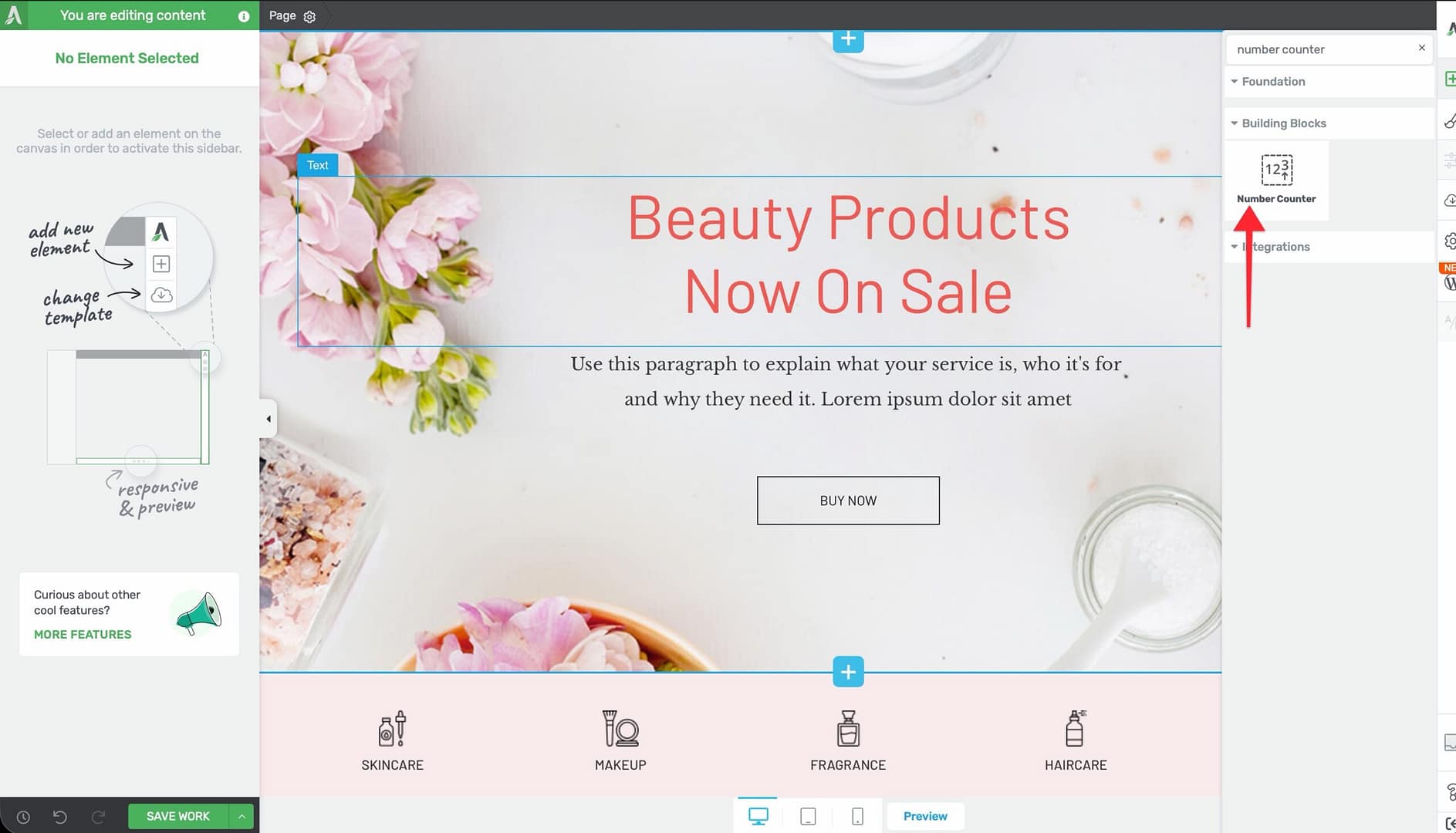
- Alternatively, scroll down to the Building Blocks section in the element list to find the Number Counter element.
- Drag the element from the panel and drop it onto your page canvas.
A default Number Counter will appear on the canvas, counting from 0 to 1. You can immediately customize it using the options in the left sidebar.
Configuring the Number Counter Options
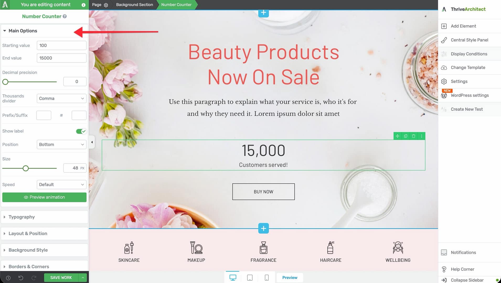
After selecting the Number Counter element, the left sidebar displays the following options:
Starting Value
A text input that sets the number where the counting animation begins.
- Default: 100
You can set this to any number, including negative values. The counter will animate from this value to the end value.
End Value
A text input that sets the number where the counting animation stops.
- Default: 15000
Set this to the target statistic you want to display. For example, enter 2500 to count up to 2,500 customers.
Decimal Precision
A slider that controls how many decimal places are shown in the counter:
- Range: 0 to 3 decimal places
- Default: 0
When set to 0, the counter displays whole numbers only. Setting this to 1 or higher is useful for displaying percentages (such as 99.9%) or financial figures.
Decimal Character
This option appears when Decimal precision is set to 1 or higher. Choose between:
- Point — Displays decimals as 99.9 (common in English-speaking regions)
- Comma — Displays decimals as 99,9 (common in European regions)
Thousands Divider
Controls how large numbers are formatted for readability:
- None — Displays as 2500
- Comma — Displays as 2,500
- Point — Displays as 2.500
- Space — Displays as 2 500
Prefix and Suffix
Two text inputs that add static text before and after the animated number:
- Prefix — Appears before the number (for example, “$” for dollar amounts)
- Suffix — Appears after the number (for example, “%” for percentages, or “+” to indicate “and more”)
Show Label
A switch that toggles an optional descriptive label for the counter. When enabled, a text input and position control appear:
- Label text — Enter the label text (for example, “Happy Customers” or “Projects Completed”)
- Position — Choose where the label appears relative to the number: Top, Bottom, or Both
Size
A slider that controls the font size of the counter number:
- Default: Varies by template
- Range: 10px to 100px
This adjusts the size of the animated number itself. The label, prefix, and suffix scale proportionally.
Speed
Controls how fast the counting animation plays:
- Slow — 4007ms (approximately 4 seconds)
- Default — 2507ms (approximately 2.5 seconds)
- Fast — 1007ms (approximately 1 second)
- Custom — Reveals a text input where you can enter a custom duration in milliseconds
Preview Animation
A button that plays the counting animation inside the editor so you can preview the effect without switching to the front-end preview.
Number Counter Formatting Examples
Here are common formatting configurations:
- Dollar amount: Prefix “$”, End value 1250, Thousands divider Comma → displays $1,250
- Percentage: End value 99.9, Decimal precision 1, Suffix “%” → displays 99.9%
- Customer count: End value 5000, Suffix “+”, Thousands divider Comma → displays 5,000+
- European format: End value 1250.50, Decimal precision 2, Decimal character Comma, Thousands divider Point → displays 1.250,50
Part 2: The Fill Counter Element
What Is the Fill Counter?
The Fill Counter element displays a circular dial that fills to a specified percentage. It provides a visual way to represent progress, completion rates, or any percentage-based metric.
Key characteristics of the Fill Counter element:
- Displays a circular progress dial with a configurable Fill Percentage (0–100%)
- Adjustable Counter Size from 0 to 2000px (default 202px)
- Separate color controls for Fill color, Circle color, and Inner Color
- Match fill value with dial value switch (enabled by default) to sync the displayed number with the dial position
- Supports External Fields for dynamic binding to custom field values
- Layout options for Width, Height, Overflow, and Scroll Style are disabled
- Typography, Background, and Animation options are hidden
Adding the Fill Counter to a Page
Follow these steps to add a Fill Counter element to your page:
- Open your page or post in the Thrive Architect editor.
- Click the green plus (+) icon in the right sidebar to open the element panel.
- Type Fill Counter in the search field at the top of the panel.
- Alternatively, scroll down to the Building Blocks section in the element list to find the Fill Counter element.
- Drag the element from the panel and drop it onto your page canvas.
A circular fill counter will appear on the canvas showing the default 75% fill. You can immediately adjust the percentage, size, and colors in the left sidebar.
Configuring the Fill Counter Options
After selecting the Fill Counter element, the left sidebar displays the following options:
Counter Size
A slider that controls the overall diameter of the circular dial:
- Default: 202px
- Range: 0 to 2000px
For most layouts, a size between 150px and 300px works well. Use larger sizes (400px+) when the fill counter is the primary visual element in a section.
Fill Percentage
A slider that sets how much of the circle is filled:
- Default: 75%
- Range: 0% to 100%
This value determines both the visual fill of the dial and (when Match fill value with dial value is enabled) the number displayed inside the circle.
External Fields
A control that lets you bind the fill percentage to a dynamic data source such as a custom field, ACF field, or other external data. This is useful for:
- Dynamically displaying course completion percentages
- Showing progress metrics that update automatically
- Pulling data from custom post meta fields
Fill Color
A color picker that controls the color of the filled portion of the circular dial. This is the segment that represents the completed or achieved percentage.
Circle Color
A color picker that controls the color of the unfilled portion of the dial. This is the background track that represents the remaining percentage.
Inner Color
A color picker that controls the background color inside the center of the circle, behind the percentage number.
Match Fill Value with Dial Value
A switch that is enabled by default. When turned on, the number displayed inside the circle automatically matches the fill percentage. When turned off, you can set the inner text independently of the dial position.
Common Use Cases
Statistics Sections
Create a row of Number Counters inside a columns layout to display key business metrics side by side—such as years of experience, projects completed, and satisfied customers.
Skill or Proficiency Displays
Use Fill Counter elements to represent skill levels or proficiency ratings. For example, display “WordPress: 95%,” “SEO: 85%,” and “Design: 90%” as a series of circular dials on a team member’s profile page.
Sales Page Social Proof
Place Number Counters in a social proof section on a sales page to highlight impressive statistics like total students enrolled, five-star reviews received, or revenue generated.
Course Completion Progress
Bind a Fill Counter to an External Field that tracks course progress. The dial automatically updates to reflect each student’s completion percentage.
Fundraising and Goal Tracking
Use a Fill Counter to show progress toward a fundraising goal, with the fill percentage representing how much of the target has been reached.
Frequently Asked Questions
Can the Number Counter Count Down Instead of Up?
Yes. Set the Starting value higher than the End value, and the counter will animate downward. For example, set the starting value to 100 and the end value to 0 for a countdown effect.
Does the Animation Trigger Automatically?
Yes. Both the Number Counter and Fill Counter animations trigger automatically when the element scrolls into the visitor’s viewport. You do not need to configure any scroll triggers separately.
Can I Use the Fill Counter with Dynamic Data?
Yes. Use the External Fields option to bind the fill percentage to a custom field or other dynamic data source. The dial will display the value stored in that field.
Why Is the Fill Counter Not Showing Typography Options?
The Fill Counter has a simplified option set by design. Typography, Background, and Animation controls are hidden for this element. The displayed number inherits the element’s default styling.
Can I Change the Counter Speed to an Exact Value?
Yes. For the Number Counter, select Custom from the Speed options, then enter your desired animation duration in milliseconds. For example, enter 3000 for a 3-second animation.
Related Resources
- Progress Bar: How to Use the Progress Bar Element — Linear progress indicators with node-based tracking
- Icon Element: How to Use the Icon Element — Add visual accents alongside your counter sections
- Columns: How to Use the Columns Element — Arrange multiple counters in a side-by-side layout
- Dynamic Content: How to Use Dynamic Content — Populate counter values from custom fields and external sources
That’s it! You’ve successfully learned how to use the Number Counter and Fill Counter elements in Thrive Architect. The Number Counter delivers animated statistics with flexible formatting, prefix, suffix, and label options, while the Fill Counter provides a visual circular dial for displaying percentages, progress, and completion rates.