In this article, you’ll learn how to use the Credit Card element in Thrive Architect. This element lets you display recognizable payment method icons on your pages—such as Visa, MasterCard, PayPal, and Apple Pay—to build trust and communicate accepted payment options to your visitors.
The Credit Card element is a simple building block that renders a row of payment card brand icons. It does not process payments or connect to a payment gateway. Instead, it serves as a visual trust signal, commonly placed near checkout buttons, pricing tables, or footer sections to reassure visitors that your site accepts their preferred payment method.
What Is the Credit Card Element?
The Credit Card element displays a horizontal row of payment brand icons. Each icon is a monochrome SVG graphic that can be recolored to match your page design.
Key characteristics of the Credit Card element:
- Displays icons for 8 supported payment brands: Visa, MasterCard, AmEx, PayPal, Discover, Bitcoin, Google Pay, and Apple Pay
- Includes a Style picker for choosing between different card icon visual styles
- Provides a single Color picker (default #595E60) that recolors all monochrome SVG icons
- Features an Add new button and sortable preview list for selecting and reordering card brands
- Includes a Size slider (10–150px, default 25px) for scaling the icons
- Does not include Typography or Shadow options (both are hidden)
- Layout options for Overflow and Scroll Style are disabled
- This is not a cloud template element
Note: The Credit Card element is purely visual—it does not handle payment processing. To accept payments, integrate a payment gateway through WooCommerce, ThriveCart, Stripe, or another payment solution.
Adding the Credit Card Element to a Page
Follow these steps to add a Credit Card element to your page:
- Open your page or post in the Thrive Architect editor.
- Click the green plus (+) icon in the right sidebar to open the element panel.
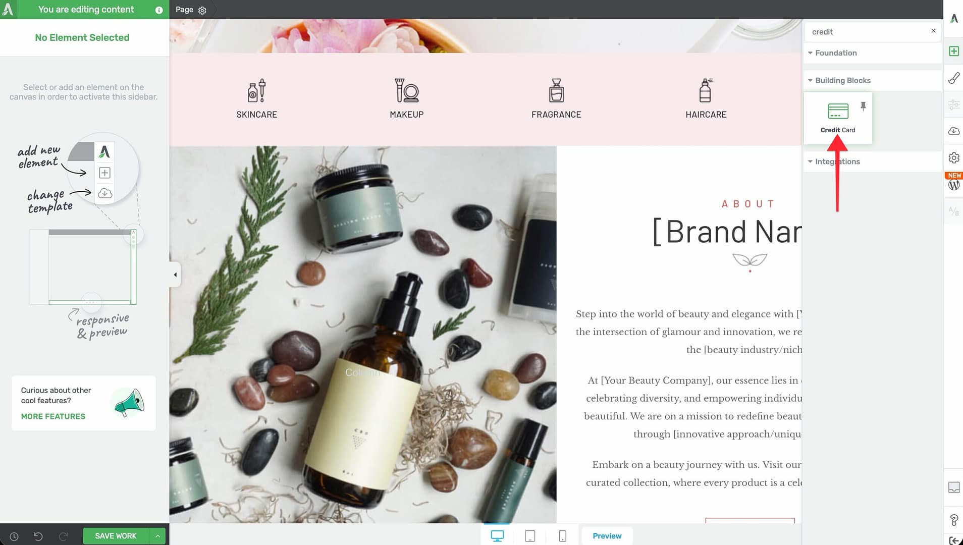
- Type Credit in the search field at the top of the panel.
- Alternatively, scroll down to the Building Blocks section in the element list to find the Credit Card element.
- Drag the element from the panel and drop it onto your page canvas.
A row of default payment card icons will appear on the canvas. You can immediately customize which cards are shown, their order, color, and size using the left sidebar options.
Configuring the Main Options
After selecting the Credit Card element, the left sidebar displays the following options:
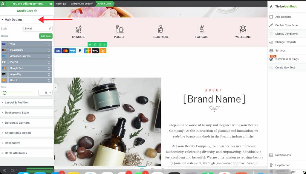
Style Picker
A visual style selector that changes the overall appearance of the card icons. Different styles offer variations in icon design—some more detailed, others more simplified or outlined. Click through the available styles to find the one that best matches your page aesthetic.
Color
A color picker that applies a single color to all card icons:
- Default: #595E60 (a neutral dark gray)
Because the card icons are monochrome SVG graphics, the color you choose fills all icons uniformly. This makes it easy to match the icons to your page’s color scheme.
Tip: Use a darker color for card icons on light backgrounds and a lighter color for dark backgrounds. Keeping the icons subtle (such as using a medium gray) prevents them from competing visually with your call-to-action buttons.
Cards
The card selection area includes two controls:
Add New Button
Click the Add new button to open a card brand selector. The selector displays all available payment brands:
- Visa
- MasterCard
- AmEx (American Express)
- PayPal
- Discover
- Bitcoin
- Google Pay
- Apple Pay
Click on a brand to add it to your card row. You can add as many or as few brands as you need.
Sortable Preview List
Below the Add new button, a sortable preview list shows all currently selected card brands. You can:
- Drag and drop cards to reorder them
- Remove individual cards by clicking their delete control
This lets you control exactly which payment brands appear and in what order they are displayed.
Size
A slider that controls the size of the card icons:
- Default: 25px
- Range: 10px to 150px
Smaller sizes (15–25px) work well for inline placement near text or inside footer sections. Larger sizes (50px+) are suitable for prominent trust badge sections on checkout or pricing pages.
Supported Payment Brands
The Credit Card element includes icons for the following payment brands:
- Visa — The widely recognized Visa credit and debit card brand
- MasterCard — The MasterCard network icon
- AmEx — American Express card icon
- PayPal — The PayPal digital payment platform icon
- Discover — The Discover card network icon
- Bitcoin — The Bitcoin cryptocurrency icon
- Google Pay — The Google Pay digital wallet icon
- Apple Pay — The Apple Pay digital wallet icon
Additional Design Options
The Credit Card element supports the following standard Thrive Architect design controls:
- Layout & Position — Control margins, padding, display settings, and element positioning (Overflow and Scroll Style are disabled)
- Borders & Corners — Add borders and adjust corner radius around the card icon container
- Background — Add a background color or image behind the card icons
Typography and Shadow options are not available for this element.
Common Use Cases
Checkout Page Trust Badges
Place the Credit Card element directly below or beside your checkout button to show visitors which payment methods are accepted. This reduces hesitation and increases conversion rates.
Pricing Table Footer
Add a row of payment icons below your pricing table to reinforce that purchasing is safe and convenient. Keep the icon size small (20–30px) so they complement rather than dominate the pricing display.
Landing Page Footer
Include payment brand icons in your landing page footer alongside other trust signals such as security badges, money-back guarantee text, and customer testimonials.
Sales Page Social Proof Section
Combine the Credit Card element with a trust statement like “Secure payment processing” and a lock icon to create a compelling trust section on your sales page.
WooCommerce Product Pages
On WooCommerce product pages, add the Credit Card element near the Add to Cart button to remind shoppers of the available payment options before they proceed to checkout.
Frequently Asked Questions
Does This Element Process Payments?
No. The Credit Card element is purely visual. It displays payment brand icons as trust signals. To process payments, you need a separate payment gateway integration such as WooCommerce, ThriveCart, Stripe, or PayPal.
Can I Add Custom Payment Icons?
No. The Credit Card element only supports the 8 built-in payment brands (Visa, MasterCard, AmEx, PayPal, Discover, Bitcoin, Google Pay, and Apple Pay). To display other payment icons, use the Image element with custom icon graphics.
Can I Use Different Colors for Each Card?
No. The Color picker applies a single color to all card icons uniformly. All icons are monochrome SVG graphics that share the same fill color. If you need individually colored card icons, use separate Image elements with full-color card brand logos.
How Do I Remove a Card from the Display?
Click on the Credit Card element to select it. In the left sidebar, find the card you want to remove in the sortable preview list and click its delete control. The card icon will be removed from the display.
Can I Link the Card Icons to a Payment Page?
The Credit Card element does not include a built-in link option. To make the card icons clickable, wrap the Credit Card element inside a Content Box and add a link to the Content Box instead.
Related Resources
- Styled Box: How to Use the Styled Box Element — Create trust badge sections that combine card icons with text
- Image Element: How to Use the Image Element — Display custom payment or trust icons
- Icon Element: How to Use the Icon Element — Add lock, shield, or other trust icons alongside payment brands
- Getting Started: Getting Started with Thrive Architect — Overview of the editor and element panel
That’s it! You’ve successfully learned how to use the Credit Card element in Thrive Architect. With support for 8 major payment brands, a sortable icon list, monochrome color control, and flexible sizing, you can add professional payment trust signals to any page in seconds.