In this article, you’ll learn how to use the Divider and Star Rating elements in Thrive Architect. The Divider element creates visual separators between content sections, while the Star Rating element displays a customizable rating graphic that’s perfect for reviews, testimonials, and product showcases.
Both elements are simple building blocks with focused feature sets. The Divider offers five line styles with solid or gradient coloring, while the Star Rating provides adjustable rating values, multiple visual styles, and support for External Fields to display dynamic ratings.
Part 1: The Divider Element
What Is the Divider Element?
The Divider element is a horizontal line that visually separates sections of content on your page. It helps organize layouts, improve readability, and guide the visitor’s eye between distinct content areas.
Key characteristics of the Divider element:
- Offers 5 line styles: Solid, Dotted, Dashed Slim, Dashed Thick, and Starred
- Supports Solid and Gradient fill types
- Includes a Thickness slider for fine-tuning the line weight
- Has a minimal feature set—Typography, Borders, Animation, Background, and Shadow options are all hidden
- Only Layout & Position is available as an additional design control
Adding the Divider Element to a Page
Follow these steps to add a Divider element to your page:
- Open your page or post in the Thrive Architect editor.
- Click the green plus (+) icon in the right sidebar to open the element panel.
- Type Divider in the search field at the top of the panel.
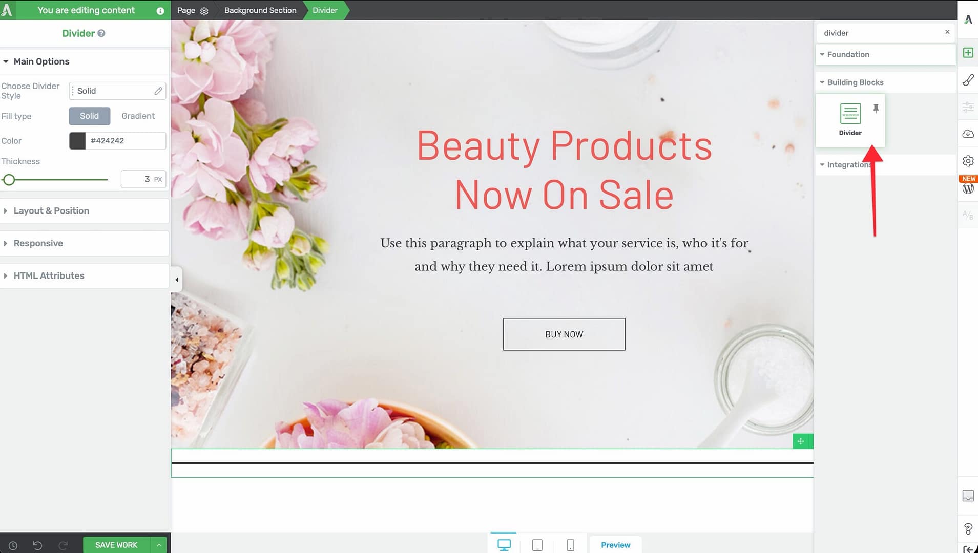
- Alternatively, scroll down to the Building Blocks section in the element list to find the Divider element.
- Drag the element from the panel and drop it onto your page canvas.
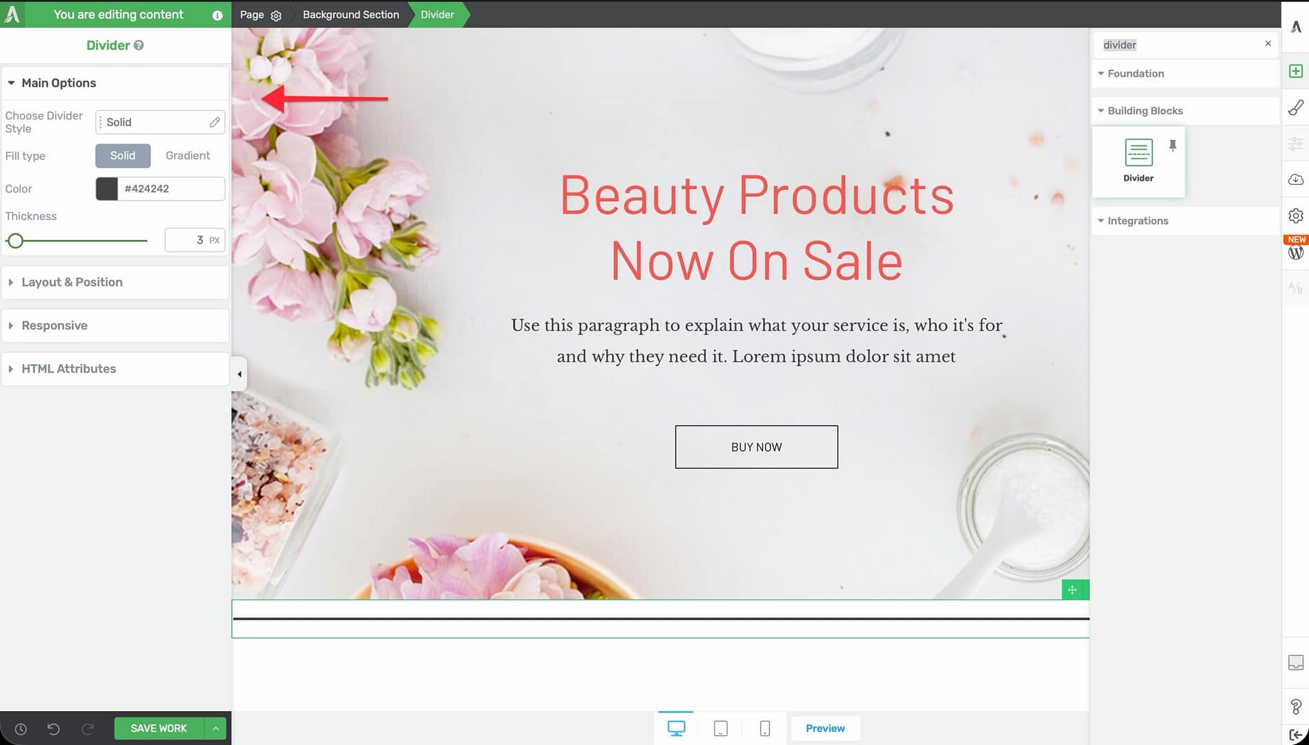
A horizontal divider line will appear on the canvas. You can immediately customize its style, color, and thickness using the left sidebar options.
Configuring the Divider Options
After selecting the Divider element, the left sidebar displays the following options:
Divider Style
A style picker labeled Choose Divider Style with 5 options:
- Solid — A continuous, unbroken line
- Dotted — A line made of evenly spaced dots
- Dashed Slim — A line made of thin dashes with gaps between them
- Dashed Thick — A line made of thick, bold dashes with gaps
- Starred — A decorative line with a star accent in the center
Tip: Use Solid dividers for clean, modern layouts. Use Starred for more decorative designs, such as between sections on a sales page or blog post.
Fill Type
A toggle that switches between two fill modes:
- Solid — A single flat color for the divider line
- Gradient — A two-color gradient that transitions across the length of the divider
Color / Gradient Picker
Depending on the fill type selected:
- Color — A standard color picker for choosing the divider’s solid color
- Gradient — A gradient editor for setting two colors, the gradient direction, and the gradient type
Thickness
A slider that controls the height of the divider line:
- Default: 5px
- Range: 1px to 100px
A thickness of 1–3px works well for subtle separators. Higher values (10px and above) create bold, decorative bands of color.
Common Use Cases for the Divider
Section Separators
Place a Divider between major content sections (such as between an introduction and features list, or between pricing and testimonials) to create clear visual breaks.
Decorative Accents
Use the Starred style or a gradient fill to add decorative flair between sections on a sales page or landing page.
Under Headings
Add a thin, colored Divider directly below a heading to create an underline accent effect. Set the thickness to 2–3px and adjust the width using the Layout & Position options.
Content Grouping
Use Dividers to group related content visually. For example, place Dividers above and below a testimonial quote to frame it as a distinct section.
Part 2: The Star Rating Element
What Is the Star Rating Element?
The Star Rating element displays a graphical star-based rating on your page. It renders a row of stars (or other shapes, depending on the selected style) with a configurable fill level to represent a rating value.
Key characteristics of the Star Rating element:
- Supports a customizable rating value with a default of 2.5 out of 5 (maximum configurable up to 10)
- Includes a Style picker with multiple visual styles
- Provides separate color controls for Fill, Background, and Outline
- Includes a Size slider (10–150px) for scaling the rating display
- Supports External Fields for dynamically populated rating values
- Supports hover state customization
- Typography, Animation, and Styles/Templates options are hidden
Note: The Star Rating element has limited Layout options—Width, Height, Overflow, and Scroll Style controls are not available.
Adding the Star Rating Element to a Page
Follow these steps to add a Star Rating element to your page:
- Open your page or post in the Thrive Architect editor.
- Click the green plus (+) icon in the right sidebar to open the element panel.
- Type Star Rating in the search field at the top of the panel.
- Alternatively, scroll down to the Building Blocks section in the element list to find the Star Rating element.
- Drag the element from the panel and drop it onto your page canvas.
A star rating graphic will appear on the canvas showing the default 2.5 out of 5 rating. You can immediately adjust the rating value, style, and colors in the left sidebar.
Configuring the Star Rating Options
After selecting the Star Rating element, the left sidebar displays the following options:
Rating Value
A numeric control that sets the rating displayed:
- Default value: 2.5
- Default maximum: 5 stars
- Maximum configurable: Up to 10 stars
You can set both the current value (for example, 4.3) and the total number of stars. Partial values are supported—a rating of 4.3 out of 5 will show 4 fully filled stars and one star filled approximately one-third of the way.
Style Picker
A control labeled Style with a Change style button that opens a panel of visual presets. Styles determine the shape and overall appearance of the rating icons (stars, hearts, or other shapes depending on the preset).
Fill Color
A color picker labeled Fill that controls the color of the filled portion of the rating. This is the color that represents the “rated” portion of each star.
Background Color
A color picker labeled Background that controls the color of the unfilled portion of the rating. This is the color visible for the empty or unrated portion of each star.
Outline Color
A color picker labeled Outline that controls the border color around each star. Adjust this to add definition to the stars or to match your page’s color scheme.
Size
A slider that controls the overall size of the star rating graphic:
- Default: 25px
- Range: 10px to 150px
Smaller sizes (10–20px) work well for inline ratings next to text. Larger sizes (50px and above) are suitable for prominent rating displays in testimonial or review sections.
Using External Fields for Dynamic Ratings
The Star Rating element supports External Fields, which let you dynamically populate the rating value from a custom field, ACF field, or other data source. This is especially useful for:
- Product review pages where each product has a rating stored in a custom field
- Testimonial templates in Thrive Theme Builder where the rating varies per testimonial
- Directory or listing pages where each entry has its own rating
To connect an External Field:
- Click on the Star Rating element to select it.
- In the left sidebar, look for the External Fields option.
- Click it to open the external fields picker.
- Select the data source and field that contains your rating value.
The Star Rating element will then display the rating value from the selected field dynamically.
Customizing the Hover State
The Star Rating element supports hover state customization. You can change the fill color, background color, outline color, or size when a visitor hovers over the element.
To customize the hover state:
- Select the Star Rating element on the canvas.
- In the left sidebar, switch to the Hover state using the state dropdown.
- Adjust the colors, size, or other properties for the hover state.
- Switch back to the Normal state to confirm the default appearance.
Tip: A subtle color intensification on hover (such as making the fill color slightly brighter) provides helpful visual feedback, especially when the star rating is used as a clickable link to a reviews section.
Additional Design Options for Star Rating
The Star Rating element supports these standard Thrive Architect design controls:
- Layout & Position — Control margins, padding, display settings, and positioning (Width, Height, Overflow, and Scroll Style are not available)
- Borders & Corners — Add borders and adjust corner radius around the rating container
- Shadow — Apply box shadow effects (text shadow is not available)
Common Use Cases for Star Rating
Product and Service Reviews
Display customer ratings alongside testimonials or product descriptions. Use a large size (50–80px) for prominent placement at the top of a review section.
Testimonial Cards
Add a Star Rating element inside a content box or styled box along with the customer’s name, photo, and testimonial text. This creates a polished review card layout.
Comparison Tables
Include small Star Rating elements (15–25px) in comparison table cells to visually represent how different products or plans score across various criteria.
Dynamic Review Templates
In Thrive Theme Builder, create a review post template that uses External Fields to pull the rating value from a custom field. Each review post automatically displays its own unique rating without manual configuration.
Skill or Proficiency Indicators
Repurpose the Star Rating element to display skill levels, proficiency ratings, or difficulty levels. For example, on a course page, use a 5-star rating to indicate lesson difficulty.
Frequently Asked Questions
Can I Use More Than 5 Stars?
Yes. The Star Rating element supports a maximum of 10 stars. Adjust the maximum value in the rating control to display up to 10 stars or shapes.
Can I Display Half-Star Ratings?
Yes. The Star Rating element supports partial values. A rating of 3.5 will display 3 fully filled stars and one star filled halfway. You can set any decimal value for precise ratings.
Can I Change the Divider Width?
Yes. Use the Layout & Position options to adjust the Divider’s width. You can set it to a percentage of the container width (such as 50%) or a specific pixel value to create shorter dividers centered on the page.
Does the Star Rating Work with WooCommerce Product Ratings?
You can use External Fields to pull WooCommerce product rating data into the Star Rating element if the rating value is stored in a custom field or is accessible through a supported data source.
Can I Use a Gradient on the Divider?
Yes. Switch the fill type to Gradient to apply a two-color gradient across the length of the Divider. This creates a smooth color transition from one end to the other.
Related Resources
- Icon Element: How to Use the Icon Element — Add scalable vector icons for visual accents
- Styled Box: How to Use the Styled Box Element — Pre-designed sections that pair well with dividers and ratings
- Dynamic Content: How to Use Dynamic Content — Populate element data from custom fields and external sources
- Getting Started: Getting Started with Thrive Architect — Overview of the editor and element panel
That’s it! You’ve successfully learned how to use the Divider and Star Rating elements in Thrive Architect. The Divider keeps your layouts clean and organized with five line styles, solid or gradient fills, and adjustable thickness, while the Star Rating delivers polished, dynamic rating displays for reviews, testimonials, and more.