In this article, you’ll learn how to customize the header section of your Thrive Theme Builder templates—including adding a logo, assigning a navigation menu, and creating header buttons.
Accessing the Header Section
- In the Thrive Theme Builder dashboard, click Templates in the left sidebar.
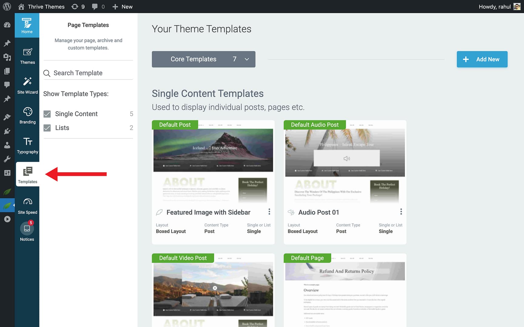
- Hover over the template you want to edit and click Edit.
- In the editor, click on the header area at the top of the template, or go to Main Options in the left sidebar and click Header to select the header section.
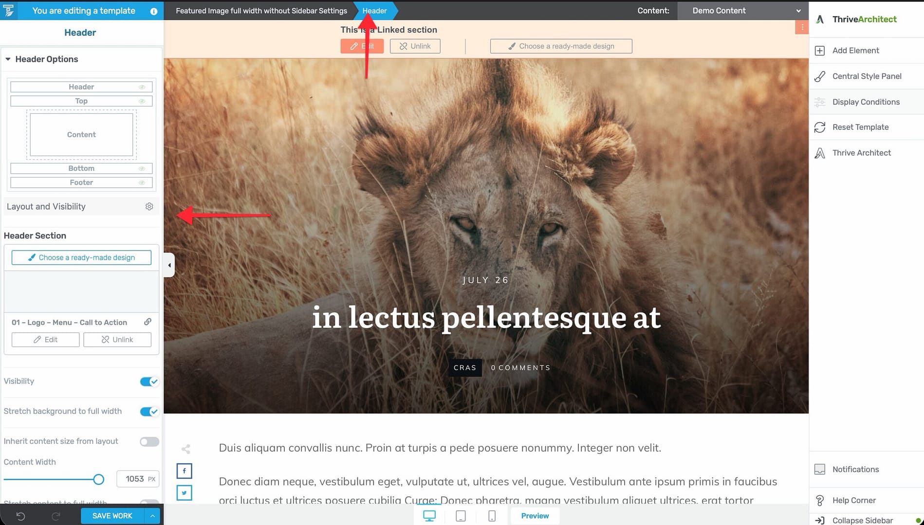
- The header section highlights, and its configuration options appear in the left sidebar.
Header Structure
The default header includes a two-column layout:
- Left column — Contains the site logo.
- Right column — Contains the navigation menu.
You can modify this structure by adding, removing, or rearranging elements within the header section.
Adding a Logo to the Header
The Logo element pulls your site logo from the branding settings you configured in the Thrive Theme Builder dashboard.
Prerequisites
Make sure you’ve already set your website logo in the Branding section of the Thrive Theme Builder dashboard. See Setting Up Your Website Branding for details.
Adding the Logo Element
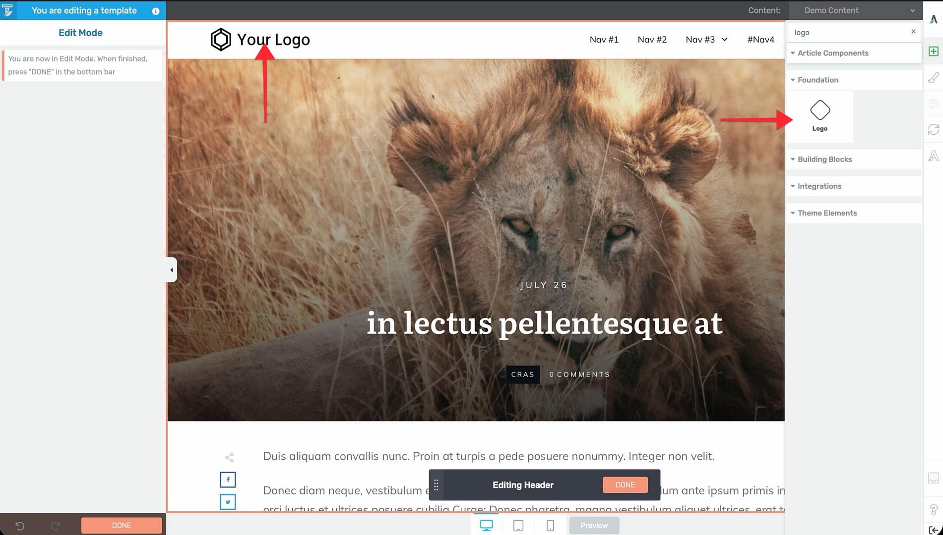
- In the header section, click the plus (+) icon to add a new element.
- Search for Logo in the element panel.
- Drag the Logo element into position in the header.
- The element automatically displays your configured site logo.
You can resize, reposition, and style the logo element using the options in the left sidebar.
Assigning a Menu to the Header
You can assign a WordPress menu to the header using two methods.
Method 1: Using the Site Wizard
- In the Thrive Theme Builder dashboard, open the Site Wizard.
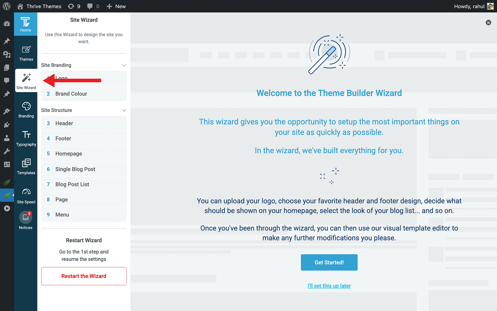
- Navigate to the Menu step.
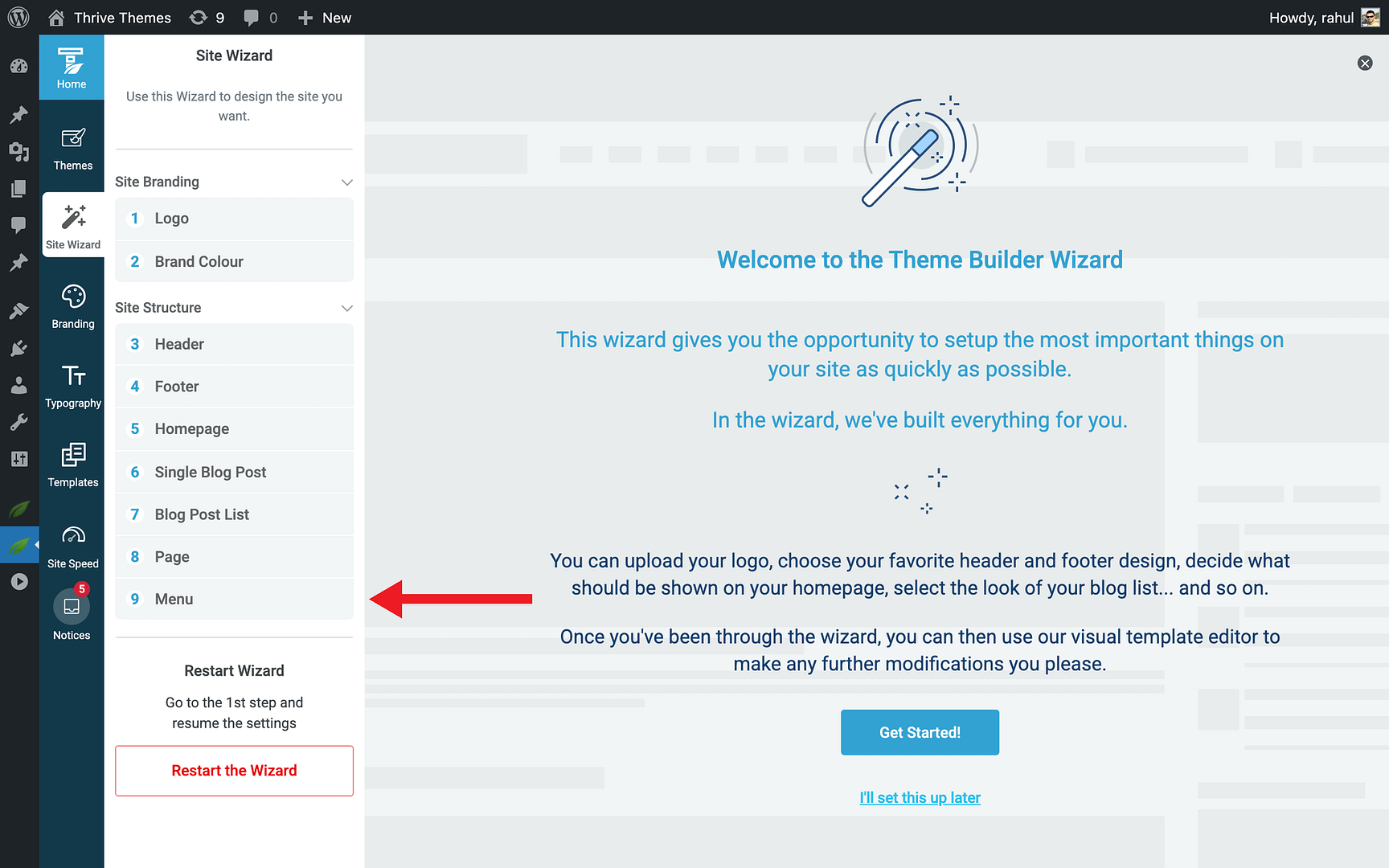
- Select a WordPress menu to assign to the header section.
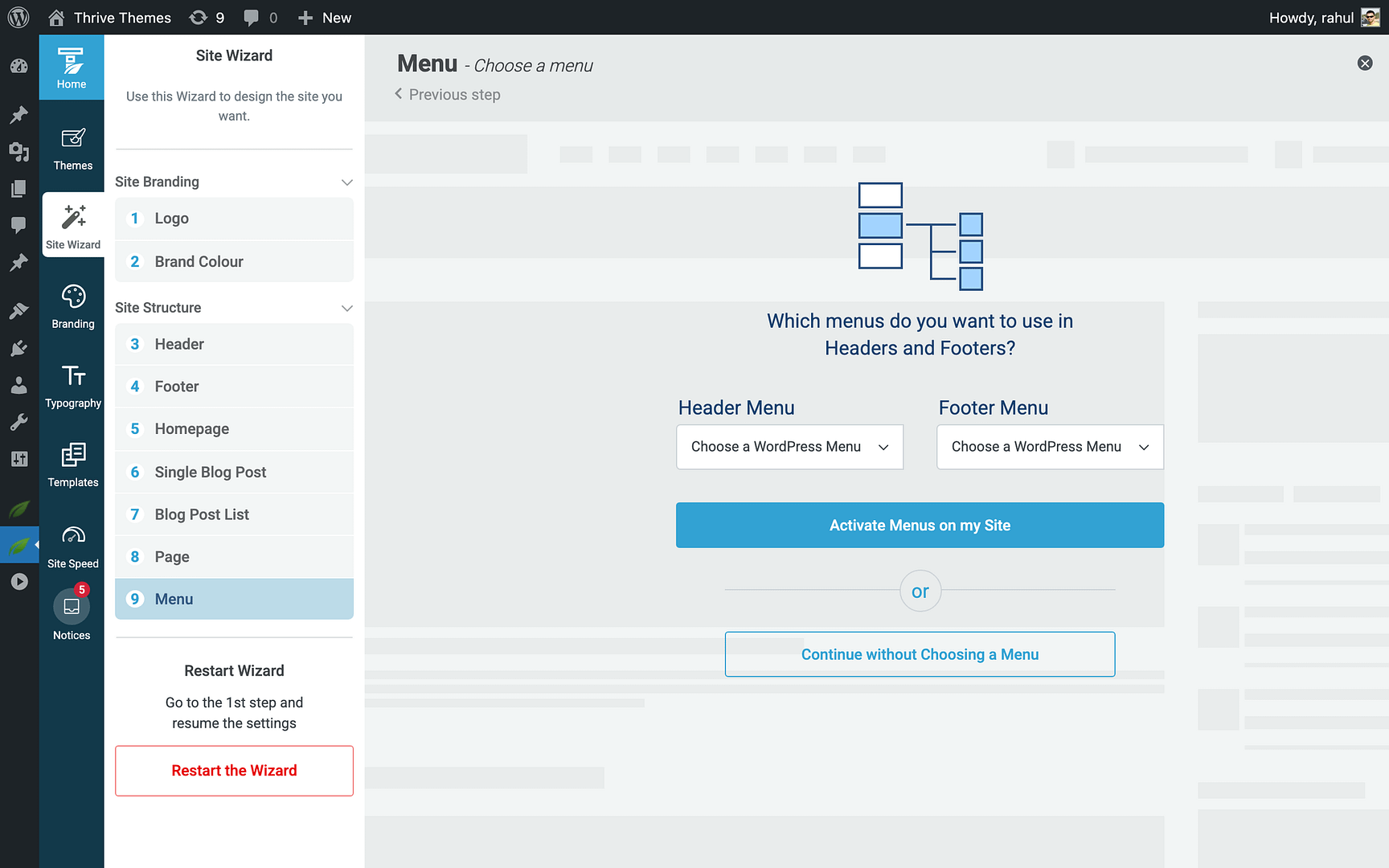
- Complete the wizard.
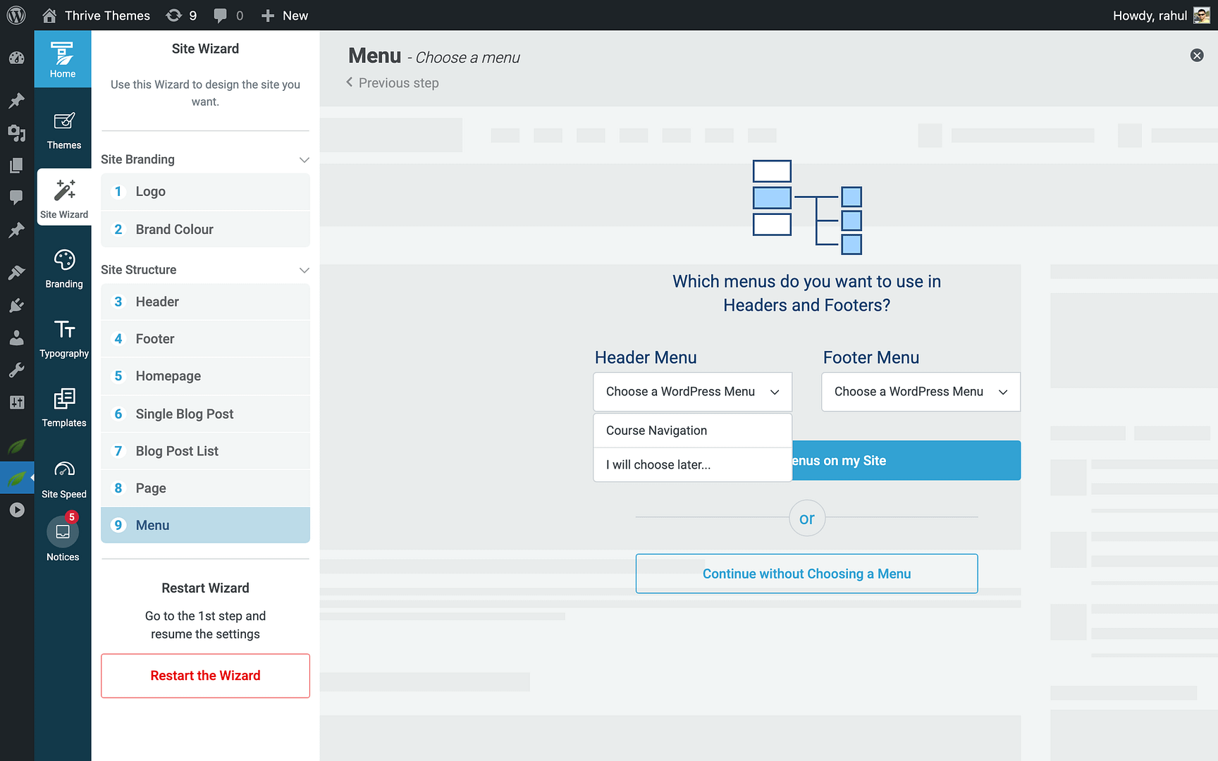
This method is best during initial theme setup.
Method 2: Using the Custom Menu Element
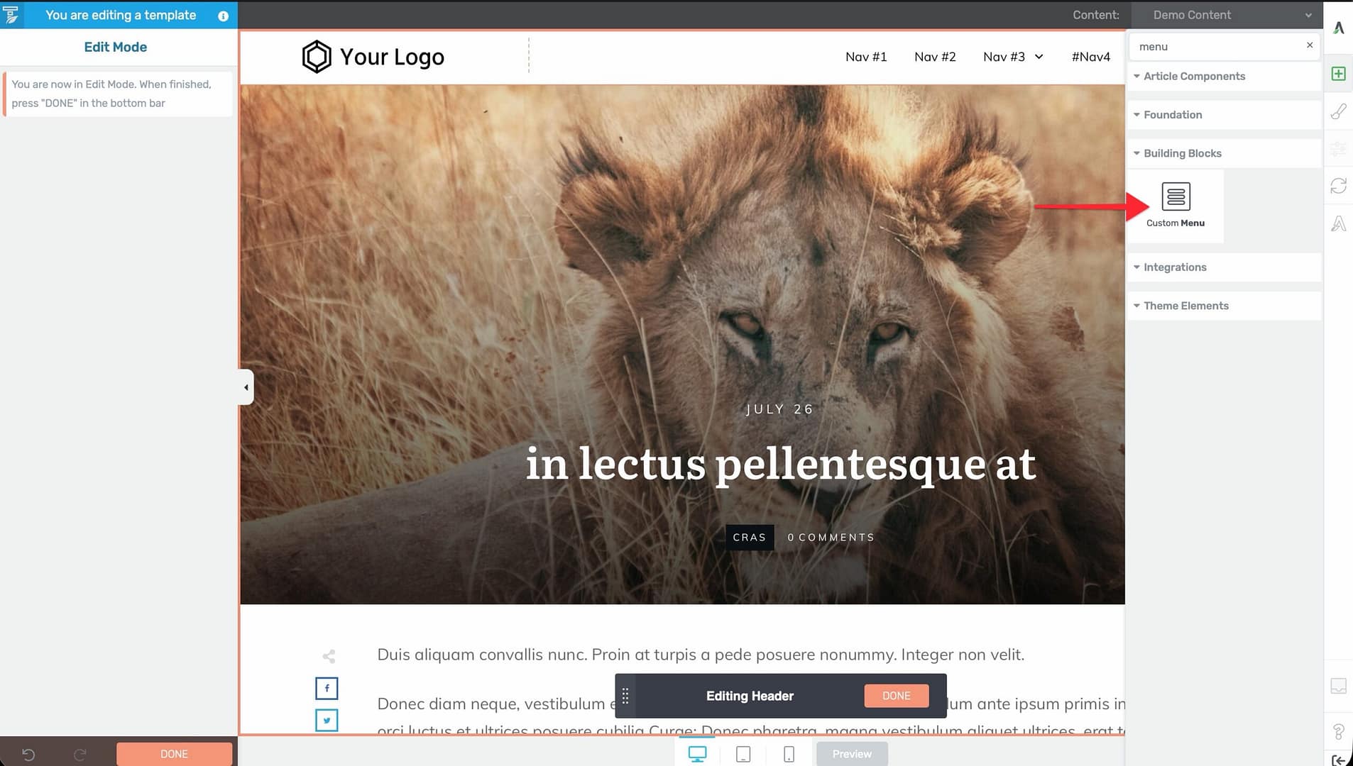
- Open the template in the Thrive Theme Builder editor.
- Click on the header section.
- Add a Custom Menu element to the header from the element panel.
- In the left sidebar, select which WordPress menu to display.
- Configure the menu appearance—horizontal or vertical layout, dropdown behavior, mobile hamburger icon, and styling.
Note: The menus available for selection are the menus you’ve created in Appearance > Menus in the WordPress admin.
Creating a Header Button
You can add a call-to-action button to your header (e.g., “Get Started,” “Contact Us,” or “Sign Up”).
Adding a Button Element
- In the header section, click the plus (+) icon to add a new element.
- Search for Button in the element panel.
- Drag the Button element into position in the header.
- Configure the button text, link, colors, and styling in the left sidebar.
Using Elements with Built-In Buttons
Some other elements include built-in button functionality. For example, opt-in form elements or call-to-action elements may include a button that you can customize within the header.
Customizing the Header Design
With the header section selected, the left sidebar provides options to customize:
- Background — Set a background color, gradient, or image.
- Padding and margins — Adjust spacing inside and outside the header.
- Height — Control the header height.
- Border — Add borders or separators.
- Scroll behavior — Configure how the header behaves when visitors scroll. See Using Scroll Behavior Options in a Header.
- Responsive settings — Adjust the header design for different devices (desktop, tablet, mobile).
Header as a Global Element
When you save a header design in Thrive Theme Builder, it automatically becomes a Global Element in the Thrive Dashboard. This means:
- The header is reusable across multiple templates.
- Changes to the header update everywhere it’s used.
- You can also insert the saved header into Thrive Architect landing pages.
Best Practices
- Keep the header compact — The header appears on every page, so keep it clean and focused on essential elements (logo, navigation, one CTA button).
- Use a sticky or reveal-on-scroll behavior — For long pages, consider making the header sticky or setting it to reveal on scroll up so visitors can always access navigation.
- Test on mobile — The header often requires the most attention on mobile devices. Ensure the logo, menu (hamburger icon), and any buttons are properly sized and positioned.
- Limit header buttons to one — Multiple CTA buttons in the header can confuse visitors. Use a single, clear call to action.
Related Resources
- Using the Footer Section: Learn how to customize the footer.
- Using Headers & Footers on Landing Pages: Learn how to use theme headers on landing pages.
- Using Scroll Behavior Options: Learn how to configure header scroll behavior.