In this article, you’ll learn how to use the Icon element in Thrive Architect. This element lets you add scalable vector icons to your pages, choose from multiple style presets, apply solid or gradient colors, and optionally link icons to any URL.
The Icon element is a flexible building block that draws from your installed icon sets. Icons are vector-based, so they scale cleanly at any size without losing quality. You can use them standalone as visual accents, inside buttons and feature boxes, or as linked navigation elements throughout your pages.
What Is the Icon Element?
The Icon element displays a single scalable icon from one of your installed icon sets. Unlike image files, icons are rendered as vectors, which means they stay crisp at any size and can be recolored instantly without editing an image file.
Key characteristics of the Icon element:
- Draws icons from your installed icon sets (managed in the Thrive Dashboard)
- Offers 9 style presets including circle, rounded, and square variations with outlined, shaded, and inverted options
- Supports Solid and Gradient color modes
- Includes a Size slider (12–200px) and a Rotate slider (-180 to 180 degrees)
- Can be linked to any URL with a built-in link control
- Supports hover state customization for interactive effects
- Compatible with Font Awesome Pro when integrated through the Thrive Dashboard
Adding the Icon Element to a Page
Follow these steps to add an Icon element to your page:
- Open your page or post in the Thrive Architect editor.
- Click the green plus (+) icon in the right sidebar to open the element panel.
- Type Icon in the search field at the top of the panel.
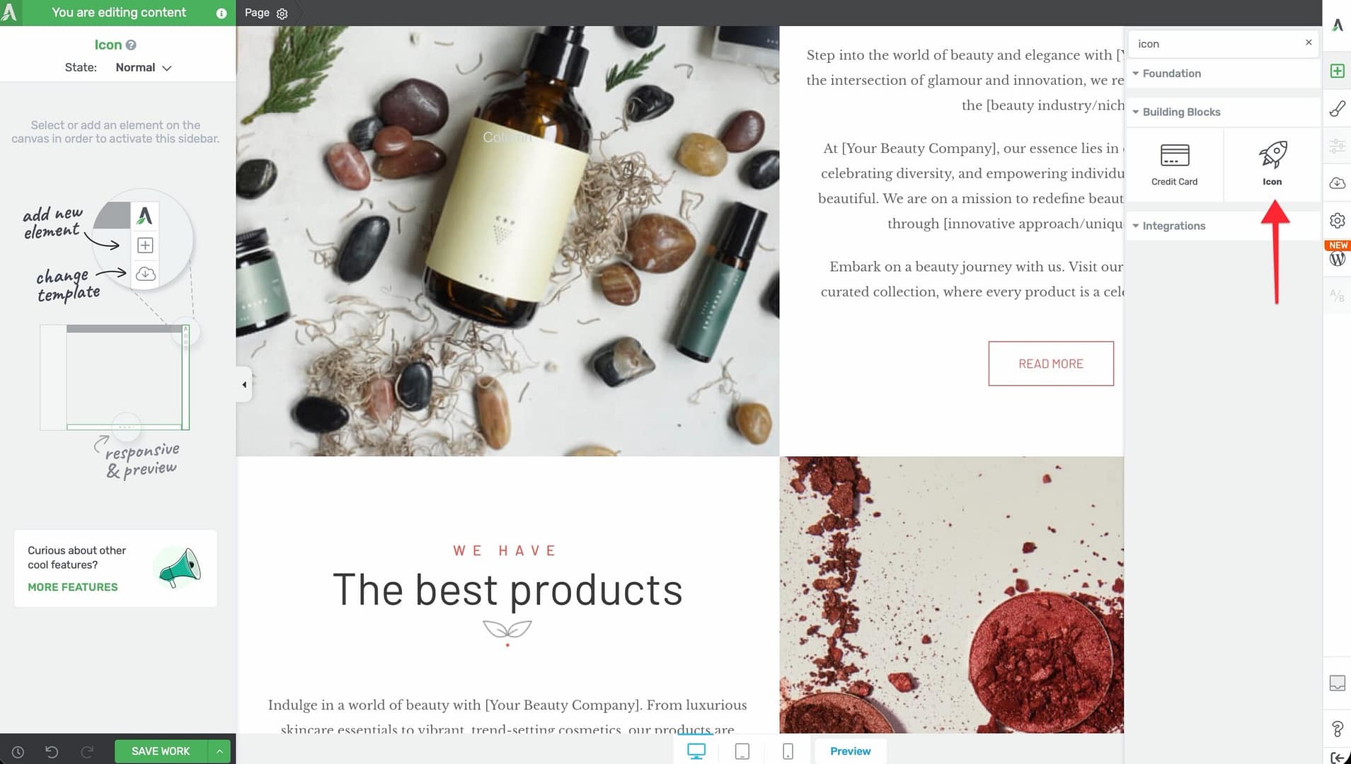
- Alternatively, scroll down to the Building Blocks section in the element list to find the Icon element.
- Drag the element from the panel and drop it onto your page canvas.
A default icon will appear on the canvas. You can immediately begin customizing it using the options in the left sidebar.
Configuring the Main Options
After selecting the Icon element, the left sidebar displays the following options:
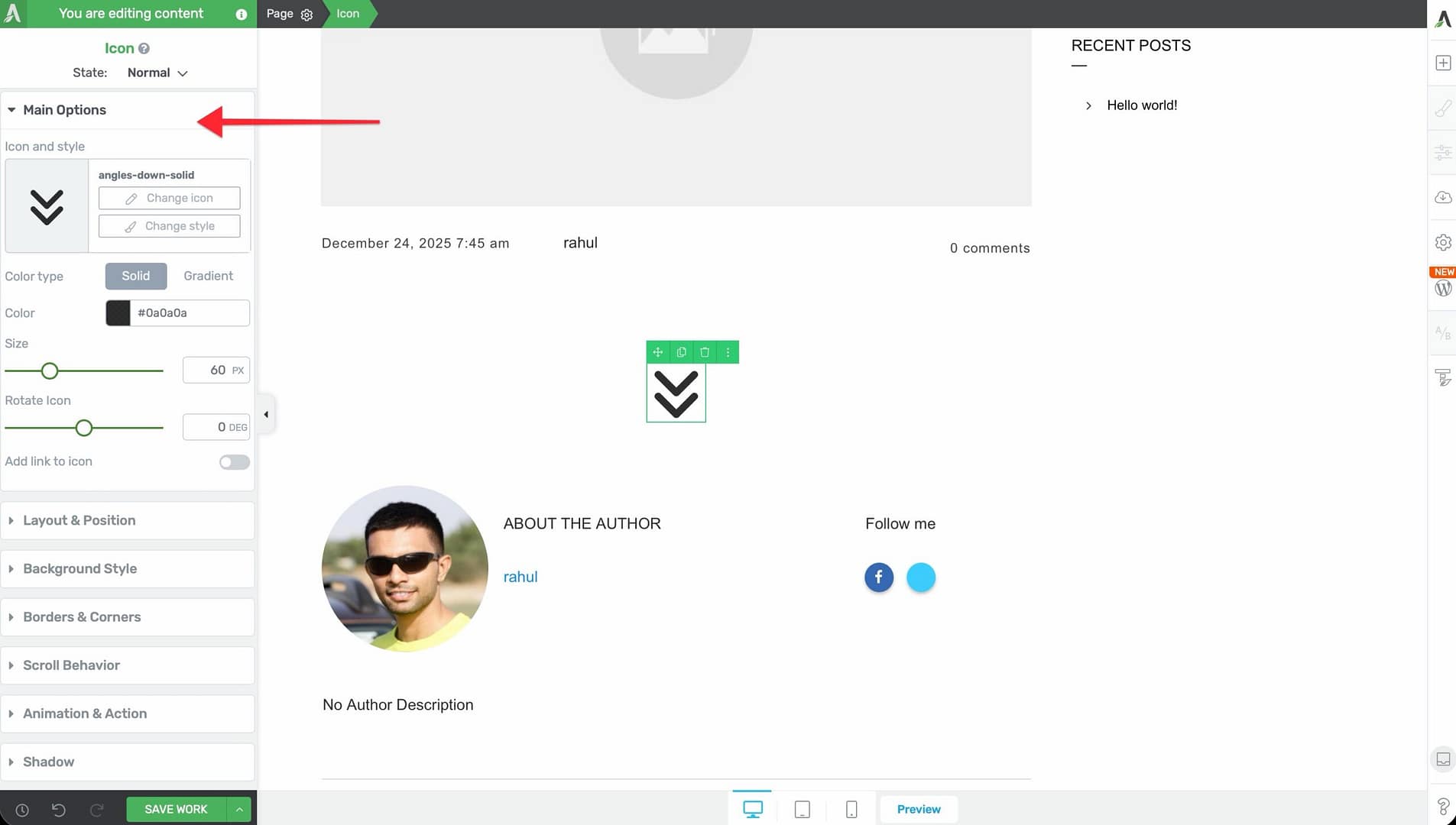
Icon and Style Picker
The Icon and style control at the top of the sidebar opens a modal with two actions:
- Change style — Select one of the 9 style presets (see below)
- Change icon — Browse your installed icon sets and select a different icon
Click either button to open the corresponding picker. The icon picker displays all available icons from your installed icon sets, with a search field to quickly find specific icons.
Style Presets
The Icon element includes 9 style presets that control the visual frame around the icon:
- Circle Outlined — A circular border around the icon with a transparent background
- Circle Shaded — A circle with a colored background behind the icon
- Circle Inverted — A filled circle where the icon color and background color are swapped
- Rounded Outlined — A rounded-rectangle border with a transparent background
- Rounded Shaded — A rounded rectangle with a colored background
- Rounded Inverted — A filled rounded rectangle with inverted colors
- Square Outlined — A square border with a transparent background
- Square Shaded — A square with a colored background
- Square Inverted — A filled square with inverted colors
Color Type
A toggle that switches between two color modes:
- Solid — A single flat color applied to the icon
- Gradient — A two-color gradient applied to the icon
Color / Gradient Picker
Depending on the color type selected:
- Color — A standard color picker for choosing the icon’s solid color
- Gradient — A gradient editor where you set two colors, the gradient direction, and the gradient type (linear or radial)
Style Color
A separate color picker labeled Style color that controls the background or border color of the style preset. This is available when you’ve selected one of the 9 style presets (not the plain icon without a style).
For example, if you’ve selected Circle Shaded, the Style color controls the background fill of the circle, while the main Color controls the icon itself.
Size
A slider that controls the icon size:
- Default: 30px
- Range: 12px to 200px
Drag the slider or type a value to set the exact size you need.
Rotate Icon
A slider that rotates the icon:
- Default: 0 degrees
- Range: -180 to 180 degrees
This is useful for flipping directional icons (such as arrows or chevrons) without needing a separate icon for each direction.
Add Link to Icon
A toggle switch that, when enabled, reveals a Link control below it. Use this to make the icon clickable and link it to any URL.
When the link is enabled, you can:
- Enter a destination URL
- Choose whether the link opens in a new tab
- Set a nofollow attribute
- Add a custom title attribute
Customizing the Hover State
The Icon element supports hover state customization, allowing you to create interactive effects when visitors move their cursor over the icon.
To customize the hover state:
- Select the Icon element on the canvas.
- In the left sidebar, switch to the Hover state using the state dropdown at the top.
- Adjust the color, style color, size, rotation, or other properties for the hover state.
- Switch back to the Normal state to confirm the default appearance.
Common hover effects include changing the icon color, scaling the icon size up slightly, or swapping between outlined and inverted style colors.
Managing Icon Sets in the Thrive Dashboard
The icons available in the Icon element come from icon sets managed in the Thrive Dashboard. To add, remove, or update icon sets:
- Navigate to your WordPress admin area.
- Go to Thrive Dashboard in the left sidebar menu.
- Click on Icon Manager.
- From here, you can:
- Browse and enable built-in icon sets
- Upload custom icon sets (SVG icon fonts)
- Remove icon sets you no longer need
Font Awesome Pro Integration
If you have a Font Awesome Pro license, you can integrate it with Thrive Architect to access the full Font Awesome Pro icon library:
- In the Thrive Dashboard, go to the Icon Manager.
- Look for the Font Awesome integration option.
- Enter your Font Awesome Pro kit code or CDN link.
- Once connected, all Font Awesome Pro icons will be available in the Icon element’s icon picker.
Additional Design Options
The Icon element supports the following standard Thrive Architect design controls:
- Layout & Position — Control margins, padding, display settings, and element positioning
- Borders & Corners — Add borders and adjust corner radius around the icon container
- Shadow — Apply box shadow effects to the icon (text shadow is not available)
- Background — Add a background color or image behind the icon container
- Animation — Apply entrance animations to the icon element
Common Use Cases
Feature Lists with Icons
Place Icon elements alongside text to create visually appealing feature lists. Use a consistent style preset (such as Circle Shaded) and color scheme across all icons for a cohesive look.
Social Media Links
Add Icon elements for each social media platform (Facebook, Twitter/X, Instagram, LinkedIn, YouTube) and link each one to the corresponding profile URL. Use the Add Link to Icon toggle to make each icon clickable.
Navigation and Action Indicators
Use linked icons as navigation shortcuts—such as a phone icon linking to a contact page, an envelope icon linking to an email address, or a download icon linking to a file.
Decorative Accents
Place small icons near headings, inside content boxes, or alongside testimonials to add visual interest. Icons break up text-heavy layouts and draw the eye to important sections.
Icon-Based Step Indicators
Combine numbered or themed icons with text to create step-by-step process indicators. For example, use a pencil icon for “Step 1: Write,” a paintbrush icon for “Step 2: Design,” and a rocket icon for “Step 3: Launch.”
Frequently Asked Questions
How Do I Change the Icon After Adding It?
Click on the Icon element, then click Change icon in the left sidebar. The icon picker modal will open, allowing you to browse and select a different icon from your installed sets.
Can I Use Custom SVG Icons?
Yes. Upload custom SVG icon fonts through the Icon Manager in the Thrive Dashboard. Once uploaded, your custom icons will appear in the icon picker alongside the built-in sets.
Why Is My Icon Blurry?
Icons rendered through the Icon element are vector-based and should never appear blurry. If you’re experiencing blurriness, make sure you’re using the Icon element (not an image of an icon) and that your browser zoom level is set to 100%.
Can I Animate the Icon?
Yes. The Icon element supports entrance animations through the standard Animation options. However, the rotation slider under the main options is a static rotation—it does not animate.
How Do I Make an Icon the Same Color as My Theme?
Use the Color picker and enter the exact hex code or RGB value from your theme’s color palette. You can also use Thrive’s global color system to apply a linked color that updates across your entire site.
Related Resources
- Divider and Star Rating: How to Use the Divider and Star Rating Elements — Other decorative building block elements
- Styled Box: How to Use the Styled Box Element — Pre-designed sections that often include icons
- Styling and Design: How to Customize Colors and Fonts — Global color management for consistent icon coloring
- Getting Started: Getting Started with Thrive Architect — Overview of the editor and element panel
That’s it! You’ve successfully learned how to use the Icon element in Thrive Architect. With 9 style presets, solid and gradient coloring, size and rotation controls, hover states, and Font Awesome Pro support, you can add polished, scalable icons to any page design.