In this article, you’ll learn how to use the Image element in Thrive Architect. This element lets you add, style, and optimize images on your pages with options for sizing, captions, image effects, hover states, and accessibility.
The Image element is one of the most commonly used elements in Thrive Architect. Whether you’re adding a product photo, a team headshot, or a decorative graphic, the Image element provides full control over how your images look, behave, and load.
Adding an Image to Your Page
Follow these steps to add an Image element to your page:
- Open your page or post in the Thrive Architect editor.
- Click the green plus (+) icon in the right sidebar to open the element panel.
- Type Image in the search field at the top of the panel.
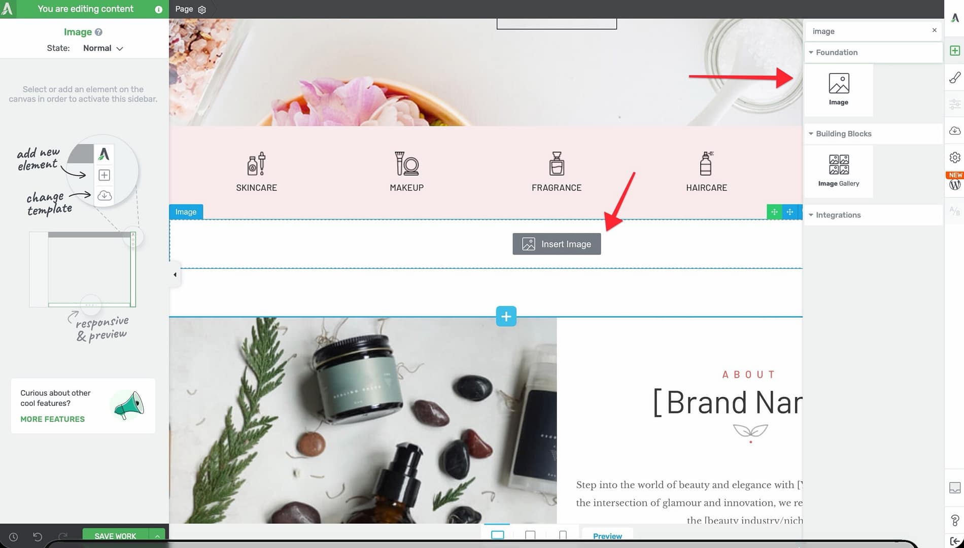
- Drag the Image element from the panel and drop it onto your page canvas.
- A placeholder image will appear. Click the Replace image button in the left sidebar to open the WordPress Media Library and select your image.
Once your image is placed, click on it to select it. The element’s options will appear in the left sidebar.
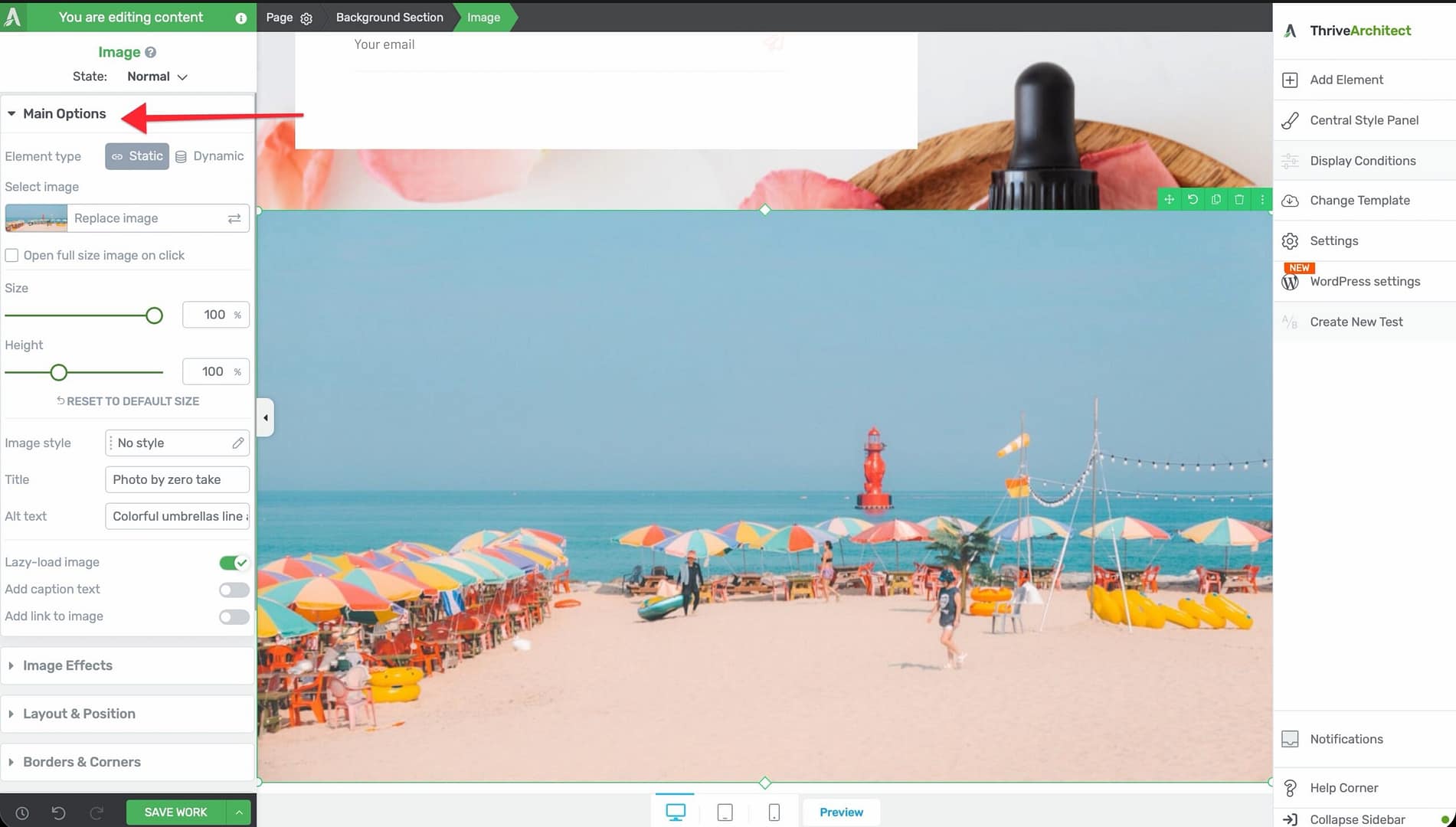
Main Options
When you select an Image element, the following options appear in the left sidebar:
External Fields
Connect the image source to dynamic data instead of a static upload:

- Featured image — Display the post’s or page’s featured image
- Author image — Show the post author’s avatar
- User image — Display the logged-in user’s profile image
- Custom fields — Pull an image from a custom field (such as Advanced Custom Fields)
This is especially useful when designing templates or dynamic layouts where the image should change based on the content.
Replace Image
Click the Replace image button to open the WordPress Media Library, where you can upload a new image or select an existing one from your library.
Open Full Size Image on Click
A checkbox that, when enabled, opens the full-resolution version of the image in a lightbox when a visitor clicks on it.
- Default: Disabled
Size
A slider that controls the display width of the image.
- Default: Auto
- Range: 30–1024px (or %)
- Minimum forced value: 5
The image will scale proportionally based on the width you set.
Height
A slider that controls the display height of the image.
- Default: Auto
- Range: 5–300
When set to auto, the height adjusts proportionally to the width. Setting a specific height may crop or stretch the image depending on its aspect ratio.
Reset to Default Size
A button that restores the image to its original uploaded dimensions, removing any manual size overrides.
Image Style
A dropdown that applies a preset visual style to your image:
- No style — The image appears as-is with no decorative treatment
- Dark frame — A dark border around the image
- Framed — A light frame with subtle shadow
- Lifted style 1 — A lifted shadow effect on one side
- Lifted style 2 — A lifted shadow effect on both sides
- Polaroid — A white border resembling a Polaroid photograph
- Rounded corners — Rounded corners applied to the image
- Circle — The image is cropped into a circular shape
- Caption overlay — A semi-transparent overlay area for caption text
youtube:https://www.youtube.com/watch?v=5MR6cGVcA1k
Title
A text input field for the image’s HTML title attribute. This text appears as a tooltip when a visitor hovers over the image.
Alt Text
A text input field for the image’s alt attribute. Alt text is critical for:
- Accessibility — Screen readers use alt text to describe images to visually impaired users
- SEO — Search engines use alt text to understand the content of your images
Important: Always provide descriptive alt text for every image. Use a brief, accurate description of what the image shows.
Lazy-Load Image
A toggle switch that controls whether the image uses lazy loading.
- Default: Enabled
- When enabled, the image only loads when it scrolls into (or near) the visitor’s viewport, improving page load speed
- Disable this for above-the-fold images that should load immediately
Add Caption Text
A toggle switch that adds a caption area below the image.
- Default: Disabled
- When enabled, a text field appears below the image where you can type a caption
Add Link to Image
A toggle switch that wraps the image in a hyperlink, making the entire image clickable.
- When enabled, link configuration options appear where you can set the destination URL, target (new tab or same tab), and rel attributes
Image Effects
Click on the Image Effects panel in the left sidebar to access visual effect filters:
- Greyscale — Convert the image to black and white
- Opacity — Adjust the image transparency
- Blur — Apply a blur effect to the image
- Brightness — Increase or decrease the image brightness
- Contrast — Adjust the contrast level
- Sepia — Apply a warm sepia tone
- Invert — Invert the image colors
- Saturate — Increase or decrease color saturation
- Hue Rotate — Shift the color hue across the spectrum
Additionally, the Image Effects panel includes:
- Image Overlay — A toggle switch that adds a color overlay on top of the image. When enabled, an Overlay color picker appears.
- Reset to Default — A button that removes all applied effects and restores the original image appearance.
Tip: Combine a greyscale effect with a colored overlay to create a branded duotone look that matches your site’s color scheme.
Hover State
The Image element supports a hover state, allowing you to define different styling when a visitor moves their mouse over the image:
- Click on the State toggle at the top of the left sidebar.
- Select Hover.
- Adjust any styling property—image effects, borders, shadows, or opacity.
- Switch back to Normal to return to the default state.
This is commonly used to create image hover animations, such as transitioning from greyscale to full color on hover.
Wrapping Text Around an Image
You can wrap text around an Image element to create a magazine-style layout:
- Add an Image element inside the same container as a Text element.
- Select the Image element.
- Open the Layout & Position options in the left sidebar.
- Set the Float property to Left or Right.
- The adjacent text will flow around the image.
Method 2: Using Columns (Recommended for Responsive Pages) — For better mobile responsiveness, place the image and text in a two-column layout using the Columns element. This ensures the image and text stack properly on smaller screens, unlike the Float method which can cause layout issues on mobile devices.
Additional Styling and Design Options
Beyond the main options and image effects, the Image element supports:
- Borders & Corners — Set border width, style, color, and corner radius for each side independently
- Shadow — Add an inner or outer box shadow for depth
- Layout & Position — Control margins, padding, alignment, float, and positioning
- Animation — Apply entrance animations when the image scrolls into view
- Scroll Effects — Add parallax or other scroll-triggered behaviors
- Conditional Display — Show or hide the image based on visitor criteria
- Responsive — Override size, visibility, and spacing per device type (desktop, tablet, mobile)
Common Use Cases
Hero Image
Create a full-width hero image at the top of your page:
- Add a Background Section to your page.
- Drop an Image element inside the section.
- Set the Size to 100% so the image fills the available width.
- Disable Lazy-Load Image since this is above-the-fold content.
Team Member Photo
Display a circular headshot for a team page:
- Add an Image element inside a Column.
- Select the Circle option from the Image Style dropdown.
- Set a consistent Size (for example, 200px) across all team photos.
- Add Alt Text with the person’s name and role.
Product Gallery With Hover Effects
Create interactive product images:
- Add Image elements in a Columns layout.
- In the Image Effects panel, apply a slight Greyscale or reduced Opacity.
- Switch to the Hover state and set effects back to full color and full opacity.
- Visitors will see images “come alive” when they hover over them.
Frequently Asked Questions
How Do I Make an Image a Clickable Link?
Enable the Add link to image toggle in the left sidebar. Enter the destination URL in the link settings that appear.
Can I Use a Dynamic Image Source?
Yes. Use the External Fields option to connect the image to a featured image, author image, user image, or custom field. The image will change dynamically based on the content being displayed.
Why Is My Image Blurry?
This usually means the uploaded image resolution is too low for the display size. Upload a higher-resolution version of the image, or reduce the display Size to match the image’s native resolution.
Related Resources
- Image Gallery: How to Use the Image Gallery Element — Display multiple images in grid, masonry, or carousel layouts
- Background Styles: How to Use Background Styles — Use images as section or element backgrounds
- Responsive Design: How to Use Responsive Design Options — Optimize images for different screen sizes
That’s it! You’ve successfully learned how to use the Image element in Thrive Architect. From basic image placement to advanced hover effects, dynamic sources, and text wrapping, the Image element gives you everything you need to present visual content professionally.