In this article, you’ll learn how to use the Image Gallery element in Thrive Architect. This element lets you display multiple images in organized layouts including grid, masonry, and carousel formats—complete with lightbox support, captions, and per-image editing.
The Image Gallery element is designed for showcasing collections of images, such as product photos, portfolio work, team headshots, or event galleries. Instead of manually arranging individual Image elements, the gallery handles layout, spacing, and interactive behavior automatically.
Adding an Image Gallery to Your Page
Follow these steps to add an Image Gallery to your page:
- Open your page or post in the Thrive Architect editor.
- Click the green plus (+) icon in the right sidebar to open the element panel.
- Type Image Gallery in the search field at the top of the panel.
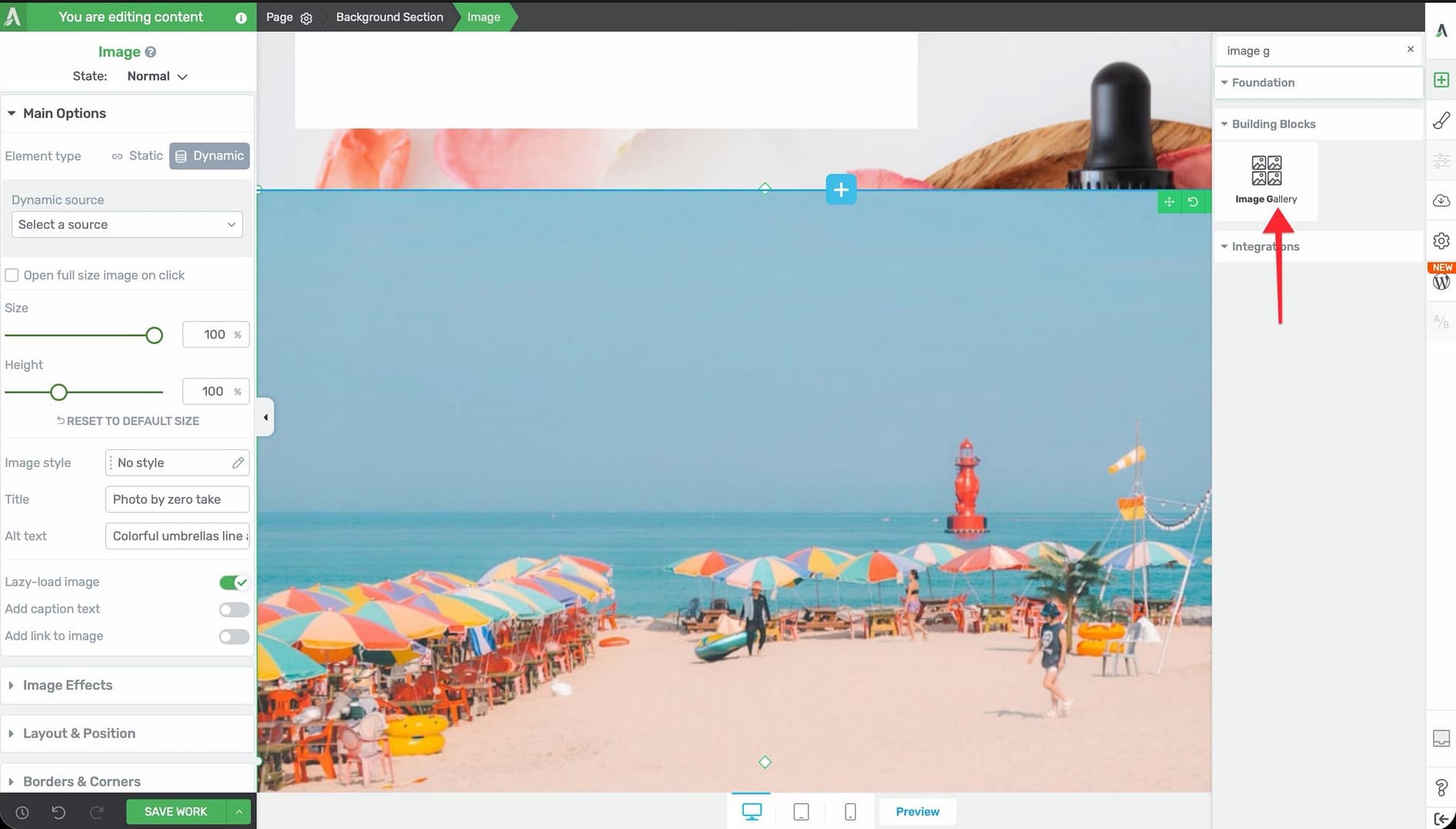
- Drag the element from the panel and drop it onto your page canvas.
- The gallery will appear with placeholder content. Click the Edit selection button in the left sidebar to open the WordPress Media Library, where you can select multiple images for your gallery.
Once your images are selected, the gallery will display them using the default grid layout. Click on the gallery to access its options in the left sidebar.
Main Options
When you select an Image Gallery, the following options appear in the left sidebar:
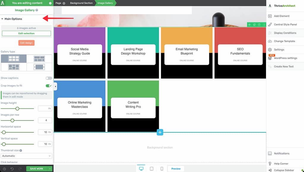
Image Count and Edit Selection
At the top of the options panel, you’ll see the number of images currently in the gallery. Click the Edit selection button to add, remove, or reorder images through the WordPress Media Library.
Edit Design
An orange Edit design button that switches the gallery into edit mode. In edit mode, you can:
- Click on individual images to adjust their position, crop area, or caption
- Drag images to reposition them within the layout
- Access per-image settings
Note: Images can be repositioned by dragging them while in edit mode, which is especially useful when Crop images to fit is enabled.
Gallery Type
Choose from four layout types, each represented by an icon:
- Grid (default) — Images are arranged in uniform rows and columns with equal sizing
- Vertical Masonry — Images maintain their original aspect ratios and are arranged in a Pinterest-style vertical masonry layout
- Horizontal Masonry — Images are arranged in rows where each row’s height adjusts to fill the available width
- Carousel — Images are displayed in a horizontal slider that visitors can navigate through
Show Captions
A toggle switch that displays caption text below each image in the gallery.
- Default: Disabled
- When enabled, captions are pulled from the image’s caption field in the WordPress Media Library
Crop Images to Fit
A toggle switch that controls whether images are cropped to fill their allocated space uniformly.
- Default: Enabled
- When enabled, all images are cropped to the same dimensions for a clean, uniform look
- When disabled, images maintain their original aspect ratios, which may create uneven row heights in Grid mode
Image Height
A slider that controls the height of images in the gallery.
- Range: 1–800px
- This is most relevant in Grid and Carousel layouts where uniform image sizing is desired
Images Per Row / Columns
A slider that sets how many images appear in each row.
- Default: 3
- Range: 1–10
- In Grid and Vertical Masonry modes, this determines the number of columns
Horizontal Space
A slider that controls the horizontal gap between images.
- Range: 0–240px
Vertical Space
A slider that controls the vertical gap between rows of images.
- Range: 0–240px
Column Height
A slider that sets the height of each column in masonry layouts.
- Range: 1–800px
Gutter
A slider that controls the spacing between images in masonry and carousel layouts.
- Range: 0–240px
Thumbnail Size
A dropdown that controls the resolution of gallery thumbnails:
- Automatic — WordPress selects the appropriate size based on the layout
- Medium — Uses the medium-size version of each image
- Large — Uses the large-size version for higher quality display
Click Behavior
A dropdown that defines what happens when a visitor clicks on a gallery image:
- Open fullscreen lightbox — The clicked image opens in a full-screen overlay with navigation arrows to browse through all gallery images
- None — Clicking has no effect (links can still be added to individual images in edit mode)
Show Captions on Lightbox
A toggle switch that displays image captions within the lightbox overlay.
- Default: Disabled
- Only available when Click Behavior is set to Open fullscreen lightbox
Carousel Options
When you select the Carousel gallery type, additional carousel-specific controls appear:
The Carousel controls section includes the following specific controls:
- Navigation Arrows (switch) — Show or hide navigation arrows on the sides of the carousel
- Autoplay (switch) — Automatically cycle through images without user interaction
- Autoplay Speed (slider) — Time between transitions in seconds
- Transition Speed (slider) — Animation duration for each slide transition
- Animation Style (dropdown) — Choose the transition effect (slide, fade, etc.)
- Loop (switch) — Restart from the beginning after the last image
- Show Dots (switch) — Display navigation dots below the carousel
Tip: Carousels work well for testimonial images, product showcases, or before-and-after photo series where you want visitors to actively browse through images.
Editing Individual Images
To customize individual images within the gallery:
- Click the Edit design button to enter edit mode.
- Click on any image to select it.
- Adjust the image’s crop position by dragging it within its frame.
- Add or edit the image’s caption, link, or alt text.
- Click outside the gallery or press the Done button to exit edit mode.
Additional Styling and Design Options
Beyond the main options, the Image Gallery element supports:
- Borders & Corners — Set border width, style, color, and corner radius for the gallery container or individual images
- Shadow — Add a box shadow to the gallery container
- Layout & Position — Control margins, padding, and alignment of the gallery
- Animation — Apply entrance animations when the gallery scrolls into view
- Scroll Effects — Add scroll-triggered behaviors
- Conditional Display — Show or hide the gallery based on visitor criteria
- Responsive — Override columns, spacing, and visibility per device type
Common Use Cases
Portfolio Showcase
Display your work in a clean grid layout:
- Add an Image Gallery element to your page.
- Select your portfolio images from the Media Library.
- Set Gallery Type to Grid.
- Set Images Per Row to 3 or 4.
- Enable Crop images to fit for a uniform look.
- Set Click Behavior to Open fullscreen lightbox so visitors can view full-resolution images.
Product Photo Carousel
Create a browsable product image slider:
- Add an Image Gallery element.
- Upload your product photos.
- Set Gallery Type to Carousel.
- Configure the carousel controls for autoplay and navigation.
- Enable Show Captions to display product names or descriptions below each image.
Masonry Photo Wall
Create a Pinterest-style layout that preserves each image’s original proportions:
- Add an Image Gallery element.
- Select a variety of landscape and portrait images.
- Set Gallery Type to Vertical Masonry.
- Set Columns to 3 or 4.
- Adjust the Gutter to 10–20px for subtle spacing between images.
Black and White Image Carousel
Create a stylized carousel with monochrome images:
- Add an Image Gallery element and set Gallery Type to Carousel.
- Upload your images.
- Click the Edit design button to enter edit mode. Select an image, then use the Image Effects panel to set Greyscale to 100%. Switch to the Hover state and set Greyscale back to 0%. Repeat for each image. This creates a black-and-white to color transition on hover using Thrive Architect’s built-in effects.
- Configure carousel navigation and autoplay settings.
Frequently Asked Questions
How Do I Reorder Images in the Gallery?
Click the Edit selection button to open the Media Library. You can drag and drop images to rearrange their order. Alternatively, enter edit mode with the Edit design button and drag images directly on the canvas.
What Image Sizes Should I Upload?
For best results, upload images that are at least as large as the largest display size you plan to use. The Thumbnail Size dropdown lets you control which WordPress image size is used for rendering. Using appropriately sized thumbnails helps balance quality with page load speed.
Can I Add Links to Individual Gallery Images?
Yes. Click the Edit design button to enter edit mode, then click on an individual image to access its link settings. This works when Click Behavior is set to None.
Can I Mix Different Image Aspect Ratios?
Yes. The Vertical Masonry and Horizontal Masonry layouts are specifically designed for mixed aspect ratios. In Grid mode, enable Crop images to fit to normalize different aspect ratios into a uniform layout.
Related Resources
- Image Element: How to Use the Image Element — Add and style individual images
- Columns: How to Use the Columns Element — Create multi-column layouts for manual image arrangements
- Responsive Design: How to Use Responsive Design Options — Optimize gallery layouts for different screen sizes
That’s it! You’ve successfully learned how to use the Image Gallery element in Thrive Architect. Whether you need a simple grid, a flowing masonry layout, or an interactive carousel, the Image Gallery element gives you flexible options for presenting multiple images in a polished, professional format.