In this article, you’ll learn how to use the Post List element in Thrive Architect. The Post List element is a powerful, template-driven element that lets you display a dynamic list of posts, pages, or custom post types anywhere on your site. You can configure its layout, pagination, filtering, carousel behavior, and featured content — all without writing any code.
The Post List is a cloud template element, meaning you start by choosing a pre-designed layout from the template library and then customize it to fit your needs. It is the recommended way to display dynamic content lists in Thrive Architect and Thrive Theme Builder.
Adding the Post List Element
To add a Post List to your page or template:
- Open your page, post, or template in the Thrive Architect editor.
- Click the green plus (+) icon in the right sidebar to open the element panel.
- Type Post List in the search field at the top of the panel.
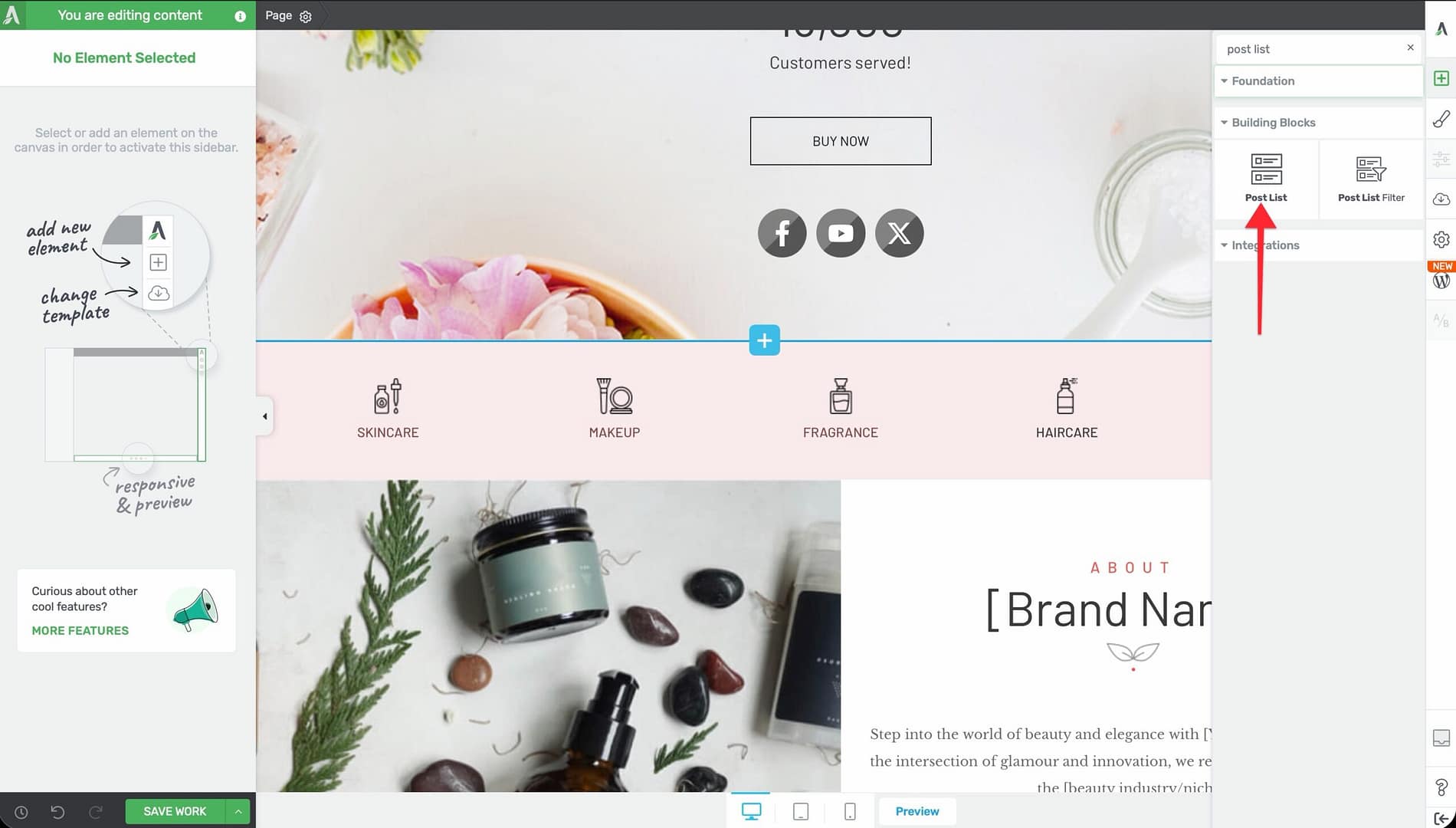
- Alternatively, scroll down to the Building Blocks section in the element list to find the Post List element.
- Drag the element from the panel and drop it onto your page canvas.
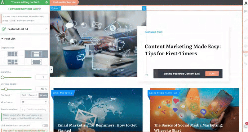
The cloud template library will open, displaying a gallery of available Post List designs. Browse or search the templates, then click on a design to insert it onto your page.
Blog List vs. Post List: Understanding the Difference
Thrive Architect includes two elements for displaying posts: the Blog List and the Post List. Understanding when to use each one is important:
Blog List
- A simpler, older element with basic layout options
- Uses a fixed design structure with limited customization
- Suitable for straightforward blog listing pages where minimal design control is needed
Post List
- A modern, template-based element with full design control
- Uses cloud templates that you can customize at the element level
- Supports advanced features: carousel mode, masonry layout, featured content, post filtering, and pagination
- Recommended for most use cases where you want visual control and flexibility
Tip: If you are building a new page or template and need to display a list of posts, use the Post List element. It offers significantly more design options and features than the Blog List.
Configuring Main Post List Options
After inserting a Post List element, select it on the canvas to reveal the main options in the left sidebar.
Display Type
Use the Display type option to choose how posts are arranged on the page. Four layout modes are available, shown as icon buttons:
- Grid — Posts arranged in a uniform grid with equal-sized items in rows and columns
- Masonry — Posts arranged in a Pinterest-style layout where items have varying heights based on content length
- List — Posts displayed in a single vertical column, one below the other
- Carousel — Posts displayed in a horizontal scrolling carousel (enables additional carousel-specific options)
Columns
Use the Columns slider to set the number of columns in the layout. The range is 1 to 10, with a default value of 3. This applies to Grid, Masonry, and Carousel display types.
Vertical Space
Use the Vertical space slider to control the gap between rows of posts. The range is 0 to 240px.
Horizontal Space
Use the Horizontal space slider to control the gap between columns of posts. The range is 0 to 240px.
Content Display
Control how much post content is shown in each list item:
- Full — Displays the complete post content
- Excerpt — Displays the WordPress excerpt
- Words (default) — Displays a specific number of words from the post content
When Words is selected, an additional Word count input appears. The default value is 12. Adjust this to show more or fewer words of each post’s content.
Read More Text
Enter custom text for the “read more” link that appears after the truncated content. This link takes visitors to the full post.
Link Entire Item to Content
Enable the Link entire item to content toggle to make the entire post list item (including the image, title, and excerpt area) clickable as a link to the full post.
Warning: When this option is enabled, individual child link elements within the post list item (such as separate “Read More” links) are disabled, and animations on the item may not work as expected. Use this option when you want the simplest possible click behavior.
Number of Items
Set the Number of items to control how many posts are displayed. The default value is inherited from your WordPress Settings > Reading > Posts per page setting. Override it here to show a specific number of posts.
Edit Design
Click the Edit Design button to enter the design editing mode. This opens the individual post item template, where you can customize the layout, typography, colors, and elements within each post card. Changes made in design editing mode apply to all items in the Post List.
Filter Posts
Click the Filter Posts button to open the post query filter modal. This is where you control which posts appear in the list — by post type, category, tag, author, custom taxonomy, date range, and more.
Configuring Pagination
The Pagination type option controls how visitors navigate through large sets of posts:
None
No pagination is displayed. Only the number of posts specified in Number of items is shown.
Numeric
Displays numbered page links below the post list (e.g., 1, 2, 3, … Next). Visitors click the page numbers to navigate through all available posts. The number of posts per page is determined by the Number of items setting.
Load More
Displays a “Load More” button below the post list. When visitors click it, additional posts are loaded dynamically without a full page reload. This provides a smoother browsing experience compared to numeric pagination.
Using Featured Content
Enable the Show featured content toggle to highlight one or more posts at the top of the Post List with a distinct, larger layout.
When featured content is enabled:
- The first post (or posts, depending on the template) is displayed in a larger, more prominent format
- Remaining posts are displayed in the standard layout below
- The featured post’s design can be customized independently using the Edit Design mode
Tip: Featured content is a great way to highlight your most recent or most important post at the top of a blog page while displaying the rest in a compact grid or list below.
Carousel Options
When the Display type is set to Carousel, a set of carousel-specific options becomes available in the left sidebar.
Navigation Controls
- Show arrows — Displays left and right navigation arrows on the carousel
- Show dots — Displays dot indicators below the carousel showing the current position
- Drag to scroll — Allows visitors to click and drag (or swipe on mobile) to scroll through carousel items
Sliding Behavior
- Infinite sliding — When enabled, the carousel loops continuously, returning to the first slide after the last one
- Slides to scroll — Set how many slides advance with each click of the arrow or dot. The range is 1 to 3
- Columns — Set the number of visible slides in the carousel viewport. The range is 1 to 10
Autoplay
- Autoplay toggle — Enable automatic slide advancement
- Speed — Set the autoplay interval in milliseconds. The range is 1 to 10,000ms, with a default of 3000ms (3 seconds)
- Pause on Focus — Pauses autoplay when a carousel item receives keyboard focus
- Pause on Hover — Pauses autoplay when the visitor hovers their mouse over the carousel
Overlap and Sizing
- Overlap end items toggle — When enabled, the items at the edges of the carousel partially overlap with the visible area, creating a peek effect that hints at more content
- Distance — Set the overlap distance. The range is 0 to 160px (or percentage)
- Adaptive carousel height — When enabled, the carousel height adjusts based on the tallest visible slide
- Uniform slides height — When enabled, all slides are rendered at the same height regardless of content length
- Vertical Position — When uniform height is enabled, choose how shorter content is aligned within the slide: Top, Center, or Bottom
Advanced Carousel Options
- Single slide fader — When enabled, the carousel transitions between slides using a fade effect instead of sliding. This works best when Columns is set to 1
- Item resize — Use the slider to scale carousel items. The range is 10 to 1080 (in percentage or pixels), allowing you to make items larger or smaller than their default size
Using the Post List Filter Element
The Post List Filter is a separate element that you place alongside (or above) a Post List element. It provides visitors with interactive controls to filter which posts are displayed in the Post List.
Adding a Post List Filter
- Click the green plus (+) icon to open the element panel.
- Search for Post List Filter or find it in the element list.
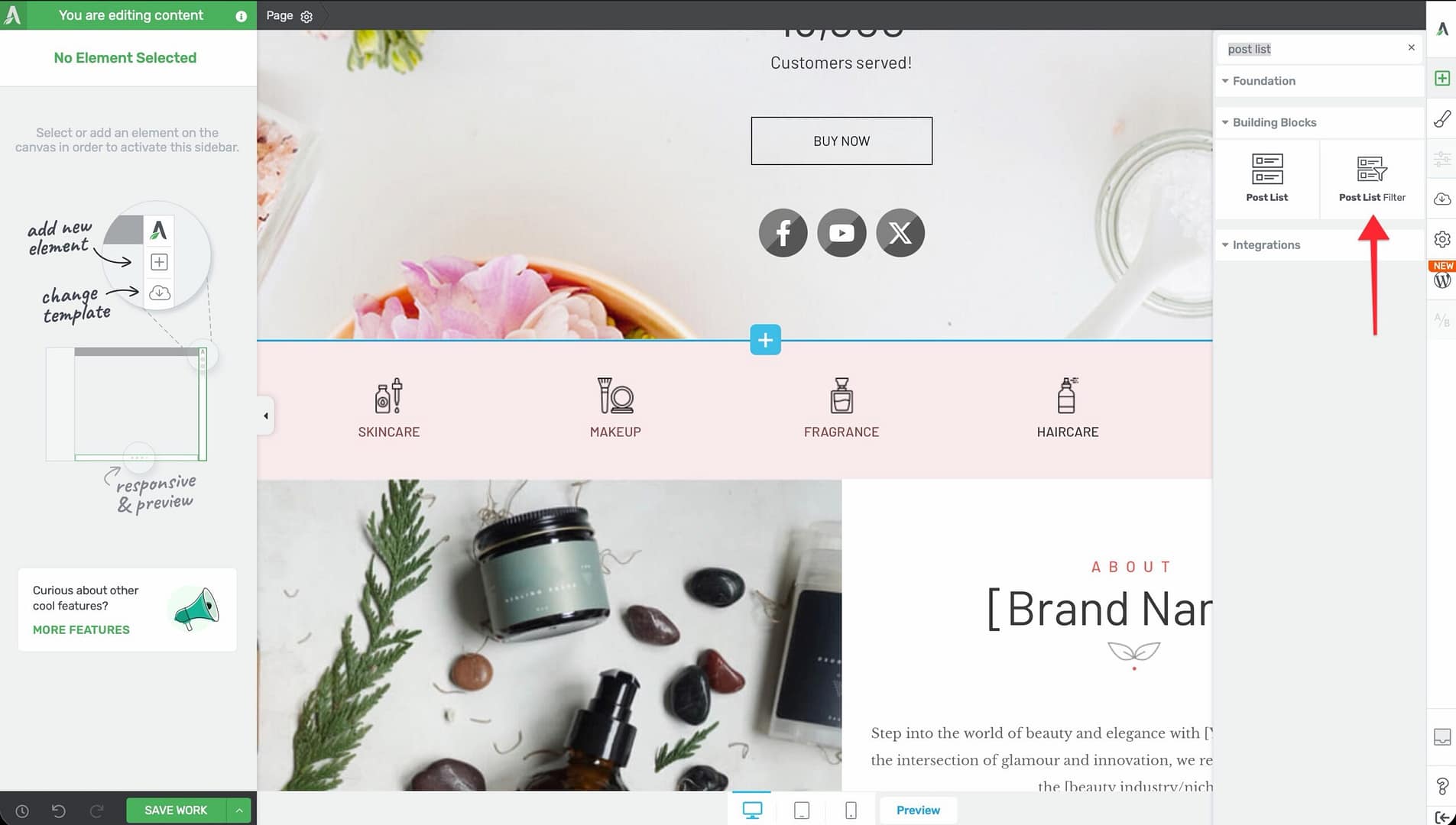
- Drag it onto the canvas and place it near your Post List element.
The Post List Filter automatically connects to the nearest Post List element on the page.
Filter Configuration Options
After selecting the Post List Filter element, the following options appear in the left sidebar:
- Filter option — Choose what the filter operates on: Author, Category, Tag, or any custom taxonomy registered on your site
- Allow multiple selections — Toggle to let visitors select more than one filter value at a time. Enabled by default
- Filter type — Choose the visual presentation of the filter:
- Buttons — Clickable button-style filters
- Checkboxes — Checkbox list (supports multiple selection)
- Radios — Radio button list (single selection only)
- Dropdown — A dropdown select menu
- Text links — Simple clickable text links
- Search — A text search field that filters posts by keyword
- Display option — Arrange filter items Horizontally (in a row) or Vertically (in a column)
- Spacing — Control Vertical spacing (0 to 200px) and Horizontal spacing (0 to 200px) between filter items
- URL query key — Set a custom URL parameter key for the filter. When a visitor selects a filter value, the page URL updates with this parameter, making the filtered view shareable and bookmarkable
- Include “All” option — Toggle to show an “All” option that clears the filter and displays all posts. Enabled by default
- Label for “All” — Customize the text displayed for the “All” option
- Content autocomplete — Search and select which specific filter values to display (e.g., only show certain categories instead of all categories)
- Default value — Set a filter value that is pre-selected when the page loads
Applying Dynamic Links to Post List Items
When customizing the design of your Post List items, you can apply dynamic links to individual elements within each post card. This ensures that buttons, images, titles, and other elements link to the correct post automatically.
Adding a Dynamic Link Inside a Post List Item
- Select the Post List element and click the Edit Design button.
- Inside the post item template, select the element you want to link (e.g., a Text element with the post title, a Button element, or an Image element).
- Open the link settings for that element.
- Click the dynamic link icon in the link input field.
- Select Post URL from the dynamic link sources.
- Click Apply.
The element will now automatically link to the URL of whichever post it represents in the list. Each post list item resolves the dynamic link to its own post URL.
Displaying Custom Post Types in a Template Sidebar
The Post List element can display not just standard WordPress posts but also custom post types (such as WooCommerce products, Thrive Apprentice courses, portfolio items, or any custom post type registered on your site).
Setting Up a Custom Post Type Post List in a Sidebar
- Open your Thrive Theme Builder template (e.g., a Sidebar template or any template where you want the post list to appear).
- Add a Post List element to the sidebar area.
- Select the Post List and click the Filter Posts button to open the query filter modal.
- In the filter modal, change the Post type setting from Posts to the desired custom post type (e.g., Products, Courses, Portfolio).
- Configure any additional filter criteria — such as category, tag, taxonomy, or date range.
- Click Apply to save the filter settings.
The Post List will now display items from the selected custom post type instead of standard blog posts.
Frequently Asked Questions
What Is the Difference Between Blog List and Post List?
The Blog List is an older, simpler element with limited design options. The Post List is a modern, template-based element with full design control, carousel mode, masonry layout, pagination, featured content, and filtering. Use the Post List for new designs.
Can I Display Posts from Multiple Categories?
Yes. Click the Filter Posts button on the Post List element and configure the query to include posts from multiple categories. You can also use the Post List Filter element to let visitors switch between categories interactively.
How Do I Change the Design of Individual Post Cards?
Select the Post List element and click the Edit Design button. This opens the post item template where you can customize the layout, colors, typography, images, and elements for each card. Changes apply to all items in the Post List.
Can I Use the Post List Element in Thrive Theme Builder?
Yes. The Post List element works in both Thrive Architect (on individual pages and posts) and Thrive Theme Builder (in site-wide templates). It is commonly used in blog archive templates, homepage templates, and sidebar templates.
Does the Post List Support Lazy Loading?
The Post List element loads its content when the page loads. For long post lists with many images, WordPress and your caching plugin’s lazy loading settings will apply to the images within the list.
How Do I Make the Carousel Autoplay?
Select the Post List element with the Display type set to Carousel. In the carousel options, enable the Autoplay toggle and set the Speed value (in milliseconds) to control how fast the slides advance.
Related Resources
- Dynamic Links and Dynamic Text: How to Use Dynamic Links and Dynamic Text — Setting up context-aware links inside post list items
- Hyperlinks and Link Styling: How to Use Hyperlinks and Link Styling — Link formatting and special link types
- Conditional Display: How to Use Conditional Display — Showing or hiding post list elements based on conditions
- Background Section Element: How to Use the Background Section Element — Full-width sections to contain post lists
That’s it! You’ve successfully learned how to use the Post List element in Thrive Architect. From choosing a display type and configuring pagination to setting up carousel behavior, post filtering, dynamic links, and custom post types, you now have full control over how dynamic content is displayed on your site.