In this article, you’ll learn how to use the Post to X (Click to Tweet) element in Thrive Architect. This element lets you add a shareable quote box to your pages that visitors can click to post a pre-written message directly to X (formerly Twitter).
Unlike most interactive elements in Thrive Architect, the Post to X element is not a cloud template element. It has its own hardcoded options for configuring the label text, post text, X username attribution, and share URL. It also supports hover state styling, giving you full control over its interactive appearance.
What Is the Post to X Element?
The Post to X element (also known as Click to Tweet) creates a styled quote box on your page. When a visitor clicks the box, it opens a new window with X’s compose screen, pre-filled with the text you’ve configured. This makes it effortless for visitors to share your content on X.
Key characteristics of the Post to X element:
- It is not a cloud template element—it has its own built-in options and generates a specific HTML structure
- The display name in the editor is Post to X (Twitter)
- It supports a hover state for interactive styling
- It includes a visible label (like “Click to Post”) and a separate post text (the actual message shared on X)
- You can attribute the post to a specific X username and optionally set a custom share URL
Adding the Post to X Element to a Page
Follow these steps to add a Post to X box to your page:
- Open your page or post in the Thrive Architect editor.
- Click the green plus (+) icon in the right sidebar to open the element panel.
- Type Post to X in the search field at the top of the panel. You can also search for Tweet or Twitter to find it.
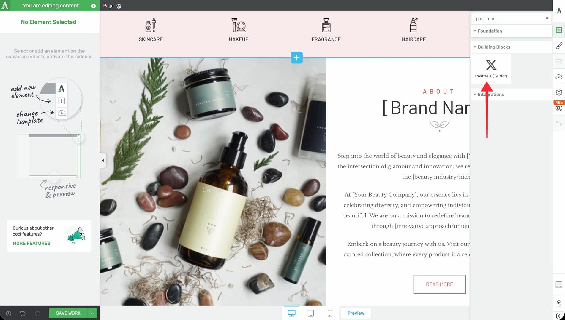
- Alternatively, scroll down to the Building Blocks section in the element list to find the Post to X (Twitter) element.
- Drag the element from the panel and drop it onto your page canvas.
The element will appear on the canvas immediately with default placeholder text, ready for you to configure.
Configuring the Main Options
Select the Post to X element on the canvas to reveal the main options in the left sidebar under the Post to X panel.

Label Text
The Label Text field controls the visible text displayed on the element as a call-to-action label (for example, “Click to Post” or “Share This on X”). This is the text visitors see on the element itself, not the text that gets posted.
Enter a short, action-oriented label that encourages visitors to click.
Post Text
The Post Text textarea is where you write the actual message that will be pre-filled in the X compose window when a visitor clicks the element. This is the content that gets posted to X.
Via @
The Via @ field lets you specify an X username to attribute the post to. Enter the username without the @ symbol—the element will add it automatically.
When a visitor posts the message, it will include “via @yourusername” at the end, which helps drive followers back to your X account.
Custom Share URL
Toggle the Custom Share URL switch to include a specific URL in the post. When enabled, a URL input field appears where you can enter the page address you want shared.
- When disabled: The post will share the current page URL by default
- When enabled: The post will share the custom URL you specify
This is useful when you want the shared post to link to a specific landing page, product page, or campaign URL rather than the page the element appears on.
Preview
Use the Preview button to see how the configured post will look when shared on X. This helps you verify the post text, attribution, and URL before publishing.
Customizing the Design
The Post to X element provides several design panels in the left sidebar for visual customization.
Hover State
The Post to X element supports a hover state, allowing you to define a different appearance when visitors move their mouse over it. To configure the hover state:
- Select the element on the canvas.
- Click the State dropdown at the top of the left sidebar.
- Select Hover to switch to hover state editing.
- Adjust colors, backgrounds, borders, and shadows for the hover appearance.
- Switch back to Normal state when finished.
Typography
Use the Typography panel to control the text appearance:
- Font Color — Color of the post text and label (applies with high priority to override template defaults)
- Font Size — Size of the text
- Text Style — Bold, italic, underline, and strikethrough options
- Line Height — Spacing between lines of text
- Font Face — Font family selection
- Text Transform — Uppercase, lowercase, capitalize, or none
- Letter Spacing — Spacing between individual characters
Background
Configure the background color, gradient, or image for the element container through the Background panel.
Borders
Use the Borders panel to add or modify border width, style, and color.
Shadow
Add a box shadow to the element container using the Shadow panel to create depth and visual emphasis.
Layout
Use the Layout panel to adjust margins, padding, and positioning for the element. The Overflow and Scroll Style controls are disabled.
Best Practices for Post to X Elements
Write Compelling Post Text
Your post text should be a standalone, shareable statement—not just a summary of your page. Think of it as a quotable highlight that would catch attention in someone’s X feed. Strong approaches include:
- A surprising statistic or data point
- A bold, opinion-driven statement
- A practical tip or actionable advice
- An inspiring or motivational quote
Place Elements Strategically
Position Post to X elements within your content where the surrounding text provides natural context. Effective placements include:
- After a key insight or takeaway in a blog post
- Next to a compelling statistic or quote
- At the end of a section as a content break
- Within a tips or best practices list
Keep the Attribution Consistent
Use the same X username in the Via @ field across all your Post to X elements. This builds consistent attribution and makes it easy for visitors to find and follow your X account.
Use Multiple Elements Per Page
You can add several Post to X elements throughout a long blog post, each with different shareable quotes. This gives visitors multiple opportunities to share different highlights from your content.
Frequently Asked Questions
What Happens When a Visitor Clicks the Element?
A new browser window (or tab) opens with X’s compose screen, pre-filled with the post text, via attribution, and share URL you configured. The visitor can review and edit the post before publishing it to their X account.
Does the Visitor Need to Be Logged In to X?
Yes. If the visitor is not logged in to X, they will be prompted to log in before they can post the message.
Can I Use This Element for Platforms Other Than X?
No. The Post to X element is specifically designed for X (Twitter). For sharing to other social platforms, use the Social Share element instead.
Is There a Character Limit for the Post Text?
The element itself does not enforce a character limit, but X has its own post length limits. Keep your post text concise and test it using the Preview feature to ensure it fits within X’s character constraints, including the URL and via attribution.
Can I Change the X Icon or Branding?
The element uses a built-in X (Twitter) icon. While you can style the element’s colors, background, and typography, the core icon and sharing functionality are tied to the X platform.
Related Resources
- Buttons: How to Use the Button Element — Create custom social sharing buttons with specific link formats
- Text Element: How to Use the Text Element — Style the surrounding content that provides context for shareable quotes
- Styled Box: How to Use the Styled Box Element — Create visually distinct quote sections
- Getting Started: Getting Started with Thrive Architect — Overview of the editor and element panel
That’s it! You’ve successfully learned how to use the Post to X (Click to Tweet) element in Thrive Architect. By configuring compelling post text, adding your X username attribution, and styling the element to match your brand, you can encourage visitors to share your best content directly to their X audience.