In this article, you’ll learn how to use the Progress Bar element in Thrive Architect. This element lets you create horizontal progress indicators in two modes—Simple (a single filled bar) and Nodes (a multi-step progress tracker)—with animated fills, color palettes, labels, and optional dual progress support.
The Progress Bar element is a cloud template element, meaning you can choose from pre-designed templates when adding it to your page. It is ideal for showing completion status, multi-step processes, project milestones, and comparison metrics on sales pages, course pages, and dashboards.
What Is the Progress Bar Element?
The Progress Bar element displays a horizontal bar that fills to indicate progress toward a goal or through a series of steps. It supports two distinct types:
- Simple — A single horizontal bar that fills from left to right to a specified percentage
- Nodes — A multi-step progress tracker with individually configurable nodes connected by a progress line
Key characteristics of the Progress Bar element:
- Two Type modes: Simple and Nodes (selected via a button group)
- Color palettes for quick, cohesive color schemes
- Optional Show label switch with configurable label position
- Adjustable Bar height from 1px to 100px (default 16px)
- Fill animation on view with configurable speed and start position
- Dual progress mode for showing a secondary progress bar
- Group editing support for progress labels, icons, nodes, lines, wrapper lines, and dual lines
- Available as a cloud template element with pre-designed styles
Adding the Progress Bar to a Page
Follow these steps to add a Progress Bar element to your page:
- Open your page or post in the Thrive Architect editor.
- Click the green plus (+) icon in the right sidebar to open the element panel.
- Type Progress Bar in the search field at the top of the panel.
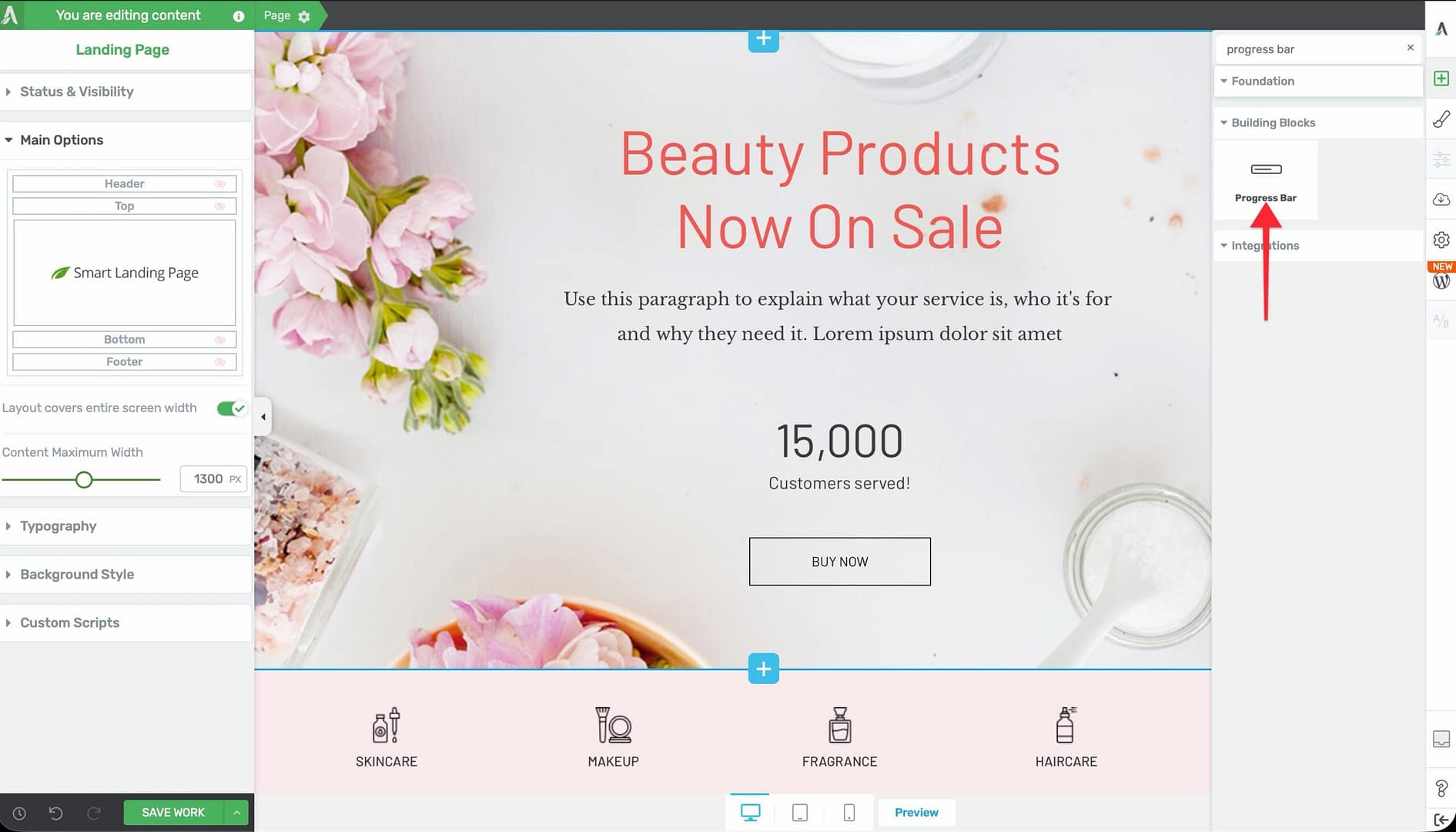
- Alternatively, scroll down to the Building Blocks section in the element list to find the Progress Bar element.
- Drag the element from the panel and drop it onto your page canvas.
Because the Progress Bar is a cloud template element, a template picker will appear, allowing you to choose from pre-designed progress bar styles. Select a template, and it will be inserted onto your page. You can then customize it using the left sidebar options.

Configuring the Main Options
After selecting the Progress Bar element, the left sidebar displays the following options:
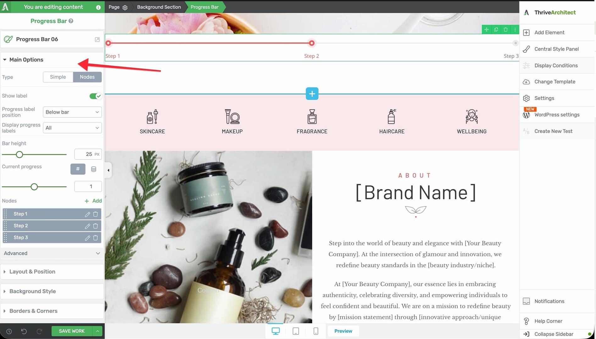
Type
A button group that switches between the two progress bar modes:
- Simple — A single horizontal bar that fills to a specified percentage
- Nodes — A multi-step bar with named nodes (milestones) along the track
Switching between types changes the available options in the sidebar.
Color Palettes
A color palette selector that applies a pre-configured color scheme to the entire progress bar. This affects the fill color, track color, label colors, and node colors in a coordinated way.
Show Label
A switch that toggles the visibility of the progress label. When enabled, a label position dropdown appears with the following options:
- Inside bar — The label text appears inside the filled portion of the bar (available for Simple type only)
- Above bar — The label text appears above the progress bar
- Below bar — The label text appears below the progress bar
For the Simple type, the label typically displays the current percentage value (for example, “75%”). You can customize the label text by clicking directly on it in the canvas.
Display Progress Labels (Nodes Type Only)
When using the Nodes type, this dropdown controls which node labels are visible:
- All — Shows labels for every node
- Current — Shows only the label for the currently active node
- First & last — Shows labels for only the first and last nodes
Note: This option only appears when the progress bar type is set to Nodes.
Bar Height
A slider that controls the vertical thickness of the progress bar:
- Default: 16px
- Range: 1px to 100px
Thin bars (3–8px) create a subtle, modern look. Thicker bars (20px+) make the progress more prominent and can accommodate inside labels.
Nodes List (Nodes Type Only)
When using the Nodes type, a sortable preview list of all nodes appears in the sidebar. Each node has a settings icon for individual configuration. Below the list, an Add button lets you create additional nodes.
For each node, you can configure:
- The node label text
- The node’s position along the bar
- Individual node styling
Configuring the Advanced Options
The Progress Bar element includes several advanced options for animation and enhanced functionality:
Fill Animation on View
A switch that enables an animated fill effect when the progress bar scrolls into the visitor’s viewport. When enabled, the bar starts empty and animates to its configured fill percentage.
Speed
Controls how fast the fill animation plays (visible when fill animation is enabled):
- Slow — 5 seconds
- Default — 3 seconds
- Fast — 1 second
Start At
A slider that sets the starting fill percentage for the animation:
- Range: 0% to 100%
- Default: 0%
Set this higher than 0% if you want the bar to appear partially filled before the animation begins. For example, setting Start at to 20% means the bar begins at 20% and animates up to the target fill percentage.
Enable Dual Progress
A switch that adds a secondary progress bar layered behind the primary one. This is useful for showing two related metrics—such as current progress versus a target, or this year’s sales versus last year’s.
When enabled, additional color and percentage controls appear for the secondary bar.
Current Progress Is 0% — Hide
A switch that automatically hides the progress bar when its fill value is 0%. This is useful when the progress bar is bound to dynamic data and you do not want to display an empty bar.
Current Progress Is 100% — Hide
A switch that automatically hides the progress bar when its fill value is 100%. This is useful when you want to remove the progress indicator once a task or goal is fully complete.
Using Group Editing
The Progress Bar element supports group editing for its sub-components. When you select the progress bar, the group editing options let you modify multiple related elements at once:
- Progress labels — Edit all label styles simultaneously
- Icons — Modify all node icons at once
- Nodes — Style all nodes uniformly
- Lines — Adjust the progress line appearance
- Wrapper lines — Style the outer track
- Dual lines — Configure the secondary progress bar appearance (when dual progress is enabled)
Group editing saves time when you need consistent styling across all nodes or labels without configuring each one individually.
Using Dynamic Values with the Progress Bar
The Progress Bar element supports dynamic values through External Fields, allowing you to populate the fill percentage from a custom field, ACF field, or other data source. This is especially useful for:
- Course progress displays where each student sees their individual completion percentage
- Fundraising trackers that update automatically as donations come in
- Project management dashboards where task completion is stored in custom fields
To connect a dynamic value:
- Select the Progress Bar element on the canvas.
- In the left sidebar, look for the External Fields option.
- Click it to open the external fields picker.
- Select the data source and field that contains your progress value.
The progress bar will then display the value from the selected field dynamically on the front end.
The Progress Bar supports four types of dynamic data sources for setting the progress value:
- Custom Fields (ACF) — Bind the progress value to an Advanced Custom Fields numeric field. The bar updates based on the field’s value for the current post or page.
- URL Query String — Read the progress value from a URL parameter. For example, if the URL is
example.com/page?progress=75, the bar fills to 75%. Set the variable name in the External Fields configuration. - POST Variable — Read the value from a form POST variable. Useful when the progress bar appears on a page that receives form submissions.
- Cookie Data — Read the value from a browser cookie. The cookie name is specified in the configuration, and the bar fills based on the cookie’s numeric value.
Important: When using dynamic values, consider enabling the Current progress is 0% — hide and Current progress is 100% — hide options to handle edge cases gracefully.
Common Use Cases
Skill or Competency Bars
Create a series of Simple progress bars inside a columns layout to display skill levels or competency ratings—such as “WordPress: 90%,” “JavaScript: 75%,” and “Design: 85%.”
Multi-Step Process Indicators
Use the Nodes type to show a multi-step onboarding flow, checkout process, or project timeline. Each node represents a milestone, and the fill indicates how far along the process the visitor has progressed.
Fundraising and Goal Tracking
Display a single progress bar showing how much of a fundraising goal has been reached. Add a label above the bar with the current amount and target.
Comparison Metrics with Dual Progress
Enable dual progress to compare two related metrics side by side in a single bar—such as current quarter revenue versus the previous quarter, or actual results versus projected targets.
Course Completion Dashboards
Bind the progress bar to a dynamic field that tracks course completion percentage. Each student sees their personalized progress when they visit the course page.
Frequently Asked Questions
Can I Add More Than One Progress Bar on a Page?
Yes. You can add as many Progress Bar elements as you need. Each one is configured independently with its own type, fill percentage, colors, and labels.
How Do I Change Individual Node Labels?
Click on any node label directly on the canvas to edit its text. Alternatively, click the settings icon next to the node in the sidebar’s sortable node list to access individual node configuration.
Does the Fill Animation Replay Every Time the Page Loads?
The fill animation triggers each time the element scrolls into the visitor’s viewport. If the visitor scrolls past it and then scrolls back up, the animation will replay.
Can I Use the Progress Bar Without Animation?
Yes. Turn off the Fill animation on view switch in the advanced options. The bar will display at its configured fill percentage immediately without any animation.
What Happens When Dual Progress Is Enabled?
A secondary progress bar appears behind the primary bar. You can set a different fill percentage and color for the secondary bar. This creates a layered effect that is useful for comparing two values.
Related Resources
- Counter Elements: How to Use the Counter Elements — Animated number and fill counters for statistics and percentages
- Columns: How to Use the Columns Element — Arrange multiple progress bars in a side-by-side layout
- Dynamic Content: How to Use Dynamic Content — Populate progress values from custom fields and external sources
- Styling and Design: How to Customize Colors and Fonts — Global color management for consistent progress bar styling
That’s it! You’ve successfully learned how to use the Progress Bar element in Thrive Architect. With Simple and Nodes modes, animated fills, dual progress support, dynamic data binding, and group editing, you can create polished progress indicators for any use case.