In this article, you’ll learn how to add a reading progress indicator to your Thrive Theme Builder templates—including how to configure its position, appearance, and sticky behavior.
What Is the Reading Progress Indicator?
The reading progress indicator is a visual bar that shows visitors how far they’ve progressed through a blog post or article. As visitors scroll through the content, the bar fills from left to right, giving a clear sense of how much content remains.
This is particularly useful for long-form content—it helps visitors gauge their progress and encourages them to continue reading.
Enabling the Reading Progress Indicator
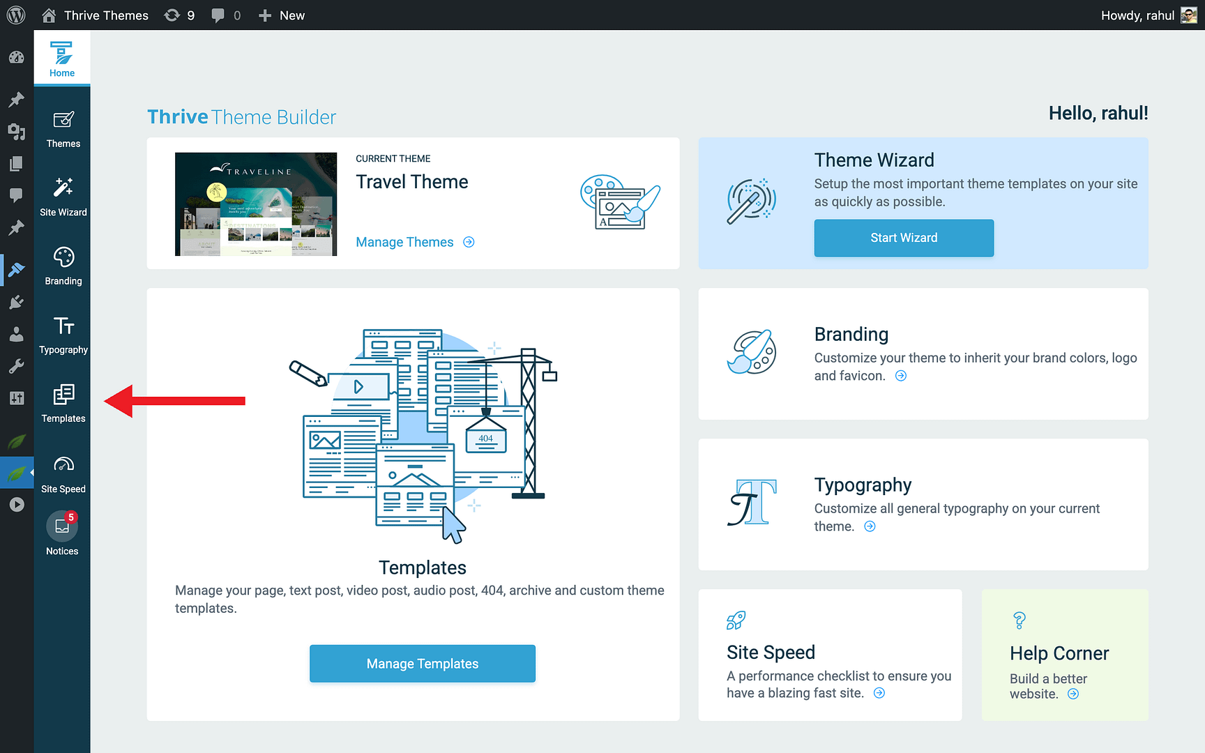
- In the Thrive Theme Builder dashboard, click Templates in the left sidebar.
- Hover over the template where you want to add the progress indicator (typically your blog post template) and click Edit.
- In the left sidebar, look for the Reading Progress Indicator toggle.
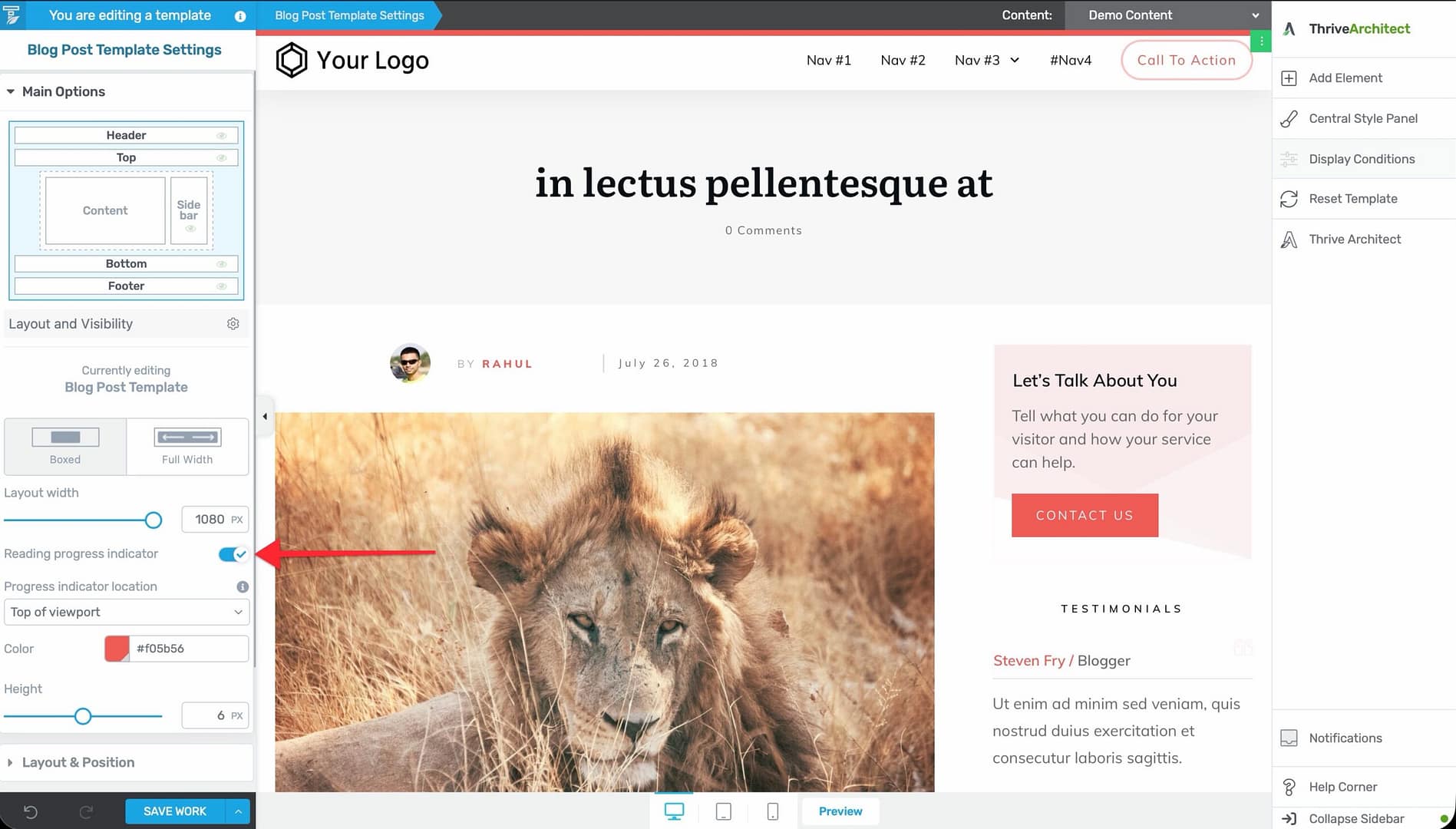
- Enable the toggle to activate the progress bar.
- Click Save Work to save the template.
Once enabled, the progress bar automatically appears on all pages and posts that use this template.
Configuring the Progress Indicator
After enabling the reading progress indicator, you can customize its appearance and position.
Position
Choose where the progress bar appears on the page:
- Top — The progress bar sits at the very top of the viewport, above everything else.
- Under header — The progress bar appears just below the header section. If the header is sticky, the progress bar moves with it.
Bar Color
Set the color of the progress bar to match your site’s design. Click the color picker and choose a color, or enter a hex code.
Bar Height
Adjust the thickness of the progress bar. The height ranges from 2px (thin and subtle) to 10px (prominent and visible). The default is 6px.
Making the Progress Indicator Sticky
When the progress indicator is positioned under the header and the header uses sticky or reveal-on-scroll behavior, the progress bar moves with the header. This keeps the progress visible at all times as visitors scroll.
When positioned at the top, the progress bar is always at the top of the viewport—it’s inherently sticky.
How It Works
The progress indicator tracks the main content area of the page:
- It begins filling when the visitor scrolls past the start of the content.
- It reaches 100% when the visitor reaches the end of the content.
- It does not track the header, footer, or sidebar—only the main content area.
Dynamic Content Integration
The reading progress indicator integrates with dynamic content shortcodes that can display:
- Remaining reading time — How many minutes of reading remain based on the visitor’s scroll position.
- Word count — The total word count of the article.
These shortcodes update dynamically as the visitor scrolls, providing additional context alongside the visual progress bar.
Best Practices
- Use on long-form content — The progress indicator is most valuable on blog posts and articles with substantial content. It’s less useful on short pages.
- Match your theme colors — Choose a progress bar color that complements your site’s design without being distracting.
- Keep the height subtle — A 4–6px bar is visible without being intrusive. Larger bars can feel heavy.
- Pair with a sticky header — If your header is sticky, position the progress bar under the header for a polished, integrated look.
- Test with different content lengths — Preview the progress bar with both short and long posts to make sure it behaves correctly at different content lengths.
Related Resources
- Using the Header Section: Learn how to customize the header.
- Using Scroll Behavior Options: Learn how to configure header scroll behavior.
- Creating Post Templates: Learn how to create and customize post templates.