In this article, you’ll learn how to use the Social Follow and Social Share elements in Thrive Architect. The Social Follow element displays linked icons that direct visitors to your social media profiles, while the Social Share element adds sharing buttons that let visitors share your content on their preferred platforms.
Both elements offer extensive customization options including multiple style presets, custom branding, orientation controls, size and alignment settings, and sortable network lists. This article also covers how to add a TikTok icon to your Social Follow element using the custom network feature.
Part 1: The Social Follow Element
What Is the Social Follow Element?
The Social Follow element displays a row of social media icons that link to your profiles on platforms like Facebook, Instagram, Twitter/X, YouTube, LinkedIn, and more. Visitors click an icon to visit your profile on that platform.
Key characteristics of the Social Follow element:
- Includes an Edit design button that opens a visual design editor
- Custom branding switch for toggling between default platform colors and your own color scheme
- 8 style presets for different icon appearances
- Orientation options: Horizontal or Vertical
- Size slider (1–60px) and Alignment options (Left, Center, Right, or Full Width)
- Social Networks picker with a sortable preview list and individual settings for each network
- Create New button for adding custom social networks (such as TikTok)
- Group editing support for Grouped Social Buttons
- Shadow, Typography, and Animation options are hidden
Adding the Social Follow Element to a Page
Follow these steps to add a Social Follow element to your page:
- Open your page or post in the Thrive Architect editor.
- Click the green plus (+) icon in the right sidebar to open the element panel.
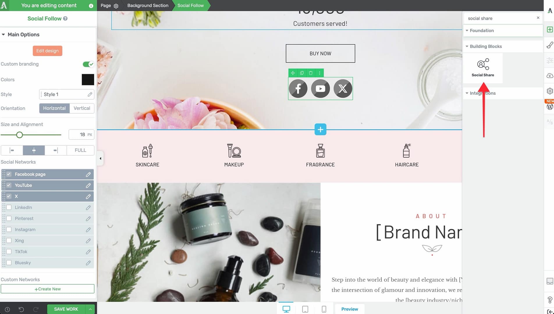
- Type Social Follow in the search field at the top of the panel.
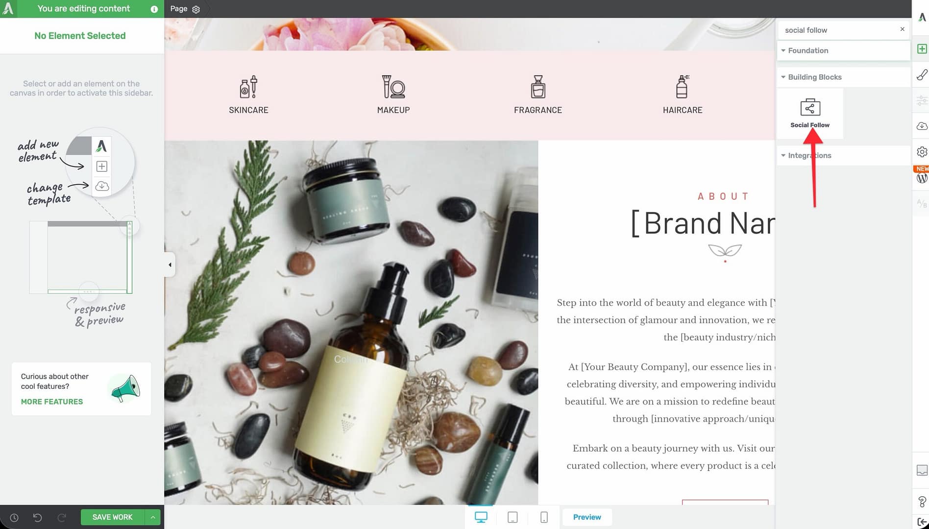
- Alternatively, scroll down to the Building Blocks section in the element list to find the Social Follow element.
- Drag the element from the panel and drop it onto your page canvas.
A row of default social follow icons will appear on the canvas. You can immediately customize which networks are shown, their style, and their linked URLs using the left sidebar options.
Configuring the Social Follow Options
After selecting the Social Follow element, the left sidebar displays the following options:
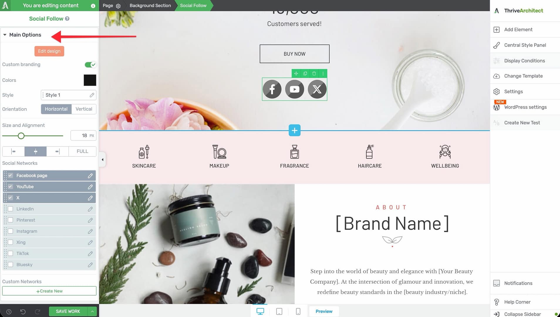
Edit Design
A button that opens the visual design editor, where you can make detailed adjustments to the overall appearance of the social follow icons, including spacing, border radius, and icon container styling.
Custom Branding
A switch that toggles between two color modes:
- Off (default) — Each icon uses its platform’s official brand color (Facebook blue, Instagram gradient, YouTube red, and so on)
- On — All icons use a unified color that you specify, overriding the default brand colors
Color Palettes
A palette selector (Social Follow Palettes) that applies a coordinated color scheme to the icons. This provides a quick way to style all icons with a cohesive look.
Style
A selector with 8 style presets (Style 1 through Style 8) that control the visual frame around each icon. Styles range from simple flat circles to outlined squares, rounded containers, and more. Click through the styles to preview each one.
Orientation
A toggle that switches the icon layout direction:
- Horizontal — Icons appear in a single row from left to right
- Vertical — Icons stack in a single column from top to bottom
Size and Alignment
Two controls that work together:
- Size — A slider that adjusts icon dimensions from 1px to 60px
- Alignment — Choose from Left, Center, Right, or Full Width
When Full Width is selected, the icons spread evenly across the full width of their container.
Social Networks
A network picker and sortable preview list that lets you choose which social platforms to display. Click the network picker to browse available platforms and add them to your list.
Each network in the preview list has a settings icon where you can configure:
- The URL that the icon links to (your profile URL on that platform)
- Whether the link opens in a new tab
You can drag and drop networks in the list to reorder them.
Adding a TikTok Icon with the Custom Network Feature
TikTok is not included in the default social network list, but you can add it using the Create New custom network feature.
Before creating the custom TikTok network, you need a TikTok icon. If you don’t already have one:
- Go to IcoMoon or a similar icon library and download a TikTok icon pack.
- In your WordPress admin, go to Thrive Dashboard > Icon Manager.
- Click Import and upload the downloaded icon pack (ZIP file).
- The TikTok icon will now be available in the icon picker.
Follow these steps to add a TikTok icon:
- Select the Social Follow element on the canvas.
- In the left sidebar, scroll to the Social Networks section.
- Click the Create New button at the bottom of the network list.
- Enter TikTok as the network name.
- Upload or select a TikTok icon image (SVG or PNG).
- Set the brand color for the icon (TikTok’s brand color is #000000 or a custom color of your choice).
- Enter your TikTok profile URL.
- Click Save to add the custom network to your list.
The TikTok icon will now appear alongside your other social follow icons and can be reordered, resized, and styled just like any built-in network.
Using Group Editing for Social Follow
The Social Follow element supports group editing through Grouped Social Buttons. When you select a single social button within the element, you can switch to group editing mode to apply changes to all buttons at once.
This is useful for:
- Applying a consistent border radius to all icons
- Changing the spacing between all icons simultaneously
- Adjusting padding uniformly across all buttons
Part 2: The Social Share Element
What Is the Social Share Element?
The Social Share element adds sharing buttons to your page that allow visitors to share your content on social media platforms. Unlike the Social Follow element (which links to your profiles), the Social Share element shares the current page URL to the visitor’s chosen platform.
Key characteristics of the Social Share element:
- Includes an Edit design button for detailed visual customization
- Custom branding switch for unified or platform-specific colors
- Colors control (CSS variable changer for the master color)
- Three Type modes: Icon only, Icon + text, and Counter
- 18 style presets for different button appearances
- Orientation options: Horizontal or Vertical
- Size slider (1–60px) and Alignment options (Left, Center, Right, or Full Width)
- Common Button Width switch for making all buttons the same width
- Social Networks picker with sortable preview list
- Custom share URL option for sharing a different page than the current one
- Show share count with configurable minimum threshold and display position
- Group editing support for Grouped Social Labels and Grouped Social Icons
Adding the Social Share Element to a Page
Follow these steps to add a Social Share element to your page:
- Open your page or post in the Thrive Architect editor.
- Click the green plus (+) icon in the right sidebar to open the element panel.
- Type Social Share in the search field at the top of the panel.
- Alternatively, scroll down to the Building Blocks section in the element list to find the Social Share element.
- Drag the element from the panel and drop it onto your page canvas.
A row of default social share buttons will appear on the canvas. You can immediately customize which networks are shown, their type, style, and behavior using the left sidebar options.
Configuring the Social Share Options
After selecting the Social Share element, the left sidebar displays the following options:
Edit Design
A button that opens the visual design editor for detailed adjustments to the share buttons’ appearance, including spacing, borders, and container styling.
Custom Branding
A switch that works the same way as in the Social Follow element:
- Off — Each button uses the platform’s official brand color
- On — All buttons use a unified color you specify
Colors
A CSS variable control that adjusts the master color applied to all share buttons. This is useful for quickly changing the overall color scheme when custom branding is enabled.
Type
A selector with three display modes:
- Icon only — Shows just the social platform icon with no text
- Icon + text — Shows the icon alongside the platform name (for example, the Facebook icon plus the word “Facebook”)
- Counter — Shows the icon alongside a share count number
Style
A selector with 18 style presets (Style 1 through Style 18) that control the visual appearance of the share buttons. With nearly twice as many styles as the Social Follow element, you have extensive options ranging from flat icons to bordered buttons, rounded containers, and decorative frames.
Orientation
A toggle that switches the button layout direction:
- Horizontal — Buttons appear in a row from left to right
- Vertical — Buttons stack in a column from top to bottom
Size and Alignment
Two controls that work together:
- Size — A slider from 1px to 60px
- Alignment — Choose from Left, Center, Right, or Full Width
Common Button Width
A switch that, when enabled, makes all share buttons the same width. This creates a clean, uniform look, especially useful with the Icon + text type where button widths would otherwise vary based on the platform name length.
Social Networks
A network picker and sortable preview list for selecting which platforms to include. Common networks include Facebook, Twitter/X, LinkedIn, Pinterest, Reddit, WhatsApp, and Email.
You can drag and drop networks to reorder them and remove networks you do not need.
Custom Share URL
A switch that, when enabled, reveals a URL input field. By default, the Social Share element shares the current page URL. Enable this option and enter a different URL to share a specific page instead.
This is useful when you want share buttons on a thank-you page to share the original sales page, or when a landing page should share a different canonical URL.
Show Share Count
A switch that, when enabled, displays the number of times the page has been shared. Additional options appear:
- Display when greater than — A numeric input (range 0–2000) that sets the minimum share count required before the count is displayed. For example, set this to 10 to hide the count until the page has been shared at least 10 times.
- Count display location — Choose where the count appears relative to the button: Left, Right, Top, or Bottom
Note: Share count availability depends on the social platform’s API. Not all platforms provide public share count data.
Using Group Editing for Social Share
The Social Share element supports two group editing modes:
- Grouped Social Labels — Edit all button label text styles at once (font size, color, weight, and so on)
- Grouped Social Icons — Edit all icon styles at once (size, color, spacing)
Group editing ensures consistent styling across all share buttons without needing to configure each one individually.
Common Use Cases
Blog Post Share Bar
Add a Social Share element at the top or bottom of your blog posts with the Icon + text type. Include Facebook, Twitter/X, LinkedIn, Pinterest, and Email for maximum reach. Enable Show share count with a threshold of 10 to display social proof once the post gains traction.
Header or Footer Social Follow
Place a Social Follow element in your site header or footer with a compact Icon only style. Set the orientation to Horizontal and the size to 20–30px for a clean, unobtrusive row of profile links.
Sidebar Social Follow
Add a Social Follow element to your sidebar with a Vertical orientation. This stacks the icons in a column that fits naturally in a narrow sidebar layout.
Sales Page Social Proof
Use the Social Share element with the Counter type on sales pages to display how many times the page has been shared. High share counts act as social proof that builds trust with potential customers.
Custom TikTok and Modern Platforms
Use the Create New custom network feature in the Social Follow element to add TikTok, Threads, Discord, Mastodon, or any other platform that your audience uses. Keep your social presence current with the platforms that matter to your audience.
Sharing a Different URL
Enable the Custom share URL option on the Social Share element to share a specific page rather than the current one. This is useful on thank-you pages, confirmation pages, or any page where the shareable content lives at a different URL.
Frequently Asked Questions
What Is the Difference Between Social Follow and Social Share?
The Social Follow element links to your social media profiles—visitors click to follow you on a platform. The Social Share element shares the current page URL—visitors click to post your content on their social media feed.
Can I Use Both Elements on the Same Page?
Yes. It is common to have a Social Follow element in the header or footer (for profile links) and a Social Share element within the content area (for sharing the page). Each element is configured independently.
How Do I Add a Custom Social Network?
In the Social Follow element, click the Create New button in the Social Networks section. Enter the network name, upload an icon, set a brand color, and provide the profile URL. The custom network will appear in your sortable list.
Why Are Share Counts Not Showing?
Share count availability depends on the social platform’s API. Some platforms have deprecated public share count endpoints. Additionally, if you have set a minimum threshold in the Display when greater than field, the count will remain hidden until that threshold is reached.
Can I Make All Share Buttons the Same Width?
Yes. Enable the Common Button Width switch in the Social Share element options. This forces all buttons to the same width, creating a clean, uniform grid layout.
How Do I Change the Color of Individual Social Buttons?
By default, each button uses its platform’s brand color. To override this, enable Custom branding and set a unified color. For individual button color control, disable custom branding and the buttons will revert to their respective brand colors.
Related Resources
- Icon Element: How to Use the Icon Element — Add individual social icons with custom links
- Custom Menu: How to Use the Custom Menu Element — Include social links in navigation menus
- Content Box: How to Use the Content Box Element — Create styled containers for social elements
- Getting Started: Getting Started with Thrive Architect — Overview of the editor and element panel
That’s it! You’ve successfully learned how to use the Social Follow and Social Share elements in Thrive Architect. The Social Follow element connects visitors to your profiles with 8 style presets, custom branding, and custom network support, while the Social Share element enables content sharing with 18 styles, share counts, custom URLs, and three display types.