In this article, you’ll learn how to use the Styled List and Numbered List elements in Thrive Architect. These two separate elements let you create visually rich lists with custom icons, adjustable spacing, and full design control over each list item.
The Styled List element uses custom icons or images as bullet markers, while the Numbered List element displays sequential numbers with customizable fonts, colors, and increments. Both elements go far beyond standard HTML lists, giving you complete control over the visual presentation of list-based content on your pages.
What Are the Styled List and Numbered List Elements?
These are two separate elements in Thrive Architect (not variations of each other), each designed for a different type of list:
- Styled List — Displays list items with custom icon markers. You choose an icon or template for the bullet points, and each item can be individually styled.
- Numbered List — Displays list items with sequential numbers as markers. You control the starting number, increment value, number font, color, and size.
Both elements are found in the Building Blocks category of the element panel.
Note: These elements are distinct from standard WordPress bullet or numbered lists created in the Text element. The Styled List and Numbered List elements provide dedicated sidebar controls specifically designed for list formatting.
Adding the Styled List Element to a Page
Follow these steps to add a Styled List to your page:
- Open your page or post in the Thrive Architect editor.
- Click the green plus (+) icon in the right sidebar to open the element panel.
- Type Styled List in the search field at the top of the panel.
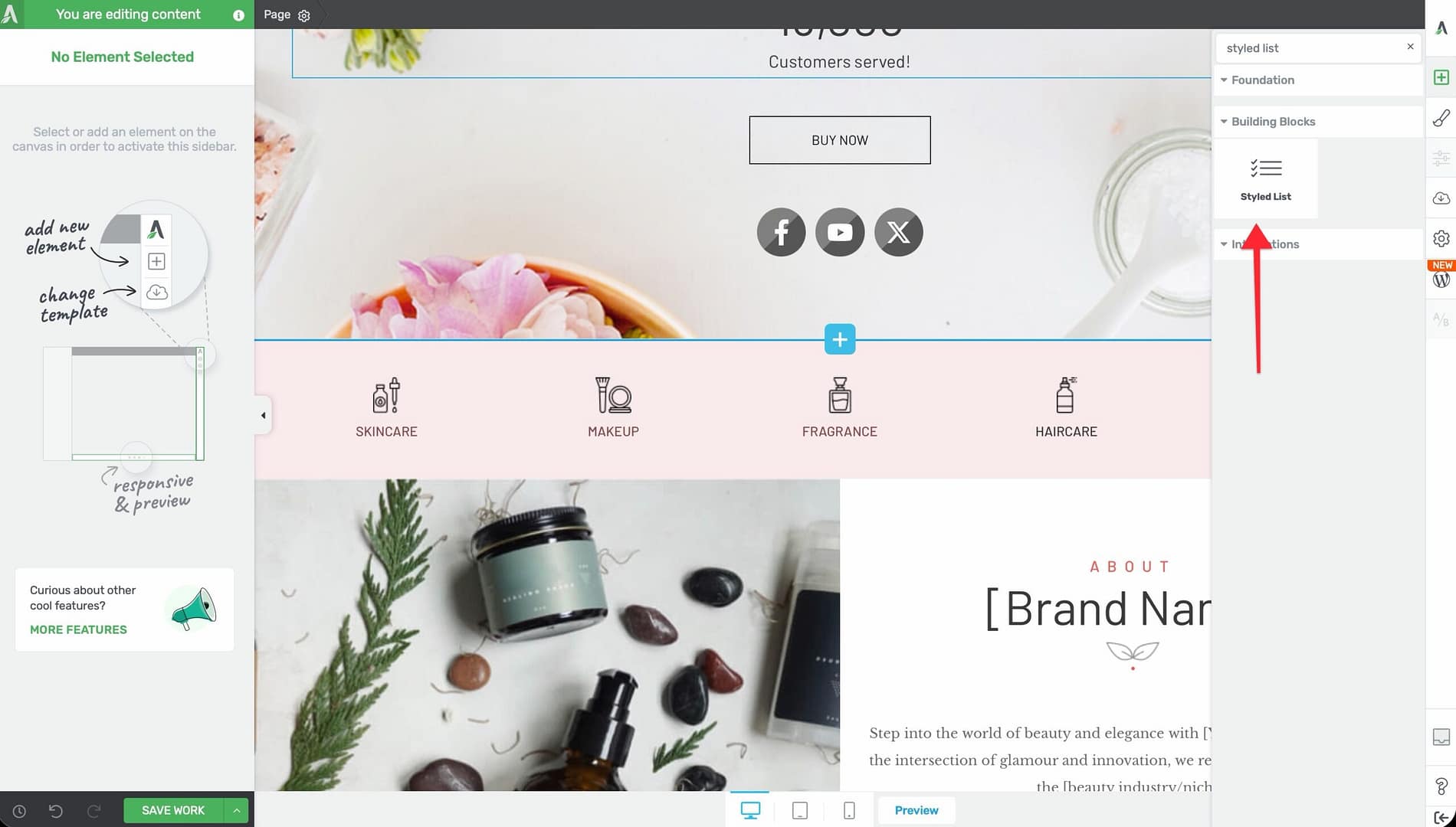
- Alternatively, scroll down to the Building Blocks section in the element list to find the Styled List element.
- Drag the element from the panel and drop it onto your page canvas.
A default styled list with placeholder items will appear on the canvas.
Configuring the Styled List Options
After selecting the Styled List element, the left sidebar displays the following controls:
Icon/Template Picker
The icon picker at the top of the sidebar opens a modal where you can:
- Choose an icon — Select from your installed icon sets to use as the list marker
- Choose a template — Select a pre-designed icon/marker template
The icon you select applies as the default marker for all list items. You can override individual item icons using group editing (see below).
List Item Spacing
A slider that controls the vertical space between list items:
- Default: 20px
- Range: 1 to 100 (px or em)
Increase the spacing for a more open, readable layout, or decrease it for compact lists.
Items Section
The Items section displays a sortable preview of all list items. From here, you can:
- Click Add New to add a new list item
- Drag items to reorder them
- Click on individual items to edit their text
- Delete items you no longer need
Group Editing
The Styled List supports group editing with three selectable groups:
- Grouped List Items — Select and style all list items simultaneously (background, borders, spacing)
- Grouped Icons — Select and style all icon markers simultaneously (color, size)
- Grouped Texts — Select and style all text content simultaneously (font, color, alignment)
Group editing allows you to make bulk changes across all items at once, rather than styling each item individually.
Typography Controls
The following typography options apply to the text within list items:
- Text Align — Align text left, center, right, or justify (uses flex-based alignment)
- Font Color — Set the color of the list item text
- Font Size — Control the size of the list item text
- Text Transform — Apply uppercase, lowercase, capitalize, or none
Adding the Numbered List Element to a Page
Follow these steps to add a Numbered List to your page:
- Open your page or post in the Thrive Architect editor.
- Click the green plus (+) icon in the right sidebar to open the element panel.
- Type Numbered List in the search field at the top of the panel.
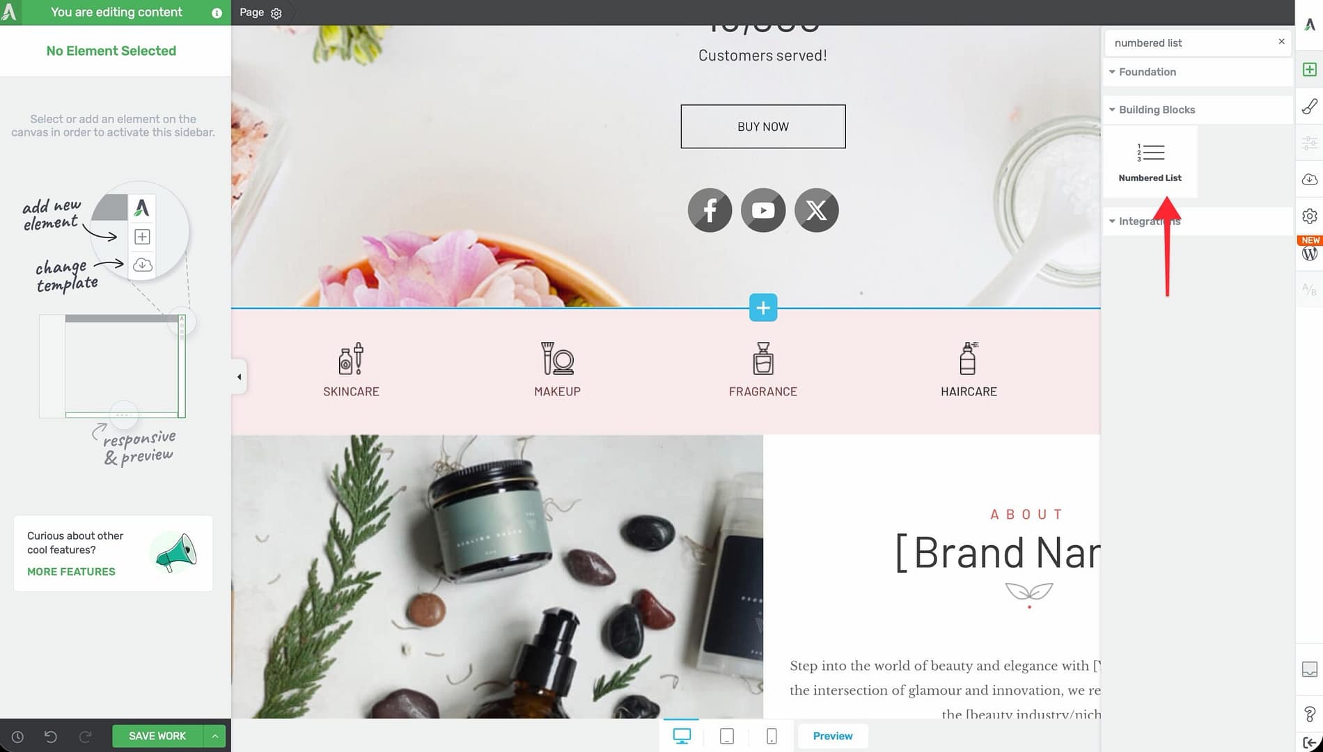
- Alternatively, scroll down to the Building Blocks section in the element list to find the Numbered List element.
- Drag the element from the panel and drop it onto your page canvas.
A default numbered list with placeholder items will appear on the canvas.
Configuring the Numbered List Options
After selecting the Numbered List element, the left sidebar displays the following controls:
Number Font
Click the Number Font selector to choose a custom font for the number markers. This uses the Font Manager, giving you access to Google Fonts, uploaded custom fonts, and system fonts.
Numbers Color
Use the Numbers color picker to set the color of the number markers independently from the list item text.
List Item Spacing
A slider that controls the vertical space between list items:
- Default: 20px
- Range: 1 to 100 (px or em)
Starting Number
An input field that sets the first number in the list:
- Default: 10
- Range: 0 to 366
Tip: Set the starting number to 1 for standard sequential lists. Use a higher starting number when continuing a list that began in a previous section of your page.
Increment
An input field that controls the step between each number:
- Default: 10
- Range: 1 to 366
For example, with a starting number of 1 and an increment of 1, the list displays 1, 2, 3, 4, etc. With a starting number of 10 and an increment of 10, the list displays 10, 20, 30, 40, etc.
Numbers Size
A slider that controls the font size of the number markers:
- Default: 18px
- Range: 8 to 200px
This is separate from the text font size, allowing you to make the numbers larger or smaller than the accompanying text.
Items Section
The Items section works the same as in the Styled List:
- Click Add New to add a new list item
- Drag items to reorder them
- Click on individual items to edit their text
- Delete items as needed
Group Editing
The Numbered List supports group editing with three selectable groups:
- Grouped List Items — Select and style all list items simultaneously
- Grouped Figures — Select and style all number markers simultaneously (color, size, font)
- Grouped Texts — Select and style all text content simultaneously
Styling Best Practices
Consistent Icon Choices for Styled Lists
When using the Styled List, choose icons that match your page’s visual theme:
- Checkmarks — Ideal for benefit lists, feature lists, and checklists
- Arrows — Good for step-by-step instructions or directional content
- Stars — Suitable for highlighting premium features or ratings
- Custom brand icons — Use uploaded icon sets for brand-specific markers
Readable Number Formatting
For the Numbered List element:
- Use a contrasting color for numbers to make them stand out from the text
- Set the Numbers size slightly larger than the text font size for visual hierarchy
- Choose a bold or distinctive font for numbers to differentiate them from body text
- Keep the increment at 1 for most use cases unless you have a specific reason for larger steps
Additional Design Options
Both the Styled List and Numbered List elements support the following standard Thrive Architect design controls:
- Layout & Position — Control margins, padding, display settings, and element positioning
- Borders & Corners — Add borders and adjust corner radius around the list container
- Shadow — Apply box shadow effects to the list
- Background — Add a background color or image behind the list
- Animation — Apply entrance animations to the list element
Frequently Asked Questions
Can I Use Different Icons for Each Item in a Styled List?
Yes. Use the Grouped Icons group editing mode to style all icons at once, or click on an individual list item’s icon to change it independently.
How Do I Continue Numbering From a Previous Section?
Set the Starting Number field to the number where you want this list to begin. For example, if your previous list ended at item 5, set the starting number to 6.
Can I Mix Styled List and Numbered List Items?
No. These are separate elements with different marker systems. If you need a mixed list, consider using two separate elements stacked vertically and adjusting the spacing to create a seamless appearance.
How Do I Change the Spacing Between Items?
Use the List Item Spacing slider in the left sidebar. This controls the vertical gap between each list item.
Related Resources
- Text Element: How to Use the Text Element — Standard text formatting including basic HTML lists
- Icon Element: How to Use the Icon Element — Standalone icons that can complement list designs
- Content Box: How to Use the Content Box Element — Container element for grouping lists with other content
- Typography: How to Use Typography and Fonts — Font management for list text styling
That’s it! You’ve successfully learned how to use the Styled List and Numbered List elements in Thrive Architect. With custom icon markers, adjustable numbering, flexible spacing, group editing, and full typography control, you can create polished, visually engaging lists for any type of content.