In this article, you’ll learn how to use the Text element in Thrive Architect. This is the most fundamental element in the editor, used for adding paragraphs, styled text, and even headings to your pages and posts.
The Text element is the starting point for all written content in Thrive Architect. Whether you’re writing a paragraph, a caption, or a styled headline, the Text element provides full control over fonts, colors, spacing, gradients, highlight effects, and advanced features like TypeFocus animation and heading conversion.
Adding a Text Element to Your Page
Follow these steps to add a Text element to your page:
- Open your page or post in the Thrive Architect editor.
- Click the green plus (+) icon in the right sidebar to open the element panel.
- Type Text in the search field at the top of the panel.
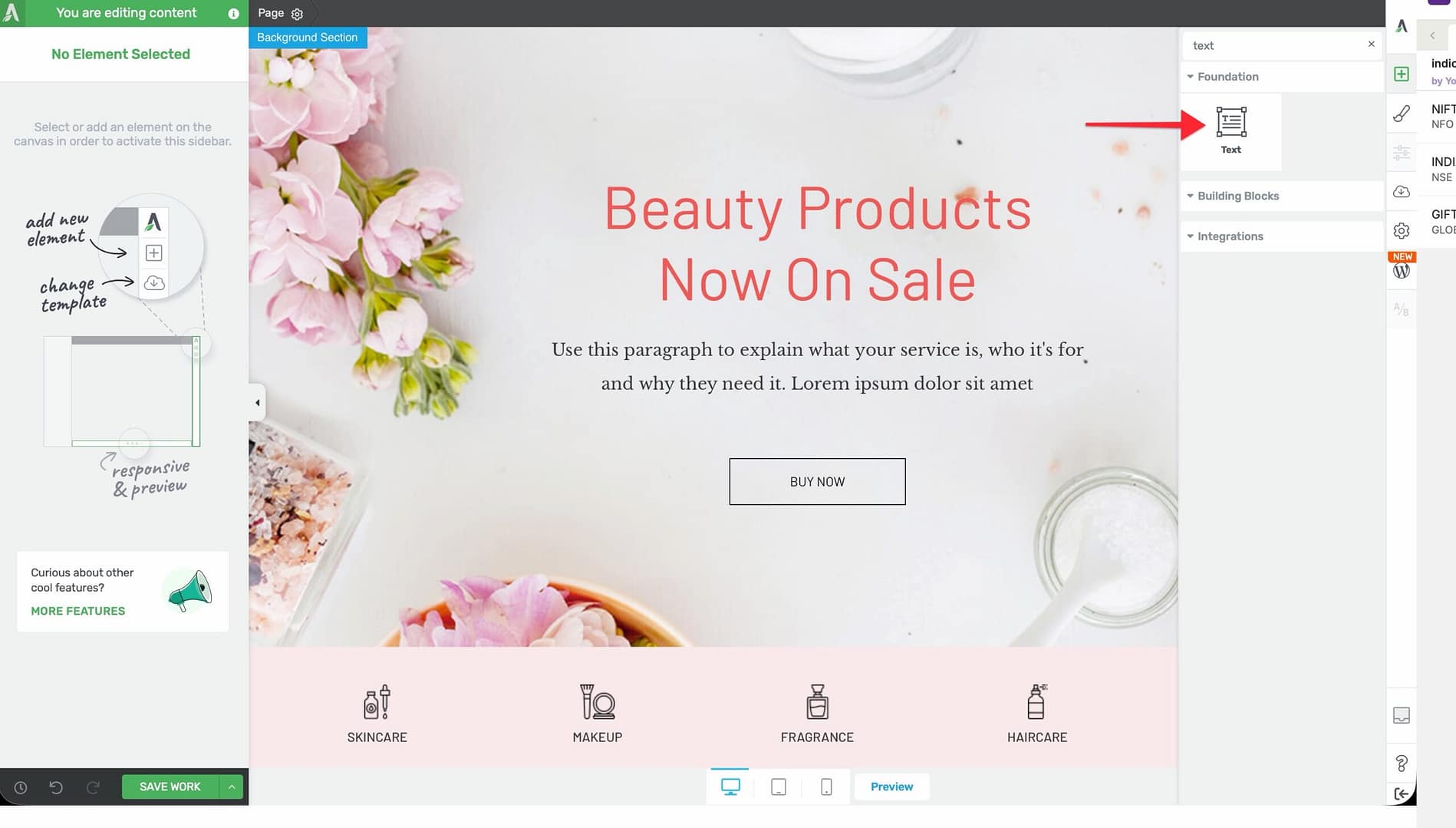
- Drag the element from the panel and drop it onto your page canvas—typically inside a Background Section, Column, or Content Box.
- A default text block will appear. Click on it to start typing or editing.
Once added, click on the Text element to select it. The element’s styling options will appear in the left sidebar.
Main Options
When you select a Text element, the following options appear in the left sidebar:
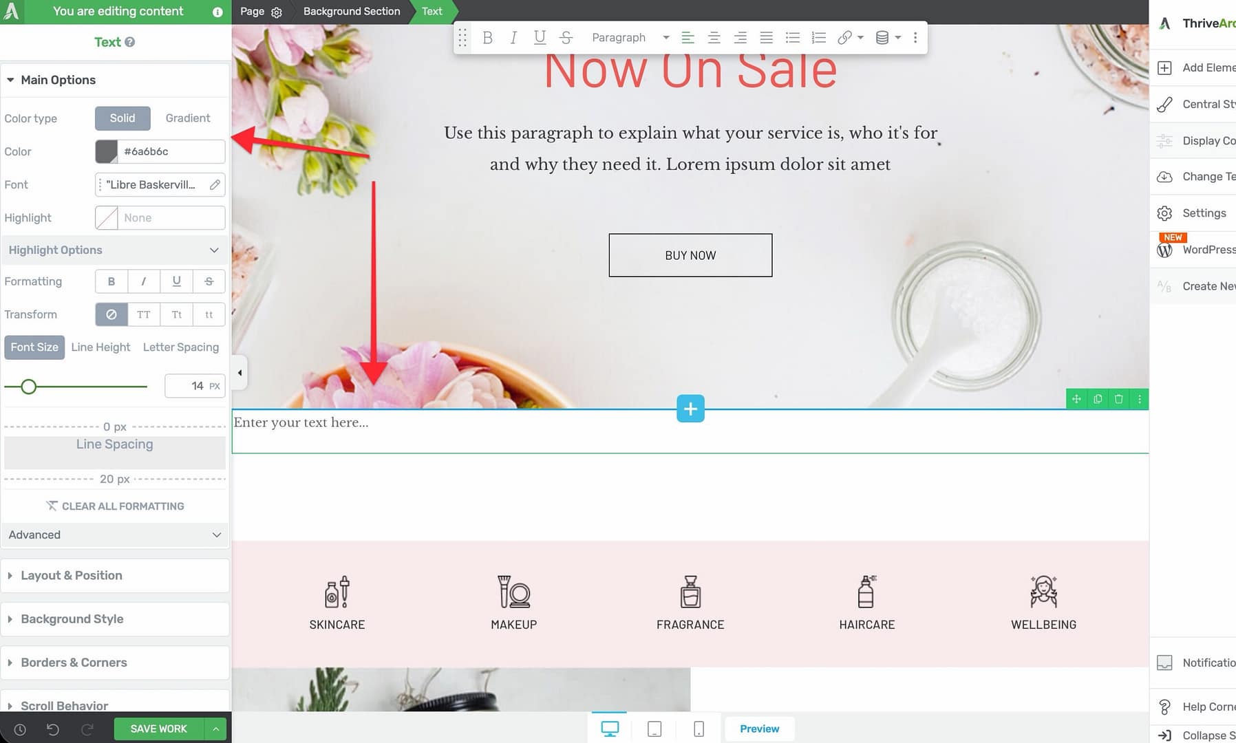
Font Color
Controls the color of your text using two modes:
- Solid — Select a single flat color using the color picker
- Gradient — Apply a gradient effect across your text characters
The default font color is black (#000).
Font Face
A dropdown selector that lets you choose from:
- System fonts available on the visitor’s device
- Google Fonts loaded from the Google Fonts library
- Custom fonts uploaded through the Thrive Dashboard
Font Background (Highlight)
Applies a background highlight color behind your text, similar to a highlighter marker effect.
When you enable this option, an expandable Highlight Options section becomes available with the following controls:
- Highlight Type — Choose the style of the highlight effect
- Stroke Width — Adjust the thickness of the highlight stroke
- Position — Control the vertical placement of the highlight relative to the text
- Dasharray Line/Gap Length — Set the length of dashes and gaps for dashed highlight styles
- Animation — Choose an animation effect for the highlight appearance
- Animation Duration — Control how long the highlight animation takes to complete
- Animation Delay — Set a delay before the highlight animation begins
- Device Highlight Status — Toggle the highlight effect on or off for specific device types (desktop, tablet, mobile)
Text Style
Apply predefined text styling such as bold, italic, underline, or strikethrough to the selected text.
Text Transform
Control the capitalization of your text:
- None — Text displays as typed
- Uppercase — All characters appear in uppercase
- Lowercase — All characters appear in lowercase
- Capitalize — The first letter of each word is capitalized
Font Size, Line Height, and Letter Spacing
A toggle group of three related typography controls:
- Font Size — Controls the size of your text. Default: 16px. Range: 1–100px (or em units).
- Line Height — Sets the vertical spacing between lines of text. Default: 1em. Range: 1–200em (or px units).
- Letter Spacing — Adjusts the horizontal space between individual characters. Default: auto. Range: 0–100px (or em units).
Line Spacing
An additional control for fine-tuning the vertical spacing between paragraphs and text blocks within the element.
When you click on the Line Spacing control, dotted lines appear above and below the text block. You can drag the upper or lower dotted line to adjust the spacing. This is especially useful for removing unwanted space below paragraphs and headings that does not appear in the Layout & Position margin/padding controls.
Clear All Formatting
A link at the bottom of the typography options that removes all custom formatting (bold, italic, color overrides, etc.) and resets the text to its default style.
Advanced Options
Expand the Advanced section in the left sidebar to access these additional controls:
TypeFocus
TypeFocus is an animated text effect that highlights or cycles through specific words or phrases in your text to draw the reader’s attention. Configure it from the TypeFocus control inside the Advanced section.
Heading Toggle
This toggle converts a standard Text element into a heading element. When enabled, the text will render as a heading tag (H1 through H6) instead of a paragraph tag.
Important: Headings are not a separate element in Thrive Architect. To create a heading, add a Text element and enable the Heading Toggle in the Advanced section.
Heading Rename
Once the Heading Toggle is enabled, use the Heading Rename dropdown to select the heading level: H1 through H6. This controls the semantic HTML tag used for the heading.
Heading Alt Text
An optional text field that sets alternative text for the heading. This is primarily used for accessibility purposes, allowing screen readers to provide additional context about the heading.
Additional Styling and Design Options
Beyond the main options, the Text element supports:
- Background — Add a background color, gradient, or image behind the entire text block
- Borders & Corners — Set border width, style, color, and corner radius
- Shadow — Add an inner or outer box shadow to the text container
- Layout & Position — Control margins, padding, alignment, and positioning
- Animation — Apply entrance animations (fade, slide, bounce, etc.) when the element scrolls into view
- Scroll Effects — Add parallax or other scroll-triggered behaviors
- Conditional Display — Show or hide the text based on visitor criteria (logged-in status, device type, etc.)
- Responsive — Override font size, spacing, and visibility for desktop, tablet, and mobile individually
Common Use Cases
Body Text and Paragraphs
Use the Text element with default settings for standard body copy:
- Add a Text element inside a Background Section or Column.
- Set the Font Size to your preferred body size (commonly 16–18px).
- Adjust the Line Height to 1.5–1.8em for comfortable reading.
- Choose a readable Font Face from the dropdown.
Highlighted Callout Text
Draw attention to a key phrase with the highlight feature:
- Select the text you want to highlight.
- Enable Font Background in the sidebar.
- Expand the Highlight Options section.
- Choose your preferred Highlight Type and color.
- Optionally add an Animation to reveal the highlight on scroll.
Animated TypeFocus Headlines
Create engaging headlines that cycle through key words:
- Add a Text element and type your headline.
- Expand the Advanced section in the left sidebar.
- Configure the TypeFocus control to select which words animate and how.
Frequently Asked Questions
How Do I Create a Heading in Thrive Architect?
Headings are created using the Text element. Add a Text element, then expand the Advanced section in the left sidebar and enable the Heading Toggle. Use Heading Rename to select the heading level (H1 through H6).
Can I Apply a Gradient to My Text?
Yes. In the Font Color section, switch from Solid to Gradient mode. You can then configure a multi-color gradient that renders across the text characters.
What Is TypeFocus?
TypeFocus is a built-in animated text feature that highlights, rotates, or cycles through specific words in a text block. It is especially useful for hero headlines and attention-grabbing sections.
Troubleshooting
- Unwanted Bullet Point Spacing — When using bullet point formatting in multi-line paragraphs within the Text element, extra spacing may appear next to bullet points. To fix this, add custom CSS targeting the list items. Go to Settings (gear icon) > Advanced Settings > Custom CSS and add rules to adjust the margin or padding on li elements within the text block.
Related Resources
- Headings: How to Use Headings in Thrive Architect — Convert text to H1–H6 heading tags
- Typography: How to Use Typography and Fonts — Manage custom fonts and global text styles
- Animations: How to Use Animations, Hover, and Scroll Effects — Add entrance animations and scroll behaviors
That’s it! You’ve successfully learned how to use the Text element in Thrive Architect. From basic paragraphs to gradient-colored, animated headlines, the Text element gives you complete control over every aspect of your written content.