In this article, you’ll learn how to use the Toggle element in Thrive Architect. This element lets you create collapsible content sections—commonly known as accordions—where visitors click a header to expand or collapse the content below it.
The Toggle element is perfect for FAQ sections, feature lists, step-by-step instructions, and any content that benefits from a compact, expandable layout. Visitors see only the toggle headers at first and can expand the sections they’re interested in.
Adding the Toggle Element to a Page
Follow these steps to add a Toggle element to your page:
- Open your page or post in the Thrive Architect editor.
- Click the green plus (+) icon in the right sidebar to open the element panel.
- Type Toggle in the search field at the top of the panel.
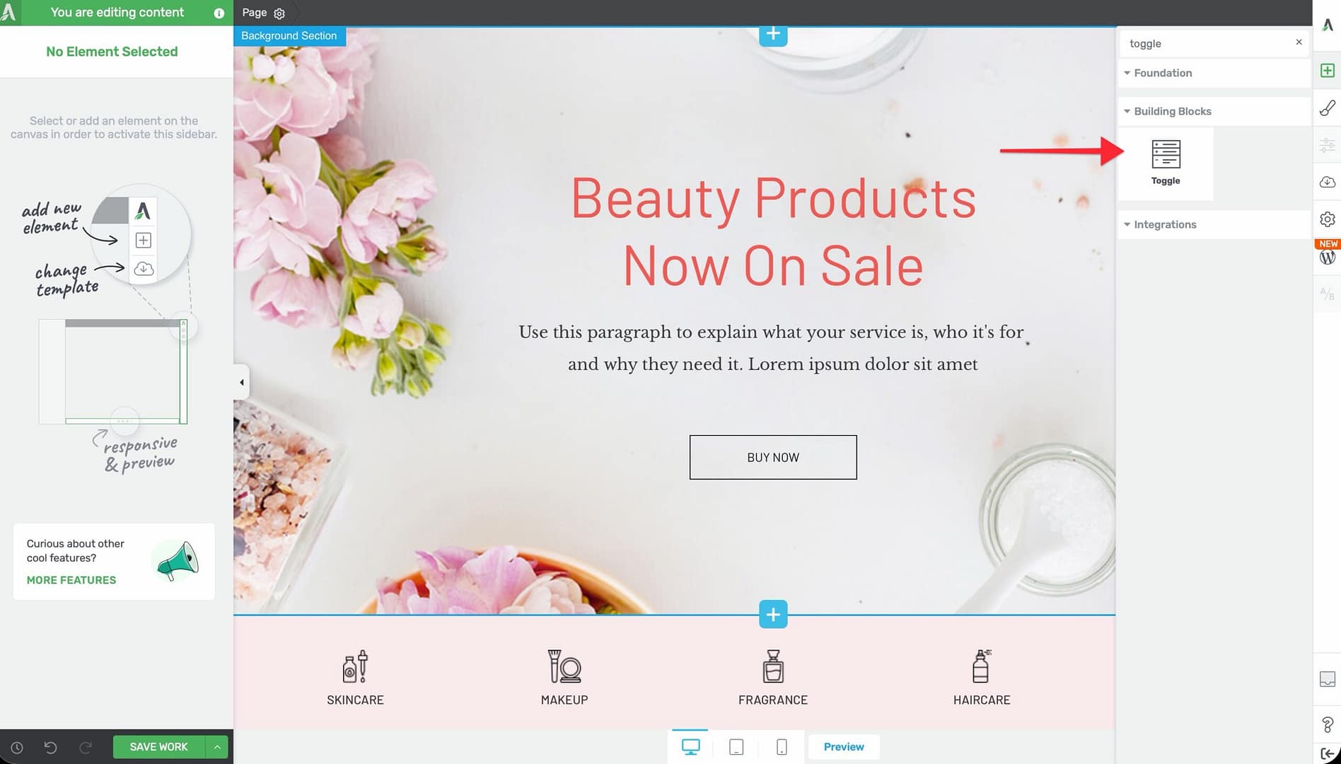
- Alternatively, scroll down to the Building Blocks section in the element list to find the Toggle element.
- Drag the element from the panel and drop it onto your page canvas.
A default Toggle element will appear on the canvas with several pre-configured toggle items ready for customization.
Managing Toggle Items
To add, remove, or reorder your toggle items:
- Click on the Toggle element on the canvas to select it.
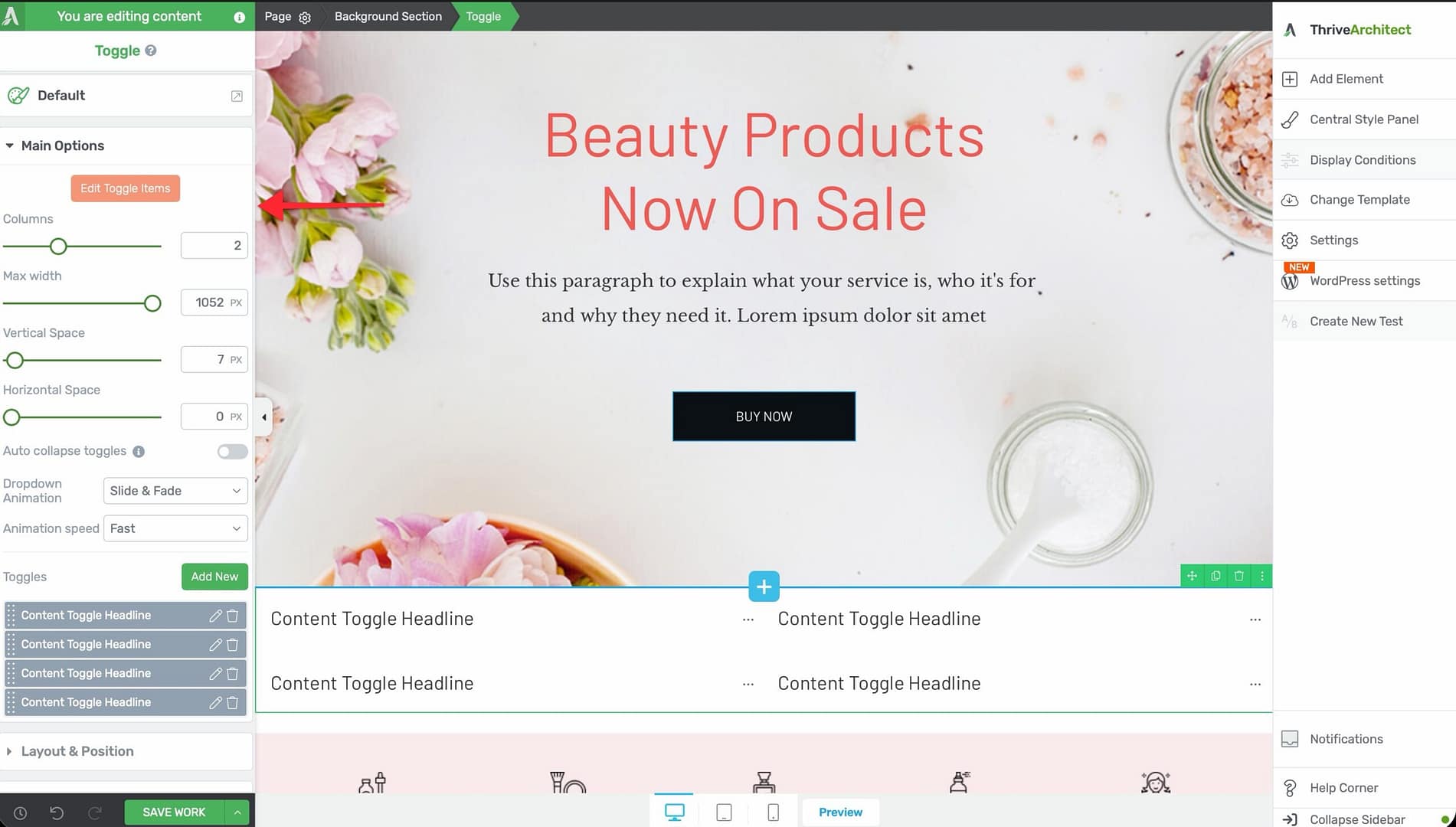
- In the left sidebar, click the Edit Toggle Items button (the prominent orange button at the top of the options panel).
- The toggle editing interface will open, where you can manage your items.
You can also manage toggles directly from the Toggles section in the left sidebar:
- The section displays a sortable list of all toggle items. Drag them to reorder.
- Click the Add New button to add a new toggle item.
- Click the settings icon next to any toggle to configure that individual item.
Configuring the Main Options
After selecting the Toggle element, the left sidebar displays the following configuration options:
Color Palettes
At the top of the options panel, you’ll find color palette presets. Click on a palette to instantly apply a coordinated color scheme across all toggle items, including headers, content areas, and expand/collapse icons.
Columns
Use the Columns slider to arrange your toggle items in a multi-column grid layout:
- Default: 1 column (toggles stacked vertically)
- Range: 1 to 5 columns
When set to 2 or more columns, the toggle items distribute evenly across the columns. This is useful for creating side-by-side FAQ sections or feature comparison layouts.
Max Width
The Max width slider controls the maximum width of the entire Toggle element:
- Default: 1024px
- Range: 100px and above
Use this to constrain the Toggle element within a narrower area, which can improve readability on wide-screen layouts.
Vertical Space
The Vertical Space slider controls the top margin above each toggle item, creating vertical separation between items:
- Range: 0 to 300px
Horizontal Space
The Horizontal Space slider controls the gap between toggle columns (only relevant when using 2 or more columns):
- Default: 16px
- Range: 0 to 300px
Auto Collapse Toggles
Enable the Auto collapse toggles switch to create accordion behavior—when a visitor opens one toggle, any previously open toggle automatically closes. This ensures only one toggle is expanded at a time.
Note: When auto collapse is enabled, visitors can still close an open toggle by clicking its header again. This keeps the interaction intuitive and predictable.
Dropdown Animation
Control how the toggle content area expands and collapses with the Dropdown Animation option:
- None — Content appears and disappears instantly with no animation
- Slide — Content slides down to expand and slides up to collapse
- Fade — Content fades in when expanding and fades out when collapsing
- Slide & Fade — Combines the slide and fade effects for a smooth transition
Animation Speed
After selecting an animation type (other than None), choose the speed of the transition:
- Slow — A gentle, drawn-out transition
- Medium — A balanced transition speed
- Fast — A quick, snappy transition
Tip: For professional content like FAQs or documentation, use Slide or Fade at Medium speed. For marketing pages, Slide & Fade at Fast speed creates a dynamic feel.
Editing Toggle Content
Each toggle item has two states: collapsed and expanded. To add content to a toggle:
- Click on a toggle header to expand it in the editor.
- Click inside the expanded content area.
- Add any Thrive Architect elements you need—text, images, buttons, videos, lists, and more.
- Repeat for each toggle item.
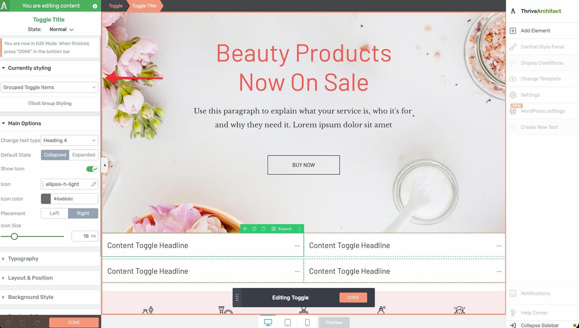
Editing the Toggle Header
- Click on the toggle header text to select it.
- Type directly to replace the default text with your own heading.
- Use the text formatting toolbar to adjust the font, size, color, and alignment.
Toggle States and Styling
The Toggle element has two visual states that you can style independently:
- Collapsed — The default state when a toggle is closed. Only the header and expand icon are visible.
- Expanded — The state when a toggle is open. The header, content area, and collapse icon are all visible.
To style each state:
- Select a toggle item.
- Use the state selector in the left sidebar to switch between the collapsed and expanded states.
- Apply different background colors, borders, header styles, and icon appearances for each state.
This lets you create visual cues that clearly indicate which toggles are open and which are closed.
Using Group Editing
The Toggle element supports group editing for the following item types:
- Collapsed toggle items — Edit the styling of all collapsed toggle headers simultaneously
- Expanded toggle items — Edit the styling of all expanded toggle headers at the same time
- Toggle content — Edit the styling of all toggle content areas at once
To use group editing, select one of the items in a group, then enable Group Editing in the left sidebar. Any styling changes you make will apply to all items in that group.
Styling Options
The Toggle element supports the following styling controls:
- Shadow — Add box shadows to the toggle container (inner shadows and text shadows are not available)
- Borders — Add borders to the toggle items (corner radius and horizontal rules are not available)
Note: The Typography and Animation components are hidden for the Toggle element. Typography is controlled within the individual text and heading elements inside each toggle item.
Common Use Cases
FAQ Sections
The most popular use for toggles is creating FAQ (Frequently Asked Questions) sections. Each toggle header contains a question, and the expanded content provides the answer. Enable Auto collapse toggles so visitors can focus on one question at a time.
Feature Descriptions
List product or service features as toggle headers, with detailed descriptions, images, or videos inside each expanded section. Use a multi-column layout (2 or 3 columns) for a more visual presentation.
Step-by-Step Instructions
Number your toggle headers (Step 1, Step 2, Step 3) and place detailed instructions inside each one. This keeps the overall page compact while giving visitors access to full details on each step.
Course or Module Outlines
Use toggles to display a course outline or curriculum. Each toggle header represents a module or section, and the expanded content lists the lessons, resources, or objectives within that module.
Terms and Conditions
Present legal or policy content in toggles to keep the page short and scannable. Visitors can expand only the sections relevant to them.
Frequently Asked Questions
Can I Set a Toggle to Be Open by Default?
Yes. Click on the toggle item you want to be open by default, and set its initial state to expanded in the toggle item settings. When the page loads, that toggle will already be open.
Can I Nest Toggles Inside Other Elements?
Yes. The Toggle element can be placed inside columns, background sections, content boxes, and other container elements. You can also place elements inside the toggle content area, but nesting a Toggle element inside another Toggle element is not recommended.
How Do I Create Accordion Behavior?
Enable the Auto collapse toggles switch in the main options. This ensures only one toggle can be open at a time—opening a new toggle automatically closes any previously open one.
Can I Use More Than 5 Columns?
No. The column slider has a maximum of 5 columns. For most use cases, 1 to 3 columns provides the best readability and user experience.
Related Resources
- Tabs Element: How to Use the Tabs Element — Tabbed content as an alternative to toggles
- Content Box: How to Use the Content Box Element — Container element for grouping content inside toggles
- Styled Box: How to Use the Styled Box Element — Pre-designed content sections from the template library
- Getting Started: Getting Started with Thrive Architect — Overview of the editor and element panel
That’s it! You’ve successfully learned how to use the Toggle element in Thrive Architect. With options for multi-column layouts, accordion behavior, dropdown animations, and independent state styling, you can create organized, interactive collapsible content that keeps your pages clean and focused.