In this article, you’ll learn how to translate your Thrive Apprentice online school into other languages—covering course content, built-in labels, template text, checkout forms, and advanced string overrides using the “Say What” plugin.
Translating Course Content in the Course Editor
You can add course content in any language directly in the course editor. Additionally, some default labels within the course editor can be translated:
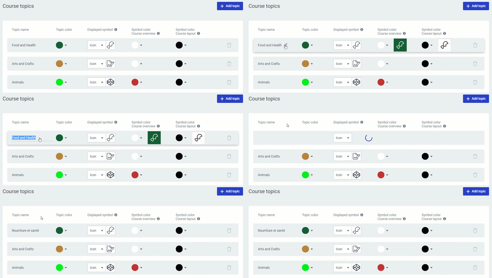
Translating Course Topics
- Open your course in Thrive Apprentice and look at the left navigation bar.
- Click on the default Course topics label in the navigation.
- Click the pencil icon next to the label to edit it.

- Replace the text with your translated version and save.
Translating Difficulty Levels
- In the course editor, click on the difficulty level dropdown.
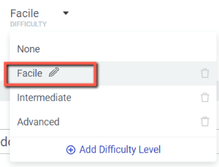
- Click the pencil icon next to a difficulty level to edit it.
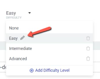
- Replace the text with your translated version and save.
Translating Labels in Thrive Apprentice Settings
The main way to translate your school’s student-facing interface is through the built-in Labels & Translations section. This covers button labels, progress messages, navigation text, and access restriction messages.
- Go to Thrive Dashboard > Thrive Apprentice.
- Click Settings in the left sidebar.
- Select the Labels & Translations tab.

- You’ll see a list of all default text strings used across your school, organized into categories such as:
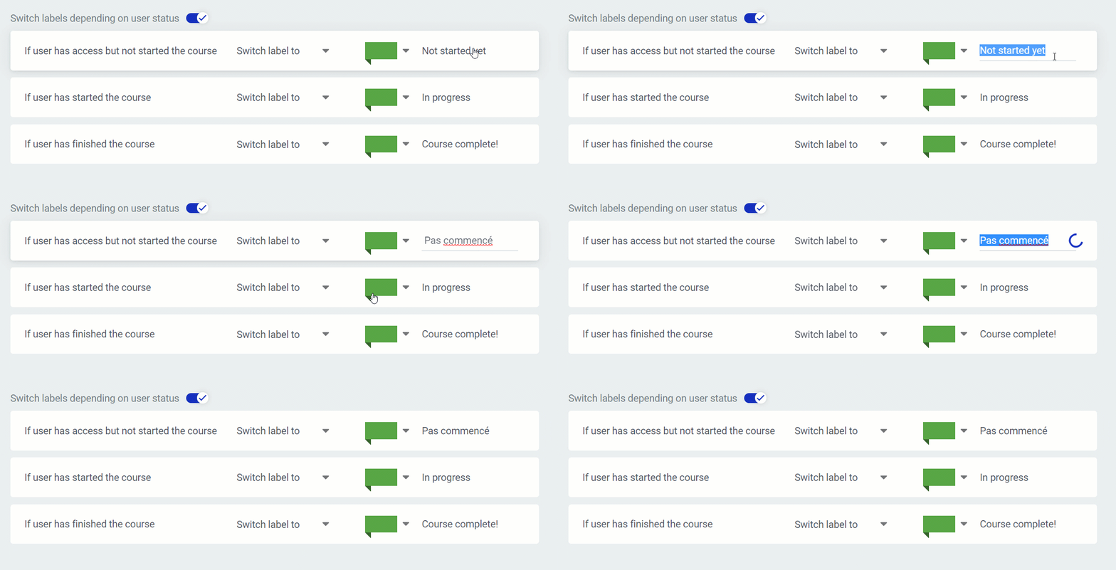
- Access restriction labels — started, in progress, completed
- Call-to-action buttons — Learn more, Start, Continue course, Revisit the course
- Course content types — text, audio, video, mixed content lesson
- Course navigation — Next lesson, Previous lesson, To course overview, Mark lesson complete
- Course structure — chapters, modules, lessons, Open/Download buttons
- Course progress — Progress, Not started yet, In progress, Finished
- Access restriction labels — started, in progress, completed
- Click on any label to edit it and enter your translated text.
- Click Save when you’re done.
Tip: Use the search bar at the top of the labels list to quickly find specific strings.
Translating Text in Templates
Some text displayed on your school pages comes from the templates rather than the Labels & Translations settings. To translate this text:
- In Thrive Apprentice, go to the Design tab.
- Click Edit Design, then click Manage Templates.
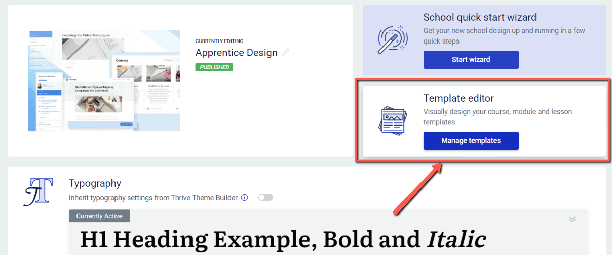
- Select the template you want to edit (e.g., Default Lesson, Course Overview).
- Click on the text elements in the template—such as the header, sidebar, or footer sections—to edit them directly.
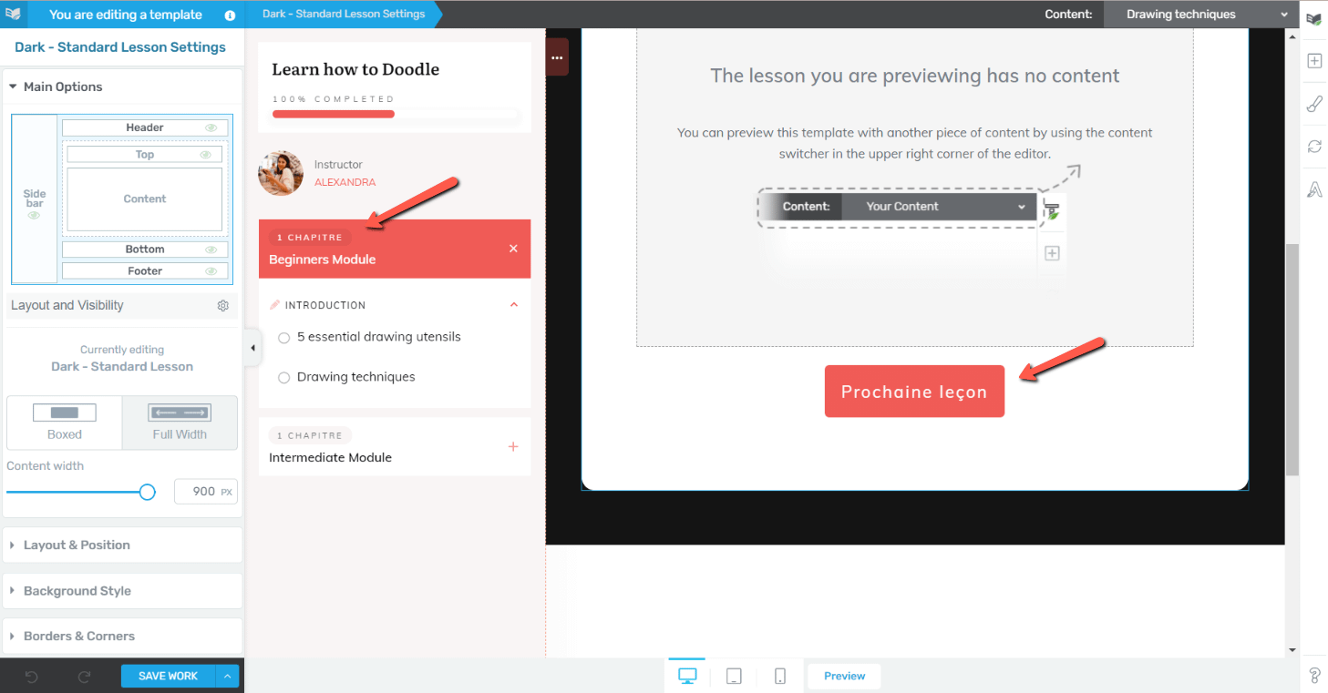
- Replace the text with your translated version and save your changes.
Note: Some placeholder text in the footer (such as contact information and company details) is pulled from your WordPress settings and cannot be edited directly in the template editor.
Translating Checkout Forms in Thrive Architect
If you’re using Thrive Apprentice’s checkout functionality, you can translate the checkout form directly in Thrive Architect.
- Open the page containing your checkout form in Thrive Architect.
- Click on the Checkout element to select it, then click Edit Form Elements.
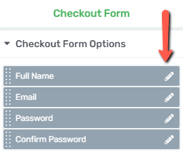
- Click the pencil icon on each form field (Name, Email, Password, etc.) to edit the label and placeholder text. Click Apply after each change.
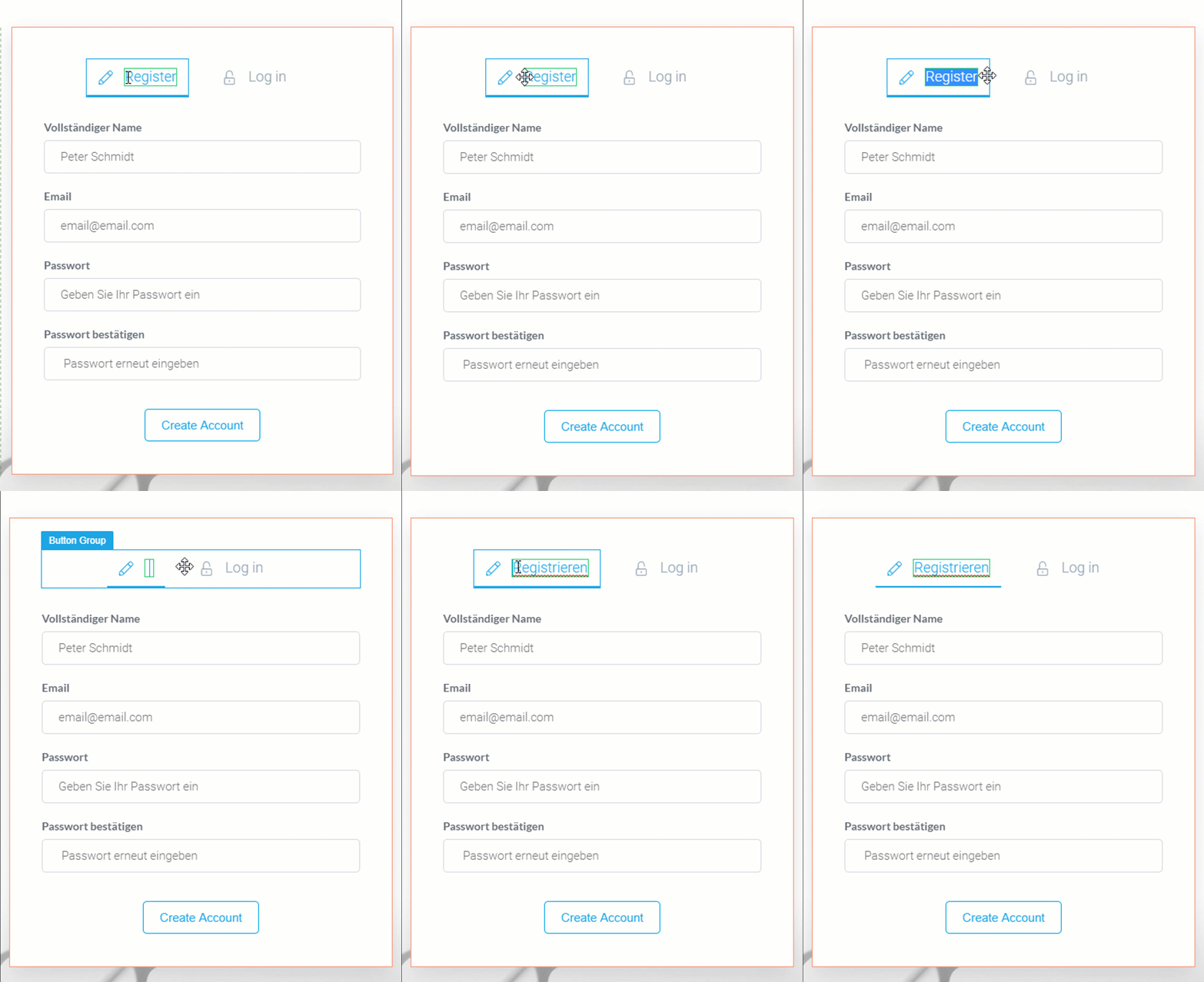
- Click directly on text elements like Register, Log in, and Create Account to edit them in place.
- To translate other form states (e.g., login form, password recovery), use the Editing Checkout dropdown to switch between forms.
- To translate error messages, go to the Advanced section of the Checkout options and click Edit error messages.
- Click Save Work when finished.
Note: Checkout form translations are page-specific. If you have multiple checkout pages, you’ll need to translate each one individually.
Using the “Say What” Plugin for Advanced Translations
Some strings are hardcoded in the plugin and can’t be changed through the settings panel. The free Say What plugin lets you override these strings without editing code.
- In your WordPress dashboard, go to Plugins > Add New.
- Search for Say What, then click Install Now and Activate.

- Go to Tools > Text Changes.
- Click Add New.
- Fill in the fields:
- Original String — the exact English text you want to replace (must match exactly, including capitalization and punctuation).

- Text Domain — enter
thrive-apprenticefor Thrive Apprentice strings.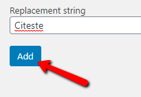
- Replacement String — your translated text.
- Original String — the exact English text you want to replace (must match exactly, including capitalization and punctuation).
- Click the blue Add button.
Here are the text domains for other Thrive products, in case you need to translate strings from them as well:
thrive-apprentice— Thrive Apprenticethrive-cb— Thrive Architectthrive-theme— Thrive Theme Builderthrive-comments— Thrive Commentsthrive-headline— Thrive Headline Optimizerthrive-leads— Thrive Leadsthrive-ovation— Thrive Ovationthrive-quiz-builder— Thrive Quiz Builderthrive-ult— Thrive Ultimatum
Important: The original string must match exactly—including capitalization and punctuation—for the replacement to work. You can edit or delete translations at any time from the Tools > Text Changes page.
That’s it! You now know how to translate your Thrive Apprentice online school using course editor labels, built-in Labels & Translations settings, template text editing, checkout form translation, and the “Say What” plugin.
Related Resources
- Settings Guide: Learn about all available options in the Thrive Apprentice Settings Guide.
- Email Templates: Customize your email notifications with the Email Templates guide.
- Designing Your School: Learn how to customize your school’s design including templates.