In this article, you’ll learn how to add engaging elements like Countdown Timers, Progress Bars, and Animations to your Thrive Leads forms to boost conversions.
Countdown Timers
Scarcity is a powerful motivator. You can add a countdown timer to any form.
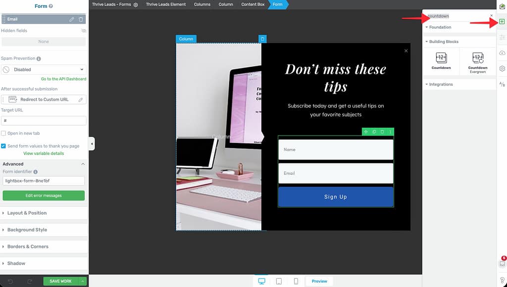
- Open your form in Thrive Architect.
- In the right sidebar, click the Plus (+) icon to add an element.
- Search for Countdown.
- Drag and drop it onto your form.
- Configure:
- Evergreen: Counts down for each visitor individually (e.g., “Offer ends in 15 minutes”).
- Fixed Date: Counts down to a specific calendar date/time.
Progress Bars
Progress bars encourage completion by showing the user they are almost done.
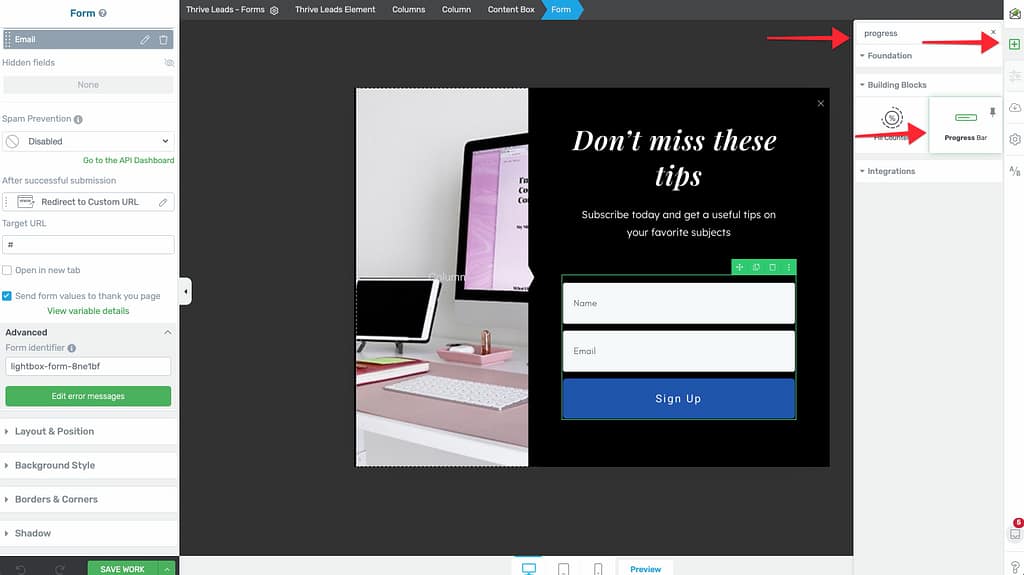
- Drag the Progress Bar element onto your form.
- Set the percentage (e.g., 50% or 75%).
- Common tactic: “You are 75% complete! Just enter your email to finish.”
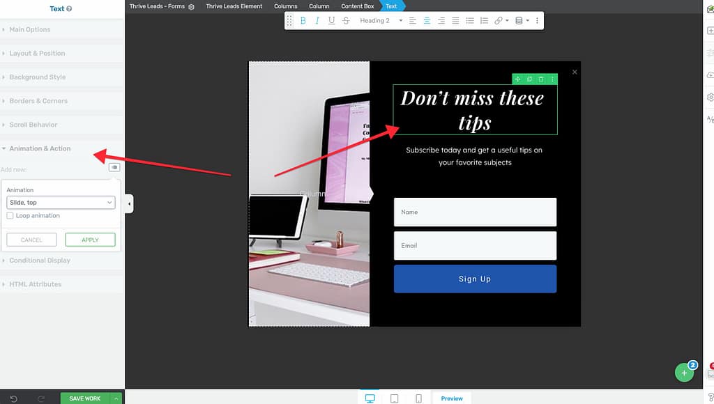
Exit Intent & CSS Animations
You can also animate the entire form or specific elements.
- Form Entry Animation: Click the Gear Icon > Advanced Settings > Entry Animation. Choose “Zoom In”, “Slide Down”, etc.

- Element Animation: Select any text or image, go to Animation & Action in the left sidebar, and choose a CSS animation (e.g., “Bounce” or “Wobble”) to draw attention to it.
CSS Animation Tutorial
Learn how to use CSS hover animations on your forms in this video:
Watch the CSS Hover Animation Tutorial (Wistia)
Learn how to use CSS hover animations on your forms in this video:
Watch the CSS Hover Animation Tutorial (Wistia)
That’s it! You’ve successfully added interactive elements to your form.
Related Resources
- Templates: Creating and Using Form Templates
- States: States and Multi-Step Forms — Complete Guide