In this article, you’ll learn how to use the Custom Menu element in Thrive Architect. This element lets you add fully customizable navigation menus to any page, with support for horizontal, vertical, and hamburger layouts, conditional visibility based on login state, and responsive design across all devices.
The Custom Menu element is found in the Building Blocks section of the element panel. You can build a menu from scratch using a custom source, or pull in any menu registered in your WordPress Appearance > Menus settings.
Adding the Custom Menu Element to a Page
Follow these steps to add a Custom Menu element:
- Open your page or post in the Thrive Architect editor.
- Click the green plus (+) icon in the right sidebar to open the element panel.
- Type Custom Menu in the search field at the top of the panel.
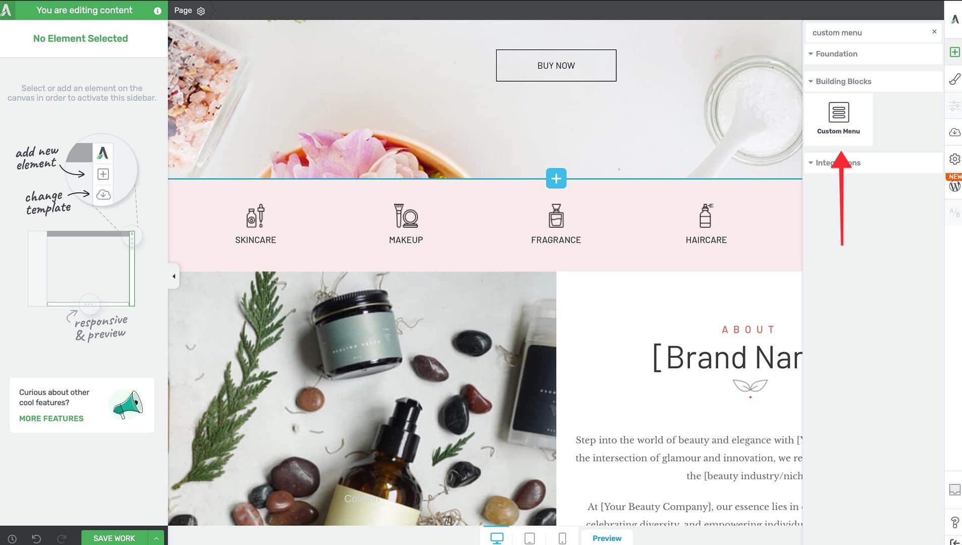
- Alternatively, scroll down to the Building Blocks section in the element list to find the Custom Menu element.
- Drag the element from the panel and drop it onto your page canvas.
A default Custom Menu element will appear on the canvas, ready for configuration.
Choosing a Menu Template
When you first add the Custom Menu element, a template selection screen appears. You can choose from several pre-designed menu templates that come with pre-configured styles, colors, and layouts. Select a template to use it as a starting point, then customize it further using the options in the left sidebar. You can also skip template selection and start with a blank menu.
Selecting a Menu Source
When you first add a Custom Menu element, you need to choose a menu source. Click on the element and look for the Menu Source option in the left sidebar:
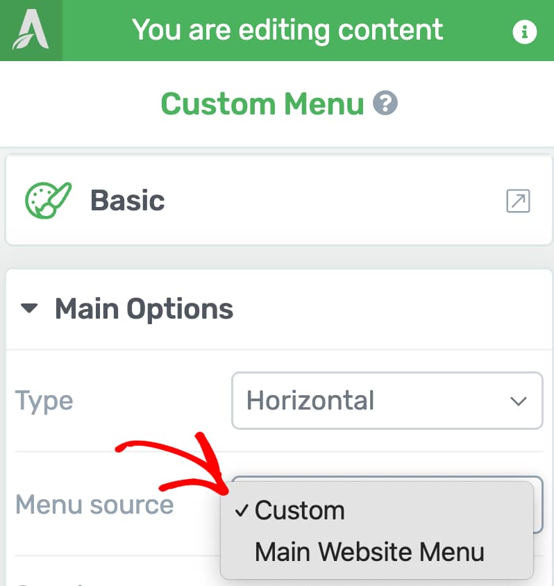
- Custom — Build a menu from scratch directly inside the Thrive Architect editor. You can add, remove, and reorder items without leaving the page.
- WordPress Menu — Select from any menu registered in Appearance > Menus in your WordPress dashboard. The menu items, structure, and hierarchy will be pulled in automatically.
Tip: Choose Custom when you want a standalone menu that lives only on the current page. Choose a WordPress Menu when you want to reuse a menu that already exists across your site.
Choosing a Menu Type
The Custom Menu element supports three distinct menu types. Select your preferred type from the options in the left sidebar:
Horizontal Menu
Displays menu items side by side in a single row. This is the most common layout for top navigation bars and header menus.
Vertical Menu
Displays menu items stacked one on top of the other. This layout is useful for sidebar navigation, footer link lists, or narrow layout areas.
Hamburger Menu
Collapses all menu items behind a hamburger icon (three lines). Visitors click the icon to reveal the menu. This layout is ideal for mobile-first designs and pages where you want to conserve space.
Configuring Color Palettes
At the top of the left sidebar options, you’ll find color palette presets. Click on a palette to instantly apply a coordinated color scheme across the entire menu, including menu items, backgrounds, hover states, and dropdown areas.
Spacing Controls
The Custom Menu element provides three spacing controls in the left sidebar:
Horizontal Spacing
Controls the horizontal gap between menu items:
- Default: 16px
- Range: 0 to 100px
Vertical Spacing
Controls the vertical gap between menu items:
- Default: 1px
- Range: 0 to 100px
Between Spacing
Controls the spacing between the menu and other nearby elements:
- Default: Auto
- Range: 0 to 300px
Split Menu with Logo
When using a Horizontal menu type, you can enable the Split menu with logo toggle switch in the left sidebar. This inserts your site logo into the center of the menu, splitting the menu items into two groups—one on each side of the logo.
To configure the split menu:
- Select the Custom Menu element on the canvas.
- Enable the Split menu with logo toggle switch.
- The logo will appear in the center of the menu. Click on it to customize its size and appearance.
- Menu items will automatically distribute on either side of the logo.
Note: The split menu with logo feature is only available for Horizontal menu types. It does not appear when using Vertical or Hamburger layouts.
Tip: You can customize where the logo links to by clicking on the logo and editing its link destination. By default, it links to your site’s home page.
Note: When the menu converts to a Hamburger layout on mobile (either manually or via responsive settings), the logo moves out of the split position and appears alongside the hamburger icon at the top of the menu.
Alignment Options
The Custom Menu element provides several alignment controls depending on the selected menu type:
Content Alignment (Vertical Only)
Controls the text alignment of menu items within the vertical menu:
- Left — Aligns all menu items to the left edge
- Center — Centers all menu items
- Right — Aligns all menu items to the right edge
Menu Alignment (Vertical Only)
Controls the horizontal position of the entire vertical menu within its container:
- Left — Positions the menu on the left
- Center — Centers the menu
- Right — Positions the menu on the right
- Full — Stretches the menu to fill the full width of its container
Hamburger Menu Alignment
Controls the position of the hamburger trigger icon:
- Left — Places the icon on the left side
- Center — Centers the icon
- Right — Places the icon on the right side
Menu Width (Vertical Only)
A slider that controls the width of the vertical menu container:
- Range: 50px to 1080px
Hamburger Menu Settings
When using the Hamburger menu type, additional settings become available:
Hamburger Trigger Icon
Choose from five icon styles for the hamburger trigger button:
- Lines — Three horizontal lines (the classic hamburger icon)
- Boxed Lines — Three lines inside a filled box
- Outlined Lines — Three lines inside an outlined box
- Circled Lines — Three lines inside a circle
- MENU Text — The word “MENU” displayed as text
Menu Display
Controls how the menu appears when the hamburger icon is clicked:
- Off Screen Right — The menu slides in from the right edge of the screen
- Off Screen Left — The menu slides in from the left edge of the screen
- Drop Down — The menu drops down from the hamburger icon
- Full Screen Overlay — The menu expands to fill the entire screen
View Expanded Menu in Editor
A toggle switch that lets you preview the expanded state of the hamburger menu directly in the editor. Enable this while designing the menu layout, then disable it before publishing.
Overlay
When using the hamburger menu, you can enable an overlay that dims the rest of the page when the menu is open:
- Toggle the Overlay switch to enable or disable the overlay
- Click the color picker next to the toggle to choose the overlay color and opacity
Dropdown Settings
Dropdown menus appear when visitors hover over or click on a parent menu item. The following settings control dropdown behavior:
Dropdown Direction / Expand Style
Controls how dropdown submenus expand. The available options vary depending on the menu type:
For Vertical menus (desktop only):
- Toggle — Expands the submenu inline, pushing items below it down
- Drop Right — The submenu flies out to the right of the parent item
- Drop Left — The submenu flies out to the left of the parent item
Dropdown Icon
Selects the icon that indicates a menu item has a dropdown submenu:
- None — No dropdown indicator icon
- Angle — A simple angle bracket
- Chevron — A chevron arrow
- Caret — A small filled triangle (caret)
- Triangle — A triangle indicator
Dropdown Animation
Controls the animation effect when a dropdown menu appears:
- None — The dropdown appears instantly with no animation
- Fade In and Out — The dropdown fades in and out smoothly
- Slide Down #1 — The dropdown slides down from the top
- Slide Down #2 — An alternative slide-down animation
- Fold Out — The dropdown unfolds from the top edge
Managing Menu Items (Custom Source)
When using a Custom menu source, you can manage menu items directly in the editor:
- Select the Custom Menu element on the canvas.
- In the left sidebar, find the Menu Items section.
- The section displays a sortable list of all menu items. Drag items to reorder them.
- Click Add New to add a new menu item.
- Click on any item to configure its link, label, and visibility settings.
Note: The Menu Items section with Add New and drag-to-reorder functionality is only available when the menu source is set to Custom. WordPress-sourced menus must be edited from Appearance > Menus.
Displaying Menu Items for Logged-In or Logged-Out Users
You can control which menu items are visible based on a visitor’s login status. This lets you show different navigation options to logged-in members versus anonymous visitors.

To configure conditional visibility for a menu item:
- Select the Custom Menu element on the canvas.
- Click on the specific menu item you want to configure.
- In the left sidebar, find the Show when option.
- Choose one of the three visibility settings:
- Always — The item is visible to all visitors (default)
- Logged in — The item only appears for logged-in users
- Logged out — The item only appears for visitors who are not logged in
Example: Creating a Conditional Menu
Here is a common setup for a conditional navigation menu:
- Home — Show when: Always
- Courses — Show when: Always
- My Dashboard — Show when: Logged in
- My Account — Show when: Logged in
- Log In — Show when: Logged out
- Sign Up — Show when: Logged out
This way, logged-in users see dashboard and account links, while logged-out visitors see login and registration links—all within a single Custom Menu element.
Tip: Test your conditional menu by logging in and out of your site in a separate browser tab. Verify that the correct items appear for each state.
Using Dynamic Text in Menu Items
You can insert dynamic text into menu item labels using the dynamic text feature. For example, you can display the logged-in user’s first name in a menu item label (e.g., “Hi, John”) by inserting a dynamic text tag. To do this, click on a menu item label and use the Insert Dynamic Field option to choose from available dynamic text sources such as the user’s first name, last name, or display name.
Using Dynamic Links in Menu Items
Menu items can use dynamic links instead of static URLs. For example, you can link a menu item to the logged-in user’s profile page, account page, or any other dynamically generated URL. To set a dynamic link, click the link option for the menu item and select Dynamic Link from the link type options. This is particularly useful for personalized navigation where the destination depends on the current user.
Adding a User Image as a Menu Item
You can display a user profile image (such as a Gravatar or custom avatar) as a menu item. This is useful for showing a logged-in user’s photo alongside their name or as a standalone avatar icon in the navigation.
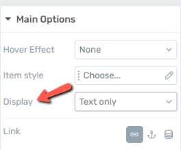
To configure how a menu item displays its icon or image, select the menu item and look for the Display option in the left sidebar:
- Text only — Shows only the menu item label text
- Icon only — Shows only an icon (selected from the icon picker)
- Icon and text — Shows both an icon and the label text
- Image only — Shows only an image (such as a user profile photo)
- Image and text — Shows both an image and the label text
Note: When using Image only or Image and text, you can choose between two image sources:
- Static image — Upload a fixed image that displays the same for all visitors.
- Dynamic source (User Image) — Automatically shows the logged-in user’s profile picture (Gravatar or custom avatar). This creates a personalized navigation experience for each user.
Hover Effects
The Custom Menu element includes built-in hover effects that activate when visitors move their cursor over a menu item. Select a hover effect from the left sidebar:
- None — No visual change on hover
- Underline — A line appears below the menu item text
- Double Line — Two lines appear below the menu item text
- Brackets — Bracket characters appear on either side of the menu item text
Note: When using Image only or Image and text display mode for a menu item, image-specific hover effects are also available. For example, you can apply a greyscale-to-color transition so the image appears in greyscale by default and switches to full color on hover. These image hover effects are separate from the text-based hover effects listed above.
Active State
The Custom Menu element supports an Active state that highlights the menu item corresponding to the current page. This helps visitors understand where they are in your site’s navigation.
To style the active state, use the state selector at the top of the element options and switch to the Active state. You can then customize the typography, colors, and other visual properties that apply when a menu item represents the currently viewed page.
Disable Links to Current Page
Enable the Disable links to current page toggle switch in the left sidebar to prevent the active menu item from being clickable. When enabled, clicking the menu item for the page you are already viewing does nothing—removing unnecessary navigation and improving usability.
Ensuring Your Menu Works on All Devices
Here is a video walkthrough of menu responsive best practices:
To make sure your menu is accessible and functional across desktops, tablets, and mobile phones:
- Use the responsive device switcher at the bottom of the Thrive Architect editor to preview your menu on different screen sizes.
- On smaller screens, consider switching to a Hamburger menu type. The hamburger layout collapses all items behind a single icon, saving screen space.
- Test the hamburger menu’s Menu Display setting (Off Screen Right, Off Screen Left, Drop Down, or Full Screen Overlay) to find the best experience for mobile visitors.
- Verify that dropdown submenus are accessible on touch devices by testing tap interactions.
Tip: You can configure different menu types for different devices. For example, use a Horizontal menu on desktop and switch to a Hamburger menu on mobile using Thrive Architect’s responsive visibility options.
Important: Desktop modifications cascade down to tablet and mobile views, but changes made on mobile only do not affect tablet or desktop. Keep this in mind when styling your menu across breakpoints — start with the desktop view and then override specific settings on smaller screens as needed.
Group Editing
The Custom Menu element supports group editing, which lets you style multiple similar items at once instead of configuring them one by one. Select the element and click the group editing icon in the toolbar to access these groups:
- Top Level Items — Edit all top-level menu items simultaneously
- All Dropdowns — Edit all dropdown containers at once
- All Dropdown Items — Edit all items inside dropdown menus at once
- All Menu Images — Edit all menu item images at once
Tip: Use group editing to ensure consistent styling across your entire menu. After applying group styles, you can still override individual items as needed.
Frequently Asked Questions
Can I Use Both Custom and WordPress Menus on the Same Page?
Yes. Add two separate Custom Menu elements to the page—one set to Custom source and the other set to a WordPress Menu source. Each element operates independently.
How Do I Add a Submenu (Dropdown)?
In the Menu Items section, drag a menu item slightly to the right beneath its parent item to nest it as a child. The child item will appear as a dropdown when visitors hover over or click the parent item.
Can I Show Different Menus to Logged-In and Logged-Out Users?
Yes. Use the Show when option on individual menu items to control visibility based on login state. Set items to Logged in, Logged out, or Always as needed.
Why Is the Split Menu with Logo Option Unavailable?
The split menu with logo feature is only available when the menu type is set to Horizontal. Switch to a Horizontal layout to access this option.
Using the Search Element
The Search element adds a search bar to your page, allowing visitors to search your site content. It is found in the Building Blocks section of the element panel.

Adding the Search Element
- Click the green plus (+) icon in the right sidebar.
- Search for Search or find it in Building Blocks.
- Drag it onto your page and choose a template.
Configuring the Search Element
Click Edit Form Elements to access the search input field settings:
- Placeholder — Set the placeholder text shown inside the search field (e.g., “Search this site…”).
- Search Input — Configure the input field appearance and behavior.
- Submit Button — Customize the search button text, icon, and style.
- Color Palettes — Use smart color palettes to quickly theme the search element.
Tip: The Search element is commonly placed in headers, sidebars, or navigation areas. When used with Thrive Theme Builder, it can be added to your site-wide header template so it appears on every page.
Related Resources
- Mega Menu: How to Build a Mega Menu — Convert a Custom Menu into a multi-column mega menu
- Background Section: How to Use the Background Section Element — Container element for placing menus inside styled sections
- Landing Pages: How to Get Started with Landing Pages — Building full landing pages with navigation menus
- Getting Started: Getting Started with Thrive Architect — Overview of the editor and element panel
That’s it! You’ve successfully learned how to use the Custom Menu element in Thrive Architect. With support for three menu types, conditional visibility for logged-in and logged-out users, split menus with logos, hamburger menu displays, hover effects, and responsive design options, you can build fully customizable navigation menus that adapt to any page layout and audience.