In this article, you’ll learn how to use the Tabs element in Thrive Architect. This element lets you organize content into tabbed sections, so visitors can switch between different pieces of content without leaving the page.
The Tabs element is ideal for presenting categorized information in a compact, interactive layout. Whether you’re displaying product specifications, FAQs, pricing plans, or multi-step instructions, tabs keep your pages clean and easy to navigate.
Adding the Tabs Element to a Page
Follow these steps to add a Tabs element to your page:
- Open your page or post in the Thrive Architect editor.
- Click the green plus (+) icon in the right sidebar to open the element panel.
- Type Tabs in the search field at the top of the panel.
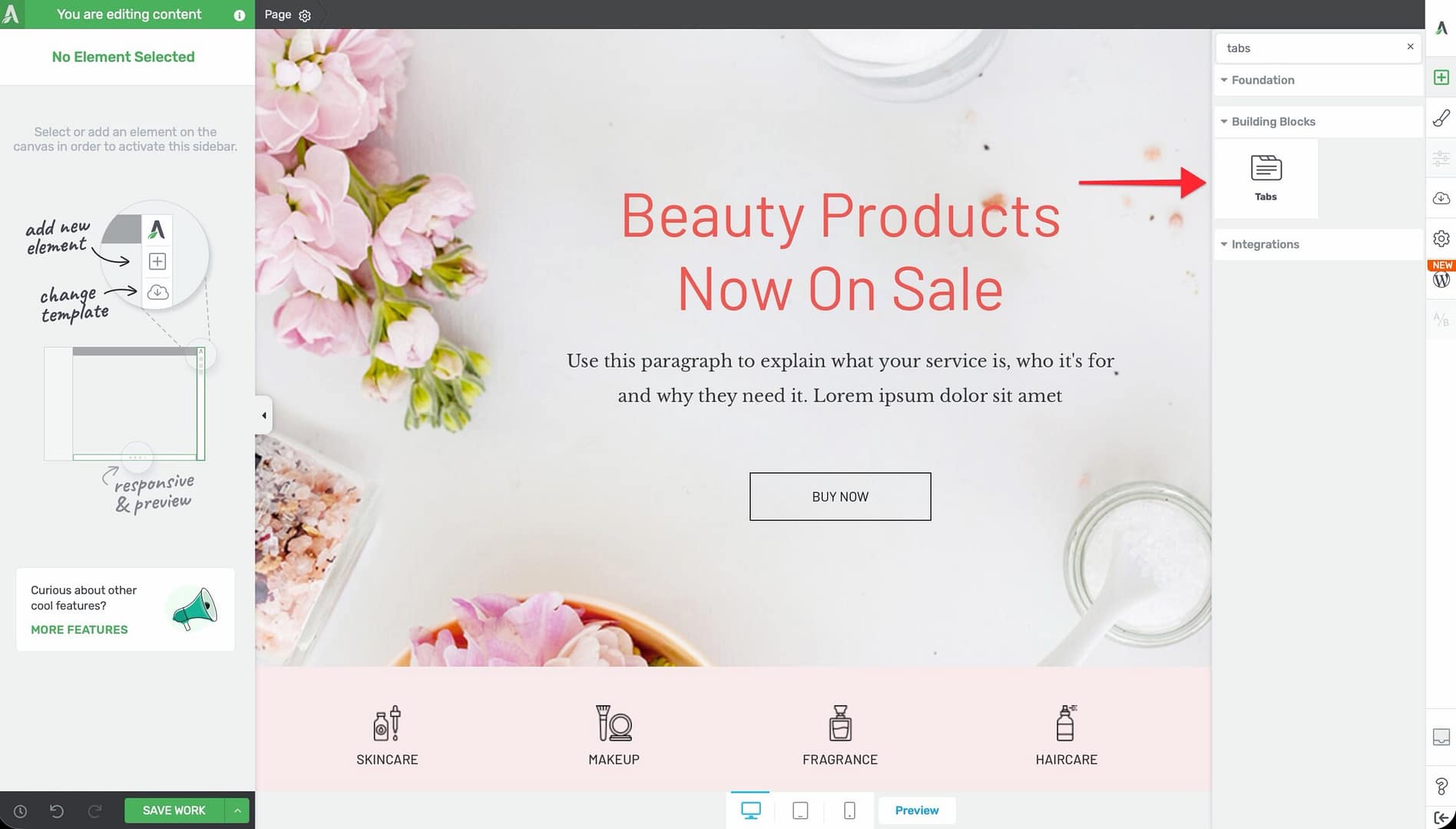
- Alternatively, scroll down to the Building Blocks section in the element list to find the Tabs element.
- Drag the element from the panel and drop it onto your page canvas and choose the tabs template.
A default Tabs element will appear on the canvas with several pre-configured tabs ready for customization.
Managing Tab Items
The first thing you’ll want to do is add, remove, or reorder your tabs. To manage tab items:
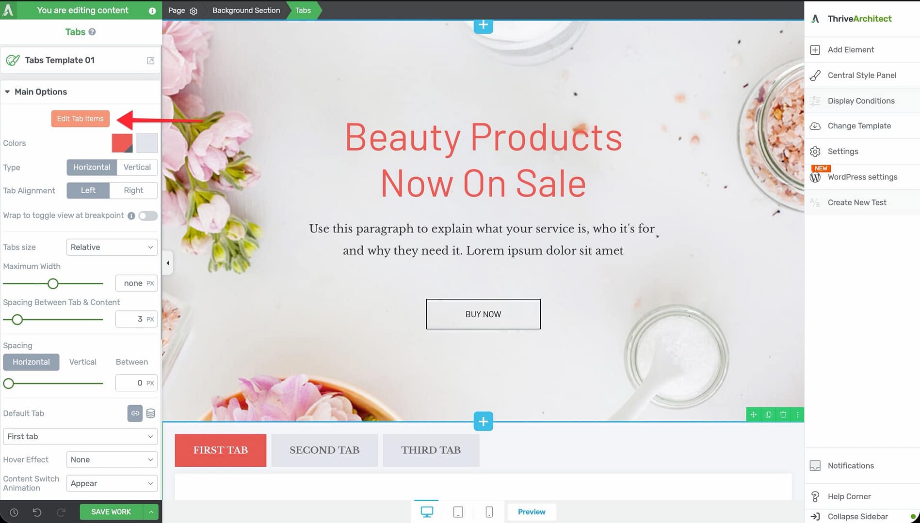
- Click on the Tabs element on the canvas to select it.
- In the left sidebar, click the Edit Tab Items button (the prominent orange button at the top of the options panel).
- The tab editing interface will open, where you can:
- Add new tabs by clicking the add button
- Remove tabs by clicking the delete icon on individual tabs
- Reorder tabs by dragging them into a new position
- Rename tabs by clicking on the tab label and typing a new name
- Click outside the editing interface or press Done to return to the main options.
Configuring the Main Options
After selecting the Tabs element, the left sidebar displays the following configuration options:
Color Palettes
At the top of the options panel, you’ll find color palette presets. Click on a palette to instantly apply a coordinated color scheme to the entire Tabs element, including tab headers, active states, and content backgrounds.
Tab Layout Type
Choose between two layout orientations:
- Horizontal — Tabs appear in a row across the top of the content area (default)
- Vertical — Tabs appear in a column along the left side of the content area
Tab Alignment
Control where the tabs are positioned within the header area:
- Left — Tabs align to the left edge
- Right — Tabs align to the right edge
Wrap to Toggle View at Breakpoint
This option (available on desktop only) converts the Tabs element into a toggle/accordion-style layout when the screen width falls below a specified breakpoint:
- Enable the Wrap to toggle view at breakpoint switch.
- Use the Breakpoint width slider to set the pixel width at which the tabs convert to toggles. The default is 767px, and the range is 767 to 1920px.
Note: This feature is useful for responsive design. On narrow screens, stacked toggles are often more user-friendly than horizontal tabs.
Tabs Size
Control the width behavior of individual tabs:
- Relative — Tabs size proportionally to their content. Use the Maximum Width slider (range 100 to 500px) to set a cap on tab width.
- Fixed — All tabs have the same width. Use the Fixed size slider (range 100 to 500px) to set the exact width.
Spacing Between Tab and Content
Use the Spacing Between Tab & Content slider to control the gap between the tab headers and the tab content area below. The range is 0 to 30px.
Tab Spacing Controls
Fine-tune the spacing around and between individual tab headers:
- Horizontal — Left and right padding within each tab (range 0 to 300px)
- Vertical — Top and bottom padding within each tab (range 0 to 300px)
- Between — Gap between adjacent tabs (range 0 to 300px)
Setting the Default Tab
By default, the first tab is active when a visitor loads the page. You can change this behavior using the Default Tab option:
Static Default Tab
Click the link icon to set a specific tab as the default. The selected tab will always be shown first when the page loads.
Dynamic Default Tab
Click the database icon to set the default tab dynamically based on visitor data. This option allows external links or page logic to control which tab opens first.
When you select dynamic mode, you can configure:
- Dynamic tab type — Choose from:
– URL Query String — The active tab is determined by a URL parameter (for example, ?tab=2) – Post variable — The active tab is determined by a POST variable – Cookie — The active tab is determined by a browser cookie value
- Variable name — The name of the parameter, variable, or cookie to read. The default is “tab.”
- Fallback value — The tab to display if the dynamic value is missing or invalid.
Tip: Dynamic default tabs are powerful for marketing campaigns. You can send different audiences to different tabs by appending a query string to your URL (for example, yourpage.com?tab=pricing).
Hover Effects
Add a visual hover effect to your tab headers. When a visitor moves their cursor over an inactive tab, the selected effect will appear:
- None — No hover effect
- Underline — A single underline appears below the tab text
- Double line — Two parallel lines appear below the tab text
- Brackets — Bracket-style indicators appear around the tab text
- Thick Underline — A bold, thick underline appears below the tab text
Content Switch Animation
Control how the content area transitions when a visitor switches between tabs:
- Appear — Content changes instantly with no animation
- From Right — New content slides in from the right
- From Left — New content slides in from the left
- From Top — New content slides in from the top
- From Bottom — New content slides in from the bottom
- Carousel — Content transitions with a carousel-style sliding effect
- Smooth Resize — The content area smoothly resizes to fit the new tab’s content height
- Swing Up — Content swings upward into view
Note: Subtle animations like Appear or Smooth Resize work best for professional and content-heavy pages. More dynamic animations like Carousel or Swing Up suit marketing and sales pages.
Adding Content to Each Tab
To add content inside a specific tab:
- Click on the tab header to activate that tab in the editor.
- Click inside the content area below the tab headers.
- Add any Thrive Architect elements you need—text, images, buttons, forms, videos, and more.
- Switch to another tab header and repeat the process for each tab.
Each tab has its own independent content area. You can add as many elements as needed within each tab.
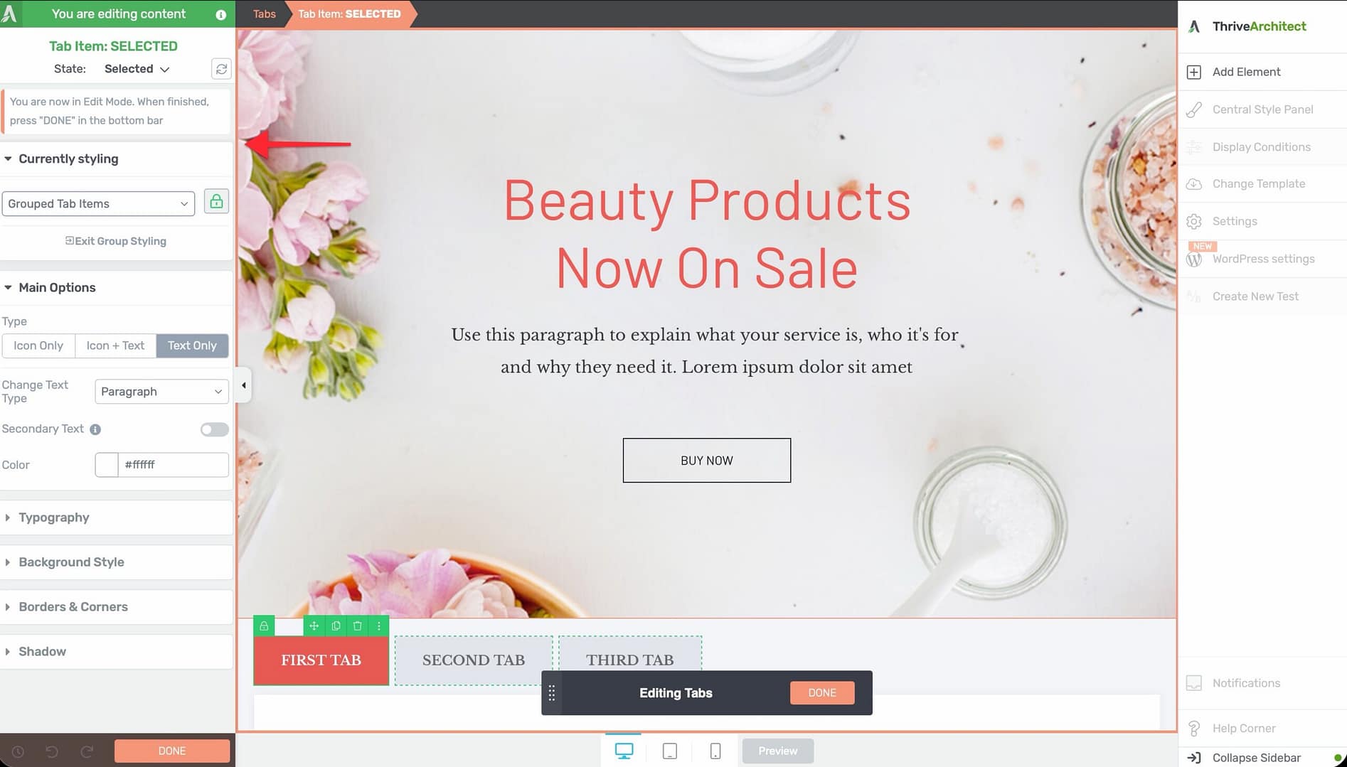
Using Group Editing
The Tabs element supports group editing for the following item types:
- Tab Items — Edit the styling of all tab headers simultaneously
- Toggle View Tab Items — Edit the styling of all toggle-view headers at once (when the wrap-to-toggle feature is active)
- Tab Contents — Edit the styling of all tab content areas at the same time
To use group editing, select one of the items in a group, then enable Group Editing in the left sidebar. Any styling changes you make will apply to all items in that group.
Common Use Cases
Product Feature Comparison
Create tabs for different product tiers or categories. Each tab contains the relevant features, pricing, and benefits, letting visitors compare options without scrolling through long pages.
FAQ Sections
Organize frequently asked questions by topic. Each tab represents a category (for example, Billing, Account, Shipping), and visitors click the relevant tab to find their answers.
Multi-Step Tutorials
Break a tutorial or how-to guide into numbered steps. Each tab represents one step, keeping the content structured and easy to follow.
Pricing Plans
Display different pricing tiers in separate tabs. This is especially effective when combined with dynamic default tabs, so you can link directly to a specific pricing tier.
Content Localization
Use tabs to display content in different languages, letting visitors switch between translations within the same page section.
Frequently Asked Questions
Can I Nest Tabs Inside Other Elements?
Yes. The Tabs element can be placed inside columns, background sections, content boxes, and other container elements. However, nesting a Tabs element inside another Tabs element is not recommended, as it can confuse visitors.
Can I Link Directly to a Specific Tab?
Yes. Use the Dynamic Default Tab feature with the URL Query String type. Set the variable name (for example, “tab”), and then link to your page with the appropriate query string (for example, ?tab=3) to open a specific tab by default.
Why Don’t I See the Typography or Animation Options?
The Typography and Animation components are hidden for the Tabs element. Typography is controlled within the individual text elements inside each tab, and content transitions are handled by the Content Switch Animation option described above.
Related Resources
- Toggle Element: How to Use the Toggle Element — Accordion-style collapsible sections as an alternative to tabs
- Content Box: How to Use the Content Box Element — Container element for grouping content inside tabs
- Columns: How to Use the Columns Element — Arrange content side by side within a tab
- Getting Started: Getting Started with Thrive Architect — Overview of the editor and element panel
That’s it! You’ve successfully learned how to use the Tabs element in Thrive Architect. With options for layout orientation, dynamic defaults, hover effects, and content switch animations, you can create organized, interactive tabbed content that keeps your pages clean and engaging.