Through the Thrive Apprentice template settings you can customize the way your course will look on your WordPress website.
This article is a step-by-step guide for customizing your Thrive Apprentice template when using the legacy editor.
If you have freshly installed the Thrive Apprentice plugin on your website, then you won’t have access to the legacy editor, only to the new Thrive Apprentice visual editor.
Note: If you are using the new Thrive Apprentice visual editor, then these articles might help you with more information on this topic:
- How to Switch from the Legacy Thrive Apprentice Editor to the New Visual Editor
- Using the Design Section of Thrive Apprentice
- Getting Started With Our New Thrive Apprentice Visual Editor
Personalizing Your Template
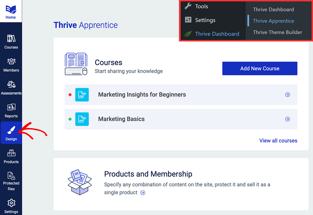
First of all, you can access your Thrive Apprentice design from the “Design” tab of your navigation bar:
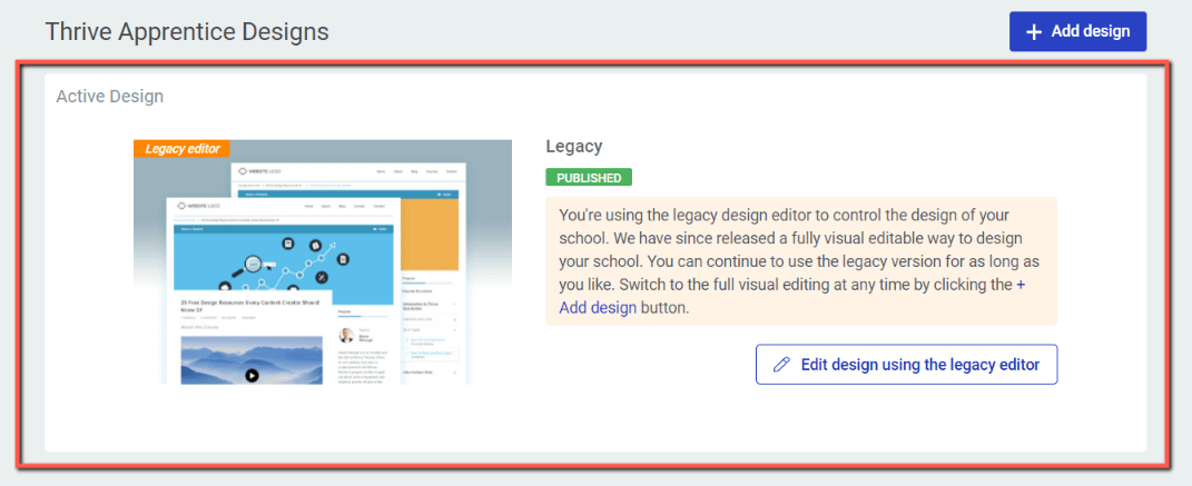
Here, you legacy editor is already published, so you can go ahead and start editing it:
By default, you will be able to edit a demo version template and see how it would look like on your actual online school:
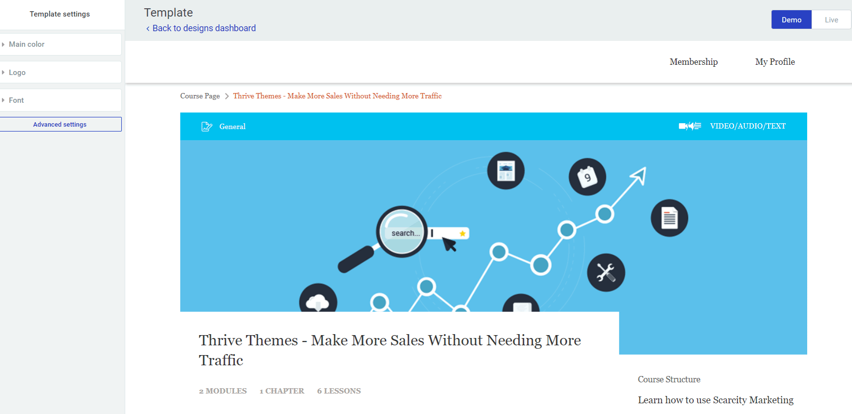
- On the left-hand side you can find the actual template settings that you can apply to the course;
- On the canvas, you can view the changes you are applying from the left sidebar.
The Demo/Live Option
As you have probably guessed, the “Demo” option indicates that you can try this interface on a demo version course:
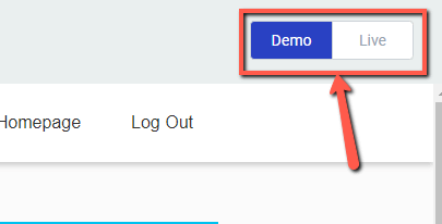
On the other hand, the “Live” option is available and you can use it if you have at least one course published on your website. If you select this option, in the canvas you will see the interface of your own course.
The Basic Template Settings
After you access the Template Settings you will see a couple of basic options, on the left-hand side of the screen:
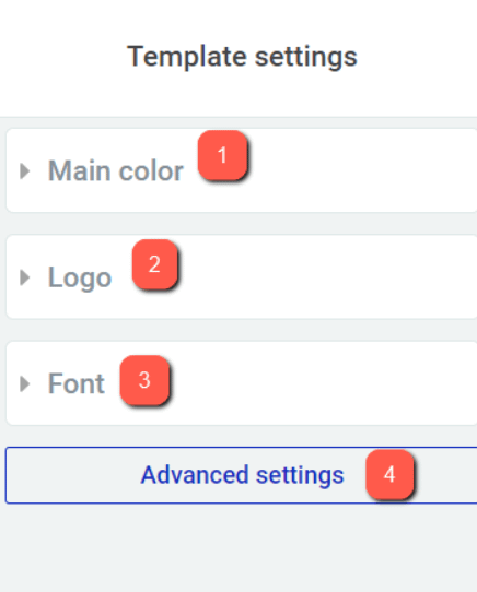
- Main Color
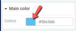
This setting allows you to choose a color that will be applied to the main elements of your course (“Start Course” button, lesson titles, etc.). Click on the box with the color and then select the desired color from the color picker that opened:
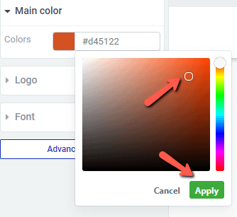
After choosing a color, click on “Apply”:
- Logo
Here you can choose a logo that will be displayed above your course:
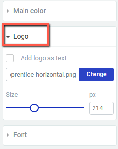
You can choose between an image and a text logo.
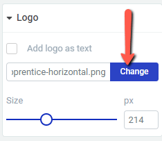
You can add an image logo by clicking on the “Change” button from this section and then, selecting the image you want to add from the media library:
If you want to add a text as a logo, then just check the checkbox next to the “Add logo as Text” option and then, enter the text you want to be displayed as your logo:
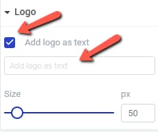
Please note that when you use the text logo, the font you select for your course will be applied to the logo as well.
You also have the option to adjust the size of the logo, regardless if it is an image or a text. In order to do this, you simply have to drag the slider or enter a value manually in the box next to the slider from the “Size” section here:

- Font
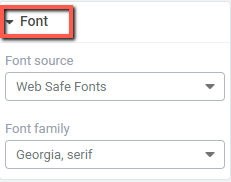
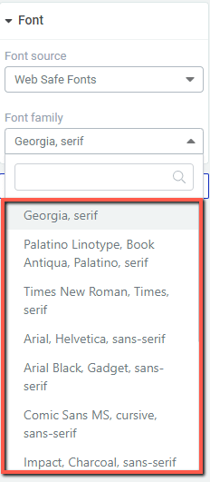
Font Source: Here you can select the source of the font that you want to use in the courses/lessons.
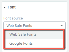
Simply click on the little down arrow from this section and a drop-down will open, where you can choose between “Web Safe Fonts” and “Google Fonts”:
Font Family: You can modify the font type of the entire text found in the courses/lessons by clicking on the down arrow from this section and then, selecting the desired font type from the drop-down:
The Advanced Settings
As stated before, these are the basic options. To access a more advanced range of options, select the “Advanced Settings” button from the bottom side of the left sidebar, with the options:
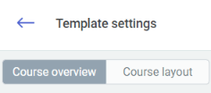
Once you access the Advanced Settings, you will have two sets of options: The “Course Overview” and the “Course Layout”:
The Course Overview
In the “Course Overview” you will be able to bring more detailed changes to the course page:
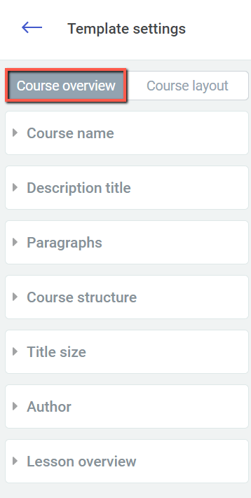
- As you can see, on the left-hand side of the screen you have a bunch of detailed options that you can apply to your course. For example, you can modify the font size of the course name or the lesson name. However, the best way is to test how each option works, on the demo course.
- The changes will be applied inside a course, where all of the lessons will be listed, NOT on the page where all of the courses are displayed.
The Course Layout
Speaking of which, if you want to bring changes to the page where all of the courses are placed, select the “Course Layout” option:
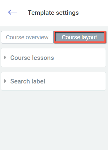
As in the case of the “Course Overview” option, you have a couple of options that you can apply to your content.
However, in this case, the options will apply to the Course Index page, which is the page where all of the courses are placed right next to each other.
In this way, you can change, for example, the labels to anything you want. And again, the best way to discover the options is to test them one at a time and see how they look like on the demo canvas.
Lastly, one more thing that you can do from the “Advanced Settings” of the template is to translate the “Course Overview” and the “Course Layout” fields. You can read more about how you can do that in the article linked here.
Also, check out the other Thrive Apprentice tutorial articles as well, for more in-depth information.
If you have any further questions, don’t hesitate to open a support conversation.