When using Thrive Theme Builder, most of the “Header” sections come with a “Call to Action” button inside them by default.
If you’re looking for a way to edit that button, keep reading this article.
Open the Template in the Thrive Theme Builder Editor
Firstly, there are two ways in which you can edit the “Header” section of a template. You can:
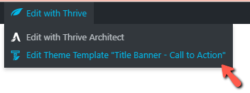
- open a page/post on which the template is applied, and click on “Edit Theme Template”:
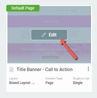
- open the “Templates” section of Thrive Theme Builder, find the template that contains the header you want to edit, and click on “Edit”:
Edit the Header Section
In order to get to the “Call to Action” button, you will have to first edit the “Header” section.
For that, click anywhere on the “Header” section, and, when the “Edit Section” button appears, click on it:

If the “Header” section does not include a “Call to Action” button, and you want to add one, all you have to do is click on the plus sign from the right sidebar, and look for the “Button” element:
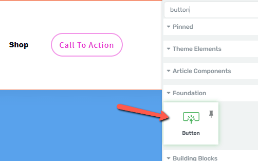
Note! Only after clicking on the “Edit Section” button, you will be able to add new elements inside the section.
So, grab the element from the list, and drag and drop it inside the section:

Now, to edit the “Call to Action” button, you will have to click on it. Its options will appear in the left sidebar.
There are two possible situations here: the “Call to Action” button is a menu item, or it is a simple “Button” element that you’ve added. Here is how to edit it, in each situation:
The “Call to Action” button – menu item
In this case, the button comes with the menu that is added to the header. If you click on the button, some options will appear in the left sidebar:
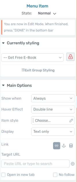
With the first set of options, you will be able to edit the menu items simultaneously. For example, if you choose a “Hover” effect, this will be applied to all of the menu items.
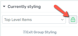
There is a way to only edit the “Call to Action” button, and that is to disable the group styling. For that, after clicking on the button, click on the small lock icon from the “Currently Styling” section of the left sidebar:
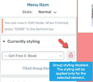
This will disable the “Group Styling” feature and will let you only work on the button:
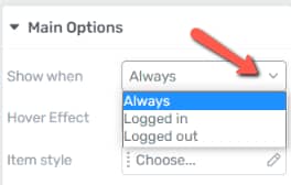
- Show when
From the first drop-down, you are able to decide when to display this menu item – it can be, for example, only for logged in users, or for the site’s guests as well:
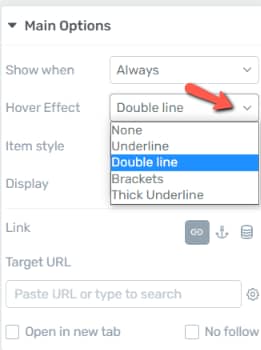
- Hover Effect
Here, decide what effect should be applied on hover:
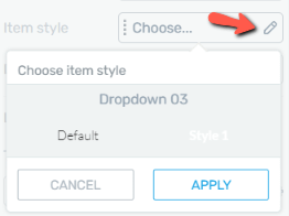
- Item style
Next, proceed with choosing a different style for your item, if you want:
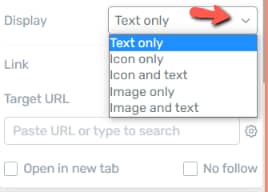
- Display
And then, from the “Display” drop-down, select how should the item look like – it can display just text, or text and images – this is entirely up to you:
- Add a link to the button
Then, one of the crucial parts of customizing the “Call to Action” button is to add a link:
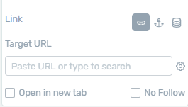
This way, when a visitor clicks on the button, they will be sent to the page of your choice. Now, this can be a static link, a jump link, or a dynamic link.
This article explains all there is to know about applying links when using Thrive Architect.
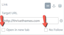
After inserting a link, you can also choose if the page linked should open in a new tab or not, or if it should be a “No Follow” link. You can do so by checking these options:
- Edit the “Hover” state
Besides using these options, feel free to also edit the way the button looks like when someone hovers their mouse over it. For that, in the top part of the left sidebar, click on “State: Normal”:
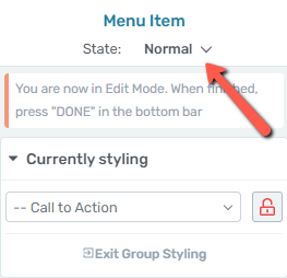
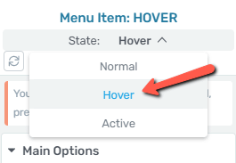
Click on “Hover”, and the options of the left sidebar will be available for you to use, and so customize the way the button looks like in the “Hover” state:
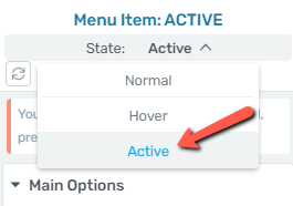
- Edit the “Active” state
Similarly, you can edit the way the button looks in the “Active” state:
Another way to edit, thus add a link to a “Call to Action” button, is when editing the “Custom Menu” element. To do that, you will have to click on “Custom Menu” in the breadcrumbs:

The options of the “Custom Menu” element are described in more detail in this article, so please check it out if you need guidance on how to use them.
In the left sidebar, click on the “Menu Items” section, to expand it:
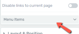
Then, click on the pencil icon next to the “Call to Action” menu item:
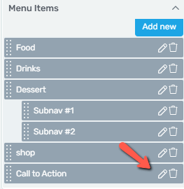
This will open a small pop-up, with the link options of the button, also presented above:
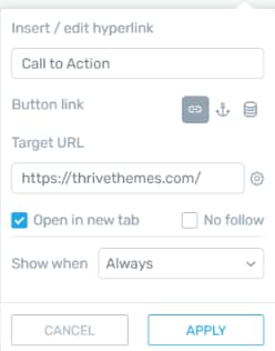
These are the ways to customize a “Call to Action” button if it is a part of the menu from your “Header” section.
The other situation was the one where this element is an actual “Button” element.
The “Call to Action” button – “Button” element
In this case, in order to edit the element, click on it, and the “Button” options will appear in the left sidebar:
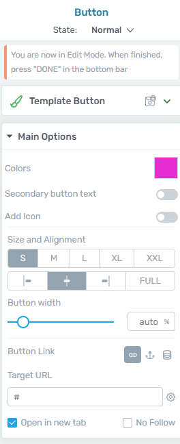
You can find a more detailed description of this element in our dedicated article about it.
You might also find this article useful, in which we’ve explained how to add a “Button” element in the “Header” section of a Thrive Theme Builder template.
Use all of the options from the left sidebar to customize the element as you wish, and then exit the “Edit Mode” of the “Header” section by clicking on the orange “Done” button:

For more information about Thrive Theme Builder, check out this section of our knowledge base.