In this article, you’ll learn how to use entrance animations, hover state effects, scroll behavior settings, and parallax effects in Thrive Architect. These features let you control what happens when visitors view, hover over, scroll past, or interact with elements on your page — creating a more dynamic, engaging, and visually polished experience.
From subtle fade-in animations that reveal content as visitors scroll, to sticky elements that follow the user down the page, to parallax effects that create depth and movement, these tools transform a static page into an interactive experience. You will also learn how to build animated page layouts, configure auto-scrolling pages, and make your animations responsive across all devices.
Working with Entrance Animations
Entrance animations control how an element appears on the page when a visitor first sees it. They are CSS-based animations that trigger when the element enters the browser viewport (comes into view during scrolling) or when a user hovers over the element.
Accessing the Animation and Action Panel
To add an animation to any element:

- Click on the element you want to animate to select it.
- In the left sidebar, locate and click on the Animation & Action section to expand it.
- You will see the Add new section with icons for adding CSS animations, popup actions, and hyperlink actions.
Adding a CSS Animation
- In the Add new section within the Animation & Action panel, click the first icon (the CSS Animation icon).
- Click the dropdown arrow to open the list of available animation types.
- Browse the animation types and select the one you want to apply.
Available Animation Types
Thrive Architect provides a comprehensive set of entrance and modify animations:

Entrance Animations
These animations control how an element initially appears on the page:
- Slide, Top — The element slides into view from above
- Slide, Bottom — The element slides into view from below
- Slide, Right — The element slides into view from the right
- Slide, Left — The element slides into view from the left
- Zoom In — The element starts small and zooms up to its full size
- Zoom Out — The element starts larger than its final size and shrinks into place
- Fade In — The element gradually appears from fully transparent to fully opaque
- Rotate — The element rotates into view
- Roll In — The element rolls into view with a combination of rotation and horizontal movement
Modify Animations
These animations alter the element’s current state and are typically triggered on hover:
- Grow — The element increases in size when triggered
- Shrink — The element decreases in size when triggered
The entrance animations are triggered by the “Comes into viewport” event, meaning they play when the element scrolls into the visible area of the browser. The modify animations (Grow and Shrink) can use the “Mouse over element” trigger, meaning they play when a visitor hovers their cursor over the element.
Looping vs. Non-Looping Animations
After selecting an animation type, you will be prompted to choose whether the animation should loop:
- Non-looping — The animation plays once and stops. The element remains in its final animated state.
- Looping — The animation resets every time the element leaves the viewport and replays when it comes back into view. This means the animation plays each time the visitor scrolls past the element.
Applying the Animation
After selecting the animation type and looping preference:
- Click Apply to save the animation to the element.
- The animation will be added to the element’s animation list in the Animation & Action panel.
Managing Animations
Once an animation is applied, you can manage it from the Animation & Action panel:
- Preview — Click the eye icon to preview how the animation looks without leaving the editor
- Edit — Click the pencil/edit icon to modify the animation settings (change the type, looping, or trigger)
- Remove — Click the trash icon to delete the animation from the element
Adding Multiple Animations
You can add multiple CSS animations to the same element. Each animation is listed in the Animation & Action panel and they will all play according to their respective triggers and settings.
Working with Actions
The Animation & Action panel also includes two additional action types beyond CSS animations:
Popup Actions
The popup action lets you apply a popup overlay to an element. When configured:
- Choose the Trigger — When should the popup appear:
- On click — The popup opens when the visitor clicks the element
- When coming into viewport — The popup opens when the element scrolls into view
- Choose the overlay content type:
- Thrive Lightbox — Opens a Thrive Lightbox overlay
- Thrive Leads ThriveBox — Opens a Thrive Leads opt-in form
- Image — Opens an image in a lightbox overlay (the image must have a title assigned)
- Video — Opens a video in a lightbox overlay (with its own display options)
Hyperlink Actions
The hyperlink action lets you apply a clickable link to an entire element (not just text). This is particularly useful for:
- Feature boxes — Make the entire feature box clickable, so clicking anywhere on the box (text, icon, or background) navigates to the specified URL
- Content sections — Turn an entire page section into a clickable call-to-action area
- Image cards — Make the entire card area clickable, not just the image
To configure a hyperlink action:
- Click the hyperlink action icon in the Add new section.
- Enter the URL you want the element to link to.
- Optionally check:
- Open in new tab — The link opens in a new browser tab
- No follow — The link includes a nofollow attribute for SEO purposes
- Click Apply to save.
Note: The URL you enter can also contain shortcodes. When the link is applied, the shortcode will be rendered and executed when a visitor clicks the element.
Working with Hover State Effects
A hover effect changes the appearance of an element when a visitor moves their cursor over it. Hover effects are powerful tools for:
- Emphasizing important elements on the page
- Providing additional information (such as tooltips) when users explore content
- Attracting attention to interactive elements by changing their appearance on hover
- Making it clear which element a user is about to click
- Creating visually engaging layouts that respond to user interaction
Accessing the Hover State
- Select the element you want to add a hover effect to (e.g., a Text, Image, Button, Content Box, or other element).
- In the left sidebar, look at the top of the panel, just below the element name. You will see State: Normal.
- Click on State: Normal to open the state dropdown.
- Select Hover from the dropdown.
Configuring the Hover State
When you switch to the Hover state:
- The left sidebar will display a reduced set of options — only the properties that can be modified for the hover state of that specific element.
- The element will be highlighted in the editor with a visual indicator, making it easier to see the changes you are making to the hover appearance.
You can now modify any of the available properties to define how the element looks when hovered:
- Change the background color or add a gradient
- Modify the border color, width, or style
- Adjust shadows (inner shadow, drop shadow, or text shadow)
- Change the font color, font size, or other typography settings
- Modify opacity or other visual properties
- Add CSS animations from the Animation & Action section
Returning to Normal State
After configuring the hover appearance, click on State: Hover at the top of the sidebar and select Normal to return to editing the element’s default (non-hover) appearance.
Resetting the Hover State
If you want to discard all hover customizations and reset the hover state to match the normal state:
- While in the Hover state, click the Reset State option.
- Confirm that you want to reset.
All hover-specific changes will be removed, and the element will no longer have a different appearance on hover.
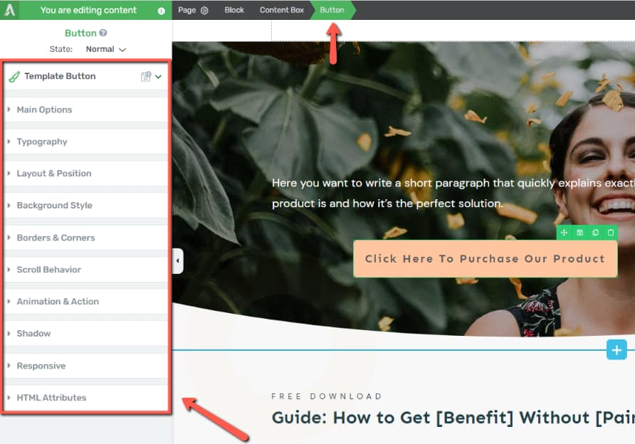
Working with Scroll Behavior
The Scroll Behavior option lets you control how elements respond when a visitor scrolls down the page. This feature is essential for creating sticky navigation bars, floating call-to-action buttons, and parallax visual effects.
Supported Elements
Scroll behavior can be applied directly to the following elements:
- Button
- Image
- Background Section
- Content Box
- Column (grouped columns)
Accessing Scroll Behavior Settings
- Select one of the supported elements on your page.
- In the left sidebar, click to expand the Scroll Behavior section.
- You will see three options: Static, Sticky, and Parallax.
Static Scroll Behavior
Static is the default scroll behavior. When set to static, the element behaves normally — it stays in its original position on the page and scrolls out of view as the visitor scrolls past it. There are no special movement or positioning effects.
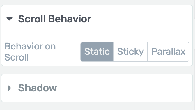
Sticky Scroll Behavior
The Sticky option makes an element “stick” to the viewport so it remains visible on screen as the visitor scrolls. The element will appear to float above the rest of the page content.
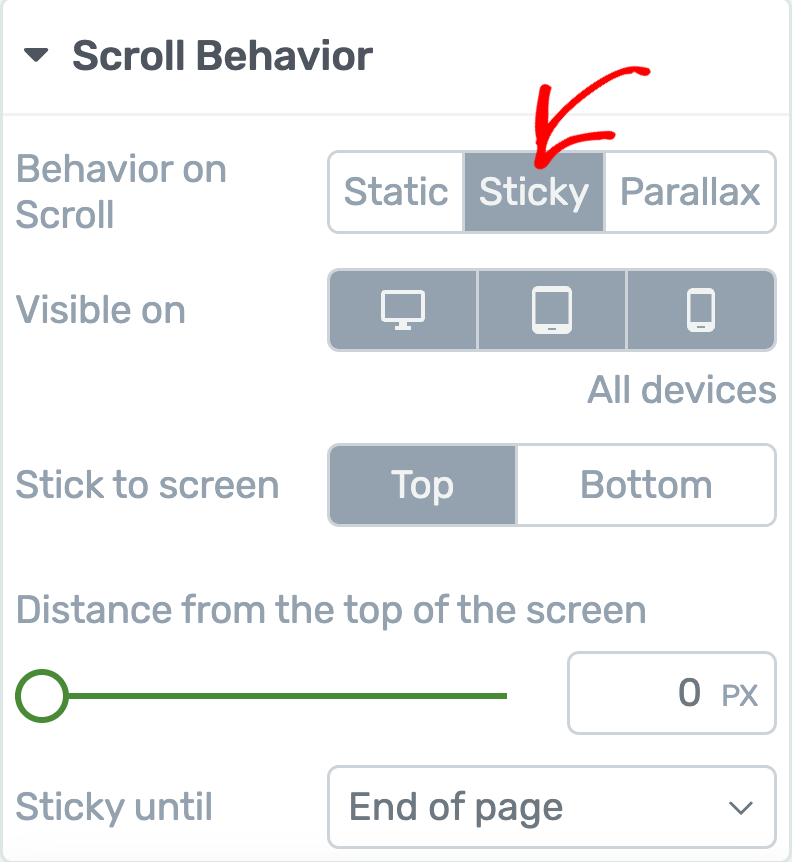
When you select Sticky, the following configuration options become available:
Visible On (Display Device)
The Visible On setting lets you control which devices display the sticky behavior:
- By default, sticky behavior is enabled on all devices (desktop, tablet, and mobile).
- Click on a device icon to toggle it off — the sticky effect will not apply on that device.
- Click the icon again to re-enable it. Selected devices have a gray background, while deselected devices have a white background.
On-Screen Position
Choose where the sticky element stays on the screen:
- Top — The element sticks to the top of the viewport
- Bottom — The element sticks to the bottom of the viewport
Distance from the Top of Screen
Control the gap (in pixels) between the sticky element and the edge of the viewport:
- Drag the slider or enter a pixel value in the input field
- For example, setting this to 20px means the sticky element will float 20 pixels below the top of the browser window
This is useful for preventing the sticky element from overlapping the browser’s address bar area, your site’s header, or other sticky elements.
Sticky Until
Choose when the element should stop being sticky:
- End of Page (Default) — The element stays sticky until the visitor reaches the very bottom of the page
- End of Parent Container — The element stays sticky only while its parent container (e.g., a Content Box or Background Section) is in the viewport. Once the parent scrolls out of view, the sticky element disappears with it.
- It Reaches Another Element — The element stays sticky until a specific element on the page scrolls into view. When you select this option, an Element ID field appears. Enter the HTML ID of the element where you want the sticky behavior to end. (Set the ID using the HTML Attributes section in the target element’s sidebar settings. Use a single word or connect words with underscores, e.g.,
footer_section.)
Tip: If you have multiple sticky elements that overlap, adjust their z-index values in the Advanced section under Layout & Position. Set a higher z-index for the element you want to appear on top. Also, use padding on surrounding elements to prevent sticky elements from covering important content.
Parallax Scroll Behavior
The Parallax option creates scroll-driven animation effects where elements move, fade, rotate, scale, or blur at a different speed than the normal page scroll. This creates an illusion of depth and adds a dynamic, professional feel to your page.
When you select Parallax, you can configure:
- Visible On — Choose which devices display the parallax effect (same device toggle as sticky behavior)
- Add New Effect — Add one or more parallax effects to the element
Working with Parallax Effects
Parallax effects are scroll-driven animations that respond to the visitor’s scrolling position. As the visitor scrolls down the page, the element transforms based on the effects you have configured. You can combine multiple effects on a single element for complex, layered animations.
Available Parallax Effect Types
Thrive Architect offers six parallax effect types:
1. Vertical Scroll
The element moves vertically (up or down) at a different speed than the normal page scroll, creating a depth effect. The element appears to float above or lag behind the surrounding content.
2. Horizontal Scroll
The element moves horizontally (left or right) as the visitor scrolls vertically. This creates a lateral sliding effect that adds visual interest and movement to the page.
3. Transparency
The element’s opacity changes as the visitor scrolls. For example, the element can fade in from transparent as it enters the viewport, or fade out as the visitor scrolls past it.
4. Blur
The element’s blur level changes as the visitor scrolls. The element can start blurry and become sharp as it enters the viewport, or vice versa.
5. Rotate
The element rotates as the visitor scrolls. The rotation amount changes progressively based on scroll position, creating a spinning or turning effect.
6. Scale
The element scales (grows or shrinks) as the visitor scrolls. For example, an image can start small and grow to full size as the visitor scrolls to that section.
Adding a Parallax Effect to an Element
- Open your page in Thrive Architect and select the element you want to animate.
- In the left sidebar, expand the Scroll Behavior section.
- Select Parallax from the scroll behavior options.
- Choose which devices should display the parallax effect.
- Click Add New Effect to add a parallax animation.
- Select the effect type from the dropdown (e.g., Vertical Scroll, Horizontal Scroll, Transparency, Blur, Rotate, or Scale).
Configuring Parallax Effect Settings
After selecting an effect type, configure the following settings:
Type (Direction)
For directional effects (like Vertical Scroll and Horizontal Scroll), you can choose the direction of movement:
- Scroll Up / Scroll Down (for Vertical Scroll)
- Scroll Left / Scroll Right (for Horizontal Scroll)
- Fade In / Fade Out (for Transparency)
- Blur / Unblur (for Blur)
- Clockwise / Counter-clockwise (for Rotate)
- Scale Up / Scale Down (for Scale)
Speed / Level
Control the intensity of the effect. Use the slider to set how dramatically the effect is applied:
- A higher speed/level creates a more pronounced effect (faster movement, more rotation, larger scale change)
- A lower speed/level creates a subtler, more gentle effect
Viewport Start and Viewport End
These settings define when the parallax effect begins and ends relative to the element’s position in the viewport:
- Viewport Start — The scroll position (as a percentage of the viewport) where the effect begins. For example, 0% means the effect starts when the element is at the bottom edge of the viewport.
- Viewport End — The scroll position where the effect ends. For example, 100% means the effect completes when the element reaches the top edge of the viewport.
Combining Multiple Parallax Effects
You can add multiple parallax effects to a single element. For example, you could combine:
- Vertical Scroll + Transparency — The element slides upward and fades in simultaneously
- Horizontal Scroll + Scale — The element slides in from the side while growing in size
- Rotate + Blur — The element rotates while gradually becoming sharp
Click Add New Effect again to add additional effects after configuring the first one.
Creating Animated Layouts
Beyond applying animations to individual elements, you can create entire animated page sections by combining multiple animated elements in a structured layout. This technique is particularly effective for hero sections, feature showcases, and portfolio galleries.
Example: Animated Image Gallery Layout
Here is a step-by-step approach to creating an animated image gallery section:
Step 1: Adding Images to the Block
- Drag and drop a Background Section element onto your page.
- Inside the background section, drag and drop a Columns element and select a 4-column layout.
- Drag and drop an Image element into each column and upload the images you want to display.
- To add more images, duplicate the columns element by hovering over it and clicking the duplicate icon.
- Replace the duplicated images with your desired content.
Step 2: Working on the Layout
Arrange the images to create a natural, non-uniform look:
- Resize images — Click on an image, open Main Options, and use the slider to adjust the image size within its column.
- Adjust layout and positioning — Click on an image, open the Layout & Position options, and adjust margins and padding. Use alignment options and advanced layout settings for larger position changes.
- Adjust column widths — Hover over the dotted lines between columns and drag to resize them. This also affects how large images can be within each column.
Step 3: Adding Animations to the Images
- Click on an image to open its options in the left sidebar.
- Expand the Animation & Action section.
- Click to add a CSS Animation.
- Select the animation type from the dropdown (e.g., Slide Left, Fade In, Zoom In).
- Click Apply.
- Repeat for each image, using different animation types for variety.
- Click Save Work when finished.
Step 4: Making the Animation Responsive
- Use the device selector at the bottom of the editor to switch between desktop, tablet, and mobile views.
- In each device view, adjust the image sizes, column layouts, margins, and padding to ensure the layout looks good on that screen size.
- Test the animations at each breakpoint to verify they display properly.
Creating Auto-Scrolling Pages
You can create a page that automatically scrolls to a specific element after a set time delay. This technique uses anchor links and the Content Reveal element to achieve a timed auto-scroll effect.
Use Cases for Auto-Scrolling
- Automatically scrolling to a contact form or CTA section after a visitor has spent time on the page
- Drawing attention to a specific section after a delay (such as a limited-time offer)
- Creating a guided page experience that moves visitors through the content
Step 1: Assign an HTML ID to the Target Element
- Select the element you want the page to scroll to (e.g., a Content Box containing a contact form).
- In the left sidebar, expand the HTML Attributes section.
- In the ID field, enter a unique identifier for the element (e.g.,
contact). - Save the page to preserve the ID.
Step 2: Construct the Anchor URL
Build a URL that links directly to the target element using the HTML ID:
- Start with the full URL of your page (e.g.,
https://mysite.com/example/). - Add a
#symbol followed by the ID you assigned (e.g.,https://mysite.com/example/#contact).
This URL, when accessed, will scroll the browser directly to the element with that ID.
Step 3: Add and Configure the Content Reveal Element
- Click the plus sign in the right sidebar to open the element library.
- Find the Content Reveal element and drag it anywhere on your page.
- In the Main Options section of the left sidebar:
- Reveal Content After — Set the number of seconds to wait before auto-scrolling (e.g., 5 seconds)
- Redirect to URL — Enter the anchor URL you constructed in Step 2 (e.g.,
https://mysite.com/example/#contact)
- Leave the Content Reveal element empty — do not add any elements inside it. An empty Content Reveal element will not be visible on the frontend, but its redirect functionality will still work.
- Save the page.
Now, when a visitor accesses the page, it will automatically scroll to the target element after the specified delay.
Tip: For smooth scrolling behavior, you can add the CSS property scroll-behavior: smooth to your page’s HTML element using the custom CSS feature. This creates a smooth, animated scroll rather than an instant jump.
Animation and Effects Best Practices
- Use animations sparingly — Too many animations can be distracting and negatively impact the user experience. Apply animations strategically to draw attention to important content.
- Keep animations subtle — Gentle fade-ins and small slides look more professional than dramatic zoom effects or rapid rotations.
- Consider page load performance — Parallax effects and complex animations can affect performance on slower devices. Test your page on various devices to ensure smooth performance.
- Test on all devices — Preview your animations on desktop, tablet, and mobile. Disable or adjust effects that do not work well on smaller screens.
- Remember hover limitations — Hover effects only work on desktop devices with a mouse cursor. Do not rely on hover effects to convey essential information that mobile users also need.
- Use sticky elements thoughtfully — Sticky elements that take up too much screen space can be annoying, especially on mobile. Keep sticky elements small and use the Visible On setting to disable sticky behavior on smaller screens if needed.
- Maintain consistency — Use the same animation type and timing across similar elements on the same page. For example, if one card slides in from the left, all cards in that section should use the same animation for a cohesive look.
- Combine effects for impact — Layer a parallax effect with a CSS animation to create rich, dynamic sections that feel polished and intentional.
That’s it! You’ve successfully learned how to use entrance animations, hover state effects, scroll behavior settings, parallax effects, animated layouts, and auto-scrolling pages in Thrive Architect. With these tools, you can create dynamic, engaging pages that capture visitor attention and guide them through your content in a visually compelling way.
Related Resources
- Global Colors and Styles: How to Use Global Colors, Gradients, and Styles
- Borders and Shadows: How to Use Borders, Shadows, and Decorations
- Typography and Fonts: How to Use Typography and Fonts
- Responsive Design: How to Use Responsive Design Options
- Content Reveal Element: How to Use the Content Reveal Element
- Button Element: How to Use the Button Element
- Background Section Element: How to Use the Background Section Element
- Content Box Element: How to Use the Content Box Element
- Image Hover Animations: Adding Hover Animation for Images in Thrive Architect
- Sticky Table of Contents: Creating a Sticky Table of Contents in Thrive Architect
- Switch Headers on Scroll: Using the Switch Headers on Scroll Option
- Tooltips: Displaying Tooltips on Your Website