In this article, you’ll learn how to use borders, corners, shadows, and decorations in Thrive Architect. These styling options let you add depth, definition, and visual interest to any element on your page — from subtle border outlines and rounded corners to dramatic drop shadows, inner shadows, text shadows, and decorative edge dividers.
Whether you want to frame a content box with a colored border, soften a button with rounded corners, add a professional drop shadow to an image, or create a visually striking section separator with a fancy divider, these tools give you full creative control without writing any CSS.
Working with Borders and Corners
The Borders & Corners panel in Thrive Architect allows you to add borders around any element and control the rounding of its corners. This is one of the most commonly used styling options and is available for virtually every element in the editor.
Accessing the Borders and Corners Panel
To access the Borders & Corners settings:

- Click on the element you want to style to select it and open its options in the left sidebar.
- Locate and click on the Borders & Corners dropdown section in the left sidebar.
- The panel will expand to reveal the border and corner controls.
Configuring Borders
The Borders section provides three main controls for defining how your borders look:

- Border Type — Choose from three predefined border styles:
– Solid — A continuous, unbroken line (the most common choice) – Dashed — A series of short dashes separated by gaps – Dotted — A series of small dots
- Border Color and Opacity — Click on the color swatch to open the color picker, where you can select any color for the border. Use the opacity slider within the color picker to control how transparent or opaque the border appears.
- Border Width (Thickness) — Use the width slider or enter a pixel value manually to set how thick the border line should be. Higher values create thicker, more prominent borders.
Applying Borders to Individual Sides
By default, when you configure a border, the settings apply to all four sides of the element simultaneously. However, you can also apply borders to individual sides for more creative layouts:
- In the Borders section, look at the border selector control. The center square represents “all sides.”
- Click on an individual side line (top, right, bottom, or left) to select only that side.
- Configure the border type, color, and thickness for that specific side.
- Repeat for any additional sides you want to style differently.
This is particularly useful for creating:
- Bottom borders that act as subtle underlines beneath headings or content sections
- Left borders that serve as accent bars next to blockquotes or highlighted content
- Side borders that create a vertical visual separation between columns or elements
Configuring Corners (Border Radius)
The Corners section lets you round the corners of an element by adjusting the border radius. This controls how much curvature is applied to each corner.
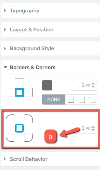
- All Corners at Once — Leave the center item selected in the corner selector to adjust all four corners simultaneously. Drag the radius slider or enter a pixel value to set the rounding intensity.
- Individual Corners — Click on a specific corner line in the corner selector to adjust that corner independently. This lets you create asymmetric designs, such as rounding only the top-left and bottom-right corners of a button.
Tip: Setting the corner radius to a very high value (such as 50% on a square element) will create a circular shape. This is a popular technique for creating round profile image frames or circular icon containers.
Borders and Corners Examples
Here are some common use cases for the Borders & Corners settings:
- Card-style content boxes — Apply a light gray solid border with a 1px width and 8px corner radius to create a clean card appearance
- Pill-shaped buttons — Set the corner radius to a high value (e.g., 50px) to create a fully rounded, pill-shaped button
- Accent-bordered testimonials — Apply a 3px solid left border in your brand color to a text element for a stylish testimonial or quote format
- Circular images — Apply a 50% corner radius to an image element to create a perfectly round image
Working with Shadows
The Shadow option in Thrive Architect lets you add shadow effects to elements, giving them a three-dimensional appearance and visual depth. There are three types of shadows available: Inner Shadow, Drop Shadow, and Text Shadow. You can apply one or more shadow types to the same element, and you can even stack multiple shadows of the same type for complex effects.
Accessing the Shadow Panel
To access the shadow settings:
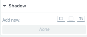
- Select the element you want to add a shadow to by clicking on it in the editor.
- In the left sidebar, locate and click on the Shadow section to expand it.
- You will see the available shadow types listed: Inner Shadow, Drop Shadow, and Text Shadow.
Inner Shadow
An Inner Shadow creates a shadow effect that appears inside the boundaries of the element, giving it an inset or recessed appearance. This is useful for creating depth effects on buttons, content boxes, and other container elements.
To add an inner shadow:
- Click on Inner Shadow in the shadow options panel.
- A popup will open with the following configuration options:
- Color — Click the color swatch to open the color picker. You can choose a color manually using the color spectrum, enter a Hex or RGB code in the dedicated field, or select from your previously saved colors in the My Colors section. Click Apply when you have chosen your color.
- Angle — Use the round dial or enter an exact value in degrees to set the direction of the shadow. This controls where the shadow appears relative to the element — for example, 0 degrees places the shadow directly to the right, while 90 degrees places it below the element.
- Opacity — Adjust the transparency of the shadow using the opacity slider or by entering a numerical value in the opacity field. Lower values make the shadow more transparent, while higher values make it more prominent. This is the same opacity value accessible from the color picker popup.
- Distance — Controls how far the shadow extends from the edge of the element inward. Use the slider or enter a pixel value to set the distance. A larger distance makes the shadow more visible and pronounced.
- Blur — Determines how soft or sharp the shadow edge is. A higher blur value creates a softer, more diffused shadow, while a lower value (or zero) creates a hard, crisp shadow edge.
- Spread — Controls the size of the shadow. A positive spread value makes the shadow larger than the element, while a negative value makes it smaller. This effectively controls the radius of the shadow area.
- Once you have configured all the settings, click Apply to save the inner shadow.
Drop Shadow
A Drop Shadow creates a shadow effect that appears outside and behind the element, giving it the appearance of floating above the page. This is the most common shadow type and is ideal for creating depth on cards, images, buttons, and content containers.
To add a drop shadow:
- Click on Drop Shadow in the shadow options panel.
- A popup will open with the same configuration options as the Inner Shadow: Color, Angle, Opacity, Distance, Blur, and Spread.
- Configure the settings to achieve your desired look and click Apply.
The only difference between a drop shadow and an inner shadow is the direction of the effect — a drop shadow extends outward from the element boundaries, while an inner shadow extends inward.
Tip: For a subtle, professional-looking drop shadow, try using a dark gray color (rather than black) with about 20–30% opacity, a small distance (2–4px), a moderate blur (8–12px), and zero spread. This creates a soft, natural-looking elevation effect.
Text Shadow
A Text Shadow applies a shadow effect specifically to the text content within an element. This is particularly useful for making text stand out against busy backgrounds, creating embossed or engraved text effects, or adding visual emphasis to headings.
To add a text shadow:
- Click on Text Shadow in the shadow options panel.
- A popup will open with the same configuration options as the other shadow types, with one exception: the Spread option is not available for text shadows.
- Configure the Color, Angle, Opacity, Distance, and Blur settings, then click Apply.
Note: You can also access the Text Shadow option directly from the Shadow section that appears when you select a Text element (whether it is a standalone text element or text incorporated within another element, such as a button). When you click on this section, only the Text Shadow option is available.
Stacking Multiple Shadows
One of the powerful features of the shadow system is the ability to stack multiple shadow effects on a single element. After you add a shadow, customize it, and click Apply, it is added to a list of active shadows. You can then add additional shadows (of the same or different types) to create complex layered effects.
For example, you could combine:
- A subtle drop shadow for a soft floating effect
- An inner shadow for added depth and dimension
- A text shadow to make the text pop
Removing a Shadow
To remove any shadow from an element:
- In the Shadow section, locate the shadow you want to remove in the list of active shadows.
- Click the trash can icon next to that shadow.
- The shadow will be immediately deleted from the element.
Working with Decorations
The Decorations option is a specialized styling feature available for container-type elements such as the Background Section, Content Box, Testimonial, Guarantee Box, and Styled Box. Decorations allow you to add visual dividers and edge effects to the sides of these elements, creating eye-catching section separators and page transitions.
Accessing the Decorations Panel
To access the decorations settings:

- Click on a supported element (such as a Background Section or Content Box) to select it.
- In the left sidebar, locate and click on the Decorations section to expand it.
- Select the side of the element you want to decorate (top, right, bottom, or left).
- Click the dropdown menu to see the available decoration types.
Decoration Types
There are four decoration types available:
Slanted Edge
The Slanted Edge decoration adds an angled edge to the selected side of the element, creating a modern, dynamic look for section transitions.
Configuration options:
- Tilt — Drag the slider or enter a value to control the angle of the slant. Higher values create a more dramatic angle.
- Change Direction — Click the toggle switch to flip the direction of the slant (e.g., from slanting left-to-right to right-to-left).
Pointer
The Pointer decoration adds a triangular pointer or arrow shape to the selected side of the element.
Configuration options:
- Width — Control how wide the pointer extends horizontally
- Height — Control how tall the pointer extends vertically
- Invert — Flip the pointer direction (e.g., from pointing outward to pointing inward)
Divider
The Divider decoration adds a wavy or zigzag edge to the selected side of the element.
Configuration options:
- Style — Choose from two divider styles:
– Pointy edges — A sharp, zigzag pattern – Rounded edges — A smooth, wave-like pattern
- Width — Control the width of the individual divider waves or peaks
- Height — Control the amplitude (depth) of the waves or peaks
Fancy Divider
The Fancy Divider is the most visually complex decoration type. It provides a library of pre-designed decorative shapes and patterns that you can apply to the top or bottom of an element.
To apply a fancy divider:
- Select Fancy Divider from the decoration dropdown.
- Click the Choose button in the Fancy Divider section that appears.
- A popup window opens displaying all available Fancy Dividers — scroll through to browse the options.
- Click on the divider you want to use, then click Choose Divider in the bottom-right corner.
Once applied, the following customization options become available:
- Height — Drag the slider or enter a value to adjust how tall the fancy divider appears
- Change Direction — Use the toggle switch to flip the divider’s orientation
- Bring to Front — When two fancy dividers are applied to the same element (e.g., one on top and one on bottom), use this option to control which divider appears in front of the other
- Color — Click the Color option to open the color picker and set a custom color for the fancy divider. Click Apply to confirm your color choice.
Important Notes About Decorations
- Regular decorations (Slanted Edge, Divider, and Pointer) can be applied to any of the four sides of an element. The Fancy Divider can only be applied to the top or bottom side.
- If a Slanted Edge or other decoration overlaps the content inside the element, add bottom padding (or padding on the relevant side) to the element to push the content away from the decoration.
- When applying a Fancy Divider to a background section, the neighboring section should either have no background style (white) or a solid color background. For the best visual result, set the Fancy Divider’s color to match the neighboring section’s background color, creating a seamless transition between sections.
Best Practices for Borders, Shadows, and Decorations
- Keep it subtle — A little goes a long way with borders and shadows. Subtle effects look more professional than heavy, dark shadows or thick borders.
- Be consistent — Use the same border radius, shadow intensity, and decoration style across similar elements throughout your page for a cohesive design.
- Use shadows for hierarchy — Elements with drop shadows appear to float above elements without shadows. Use this visual hierarchy to draw attention to important elements like call-to-action buttons and key content sections.
- Match decoration colors — When using fancy dividers between sections, always match the divider color to the adjacent section’s background color for a seamless visual transition.
- Test on all devices — Preview your page on desktop, tablet, and mobile to ensure that borders, shadows, and decorations look good at every screen size.
That’s it! You’ve successfully learned how to use borders, corners, shadows, and decorations in Thrive Architect. With these styling tools, you can add depth, definition, and visual polish to any element on your page — from clean card layouts with subtle borders and shadows to dramatic section transitions with decorative dividers.
Related Resources
- Global Colors and Styles: How to Use Global Colors, Gradients, and Styles
- Typography and Fonts: How to Use Typography and Fonts
- Animations and Effects: How to Use Animations, Hover, and Scroll Effects
- Background Section Element: How to Use the Background Section Element
- Content Box Element: How to Use the Content Box Element
- Button Element: How to Use the Button Element
- Fancy Dividers Best Practices: Fancy Dividers Best Practices