

Want to add section dividers to your WordPress landing pages?
These eye-catching elements are easy to add to your pages, even if you have limited technical skills.
Here's our step-by-step guide to adding WordPress section dividers.
Why Add a Section Divider to Your Page?
Most people with WordPress websites start with a template.
Why?
Because they give you an incredible starting point to build a professional-looking website.
However, we all want to make sure our sites have that person feel - that they're not just carbon copies of 1,000 other websites out there. I remember when I first launched my website, I was so proud of it. But after a few weeks, I realized it looked just like every other template out there. It felt like I was just another face in the crowd, and I knew I had to find a way to make it uniquely mine.
The difficulty is, most of us aren't web designers, so adding professional-looking but original design elements to our sites isn't easy.
Whenever it comes to web design, we always say this: keep it simple!
I often found myself torn between wanting to showcase my creativity and keeping my design simple. There was a time I added too many elements, and it overwhelmed my visitors. Learning to embrace simplicity while still expressing my style was a game-changer.
One way you can continue to keep things simple while giving your website a personal touch is with section dividers, also known as shape dividers, or decorative deviders. They look professional, add character and a decorative touch to your site, and most importantly, they're easy to pull off.
When I first added a section divider to my landing page, it was like flipping a switch. Suddenly, my content felt more organized and visually appealing. It was a small change, but it made a huge difference in how my visitors interacted with my site.

Example of a shape divider
So, if you're looking to add a simple but high-impact new element to your WordPress page, follow along to this guide to adding WordPress shape dividers.
5 Steps to Add WordPress Section Dividers to Your Page
Quick Navigation: Jump to a Specific Step
We're going to show you how incredibly easy it is to add a range of shape dividers to your page.
Step 1: You Need a Good Landing Page Builder

If you're using the WordPress block editor (the native editing tool), then you might already know this: it's quite hard to bring your vision to life with just the basics.
To give your site the additional personal touches you envision, you need a high-quality page builder.
If you're not an expert coder or designer and you want a simple yet powerful visual builder, then your best bet is Thrive Architect. Our team of world-class designers has given you an amazing starting point, but it's backed up by our developers who have made it incredibly easy for you to personalize your site in every imaginable way.
I once spent hours trying to align elements on my page, feeling completely lost. But once I discovered Thrive Architect, I was able to drag and drop elements effortlessly, and my design came together in minutes.
Throw in the fact that our team of expert marketers test everything to make sure it's highly conversion-focused and you've got everything you need.
Oh, and of course, it makes it incredibly easy to add shape dividers!
Just check out the pricing page and install the plugin following this handy guide.
You'll instantly have access to tons of awesome landing page templates, a powerful page editor, and gain control of the small details of your website design.
Pro tip: Add Shape Dividers to Your Theme
If you want to add shape dividers across your entire website, you can do that by editing your theme with Thrive Theme Builder.
Check out this guide to landing page builders vs theme builders and find out which one best fits your needs.
Step 2: Choose Your Section Divider Template
Now it's time to see how easy it is to add a shape divider.
Just hover over Pages in your WordPress sidebar and click Add New, give your page a title and then click Edit With Thrive Architect.
You'll have the option to build a page from scratch or to start with a pre-made template.

We recommend starting with a pre-made template, as it's a huge timesaver, but it's completely up to you. With Thrive Architect you have complete editing control to build your page how you see fit, so choose the option that best fits your needs.
Then it's simply a case of clicking on a background section and choosing Decorations from the left-hand sidebar and choosing Fancy Divider from the dropdown menu.

A new dropdown menu titled Fancy Divider will appear, and now you can choose what type of section divider you would like to use. You'll notice there are over 50 custom dividers to choose from, so you're bound to find the one that best fits your design.

Step 3: Pick Your Section Divider Color and Change the Opacity
When you add your shape divider, it's going to be a neutral white color, so now we want to change this to fit your design vision.
A word of warning to be careful with your color choices - I remember when I first started experimenting with colors on my site. I tried a bright yellow for my section dividers, thinking it would pop. But instead, it clashed with my overall theme. It took a few tries, but I finally settled on a calming blue that complemented my brand perfectly.
Of course, Thrive Architect gives you complete control to find out what works best for you.
In the left-hand sidebar, you'll now see additional options for editing your shape divider, including color options. Click on the color tab and you'll be able to select the color you want. Notice as well that Thrive Architect will suggest colors based on the existing color scheme of the page.

Once you have the right color, your shape divider is going to be looking great, but there's another important step - opacity. The lower the opacity, the more your shape divider will blend into the background color behind it, giving it a seamless effect.
Play around with the options and find the color and opacity that works best for you.
Step 4: Adjust Height and Padding
You want your shape divider to make a statement but you don't want it to distract from the content itself. If you have too much overlapping and it's hurting the user experience, then you need to adjust the height of the shape divider, or the padding of the background section.
Adjusting the height of the section divider will simply make it smaller so it doesn't take up so much space on the page. You can do this by dragging the Height slider until you perfect your design.

Adjusting the padding of the background section will move any element that’s inside the background section up (or down) and will avoid overlap with the Fancy Divider.

You can use either of these methods, or a combination of both, to get your shape divider looking exactly how you want it.
Step 5: Check How Your Section Divider Looks on Mobile
Whenever you design a webpage, it's important to always think about how it looks on mobile. This is where a ton of your traffic is going to come from, so you've got to make sure your site (and shape divider) looks perfect in this format.
I once launched a new landing page without checking how it looked on mobile. When I finally did, I was horrified to see that key elements were cut off, and my visitors were clearly frustrated. It was a wake-up call that taught me to prioritize mobile design.

Desktop view

Bad Mobile Display
In the examples above, we can see that this shape divider looks great on desktop, but it's really distracting on mobile. Luckily, Thrive Architect makes it incredibly easy to edit how your page looks on mobile. Just click the mobile icon at the bottom of the page and start editing.
With just a few tweaks to the shape divider height or the background section padding, we can make sure our fancy divider looks perfect on mobiles as well as desktops.

Looks good!
Make sure to optimize the design for responsive viewing, ensuring that the shape divider looks good on all devices.
Additional Tips When Using Shape Dividers
It’s very important to consider the following guidelines when using the shape dividers feature in order to avoid design disasters.
1. Images + Shape Dividers = Lousy Friends
Be EXTRA careful when using shape dividers on background sections with images. They rarely work well together.
It's about demanding attention. When you use a shape divider on a colored background section, the divider adds a bit of spice and gets the attention.
When your background section is an image the shape divider will compete to grab the attention.
That's why in the image examples for this blog post, we used background sections with (solid) colors to illustrate how the shape dividers works.
However, if you ever find an image that you think works well with a shape divider, go for it!
2. Don’t Overuse Gradients
It's important to have a smooth transition between two background sections with the help of a shape divider.
In a nutshell, here’s the secret:
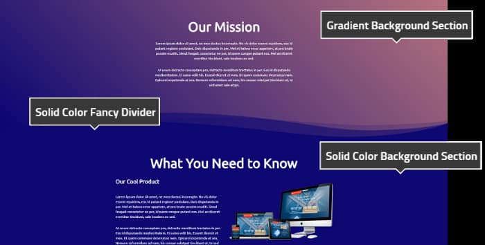
Gradients & Solid Colors
In the example above, the shape divider is applied to the bottom of the upper background section (the one with the gradient).
In order to make a smooth transition between background sections, the bottom background section needs to have a solid color. This allows to apply the same solid color on the shape divider and guarantee a good look.
Learn More About Key Web Design Principles
Designing a website or landing page can be a bit of a minefield, especially if you don't have strong technical skills.
It's certainly not impossible though!
When I first started, I felt overwhelmed by all the options and tools available. But with each small victory—like successfully adding a shape divider—I gained confidence. It was a journey, but now I love the creative process of designing my site.
Tons of people create incredible web pages without coding knowledge or having taken a web design class. One thing they do, though, is stick to (consciously or subconsciously) certain key design principles.
Before you take the next steps with your site, we recommend you check out this complete guide on 13 Fundamental Web Design Principles. It's been put together with the help of our Head of Design, and it's got some incredibly useful tips!
FAQs: Website Section Divider
Website section dividers are decorative elements used in web design to create visual separation between sections of a webpage. They enhance the overall aesthetic by adding unique shapes and styles, making the website look more professional and visually appealing.
You can add website section dividers to your WordPress site using Thrive Architect, a user-friendly page builder. Simply select the "Fancy Divider" option within the builder, choose from over 50 different shapes, and customize it to fit your design preferences.
No, you do not need any coding skills to use website section dividers. Thrive Architect is designed for users of all skill levels, allowing you to easily add and customize shape dividers without any technical knowledge.
It is generally not recommended to use website section dividers with background images, as they can clash visually. Section dividers work best with solid color backgrounds, which allows them to stand out and create a clean separation between sections.
To ensure your website section dividers look good on mobile devices, always check the mobile view in Thrive Architect. You can adjust the height and padding of the shape divider to ensure it complements the content and maintains a visually appealing layout on smaller screens.
You're Ready to Create Amazing Shape Dividers
As you can see, adding a WordPress shape divider to your page is pretty straightforward.
Just follow the steps and you'll have characterful, yet professional dividers that your visitors will love.
Want even more great web design tips?
We've got you covered.
- How to Refresh Your Website, Stay Trendy, and Boost Conversion Rates
- Entrepreneur’s Guide: 7 Elements of a Successful Sales Page
- How to Make Your WordPress Site Mobile-Friendly (9 Tips)
Now there's just one thing left to do!
Get Thrive Architect and start adding shape dividers to your designs.
I really love this feature. Thanks for always increasing the value of my membership. Thrive is an awesome company.
Really glad to hear that, Joe! 🙂
Welcome David!
Thrive, you are one of my favorite companies.
Thank you, Holden!
Why you are the best… 😉
Thanks Falk 😉
Great new add to TA! Eliminates the need for a slider plugin. Although not as robust as Smart Slider, it is enough for me to eliminate the need for it. Well done!
Hi Chik great to hear 🙂 We’re not a great fan of sliders anyways 😉
it look likes you are the new content marketer at Thrive Themes . Great post , great video, and amazing feature.
Thanks a lot, Juan! 🙂
I think it’s a big step that he needs to give Architect and Thrive Themes not to be defeated by Elementor that is taking a good advantage, at least as a visual editor.
We still have quite a few tricks up our sleeves, Alain 😉
LOVE this!
Really glad to hear that, Lakia! 🙂
Nice feature – If only the design of my site was suitable for this, but it’s build on clean lines and only 3 strong colours. But I love that you’re always innovating!
Thank you, Mike! Still, maybe you could sneak a “subtle” divider in there 🙂
As always, Thrive just keeps getting better. I’ve got a project for this one immediately. Well explained too.
Thank you, Quentin 🙂 Glad to hear that!
Super cool new feature. Thanks!
Oure pleasure, Mark!
Hi, very nice Feature as it seems! Still, I just have to ask again – as annoying as this maybe – are parts of the team concerning themselves with GDPR too? The Google Fonts remain a big Problem. Is there any solution in sight? With all the new Features in the Pipeline – that are all great – I am fearing this might not get done. Any update on this?
They addressed the GDPR issue in a previous update Tim
What was that issue about?
Thanks, Andrew. That would be wonderful. But are you sure we’re talking about the same thing? I mean the fact that TA calls Google Font whether I use them or not. Has that stopped? My ticket as to that is still open. Any more Information on that would be appreciated!
We’ve updated our themes to address this issue. Thrive Architect only loads the fonts in use on any given page.
Hello, Tim. We have a team that is dealing specifically with GDPR issues. As far as the Google Fonts, we took care of that 🙂
Excellent new feature – Is it possible for us to create and use our own dividers, David? Would be great for other skylines etc.
Very nice feature
Thanks, Jafar!
That would be cool indeed. Unfortunately, making these SVGs work they way they do is quite tricky. I don’t know if we can make them user-uploadable, but maybe there’s something else we can do to provide a more extensive library of dividers.
This is FUN!!! Now I’m going to have to reread the cautions about not overdoing it. 🙂 Oh and it’s also useful. 🙂 But it’s FUN!
That’s the spirit! 🙂
What a great feature to make our pages look more modern!
Yep, totally agree 🙂 Enjoy!
Great new feature! Looking forwarding to implementing.
Absolutely, Evangeline! Go right ahead 🙂
Nice feature. Maybe I’ll use it one day on my blog.
Absolutely, Luke! You could experiment with it and see how it fits your blog 🙂
That looks pretty good. How about a timeline type divider like the one that Thrive itself uses when showing the progression of it’s products. A divider that goes vertically up the page like that and allows the user to populate details at each alternating pointer would be helpful in a lot of situations.
Thanks for the suggestion Shane.
That would be quite different from these dividers (wouldn’t be the same feature at all), but pretty cool I agree.
Hi Hane, any options currently to make vertical dividers other than just putting a border on a column?
Hi,
No only horizontal.
But if you’re using a content box (inside the column element) you can use the decorations options to add slanted edges or dividers (not the fancy dividers but some less fancy ones 😉 )
So excited about this! My biggest challenge is going to be not going overboard. 🙂
I know what you mean, Carmen 😀 Best of luck, you can do it!
You guys are awesome.
You’re awesome too, Sharon! 🙂
Oh my…I just fell in love with Thrive even more! : )
Haha I’m glad to hear that, Katrina! 🙂
looks good
Glad to hear that, sir 🙂
Love this.
Thanks, Lex 🙂
David, You are just like ME mate 😛 I travel same cities again and again Design Amazing websites with Thrive Architect and i also watched an entire season of FRIENDS in one day 😛
That’s awesome! 😀
Awesome new feature. Cheers
Thanks, Cole 🙂
This is great! I am building a new sales page and am looking forward to what I might be able to do with this. You guys are the best!
Thanks a lot, Paul! Best of luck 🙂
WOW!! I love that!
Yaaay 😀
Welcome David! You managed very well for your first video on a very exciting new feature for Thrive Architect. I hope we get to see you again soon…
Thank you very much, Sonia! Definitely, the next video is coming up soon 🙂
oh my god..
You guys really do listen to your customer..
This is the best membership i’ve spent for my money..
Really glad to hear that, Ilyas! We’ve got even more features coming up 🙂
What a fantastic addition to Thrive Themes. I look forward to using it in the proper context. Thank you! You are always innovating.
That’s great 🙂 Thank you for your comment, sir!
This is one of my favourite features you have added – can’t wait for the list to expand even further – can’t get enough fancy dividers lol
Haha I know what you mean 😀
GR8 new feature & welcome to the camera David.
Thanks a lot, Tony! 🙂
Always increasing member value! I love knowing that you are constantly giving us useful features to use on our own and client projects. Kudos!
Thank you, Andrew! 🙂
really nice feature, great tutorial, thanks, David
Thanks a lot, Ramesh!
Thanks, David. Another awesome feature from Thrive.
Quick question: do all these fancy styles affect overall site speed in any way?
The fancy dividers use SVGs (vector graphics). It’s a super lean way of drawing something on a web page. Much smaller and faster than if it were an image file. In terms of speed impart, it’s more like having a few lines of text on the page than it is like loading an image.
I missed that one! Thank you for sharing a such cool feature 🙂
Our pleasure, Gaëtan 🙂
The “INVERT” button does not show up in my decoration box…why?
Hmm, that doesn’t seem right. The best way would be to open a suport ticket for this issue. This will allow us to take a look and solve the problem fast. Thanks, Nathalie 🙂
What a knock-out, way kewl feature!!!!!!!!!!!!!
Haha I know right!? 😀
David, thanks for the amazing lesson. I’ve already implemented it – https://prnt.sc/k18ihr
Oh that’s awesome! Really glad to see this, Alexey 🙂
This is super cool! I was just wishing that this was a feature a few weeks ago! 🙂
That’s awesome! Glad to hear that 🙂
Wow, this feature looks awesome, thrive architect is improving.
Add more awesome features like this, it will be awesome for us.
Thanks for introducing this.
Will try it out.
We’ll definitely add more features 🙂 Thanks for your comment, Priya!
Hey David, what fonts are you using in the example? haha
Nvm, found it, It’s Ubunutu =p
Haha yep, I know it’s a cool looking font 🙂
i really like the beard on you hanna.. Kudos on the bold look.. 🙂
I’m rocking it, right? :p
A nice feature and a very helpful tutorial. Thanks David and thanks Thrive Themes.
Thank you for your comment, Detlev! 🙂
It look awesome!
Thanks! 🙂
Already loved dividers. The fancy ones (clouds!!!) are the best addition since Architect’s release. Thank you Thrive team!
I couldn’t have said it better! 😀
Thank you for your comment, Adrien!
Genius!
Haha thank you! 🙂
I am thrilled you’ve brought this feature to TA. I was considering (dare I say this out loud) adding another great Page Builder (beginning with ‘E’) to my suite of tools for this feature.
*gasp*
Well, I’m so glad you stayed with us, sir! We have even more awesome features coming your way 🙂
This is such a nice feature! Cannot wait to give this a play with my up and coming redesign! 🙂
That’s awesome! Thanks for the comment, Adam 🙂
This is one of the best features in my opinion, but I am not able to change the color of the fancy dividers anymore and I don’t knwo why 🙁 Also sometimes dividers are not shown up at the bottom or on the sides. Do you have an idea? Did I do something wrong? Thx and regards Robert
Hi Robert! The best solution in this kind of situation is to open a Support ticket, just so that we can see exactly how this occurs on your website. The guys here will be more than happy to help 🙂