When I create a sales page, I don’t think about design first — I think about persuasion. A sales page exists to sell. Every section has a role to play: the headline grabs attention, the story builds connection, the pricing table removes doubt, and the call-to-action seals the deal. Miss one of these steps, and you leave money on the table. Nail them, and you’ve built a professional, high-converting machine.
I’ve been in this game for over 7 years. I’ve designed hundreds of sales pages, analyzed thousands more, and tested what really makes people click “buy.” One thing stands out: the best-performing sales pages aren’t random collections of blocks — they’re structured conversations that lead visitors from curiosity to confidence.
In this guide, I’ll walk you through the 8 essential elements every sales page needs. Think of it as a clear, scannable framework you can follow to make sure your page isn’t just presentable, but persuasive. By the end, you’ll know exactly what to include to turn attention into action.
You Don’t Need to Be a Sales Expert to Create High-Converting Sales Pages
A lot of people think sales pages are only for marketing pros or copywriting wizards. I get it — when you’re running a business and juggling ten different hats, the idea of building a page that convinces someone to pull out their card can feel overwhelming.
But here’s the truth: you don’t need a marketing degree to create a sales page that works. The average landing page converts at just 6.6% across industries — and I’ve seen simple, well-structured changes double that. (Unbounce)
What really matters isn’t fancy design or clever jargon. It’s clarity. It’s empathy. It’s showing the right person that you understand their problem and giving them a clear, risk-free path to the solution. You need the right sales page strategy to make it happen.
The strongest sales pages almost always include:
A headline that grabs attention and makes someone think, “This is for me.”
Messaging that resonates by speaking to real pain points and desires.
Social proof like testimonials or reviews that back up your claims.
A guarantee that removes the risk of saying yes.
I’ve designed and analyzed hundreds of sales pages, and the pattern is always the same: when you focus on people instead of perfection, you win. And that’s something anyone can do.
What Are the Key Elements of a Winning Sales Page?
In my experience, most sales pages fail not because the offer is weak, but because the structure is missing. I like to think of a great sales page like a puzzle — every piece matters, and when one is left out, the whole picture falls apart.
Over the years, I’ve seen the same core elements show up again and again on pages that convert. Whether you’re writing something short and direct or a detailed long-form page, these are the essentials that keep your message clear, persuasive, and professional.
Let’s break them down.
Element 1: An Attention-Grabbing Hero Section
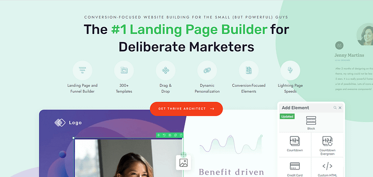
When your visitors land on your sales page, the first thing they’ll see is the hero section — and it has one job: grab attention. Think of it as the opening line in a conversation that makes someone want to lean in and hear more.

This is where you deliver your value proposition upfront — the one idea that makes someone think, “This is for me.” A winning hero section combines a powerful headline, high-quality visuals (or video), and a clear call-to-action (CTA) that says, “Here’s what we’ve got, and here’s what you can do with it.”
Your hero section answers the two questions every visitor has right away: Why should I care? and What problem does this solve for me? Do this well, and your visitors are far more likely to keep scrolling, explore your offer, and take action.
👉 Want practical headline tips? Check out our guide on how to make your headlines stand out.
👉 Or dive into our step-by-step tutorial on how to create a hero section that stands out.
Element 2: A Powerful Value Proposition & Compelling Story
After the hero section grabs attention, the next step is to build connection and relevance. This is where your value proposition and story come together.
Your job here is to show visitors that you get them. Address their pain points directly and speak to the struggles they’re facing. Once you’ve drawn out the challenges, pivot to the solution — your offer. But don’t just list features. Frame your product or service as the turning point in their story.
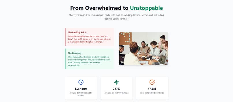
A great way to strengthen this section is with audience qualification:
- This is for you if… you’re ready to [benefit X], need [benefit Y], or want [benefit Z].
- This is not for you if… you’re looking for [misaligned solution], or you prefer [alternative approach].
This simple addition makes your ideal customer feel seen and helps disqualify those who aren’t a fit. Both build trust — because you’re not trying to sell to everyone.
When you pair empathy with clarity, your story becomes more than words on a page. It’s proof that your offer is designed for the right person, at the right time.
Element 3: Testimonials to Back Up Your Claims
Once you’ve introduced your offer, it’s time to prove it works. Testimonials are one of the most powerful forms of social proof — they assure prospects that others like them have seen real results.
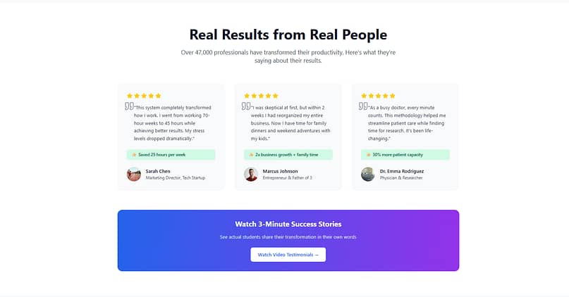
Adding testimonials isn’t just nice to have — it directly impacts performance. For example, landing pages with social proof convert at 12.5%, compared to 11.4% without it. Other studies show that including testimonials can lift conversions by 34%. And it’s no surprise, given that 92% of consumers read testimonials or reviews before buying.
Customer testimonials act like trusted voices saying, “I tried this, and it changed things for me.” The most impactful ones highlight transformation, not just satisfaction — painting a before-and-after image that helps potential customers see themselves in the same successful outcome.
👉 Need bigger credibility? Check out our guide on using social proof effectively.
Element 4: Clear Calls to Action
By now, you’ve captured attention, told your story, and built trust with testimonials. The next step is guiding your visitor to act — and that’s the role of clear calls to action (CTAs).

Think of CTAs as checkpoints in the journey. A strong CTA doesn’t just sit at the bottom of the page; it appears at natural decision points. Include at least three:
Near the top (for quick deciders),
Mid-page (for readers who need more context), and
At the end (for those who scroll through everything).
Each CTA should be unmistakable, action-oriented, and specific. Instead of vague copy like “Submit,” use persuasive language like “Get Instant Access” or “Start My Free Trial.” This makes the next step feel natural and rewarding.
👉 Want to maximize impact? Read our guide on creating call-to-action buttons that convert.
Element 5: Proactive FAQs Section
Even when your page is persuasive, visitors often hesitate before hitting “buy.” That hesitation usually comes from unanswered questions or lingering doubts. Your FAQ section is where you address those head-on.
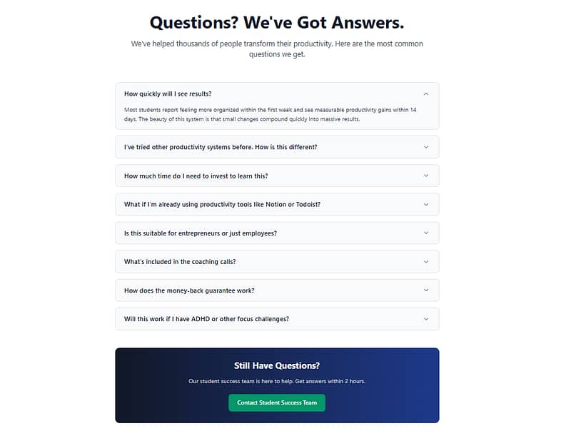
This isn’t just about logistics like “How do I log in?” or “What payment methods do you accept?” — it’s where you dismantle objections. Think of the questions your prospects might be too polite (or skeptical) to ask:
“Is this really worth the price?”
“What if it doesn’t work for me?”
“How is this different from [competitor]?”
By answering these questions proactively, you remove the friction that stops visitors from converting. A clear FAQ builds trust, reassures hesitant buyers, and helps them move forward with confidence.
👉 Want to add one to your site? Here’s a step-by-step guide on how to create an FAQ section in WordPress.
Element 6: Pricing Table + Guarantees
Before a visitor becomes a customer, they’ll want to know exactly what they’re committing to. A pricing table lays out the options side by side, helping people compare features, weigh value, and quickly spot the plan that fits them best.
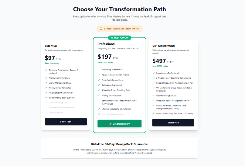
But this section does more than present numbers — it’s also where you reduce risk. A clear, upfront guarantee can be the single most powerful confidence booster you add to your page. Whether it’s a 30-day money-back guarantee, a satisfaction promise, or a results-based commitment, guarantees tell your audience: “I believe in this offer so much that I’m taking on the risk, not you.”
By combining transparent pricing with risk reversal, you remove the final barrier of purchase anxiety and make saying “yes” feel safe.
👉 Need help setting this up? Explore our guide to creating the perfect pricing page.
Element 7: Scarcity & Urgency
Even after reading your full sales page, some visitors will still be on the fence. That’s where scarcity and urgency come in — the subtle push that turns “I’ll think about it” into “I’ll do it now.”
Scarcity can look like a limited number of spots, countdown timers, or low-stock indicators. Urgency can come from a bonus that expires, or an enrollment window that closes soon.
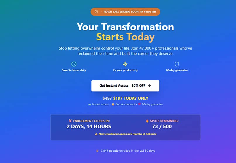
When used responsibly, these aren’t cheap tricks — they reflect real constraints and help people make timely decisions instead of putting them off indefinitely. Done right, scarcity communicates: “This opportunity won’t always be here, so if it’s right for you, act now.”
👉 Learn more about responsible tactics in our guide to using scarcity to drive conversions.
Element 8: Credibility & Trust Signals
At the end of the day, people buy from businesses they trust. That’s why your sales page needs clear credibility markers to back up your claims. These subtle details work together to show that your offer — and your brand — are reliable.
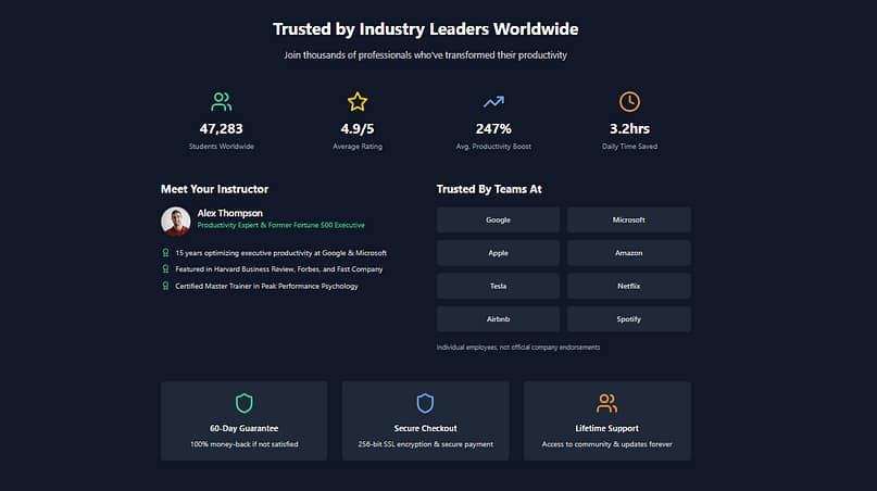
Consider adding:
- Founder or brand story – Share who’s behind the product and why it exists. This creates a human connection and answers the unspoken question: “Why should I trust you?”
- Security badges and guarantees – Symbols like SSL certificates, payment protection logos, or privacy assurances reduce hesitation during checkout.
- Press mentions or certifications – “As seen in…” logos, awards, or accreditations immediately boost authority and recognition.
Even small credibility signals can tip the balance for someone on the edge of a decision. Without them, your page might feel incomplete — with them, it feels established and trustworthy.
Bonus Tips to Create a Solid, Successful Sales Page
So, you've built a great sales page, weaving together elements to grab your reader’s attention and all the right nudges towards making a purchase. But before you hit “Publish” there are a few bonus tips to fine-tune it into a solid, unstoppable sales machine:
1. Make Your Pages Mobile-Friendly: Your audience very likely to visit your sales page from their mobile devices. Making your webpages mobile-friendly significantly boosts the chances of landing more sales — since your sales letter will be more accessible. Test your pages on multiple devices before the release day.

Mobile editing in Thrive Architect
2. A/B Test Your Sales Pages to Boost Conversion Rates: A/B testing your sales pages helps you see what resonates with them most. By comparing different versions of your page, you discover exactly what makes your visitors say, "Yes, I want this." It’s a methodical way to lift the curtain on what works best, refining your page based on real data rather than guesswork.
3. Have an Analytics Tool for Better Optimization: You wouldn’t go on a hike without a map, would you? Similarly, running a sales page without a reliable analytics tool is like navigating in the dark. Integrating an analytics tool allows you to turn on the lights and gather insights into how visitors interact with your page.
Together, these bonus tips are the final touches that transform a good sales page into an effective sales page.
FAQ: Sales Page Elements & Conversion
A high-converting sales page typically includes a headline and hero section, a compelling narrative that connects with the reader’s pain points, a clear solution and irresistible offer, social proof and credibility signals, multiple calls-to-action (CTAs), risk reversal through a guarantee, and an FAQ section to handle objections.
These elements work together as a structured argument that guides visitors from curiosity to purchase.
The sequence of elements matters as much as the elements themselves.
A proven flow is: headline/hero → story → solution/offer → social proof → pricing/guarantee → objections → CTA.
This structure builds momentum and mirrors a natural decision-making journey, often described as a “slippery slope” that reduces friction and leads prospects toward action.
Effective copy starts with empathy.
Address the customer’s current frustrations (the “status quo”), then introduce a big promise — the transformation your product delivers.
Use storytelling frameworks like the Hero’s Journey, translate features into benefits, and borrow your customer’s own words from interviews, reviews, or forums to make the copy specific and relatable.
Trust comes from transparency and proof.
Use testimonials, reviews, case studies, trust badges, and press mentions to reassure readers. Pair these with proactive objection handling: address doubts about price, trustworthiness, and relevance directly in the copy or FAQ.
Finally, add a strong guarantee to remove risk and make the decision easier.
It depends on your offer. Long-form pages work best for high-cost, complex, or commitment-heavy products — or when targeting a cold audience that needs more education.
Short-form pages work for simple, low-cost offers aimed at a warm audience already familiar with your brand. The key is matching length to the level of persuasion needed.
You can learn more about long-form vs short-form sales pages in this detailed guide.
A great CTA uses clear, action-oriented language (“Get Started Now,” “Claim My Spot”) and stands out visually with contrasting color and size.
CTAs should appear at multiple points in the sales page — near the top, mid-page, and at the end — to catch readers with different attention spans.
Supporting elements like guarantees, benefits, or urgency can make CTAs even more persuasive.
Optimization starts with removing friction (shorter forms, faster page load times) and testing high-impact elements like headlines, CTAs, and value propositions.
Use analytics, heatmaps, and A/B testing to identify what resonates with your audience. Adding live chat, exit-intent offers, or refining visuals can also improve performance.
Above all, keep your page focused on one big idea — the core message your entire page should reinforce.
And Finally…the Secret Weapon to Consistently Creating Perfect Sales Pages that Convert
Crafting a successful sales page doesn’t have to feel like trying to solve a puzzle with missing pieces. With the right tools, you can turn sales page creation into a straightforward, repeatable process.
High-converting content in rapid time!
And with a page builder like Thrive Architect, you can achieve exactly that.
Why Thrive Architect is Your Sales Page Superhero
Drag-and-Drop Simplicity: Picture yourself creating a sales page with the ease of moving each piece around until everything fits just right. That's the drag-and-drop interface of Thrive Architect. It’s designed for real people, not just tech experts.. You can literally see your page come to life as you add, move, and edit elements with a simple click and drag.
Templates Galore, Customized by You: Jumpstart your design process with professionally designed landing page templates that are anything but cookie-cutter. Each one waiting for your personal touch, allowing your brand’s personality to shine through.
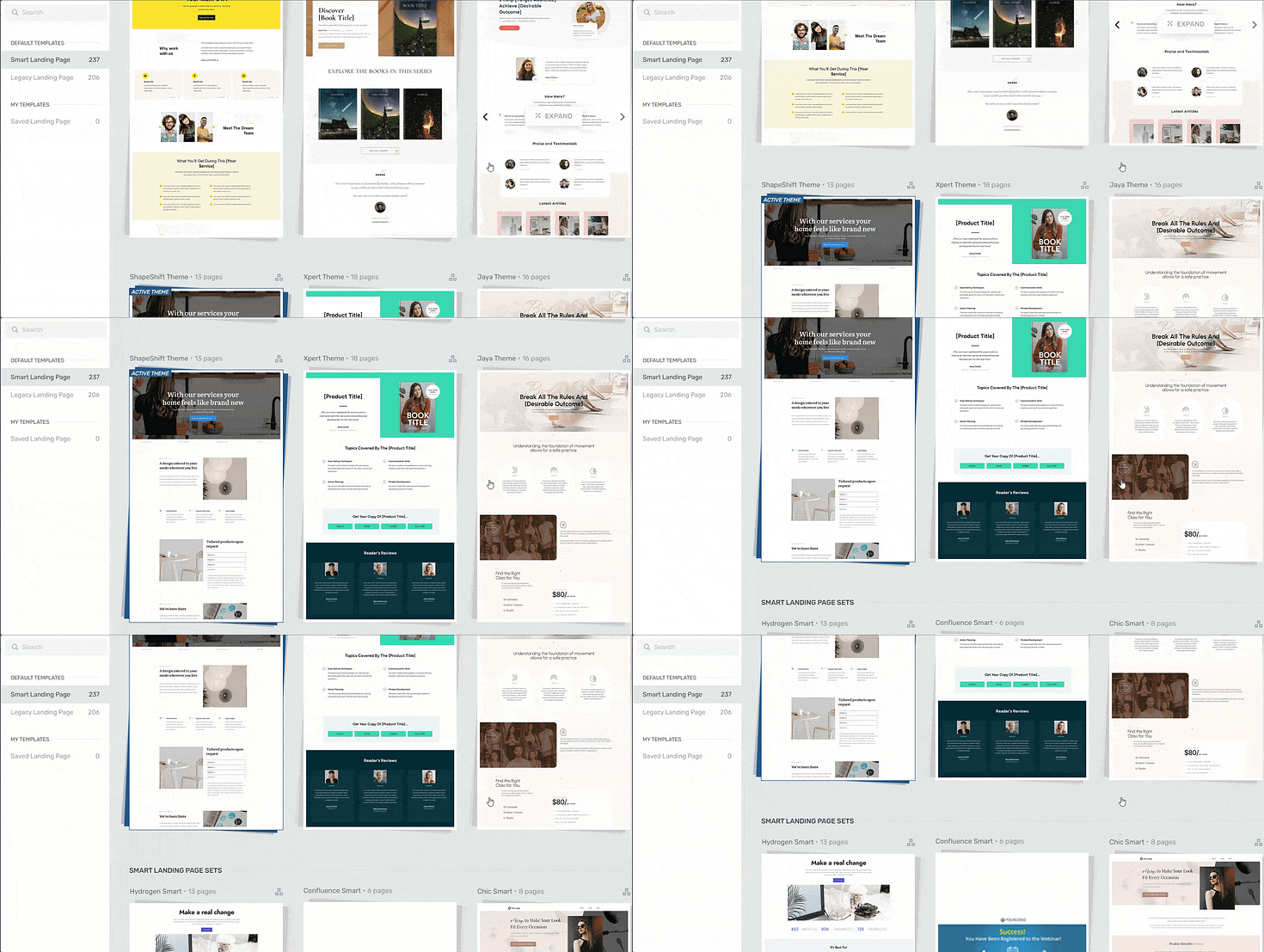
Landing page template sets in Thrive Architect
- Designed to Convert: Every element you add with Thrive Architect speaks the language of conversion. From compelling call-to-action buttons to engaging testimonial sections, it’s like having a marketing expert right there with you, guiding your design choices to ensure they’re primed for your audience's clicks.
- Plays Well with Others: Have favorite marketing tools you’re not ready to part with? Thrive Architect integrates seamlessly with a wide range of tools and platforms, from email marketing to social media.
- Looks Great on Any Device: A sales page template that looks fabulous on desktop but falls apart on mobile just doesn’t cut it. Thrive Architect ensures your page automatically adjusts to look its best on any device, so everyone has a front-row seat to your offer, no matter how they browse.
- What You See Is What You Get: With real-time editing, what you see is literally what you get. There’s no guessing how your page will look once it’s live. Each change you make is instantly visible, allowing you to tweak and perfect your page on the fly.

Thrive Architect Editor
In the end, creating a sales page with Thrive Architect feels less like completing an overwhelming and more like bringing your vision to life with a few clicks and drags.
And you can get started immediately.


