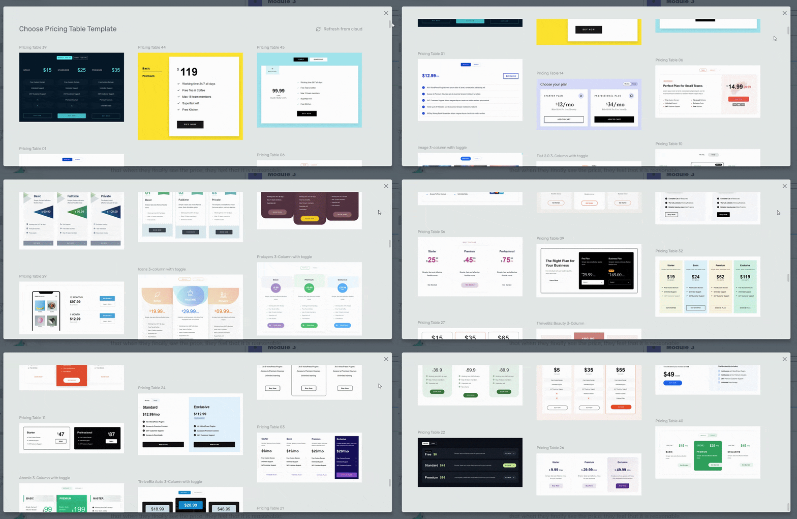
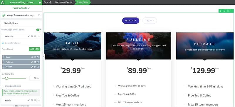
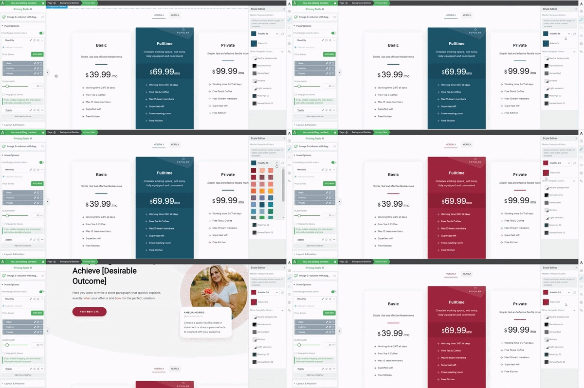
Color me impressed, but it looks like you've got a product to sell on your website now!
That's fantastic, but hold up a sec before you publish your "Buy Now" button...
Even though you can ditch your clunky pricing table plugin to use Thrive Architect's fully customizable pricing table element instead, let’s pump the brakes to discuss what makes a good pricing table in the first place.
I know you want to jump straight into building an eye catching one with tons of fancy features — like toggle switches and buy buttons that POP — but you should learn how the conversion focused nuts and bolts of pricing tables go together first and work your way up to the visual flare from there.
More...
Shall we take a quick stroll through all those pricing table ingredients? Right then, let’s get started...
Pro Tip: Pricing Tables vs. Pricing Pages
If you’re creating a pricing table, then you’ll be including it on either a sales or pricing page.
If you need some help crafting the layouts of pages that your pricing tables will live on, read this Thrive Themes blog post on Pricing Pages first.
Part 1: Build Your Pricing Table Framework
When you think about it, pricing tables are just fancy comparison charts for your products or services.
The "Product Column" x "Feature Row" structure of pricing tables is well established, but the psychology behind how your customers compare such offers must be understood if you want them to convert. This section will focus on how to get that psychological framework just right.
Offer 3 Variations of Your Product to Start
Why 3?
Two reasons:
First, presenting many more offers than 3 makes it easy to overwhelm your customers with too much choice… what’s called Analysis Paralysis, Decision Fatigue or The Paradox of Choice in internet marketing circles:
Give Barry Schwartz's TED Talk on "The Paradox of Choice" a watch if you haven't already.
Second, if you only have a single offer, your customers may automatically and unconsciously compare your product to that of a competitor.
For example, if you want to sell a single eBook on your pricing table for $37, your customers may start comparing your offer to a similar $10 Kindle eBook. That’s not a favorable price comparison for your bottom line, not to mention that you’re never going to compete with Amazon.com on price.
Instead, you could transform your eBook from a single product into a simple 3 tiered offer. For example:
- eBook only ($37)
- eBook + Author’s Notes ($47)
- eBook + Author’s Notes + Facebook Group access ($67)
Now your customers will be more likely to compare between your products instead of between yours and a competitor.
This is not to say that 3 product offers on a pricing table will always convert better than 2, 4 or 5. That’s impossible to know without A/B testing multiple pricing tables against each other using a tool like Thrive Optimize in the unique context of your own business.
But because avoiding choice overwhelm and encouraging customers to compare amongst your own products should be a top priority, it’s smart to build the first iteration of your pricing table will 3 offers — or at least until you can get some A/B tests up and running to prove otherwise!
Pro Tip: Avoid Common Pricing Mistakes
If you’re still struggling with how to set your prices in the first place, learn how to avoid the most common pricing mistakes in this Thrive Themes blog post.
Anchor Your Prices
There’s a psychological phenomenon called anchoring where people rely on initial information way too much when trying to make a decision.
For example, if you watch game shows where contestants must correctly guess the price of prizes to win them, most of the answers will be close variations of the first contestant’s guess. One of the reasons for this is because the first guess anchors the group's thinking to that first piece of information:
Contestants on Bob Barker's "The Price Is Right" game show guess very similar prices based on the first contestant's anchor...even when the odds are against doing so. Note: The winner must have the closest bid to the retail price of the prize without going over.
This same phenomenon is at work when customers compare different products within a pricing table. You can use this psychological phenomenon to your advantage by doing the following 2 things:
First, select one of your offers and present it as your "Best Choice" or "Most Popular" option. This highlighting of a product option helps anchor customers to that price when they start their mental comparison:
Stencil's Pricing Table with a "POPULAR" tag added to the top right corner of their Unlimited plan.
Second, you can anchor your pricing by offering a discount for longer period purchases (e.g. annual vs. monthly subscriptions) or different economies of scale (e.g. 1 vs. 5 vs. 15 units):
The Thrive Architect pricing table showing economy of scale discounts for purchasing 5 and 15 license packs.
You can also use a toggle button feature to switch between different ‘instances’ of your pricing to show monthly vs. annual payment rates like in the Stencil example again:
The Stencil Pricing Table uses a toggle switch so customers can view separate Monthly and Yearly Billing options. The "Save 40%" green arrow pointing to the Yearly Billing option is a nice visual touch to explain the discount.
Pro Tip: Show Pricing in Multiple Currencies
If you have online customers from multiple countries, it might be useful to test whether or not showing your prices in multiple currencies boosts conversions.
The idea here is that a currency toggle can reduce purchase friction for customers outside your main currency zone.
You can build this multiple currency pricing table in Thrive Architect by creating different Pricing Table ‘instances’ for each of the currencies you want to display:
Basic
Simple, fast and effective flexible move
€19.99
/mo
Popular
Fulltime
Creative working space, not noisy, fully equipped and convenient
€59.99
/mo
Private
Simple, fast and effective flexible move
€99.99
/mo
Basic
Simple, fast and effective flexible move
$21.99
/mo
Popular
Fulltime
Creative working space, not noisy, fully equipped and convenient
$67.99
/mo
Private
Simple, fast and effective flexible move
$114.99
/mo
One of the new Thrive Architect Pricing Table templates customized for multiple currencies.
Part 2: Present Your Offers Clearly
Now that the psychological foundation of your pricing table has been set, let’s bring it to life with some clear, concise and persuasive copy.
One of the keys to creating high performing pricing tables is to present information in ways your customers can instantly understand. If you make your potential buyers perform too many mental gymnastics to understand your offers, they probably won’t buy.
So next, let's discuss the copywriting strategies you can use to help your pricing table convert better.
Avoid Ambiguity in Your Pricing Tier Names
How many times have you come across an online pricing table that uses ambiguous names for their pricing tiers?
Sanebox's Pricing Table uses ambiguous pricing tier names for their offers. Who and what are each of these products for? The original premise was "This offer is less than the cost of a Snack / Lunch / Dinner", but that pitch is completely lost on their current pricing table.
Being too clever or too cliche (e.g. Bronze, Silver, Gold) with your tier names often makes them ambiguous as to which of your customer segments they’re actually for.
A better strategy is to make your pricing names more clear so customers know exactly which deal applies to their unique needs. For example, the Tettra pricing table shown below uses “Starting”, “Growing”, “Scaling” and “Sustaining” to establish exactly what sorts of teams they’re targeting with each of their plans:
The Tettra Pricing Table uses their tier names ("Starting", "Growing", "Scaling" and "Sustaining") to target teams and companies in a specific phase of their business growth.
Alternatively, you can use a much more direct strategy and name each of your pricing tiers with the exact benefit customers receive like the following ConvertKit example:
Instead of using a clever or cliche naming scheme for their pricing tiers, ConvertKit named each tier after the main benefit each product offers: "0-1k subscribers", "1k-3k subscribers", etc.
Concisely Package Your Features & Benefits
The most difficult part to building any pricing table is presenting your core features in concise and informative phrases that support fast comprehension.
How do you this in a way that doesn’t confuse or overwhelm your leads right before purchase? A few copy strategies come to mind:
First, instead of creating endless lists of features within your pricing table columns, highlight the differences by building on what each offer provides from the most basic to more premium tiers.
Instead of restating the same features in every column, you can write “All the ‘Previous Tier Name’ features, plus:” and then proceed to list out the features unique to the next premium tier. Check out the Avocode pricing table example below to see what I mean:
The Avocode Pricing Table uses the "Everything in the previous 'Pricing Tier Name', plus:" strategy to limit the length of their feature and benefits list. This also highlights each plan's differences.
When a feature list gets too long, it makes it harder for customers to quickly understand which option is right for their needs causing unnecessary friction before your conversion.
I’m looking at you Slack! I love ya, but there’s gotta be a better way...
The Slack pricing table doesn't have the concise length you want to aim for in a conversion focused pricing table.
A second way you can pack more explanatory copy into a smaller pricing table space is by using a Tooltips feature. Tooltips are small popup boxes that appear when your cursor moves over hover elements. You can see a good pricing table example of this from Siteground:
The Siteground pricing table uses Tooltips to offer more details about each offer without letting the table length get out of hand. When a customer scrolls over indicated hover elements, a Tooltip popup box appears with additional information about that offer.
You can use Thrive Architect’s Tooltip feature to do this on your pricing tables too. It works for any element that has a hover state including:
- Content boxes
- Images
- Buttons
- Icons
The Tooltips feature will not work on elements that do not have hover states (like Paragraphs and Headers) or elements that do not have animations (like Backgrounds).
For example, in the Thrive Themes Pricing Table template shown below, you can customize Tooltips to appear over icons in the features section of each offer column:
Basic
$ 99.99
Simple, fast and effective flexible move
Fulltime
$ 199.99
Simpler, faster and more effective flexible move
Private
$ 299.99
Simple, fast and just for you
One of the new Thrive Architect Pricing Table templates customized with Tooltips. Hover over the arrow icons to see how they work. It's a good idea to indicate the Tooltip element is hover-able with a design feature like dashed underlines.
Write Persuasive Call-To-Action (CTA) Copy
The final factor every good Pricing Table requires are persuasive CTA buttons that avoid generic phrasing. You can do this by using highly relevant, specific and value driven copy. It may surprise you, but the few words you include within your pricing table buttons matter.
Peep Laja from ConversionXL states this in his own pricing page optimization article. In fact, he says he’s never seen an example of “Buy Now” button copy converting better than more specific alternatives.
So how do you come up with better CTA button copy for your pricing tables?
Michael Aagaard from Unbounce says you should ask yourself 2 important questions:
Question 1: What's my prospect’s motivation for clicking this button?
Answer this by putting yourself in the customer's shoes: “I want to ______.”
So if you happen to be selling online courses on how to speak survival Japanese for business travelers, your customer would probably answer: “I want to learn survival Japanese for my upcoming business trip to Japan.”
Question 2: What’s my prospect going to get, when he/she clicks this button?
You can answer this question by just stating what your customer actually gets — like instant access to your online survival Japanese language course.
Now smash these 2 answers together to come up with a relevant, specific and value driven CTA button copy for your pricing table: “Get Instant Access & Learn Survival Japanese Now”.
Generic “Buy Now”, “Get Instant Access” or “Download Now” buttons just won’t trigger the same sort conversion response in your target customers.
Part 3: Make Your Pricing Table POP with Judicious Design
When it comes to the visual design elements of your pricing table, it's important not to get too carried away. If you've built a solid pricing table structure and your copy is compelling, now it's time to use visuals to help direct the eye where you want it to go.
So here's a few ways to help you do that...
Use contrasting Colors and Element Sizing
One common strategy in pricing table design is to emphasize your recommended product option (often your product anchor) with a contrasting highlight color, enlarged pricing column and larger font sizes.
Wistia does an exaggerated version of this in their own pricing table:
The Wistia pricing table uses contrasting CTA colors and different sized prizing tier boxes to highlight their anchor offer.
You can also use this same color and sizing strategy for your ‘recommended product’ CTA Button like Highrise does in their pricing table:
The Highrise pricing table emphasizes their "Most Popular Plan" by using a contrasting CTA button color to call more attention to it.
Pro Tip: Create “Finger-Friendly” Pricing Table CTA Buttons for Mobile
Remember to follow the Mobile Landing Page Best Practices when customizing your pricing table CTA buttons.
Always make sure they’re “finger-friendly” for touch screen devices.
Use Visuals to Emphasize, Not Distract
Although the design and images you use on your pricing tables are important, it’s even more critical that you don’t overuse them. A little touch of visual POP goes a long way because that’s what will stand out.
Let me show you what I mean:
The Freshdesk pricing table uses one highlight color to emphasize its anchor offer as well as illustrative images to show which customer segments each product is appealing to. The pricing tier names are ambiguous, but they make up for it using subtext beneath each name to clarify exactly who each offer is for.
In the Freshdesk example above, images are used to visually convey which customer segment each offer is for. The FREE service shows a single budding sprout while the Enterprise service shows a thick Forest — and everything in between.
I also give Freshdesk bonus points for adding a single, attention grabbing animation to their “Best value for large teams” Estate plan to help draw your eye to that choice.
Like I said, a touch of visual pop goes a long way to boosting your pricing table design.
Pro Tip: Make Your Options Easy to Compare
In the Concisely Package Your Features & Benefits section, we discussed how long feature lists can make your pricing tables harder for customers to compare and understand.
From a design standpoint, one way to help you with this is to visually emphasize the differences between your pricing tiers. An example of this is shown in the Symu pricing table example below where they grey out features that don’t apply to their more basic plans:
The Symu pricing table effectively emphasizes the differences between their pricing tiers by greying out the features that aren't included in their more basic plans.
Now It's Your Turn
Since you’re now armed with all the ingredients it takes to create high converting pricing tables, it’s your turn to put this theory into practice.
I’m curious to see what sort of pricing table you’ll cook up for your next sales or pricing page.
If you have any questions or comments about pricing table design or the new Pricing Table element in Thrive Architect, let us know in the comments below!
Awesome stuff and amazingly timely. We were just discussing all this yesterday and today there’s this wicked information in my inbox. Its a great day. Keep on Keepin’ on ThriveTheme folks. We really appreciate all your knowledge and efforts. Cheers!
Thanks Andy…more timely articles coming your way!
Hey Matt!
First off, great post on Pricing Tables! There was a lot of in-depth detail about pricing tables and the psychology (my favorite!).
I do have one question revolving around creating pricing tables in Thrive Architect.
I noticed that in the pricing tables, there is a button that allows you to switch between monthly and yearly payments.
Where can I create that toggle button in TA?
Best Regards,
Amir Sharapov
Thanks Amir!
The toggle switch is now a feature of the Pricing Table element within Thrive Architect.
First, make sure you’ve got Thrive Architect updated with latest release so the new element shows up for you in your sidebar.
Then, drop the Pricing Table element into your content and add another “Instance” in the sidebar options. The toggle switch will then automatically appear as a “Button Group” within the breadcrumbs of the Pricing Table you’re working on.
Awesome!
Thank you very much!
You’re welcome Amir!
Looking for a good tip on how to keep the buy buttons horizontally level on a price table with various heights between the options.
If I understand your question correctly Jason, it’s just a matter of making sure each of your columns end at the same length.
You can use Tooltips to help you with this, the “Everything in the Previous Tier + …” strategy we discussed, being more concise with your copy, or maybe even putting your CTA buttons at the top of the column as in the final Symu pricing table example.
THis article is AMAZING. Bookmarked Matt’s page. I also got my geology degree before switching to online work!
Thanks Jackson…great to see another geo in the Thrive community!
Such useful tips, LOVE IT! Thanks 🙂
Cheers Mariola!
great content, thx. its “pump the brakes” not “pump the breaks” just saying. 🙂
Oh man, the perfectionist in me has been thoroughly shamed! ;-p
Thanks for the heads up Jose…brake job complete!
What a choice, this should make pricing easier and a lot more beneficial.
Cheers John!
Hey Matt,
I was just wondering if there’s a way to create such tilted ribbons (Stencil, Sanebox) with TA?
Thanks,
Rzv
Hi Razvan,
Although you could create the slanted ribbon effect using Slanted Edge Decorations within a content box element, you won’t be able to rotate your text 45 degrees.
However, you can get around this by creating the slanted banner using a basic online graphics tool like PicMonkey or Canva. Then upload the image to your WP media and set it as the background image of a Content Box and finally position that element where you need it on your column.
Hey Matt, great article! Was wondering, can we do a pricing table with a count-down timer on each column?
Thanks John! You can drop either the Thrive Architect countdown timer element or Thrive Ultimatum countdown timer element in your pricing table designs.
Really well done article! Now, how do we add elements such as the “popular” highlight using Thrive Architect? I don’t see those options within the Pricing Table element templates.
Thanks Ray!
There’s no “Popular” highlight feature in the Pricing Table sidebar options, but you can design whatever you need using the Thrive Architect editor by customizing Paragraph and Header fonts, or elements like content boxes and images to get the look you’re going for in the anchor price column.
Hopefully this is a precursor to getting a Thrive Themes membership plugin I’ve always hoped for 😉
One day Rick…one day… 😉
Great stuff, but my product is b2b and a consultive sale, any tips on prices / tables?
Thanks Jules. I would do a quick survey of B2B and consultant company sales pages in your niche to see what sort of pricing table strategies they’re using. Give the complete design freedom Thrive Architect gives with pricing tables, you can imitate the clever strategies you see to test what works for your business.
If you find 2 pricing table ideas you want to test, consider A/B testing them using Thrive Optimize (2 identical sales pages with only the pricing table designs different) to see if one pricing table design strategy outperforms the other.
I’m using a 3 tiered vertical columned table (like the Highrise above) for my three packages I’m offering to my clients. It looks amazing on desktop but is totally non-responsive on tablet or phone. It puts the gold (or center lifted column first and the others are pretty much invisible. Help!! I spent a lot of time on this table. Very disappointing.
It’s impossible for me to help you diagnose the problem in a comment Pamela. I suggest contacting support to see if they can help you work out the mobile responsiveness settings for your pricing table.
Very interesting as usual ! I learned a lot with your copywriting stuff.
But this is mainly for one production.
I’d like to do something like Fresdesk and in the templates, i didn’t found how to create more than 3 colums.
How can i do this ?
regards