When building a site using Thrive Theme Builder, you can add and customize various elements in order to achieve the look that you want your website to have. The “Dynamic Styled List” is a useful element to use in case you want to import a list of categories/ authors/ etc. on your website.
This article will go through the options that you can use in order to customize the element.
Add the Element to Your Template
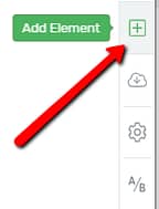
The first thing that you have to do, just like in the case of any element, is to add it to your page or post.
In the Thrive Theme Builder editor, go to the right sidebar and click on the plus sign:
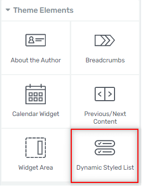
This opens a list of all the Thrive Theme Builder elements. Here, scroll down until you find “Dynamic Styled List”, or type the name in the search bar:
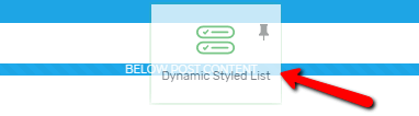
Then, once you find it, grab the element and drag and drop it onto the template where you best see fit:
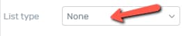
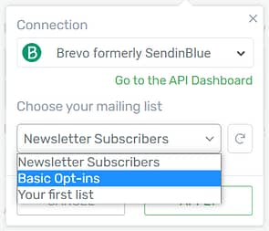
When you add the element, a small drop-down menu will open. You will automatically be asked to select the list that you want to use:
Scroll down in order to see all of your options, and click on the list that you want to add. You can also change it later if you want:
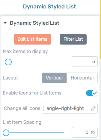
After you choose a list, you can start customizing it using the options from the left sidebar:
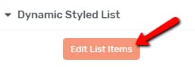
Edit List Items
The first option from the left sidebar is the “Edit List Items”. You can use this if you want to make modifications to the actual items that assemble the “Dynamic Styled List” element:
When you click on it, you will be taken into “Edit Mode”. You can then click on each element you want to edit (icons, text, etc.), and the element options will appear in the left sidebar. For example, if I click on the category name, the inline text options will appear in the left sidebar:
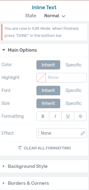
If you want to find out more about the “Text” element options, check out this article.
After you have finished editing the items, in order to exit the “Edit Mode”, click on “Done”:

Filter List
The second option you can use in the left sidebar is the “Filter List” one. This feature allows you to filter the pages/posts/content you are displaying on your website.
After you click on “Filter List”, you will be able to view the available options in the pop-up that opens:
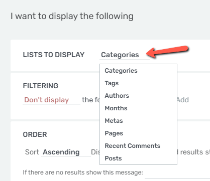
If you click on the first drop-down list, you will be able to select the type of lists you want to display:
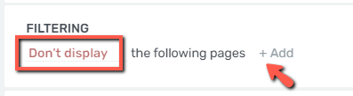
After you select the desired list, you can go ahead and use the “Filtering” section if you don’t want to display something.
Click on the plus sign next to “Add” in order to start selecting the pages that you don’t want to have displayed:
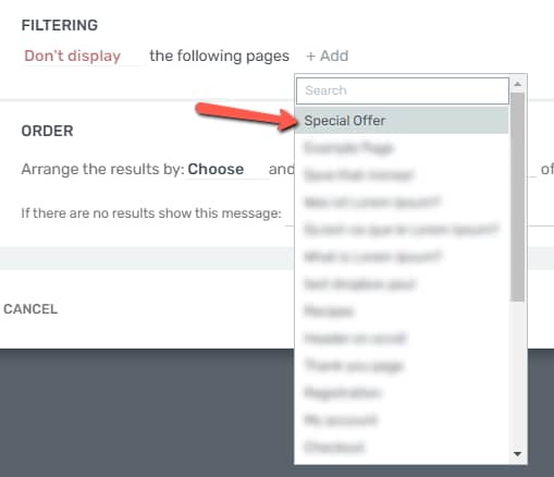
Note: Keep in mind that the filtering options from here will be different, depending on what type of list you have chosen to display.
Use the drop-down list to scroll through the list of available content, or use the search bar to look it up:
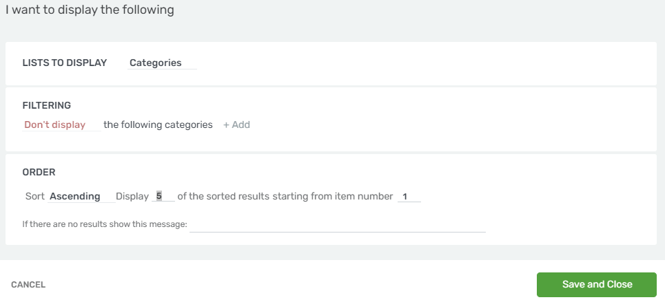
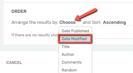
The next thing you can do is to set the order of how the content will be displayed:
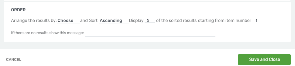
The first drop-down allows you to order the results based on various criteria:
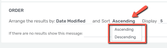
Then, you can choose to sort it in an ascending or descending order:
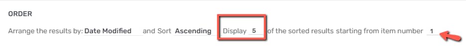
And lastly, you can set how many posts/pages/items of content you want to show on your “Dynamic Styled List” and in what order you would like to display them:
In case there are no results to be displayed in your “Dynamic Styled List” element, you can set a customized message in the field located under all these options:

This feature is similar to the “Post List” element available in Thrive Architect, so you can read this article if you want to learn more about how both of them can be used.
Use the Element Options
After you have edited the element in the “Edit Mode”, you can move forward and customize it using the rest of the options available in the left sidebar.
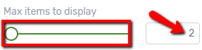
Max Items to Display
The next option is about the number of items the list will display. Whichever type of list you are using, you can set the maximum number of items to display. In order to change this number, you can either drag the slider from side to side, or you can manually enter a numerical value in the field next to the option:
Layout
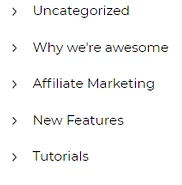
After the option with the number of items to display, the next one is the “Layout” option, where you can choose if you want the list items to be displayed horizontally or vertically. Click on the option you prefer:

In the example that I am using, here is how the “Categories List” looks like if the layout is “Vertical”:
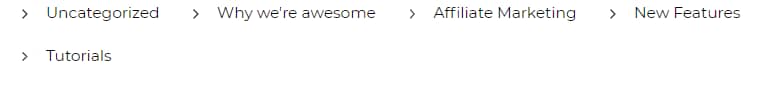
And here is how the list looks like if I decide to use the “Horizontal” layout:
Enable Icons for List Items
After deciding which layout to use for the “Dynamic Styled List” element, you can also decide if you want the list to consist of icons, as well, or not. The element has this option, called “Enable Icons for List Items”, activated by default. You can remove the icons from the element by clicking on the switch next to the option:
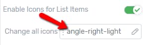
Change All Icons
If the above-mentioned option is enabled, you will also be able to change the icons, with the use of the next option (“Change all icons”). In order to do that, click on the field next to the option:
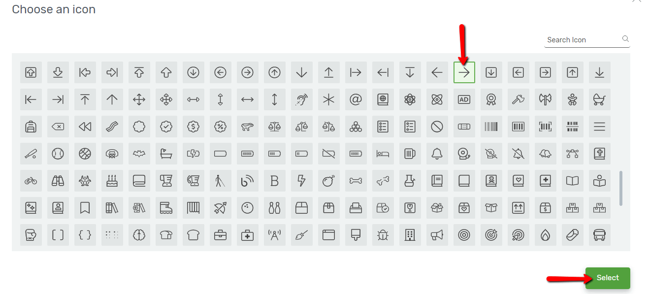
This will open a pop-up with all the available icons. You can scroll down until you find the one you like, select it, and then click on the green “Select” button:
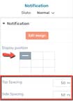
List Items Spacing
The last option from the left sidebar “Dynamic Styled List” section is the “List Item Spacing” option. This is where you can decide the spacing in between the items. Depending on which type of layout you have previously chosen, you can either set the vertical spacing, or the horizontal spacing. In order to modify it, either drag the slider from side to side or manually enter a numerical value in the field next to the slider:
These were all the options that can be found under the “Dynamic Styled List” section of the left sidebar. Besides these, you can also use the rest of the options to further customize the element (such as “Borders & Corners”, “Animation and Action”, etc.), all for which we do have separate articles in our knowledge base.
For more information about various Thrive Theme Builder elements or features, make sure to check out the articles we have in the dedicated section of our knowledge base.