Do you want to encourage your website visitors to take the next step, like signing up or making a purchase? Adding a Call to Action element with Thrive Architect helps you create clear and attractive prompts that guide your audience toward your goals.
In this article, we’ll show you how you can add the Call to Action element on your website and customize it in Thrive Architect.
- Adding a Call to Action Element on Page
- Changing the Template of the Call to Action Element
- Editing the Status of a Call to Action Element
- Using the Main Options of the Call to Action Element
- Using the Other Options of a Numbered List Element
Adding a Call to Action Element on Page
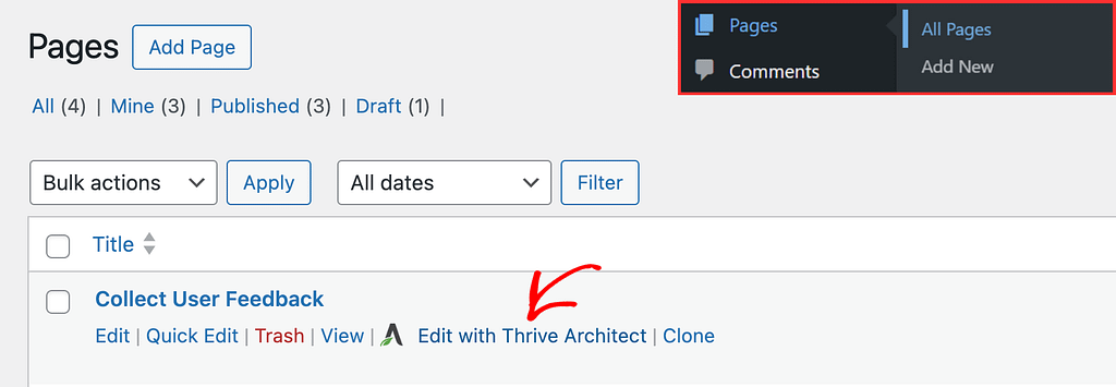
To add the Call to Action element to a page, begin by opening the page in the Thrive Architect editor. To do so, open your WordPress admin area, Pages >> All Pages, hover on the page you want to edit and click Edit with Thrive Architect.
When the page is opened in the Thrive Architect editor, go to the right panel and click the plus (+) icon.
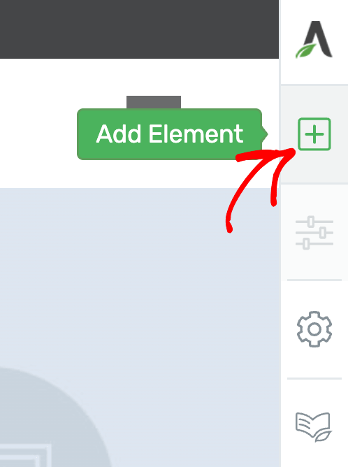
Clicking on the plus icon will open up the list of Thrive Architect elements to choose from. From this list, drag and drop the Call to Action element on the page.
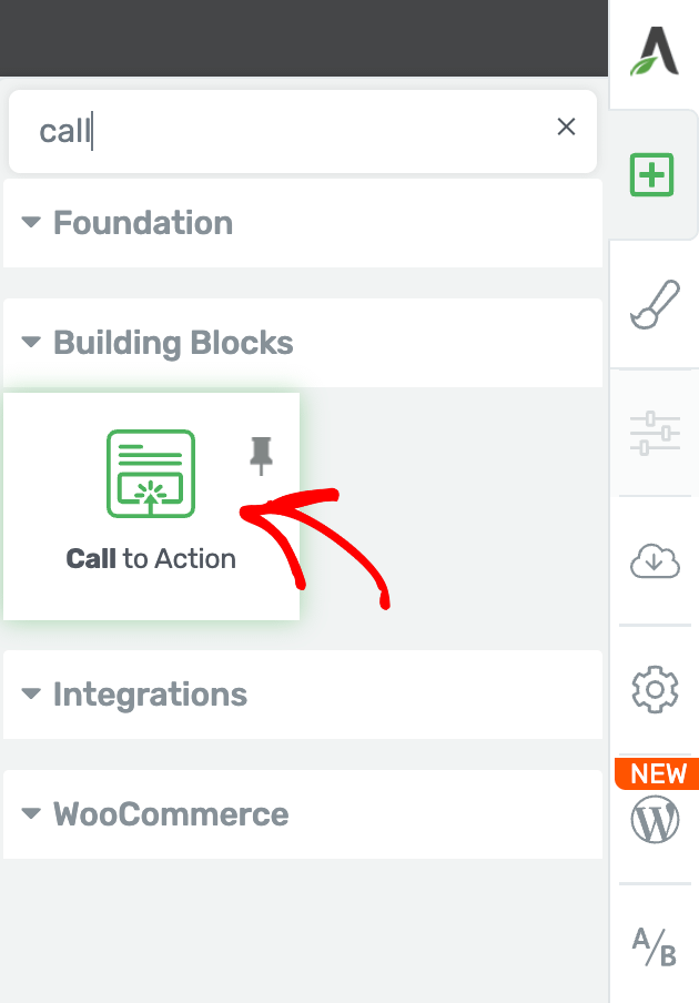
Once you drag and drop the element in your desired location you’ll see a popup with the available call to action templates you can use.
On this popup, click on the template you want to use and close the popup.

When on the page, click the call to action so you can customize it using the settings you see in the left column.

Changing the Template of the Call to Action Element
When you add a call to action to a page, you’ll see it appear with the template you’ve chosen in the popup. If you want to change the call to action template on the page, first, click the call to action to open the settings in the left column.
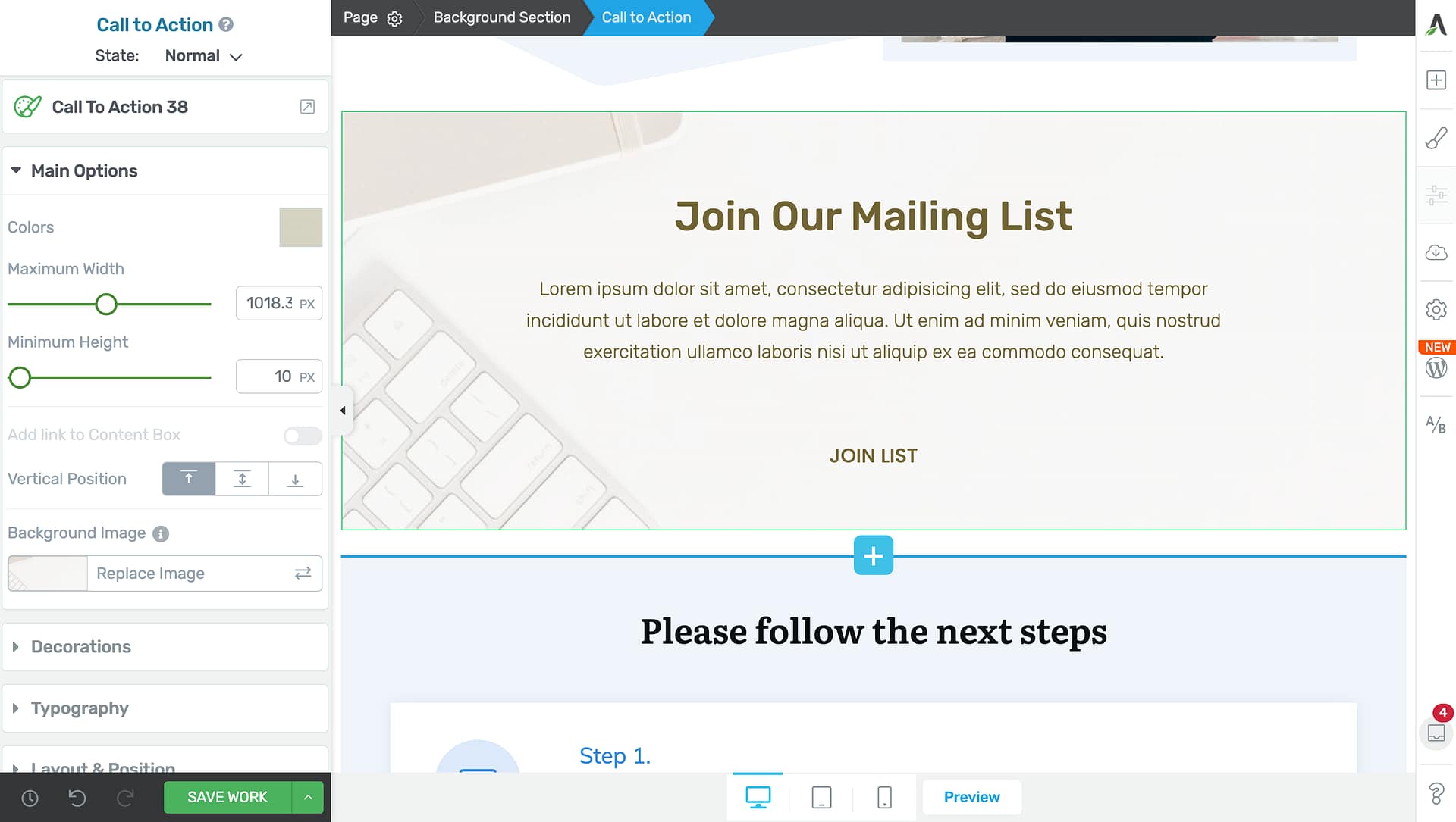
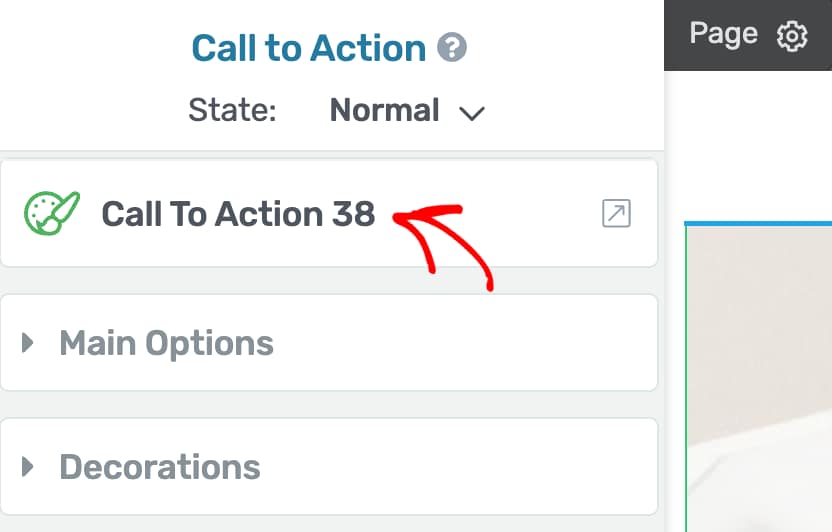
In the left column, click on the template name. In this case Call to Action 38.
When you click on the current call to action template, you’ll see a popup with the templates you can use. On this popup, select the template you want to use and click the Replace Template button.

Editing the Status of a Call to Action Element
Like many other Thrive Architect elements, the Call to Action element comes with two states – Normal, for when it is seen on the page, and Hover, for when a user hovers over it.
You can customize to change the look and feel of the call to action in both these states.
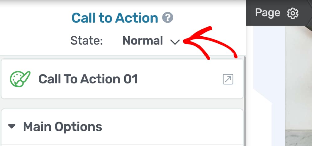
To change the state, click on the Call to Action to open its editing options in the left column.
In the left column, change the State of the call to action by clicking the down arrow besides Normal.
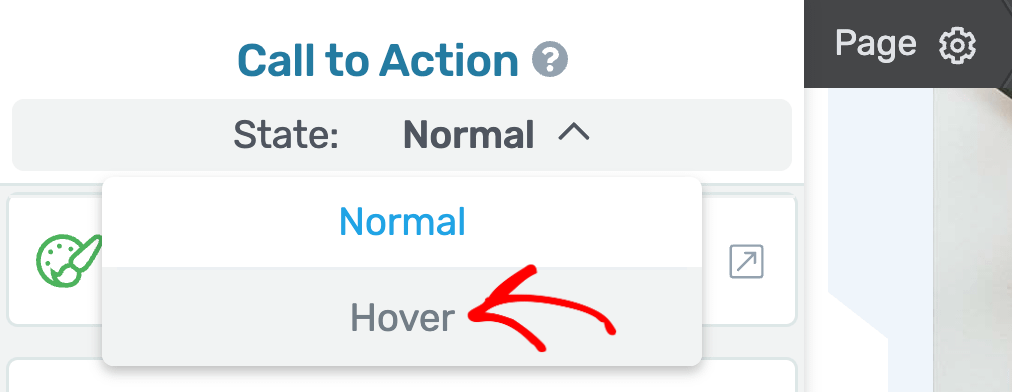
When you click to change the state, you’ll see two states that you can select from and edit the call to action accordingly.
To edit the call to action styling that’ll show up when the user hovers on it, select the Hover state here.
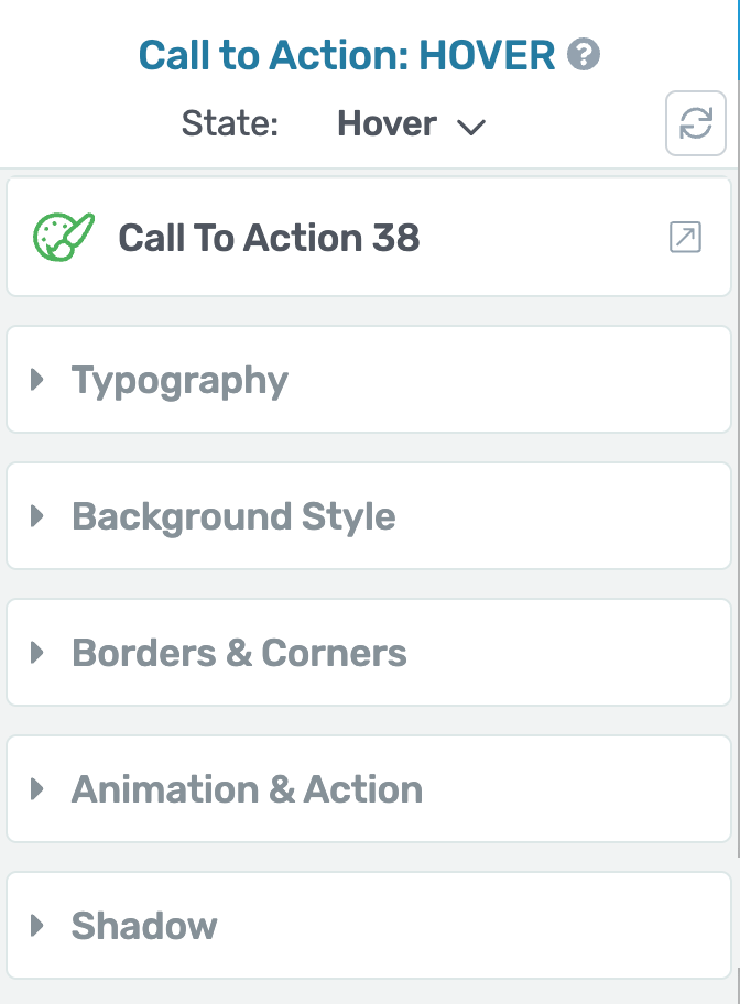
When you select the Hover state of the call to action, you’ll see the available settings for this state in the left column.
To know more about the settings for the Call to Action hover state, refer to our document here.
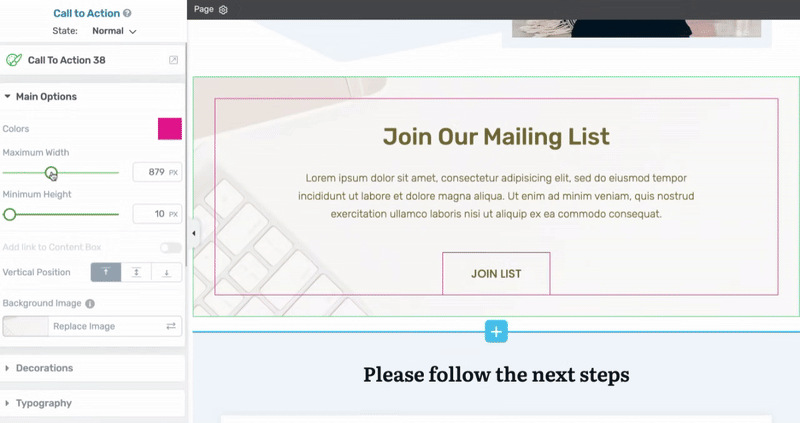
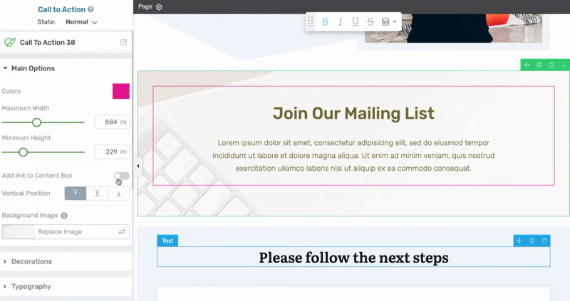
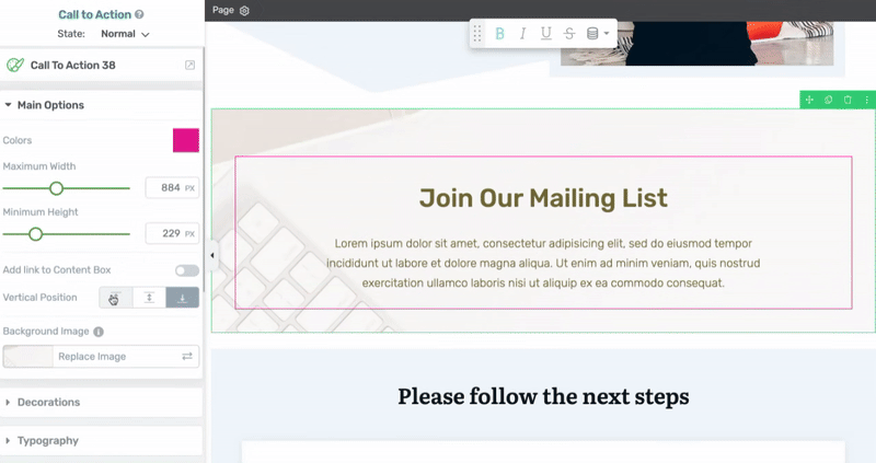
Using the Main Options of the Call to Action Element
The Main Options of the Call to Action element allow you to customize the main look and feel of it. They enable you to do the following.
- Changing the Color of the Call to Action
- Setting the Maximum Height and Width of the Call to Action
- Adding a Link to the Content Box
- Managing the Vertical Positioning of the Call to Action
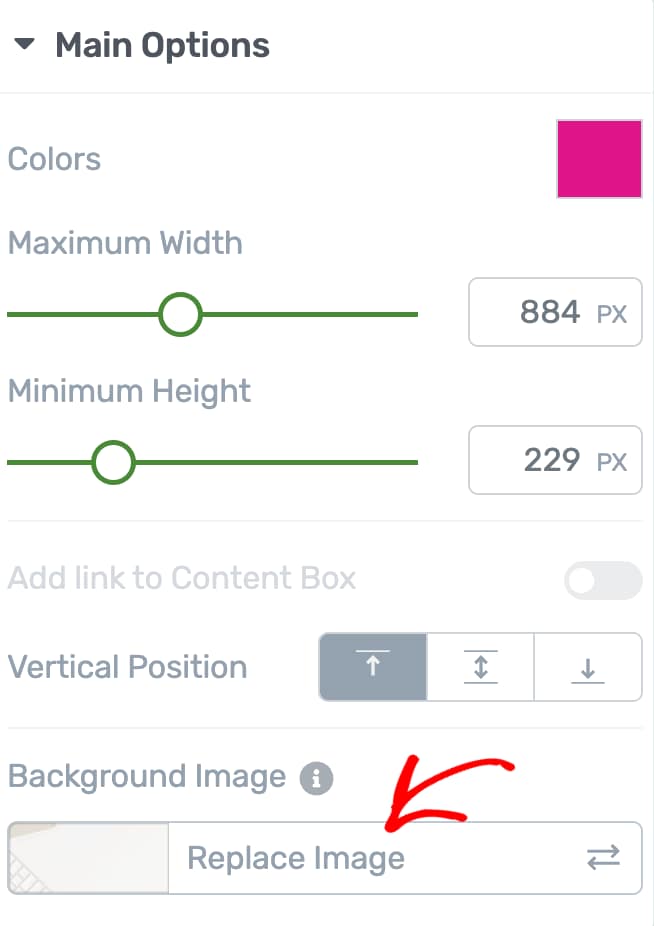
- Setting/Editing the Background Image of a Call to Action
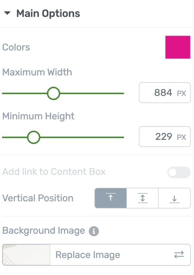
Changing the Color of the Call to Action
The Color setting for the Call to Action lets you set the color used on it. To change the color, click on the color box, select a color from the color picker and click the Apply button.
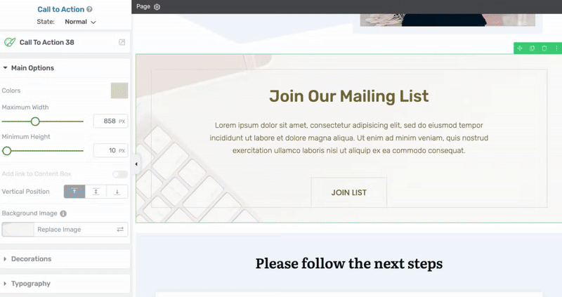
Setting the Maximum Height and Width of the Call to Action
The next two settings allow you to set the maximum height and width of the call to action.
To do so, you can use the slider or enter the number in the given field beside the setting.
Adding a Link to the Content Box
If you want to add a link to your element, turn on the switch beside the option to add a link to the content box.
Note: This setting will look disabled if you already have a link inserted inside the Call to Action container. In this example, there’s a button with a link and therefore you see this setting disabled by default.
When you do this, more link options will appear, just like you see for other elements when adding a link.
First, you can choose the kind of link you want:
- Static link: This sends users to a specific URL you set.
- Jumplink: This takes users to another section on the same page.
- Dynamic link: This updates automatically based on the content or context (for example, linking to a related post).
Here, pick the type of link that works best for what you need.
Managing the Vertical Positioning of the Call to Action
The “Vertical Position” option lets you decide where your content appears inside the “Call to Action” box. You can put your content at the top, center, or bottom of the box. The default setting is at the top.
To change the position, just click on the one you want (top, middle, or bottom), and you’ll see the content move to that spot inside the “Call to Action” box. This helps you control how your message looks and catches people’s attention.
Setting the Maximum Height and Width of the Call to Action
The next two settings allow you to set the maximum height and width of the call to action.
To do so, you can use the slider or enter the number in the given field beside the setting.
Other Options for the Call to Action Element
Just like the other Thrive Architect elements, the Call to Action element comes with additional options where you can manage the layout and positioning, borders and corners, background styling, shadows, etc.
To learn more about these options, read the documents listed below.
- Using Decorations Options in Thrive Architect
- Using Typography Options in Thrive Architect
- Using Layout and Position Options in Thrive Architect
- Using the Background Style Option in Thrive Architect
- Using Borders and Corners Settings in Thrive Architect
- Using Scroll Behavior Options in Thrive Architect
- Using Animations and Actions in Thrive Architect
- Adding Shadows to Thrive Architect Elements
- Using the Responsive Option in Thrive Architect
- Using the Conditional Display in Thrive Architect
- Using HTML Attributes in Thrive Architect
Customize the Content of the Call to Action Element
After customizing the way the “Call to Action” element looks, it is also important to customize the content that can be found in it. When you have added the element to the page and chosen a template for it, the respective template came with general texts, images, buttons, etc.
You will have to change all such default/general content by replacing them with your own texts, images, buttons, etc. This is needed to make the “Call to Action” unique and specific to your page. In order to change the default content, click on the element you want to change.
This way its specific options will appear in the left sidebar. Then, use the options of the respective element to customize the part of the content it represents.
For example, if you want to change the text of a button, simply click on it, delete it directly from the editor and then write your own button text. In the case of buttons, it is also important to use the “Button Link” option, which appears when you select the button from the “Call to Action” element. With this, you can link the button to a different page, where you want the users to be redirected after they click on the button.
Another example would be changing a default image. In order to do that, you will have to use the “Replace Image” option, from the sidebar, to change it with your own image.
Keep in mind that doing this for every element with general content, inside the “Call to Action”, is essential, so that they represent your own business/services.
We’ve just seen how you can add and customize the Call to Action element on a page using Thrive Architect. You can take a virtual tour of it in the video below.