Let’s have a look at how you can recreate this animation on your website, using only Thrive Architect
Open the Page/Post
First of all, open the page or post on which you are planning to work. For this example, I am using a pre-built landing page template:
The template that I’m using is from the Kwik Theme library:
Note: I went for the “Lead Generation Page” template. Feel free to choose the same, if you want to recreate the exact look, or simply pick a different template or a blank one:
Start working on your template and customize it to match your website. I kept a block that looked similar to what I had in mind.
Add the Image to Your Page
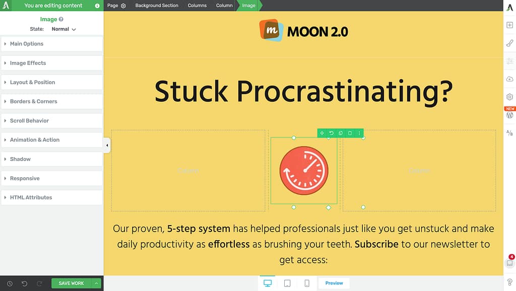
So, when your template is customized you can proceed with actually recreating the layout from the beginning of this article. First, open the right sidebar list of elements and add an “Image” element onto your canvas, somewhere at the top of the page:
Align and Resize the Image
The “Main Options” will appear in the left sidebar. Use them to resize the image, if need be, and make any other adjustments that you see fit at this stage:
Next, expand the “Layout & Position” section of the same sidebar:
Here, make sure the element is aligned to the right:
Add CSS Animation on Hover
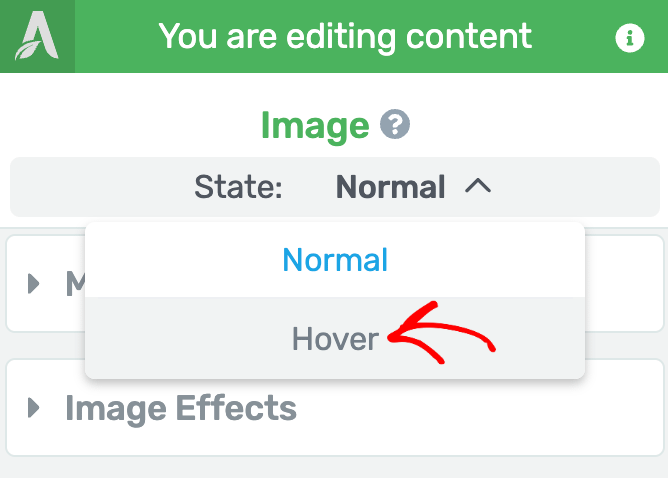
The next step is to access the hover state of the element. Click on the downwards pointing arrow from the “State” panel:
Select “Hover”:
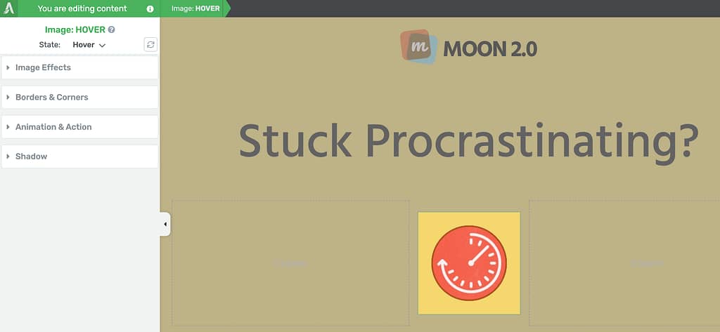
This is where you can apply a CSS animation to your element so that it will move anytime someone hovers over it:
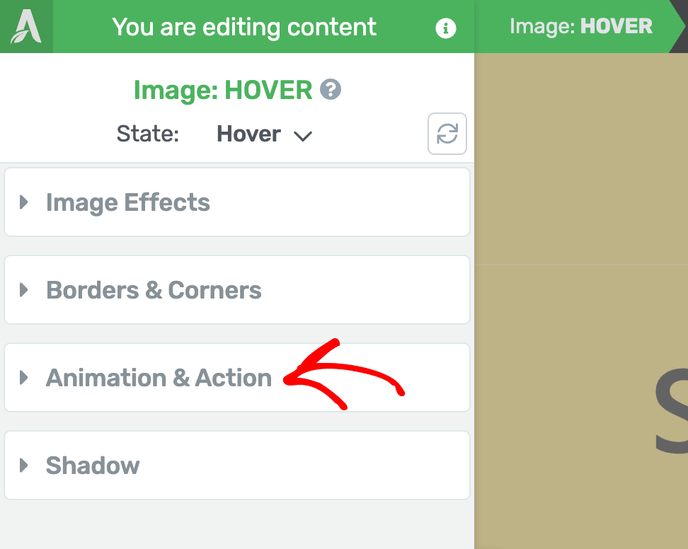
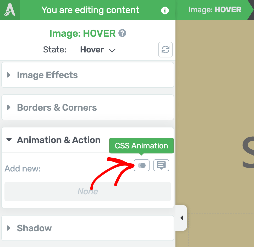
After you expand the “Animation & Action” section, go ahead and click on the “CSS Animation” option:
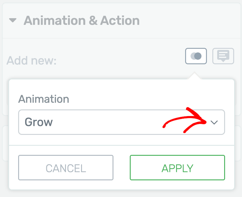
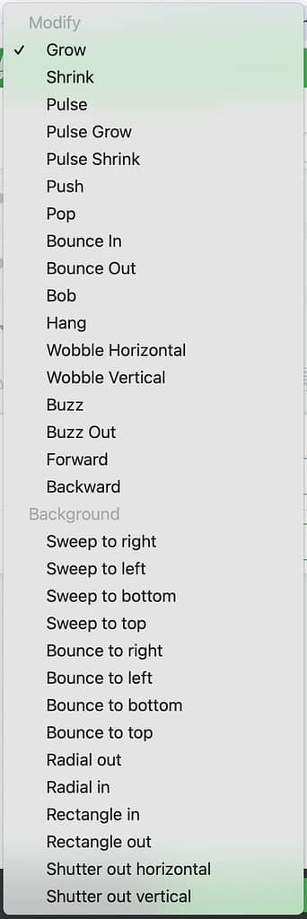
Here, pick an animation from the list. I went with the “Forward” animation for this first image:
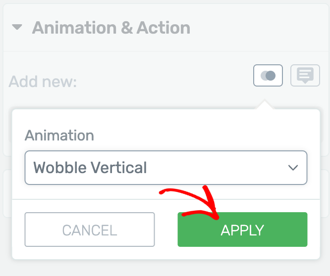
After you select it and click on “Apply”, you will be able to preview it from this little eye icon next to it:
Make any other adjustments in hover state, and when done, you can go back to the normal state from the same drop-down list:
Add a Link to Your Image
Lastly, there’s one more step to be done here, before going on to the next element, and that is to add a link to your image. So, with your image still selected, look for the “Add link to image” toggle of the “Main Options”:
Enable it and in the “Target URL” field that appears, look up the page that you’d like to link to:
Whenever someone clicks the image, it will work like a button, and will basically redirect the visitor to the page your set up here.
And this is it for the first image – up to this point you’ve managed to add it to your page, adjust its position and sizing, apply an animation in hover state and also turn it into a clickable element that takes the visitor to another page.
Duplicate the Image
Now let’s do the same for the second image. To speed up the process, you can duplicate the already existing image:
Then select the duplicate version:
In the left sidebar, make sure you replace the existing image with a new one:
Also, the “Add link to image” will already be active by default, since this image is a duplicate of the first one, so here as well, make sure you replace the “Target URL” link:
Align and Resize the Image
After this is done, you can go on to the next step which is adjusting the position of the image on the canvas. Expand the “Layout & Position” section:
And here, access the “Advanced” settings:
You will have to tweak the values for the horizontal and vertical positions of the element. Make sure the “Relative” button is selected, and then add negative values to the horizontal and vertical fields:
Once you’re done, the images should be placed something like this:
Add CSS Animation on Hover
Next, you will have to apply an animation to this image as well, on hover state:
Since this is a duplicate image, it will already have the animation added to the original, but you can click on the pencil icon to edit it:
Pick another “CSS animation” from the list:
And now you can go back to the regular normal state and save your preview your work. The images should now move like this when you hover over them:
This would be a quick step-by-step tutorial for recreating the above layout. Feel free to check out other tutorials of this type available in our knowledge base:
- Create a Duotone Page in Thrive Architect
- Create an Animated Layout Using Only Thrive Architect
- How to Recreate the Kwik Theme Aspect and Animations on Your Website
- How to Recreate the Ommi Theme Animations on Your Website
Furthermore, if you enjoyed reading this article, don’t hesitate to reward it with a smile below 🙂