If you were wondering how to create an interesting duotone layout on your page along this cool button animation, then keep on reading this article:

You can recreate the exact look in Thrive Architect, and I will be showing you how to do just that in this step by step tutorial.
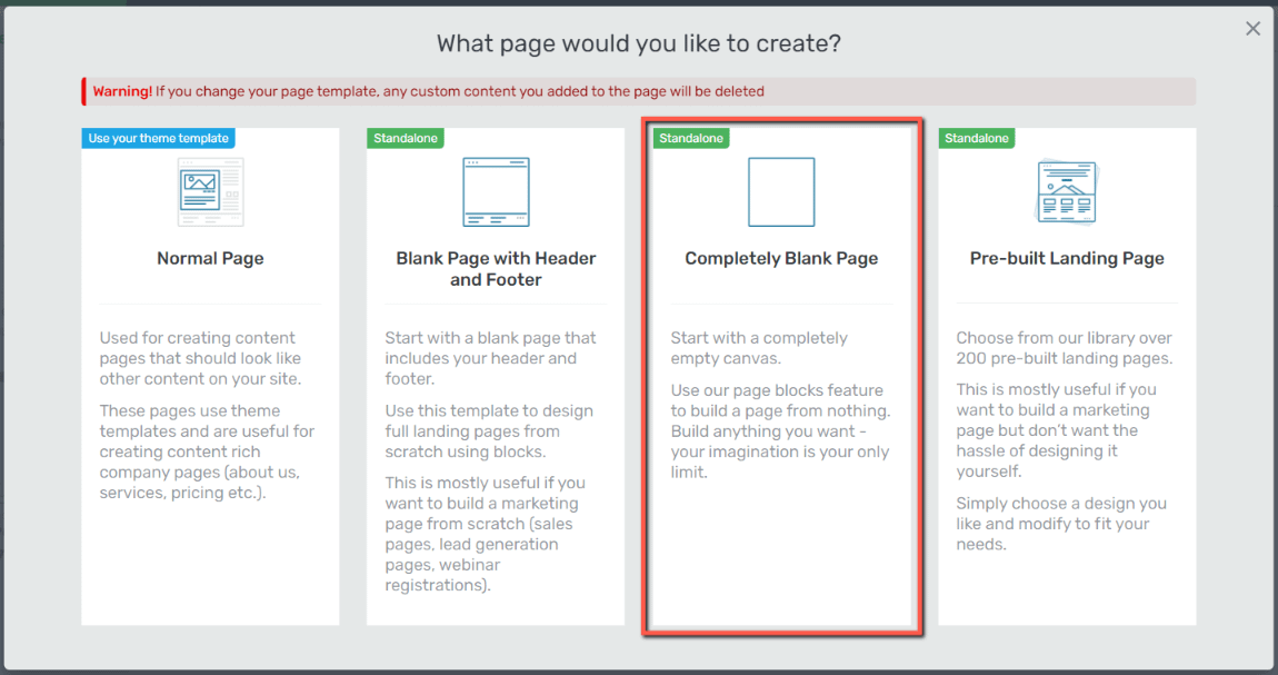
Firstly, open the page on which you plan to recreate this look and make sure that it’s a blank one:
Create a Two Column Layout
Next, we’ll move on to the step of splitting the page into two separate columns. That can be done directly by adding a “Columns” element to your canvas or by placing two elements next to each other (which will automatically create two columns on your canvas).
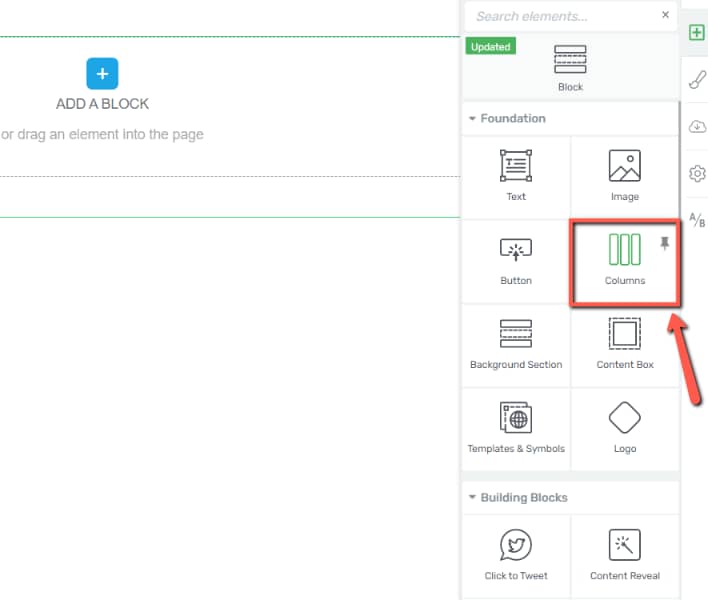
For this example, I’ll use the “Columns” element, which I’ll drag and drop onto my canvas from the right sidebar list of elements:
Next, select the two columns layout for your element:
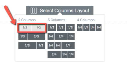
You should now have a page split into two identical columns.
To achieve the duo page that covers the entire screen, you need to make sure that the columns cover the entire width of the canvas you are working on.
You can easily check that by hiding the left sidebar list of options, like so:
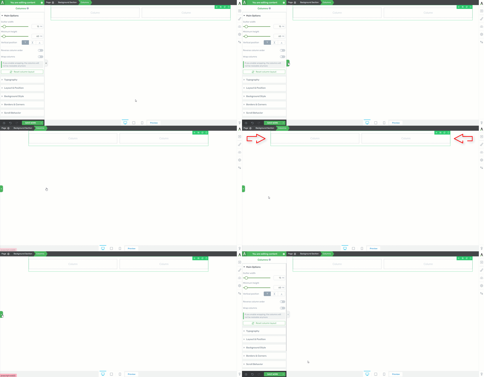
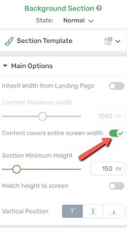
In order to make sure the columns go full width, select first the “Background Section” in the breadcrumbs:

You will notice here that the width is set to be inherited from the landing page:

Simply deactivate the toggle and you’ll notice that the columns’ width will change as well:

Lastly, activate the toggle next to “Content covers entire screen width” to make sure your columns’ width goes from side to side:
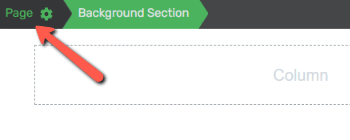
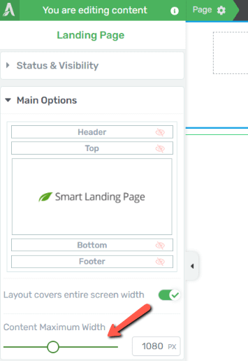
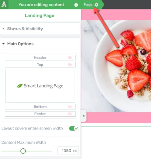
Note: You can easily find out what is the inherited width, by accessing first the “Page” settings from the breadcrumbs:
And then in the left editor, you’ll see the content width of the landing page you’re currently working on:
So now, the background section that was automatically created when you added the “Columns” element, covers the entire screen width. You can easily check that again if you hide once more the left sidebar list of elements:

Add Content to Your Columns
Next you can proceed with adding content to your columns. The first column will have an “Image” element added to it:
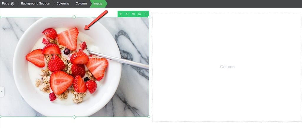
Whilst the second one will have a “Text” element and a “Button” element:
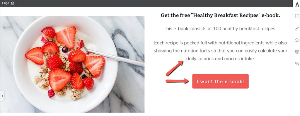
After you place your elements and customize them to match your product or offer, you might notice that there are still several adjustments you can make here.
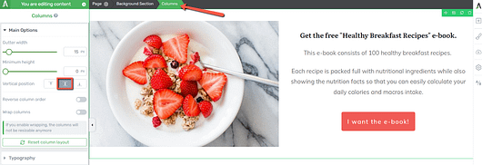
For example, I want to my right side columns’ content to be centered, so for that I’ll head over once more to my breadcrumbs, select “Columns” and then make sure that the “Vertical position” is set to center:
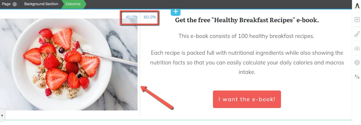
Lastly, you can change the layout proportions for the columns from the dotted line that separates them. Simply drag it to the left or right and find the right proportion for you:
Add a Background Layer
Now let’s move on the next step, which is adding a background layer to our canvas.
Select once more the “Background Section” in the breadcrumbs, and then open the “Background Style” tab of the left sidebar:
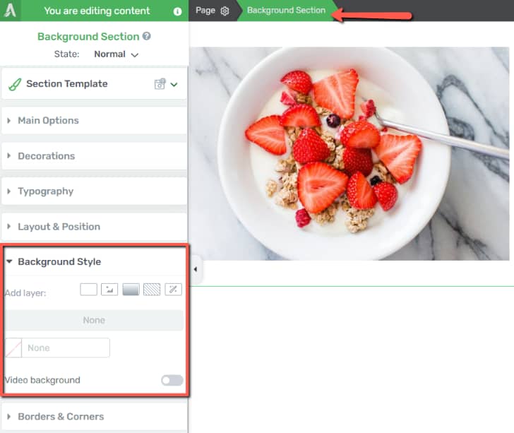
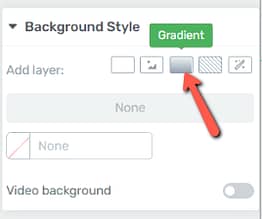
We will recreate the duo color background using a “Gradient” layer:
Set the “Angle” of the gradient to 90°:
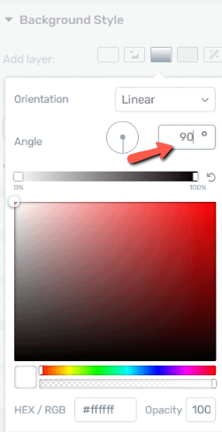
Now pick a color from the color field or from the list of saved colors, and also, make sure the opacity is set to 100:

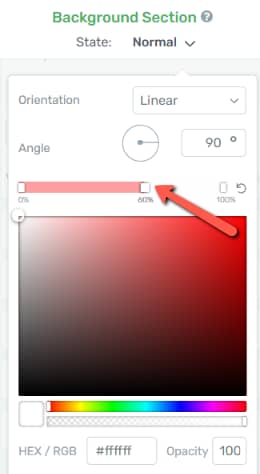
Next, you have to add a 60% marker to your gradient. To do that, click anywhere on the slider, which will automatically add a marker to it, and then drag it to the 60% value:
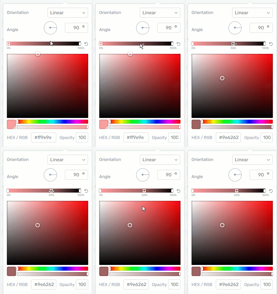
And lastly, make sure that that the color of the marker is the same color as the color of your gradient, and here as well make sure the opacity is set to 100:
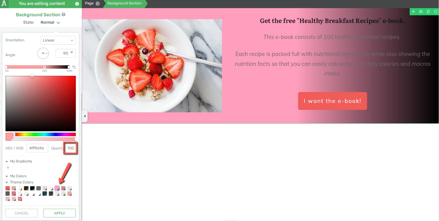
Next, click on farthest point on the slider (right at the end of it, where the 100% mark is):
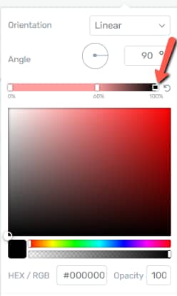
And make it white or transparent:
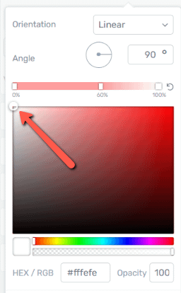
This is how the gradient layer should look up to this point:
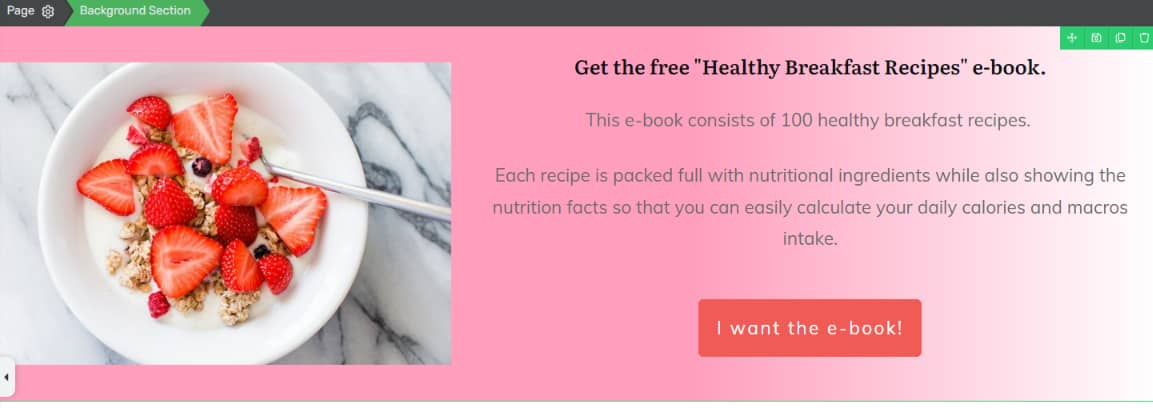
On the left, we have a solid pink color, but the right hand-side of the screen there’s a gradient of white.
The design we want to achieve has a clear demarcation between these two colors. So, in order to do that, we have to add another marker, right next to the previously added one:
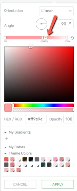
And then, make it full white:
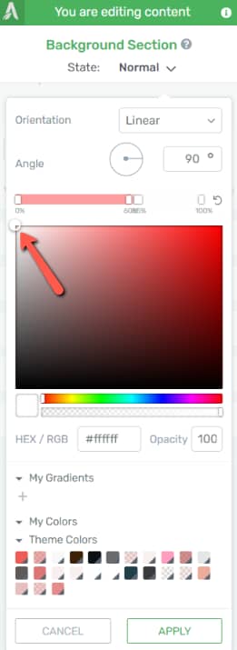
Lastly, drag the last post marker to the same spot as the first one, so that both of them sit at the 60% value:
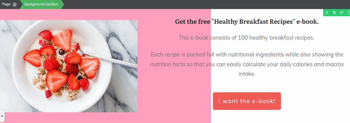
The page should be now split into two very distinct colors, with a clear separation between them:
Create an Overflow Header
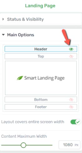
The header can be easily accessed from the left sidebar options of the page you’re working on, after you select it from the breadcrumbs:
Here, make sure the header is visible by clicking on the little eye icon next to it:
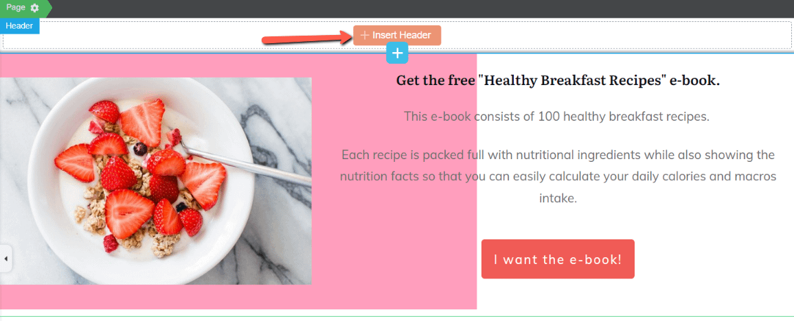
Your header might show right up if your website has one set by default. If not, you’ll see this button that you can click on in order to insert a new header:
And choose either a saved header or create a new one from scratch or from a predefined template:
What we want to do here is to create an overflow header, that’s going over our background section.
Click on the “Edit Header” button of the left sidebar:
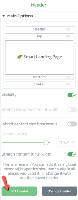
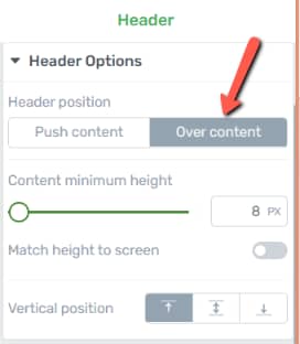
And in the “Header Options” make sure the “Over content” button is selected:
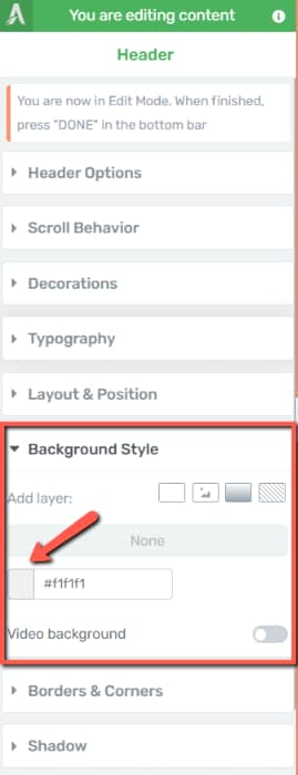
Next, while you are still in the edit mode, open the “Background Style” section of the same left sidebar and click on the color field:
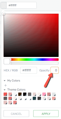
And then lower the opacity to 0:
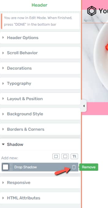
I’ve noticed that has a very subtle shadow on the lower side. This is due to the fact that the template I’ve chosen for it has a “Drop Shadow” added, which I can simply remove by opening the “Shadow” section and removing it from there:
While you are still in the editing mode, don’t forget to customize your header elements. So if you have a “Custom Menu”, make sure its menu items are renamed and that links are added to them, so that they redirect the users to a place on your website when clicked.
Lastly, if your header has a “Logo” element as well, don’t forget to replace it with your own:
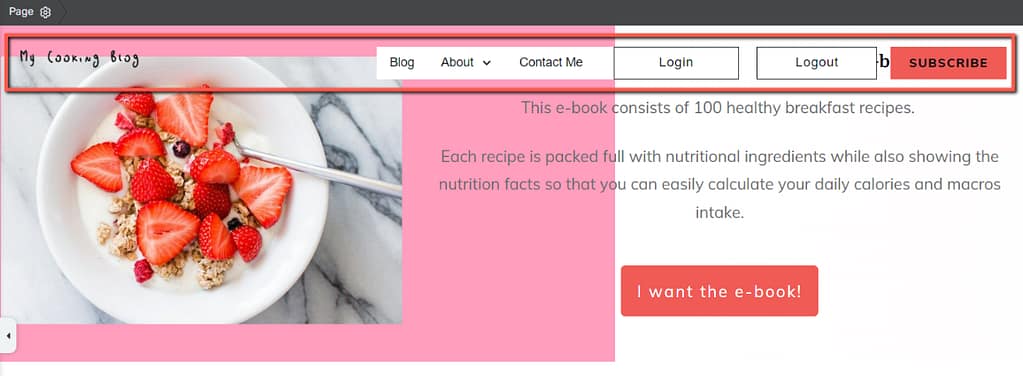
Once everything is customized, click on “Done” and return to the main options of the header.
After you do this, you might still need to make some positioning adjustments, so that the header will not overlap too much with the existing content:
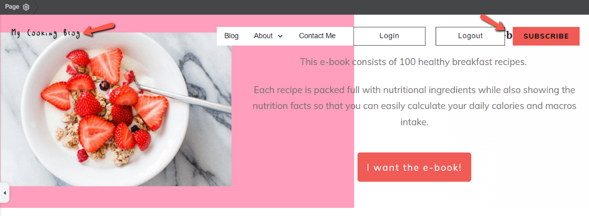
This can be easily modified by adding a padding specification to the top of the “Background Section” element.
Make sure once more that the “Background Section” is highlighted in the breadcrumbs, and open the “Layout & Position” options:
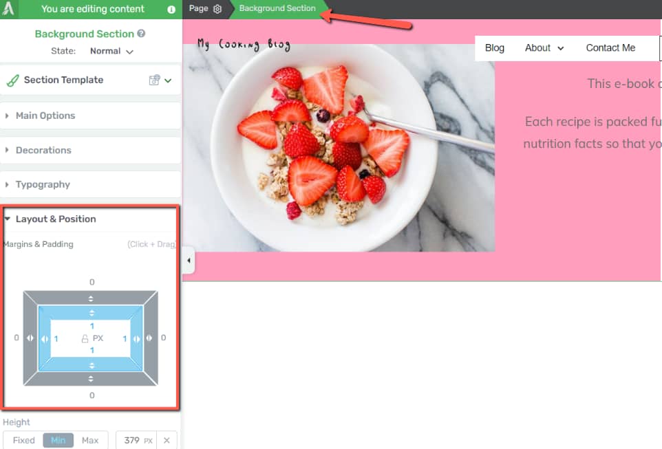
Now increase the padding of the upper part, until your content and header don’t overlap anymore and have a nice look. I added a value of 75 pixels:
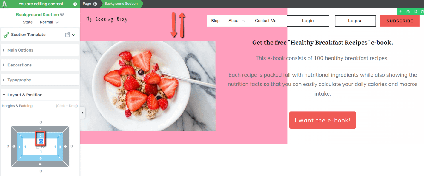
Finally, let’s move on to the final step, which is customizing the call to action button and adding a cool effect to it.
Customize the Call to Action Button
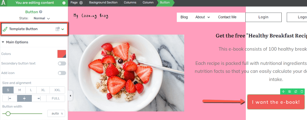
Select the “Button” element from your canvas and open the template library:
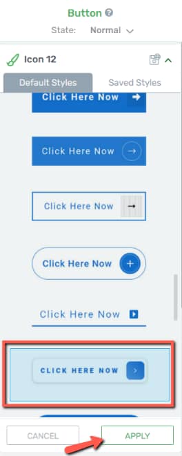
Pick a style for it and then click on “Apply”:
Add a Shadow
Next, in the same left sidebar, access the “Shadow” tab:
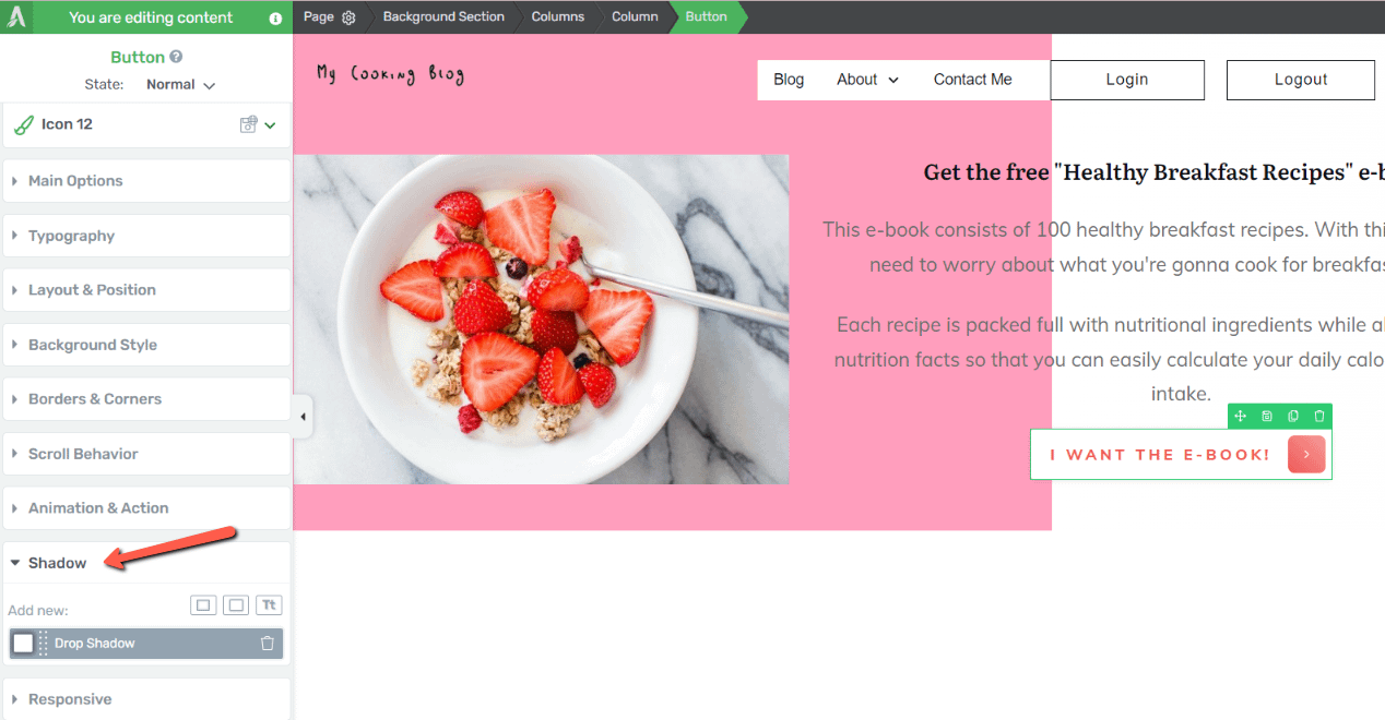
My button template already has a “Drop Shadow” added to it, which I can easily customize from here:
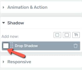
If, on the other hand, your button template does not have a “Drop Shadow”, you can easily add it from the same left set of options:
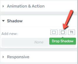
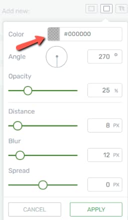
Then, with your shadow added, start customizing it. First, pick a color for it:
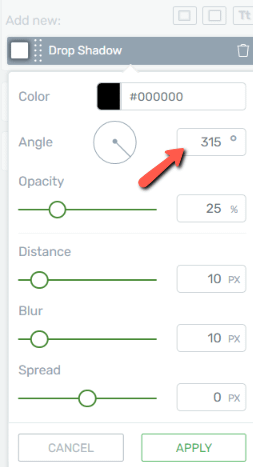
Then, lightly adjust the angle of the shadow, so that it creates a cool out of the box effect. For this example, the shadow will drop to the lower right end of the button:
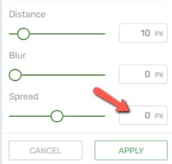
And lastly, completely remove the blur and to create a solid shadow:
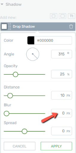
Note: In case your button template has a spread value added to it, make sure to set it to “0” as well:
Customize the Hover State
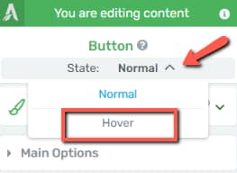
Next, you can also modify the way the button looks when you hover over it. For that, open the “State” drop-down list and select “Hover”:
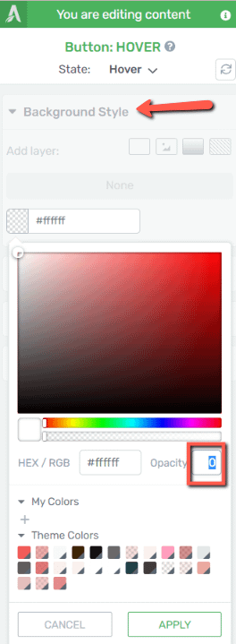
For this example, let’s make the button transparent on hover. For that, access the “Background Style” section and set the opacity to “0”:
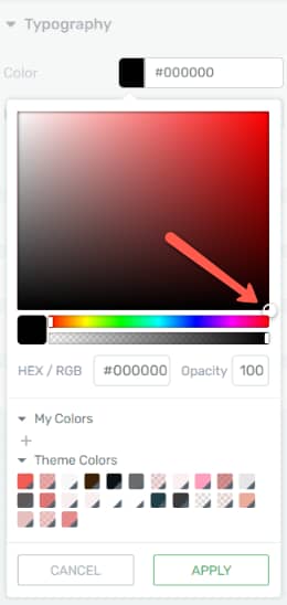
And lastly, change the color of the text from the “Typography” settings:
The button should look like this when hovered over:

Add a CSS Animation
If you want to animate the button even more, you can add an animation from the “Animation & Action” section:
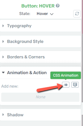
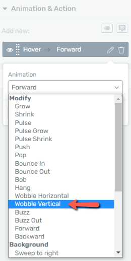
After you click on the “CSS Animation” button, you will see this drop-down list with animations you can choose from:
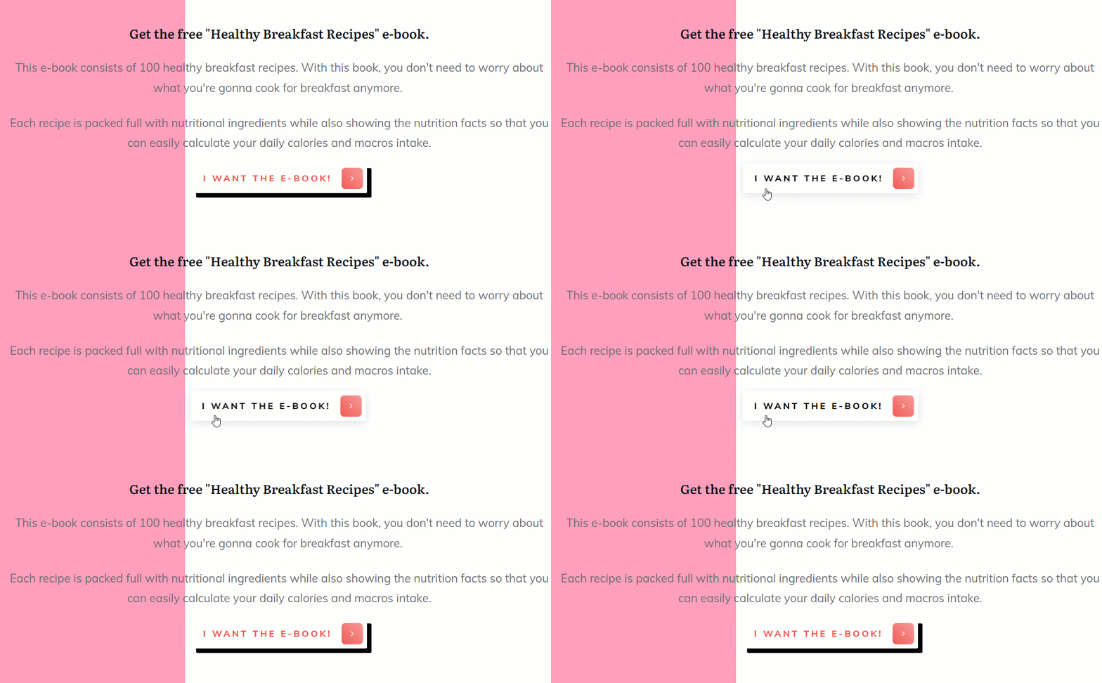
And here’s how the button would animate when hovered over, with this animation added to it:
Mobile Responsiveness
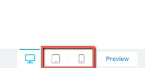
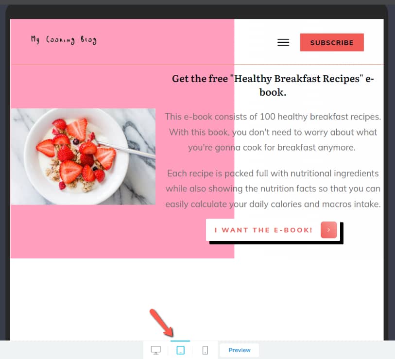
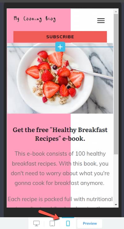
Finally, another thing worth doing here is checking how the page looks on all devices. You might need to do some minor tweaks, but otherwise, both the tablet and mobile view should have by default a clean design.
Simply click on the tablet and mobile view in this panel, and then make the necessary adjustments, as you best see fit:
This is how it looks like on a tablet:
And here’s how it looks like on an even smaller device – a mobile. The columns are automatically stacked on top of each other, so that the user can easily scroll and read all the information:
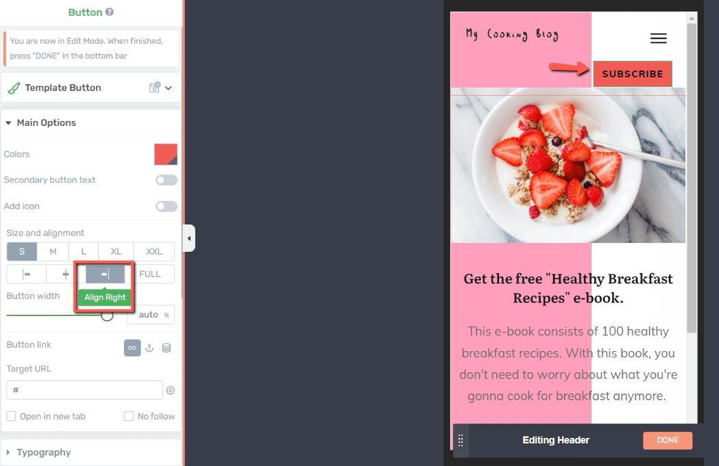
One thing I want to do here is to make the “Subscribe” button smaller and change its position a bit. So for that, I’ll go into the edit mode of my header and simply change the “Full” alignment of my button to a right alignment:
Note: If you find that some elements are overcrowding the page on a smaller screen size, you can very easily hide them.
For example, if you don’t want the subscribe button at all, you can hide it from the “Responsive” section.
Select the element you want to hide and expand the “Responsive” section of the left sidebar. Now simply click on the device for which you want to hide the element:

Any change you make on these two devices will not be applied to the desktop mode.
The changes you make will cascade down to the lower screen sizes, and not vice versa.
This means that any change you make on the desktop will cascade down to the tablet and mobile views. The changes you make on tablet view, will also be applied to the mobile, but not to the desktop. And lastly, the changes you make on mobile are only applied on mobile.
And now my duotone landing page is done. It has a cool layout, nice animations added to it and it’s also fully optimized to all screen sizes and devices.
I hope you enjoyed this tutorial. If you did, don’t hesitate to give it a smile below 🙂