Do you want to enhance the buttons on your page to grab user attention and convert more? Hover effect animations on a button provide visual feedback, making it clear that the element is interactive to improve usability and enhance the overall user experience.
In this article, we’ll show you how you can add a hover effect animation to a button element on a page.
- Accessing the Hover Effect Settings of a Button
- Changing the On-hover Color of the Button
- Adding a Hover Effect Animation
Accessing the Hover Effect Settings of a Button
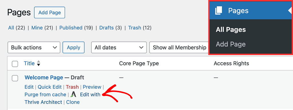
To open the button settings, start by opening the page that has the button. To do so, open your WordPress admin area, navigate to Pages >> All Pages, hover on the page that contains the button, and click on Edit with Thrive Architect.
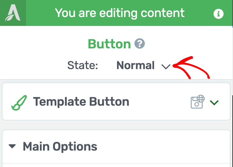
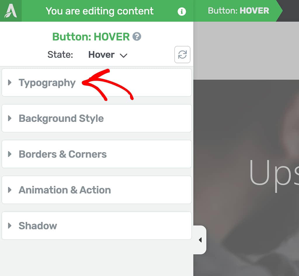
In the editor, click on the Button to open its editing options in the left column.

In the left column, change the State of the button by clicking the down arrow besides Normal.
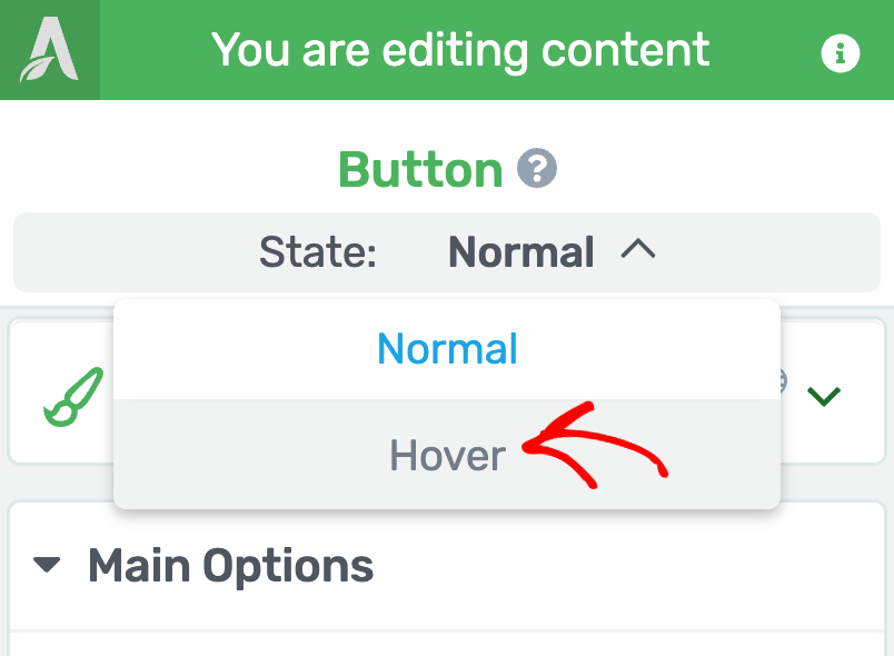
When you click to change the state, you’ll see two states that you can select from and edit the button accordingly.
To edit the button styling that’ll show up when the user hovers on it, select the Hover state here.
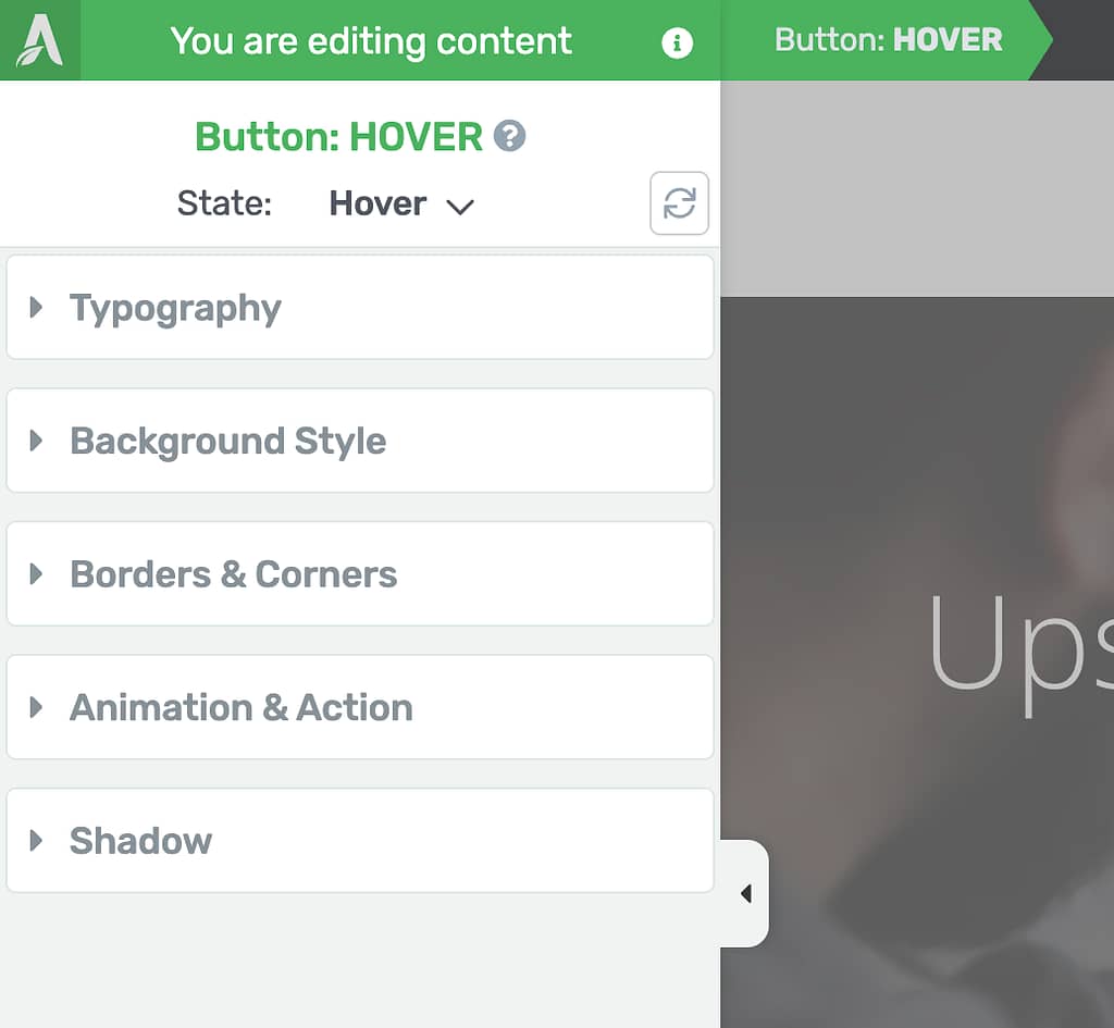
When you select the Hover state of the button, you’ll see the available settings for this state in the left column.
Changing the On-hover Color of the Button
When we talk about the colors on a button, there are two parts you’ll need to handle.
- The Typography: The button text
- The Background Style: The button color
Button Text Color
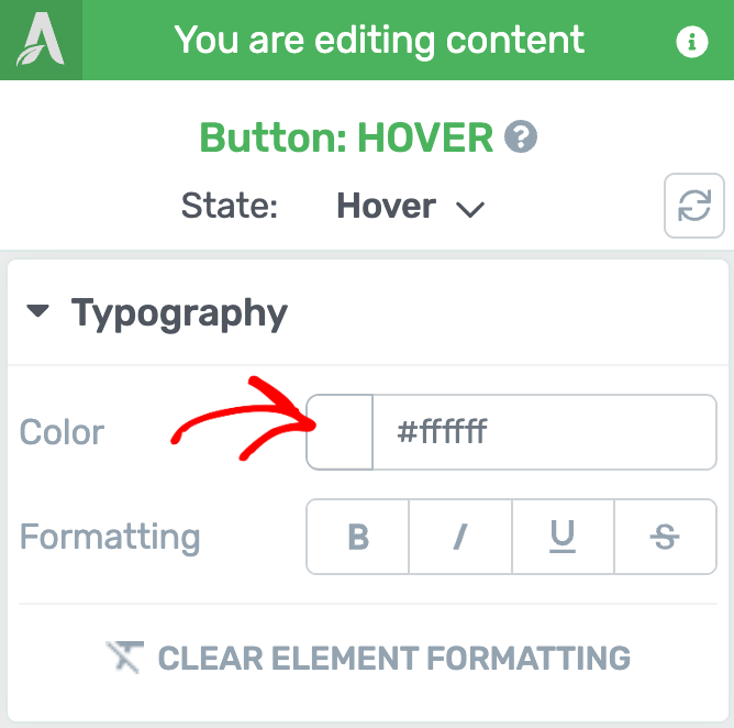
To change the color of the text on the button, while in the Hover state, click to open the Typography settings in the left column.
Under the Typography settings, click to change the color of the text.
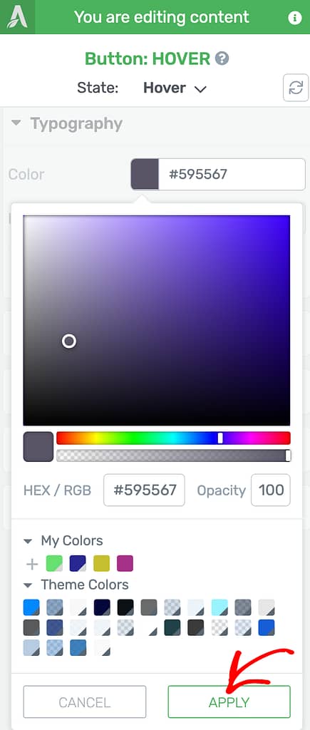
When you click to change the color, select a color from the color-picker and click the Apply button.
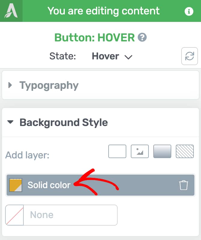
Button Background Color
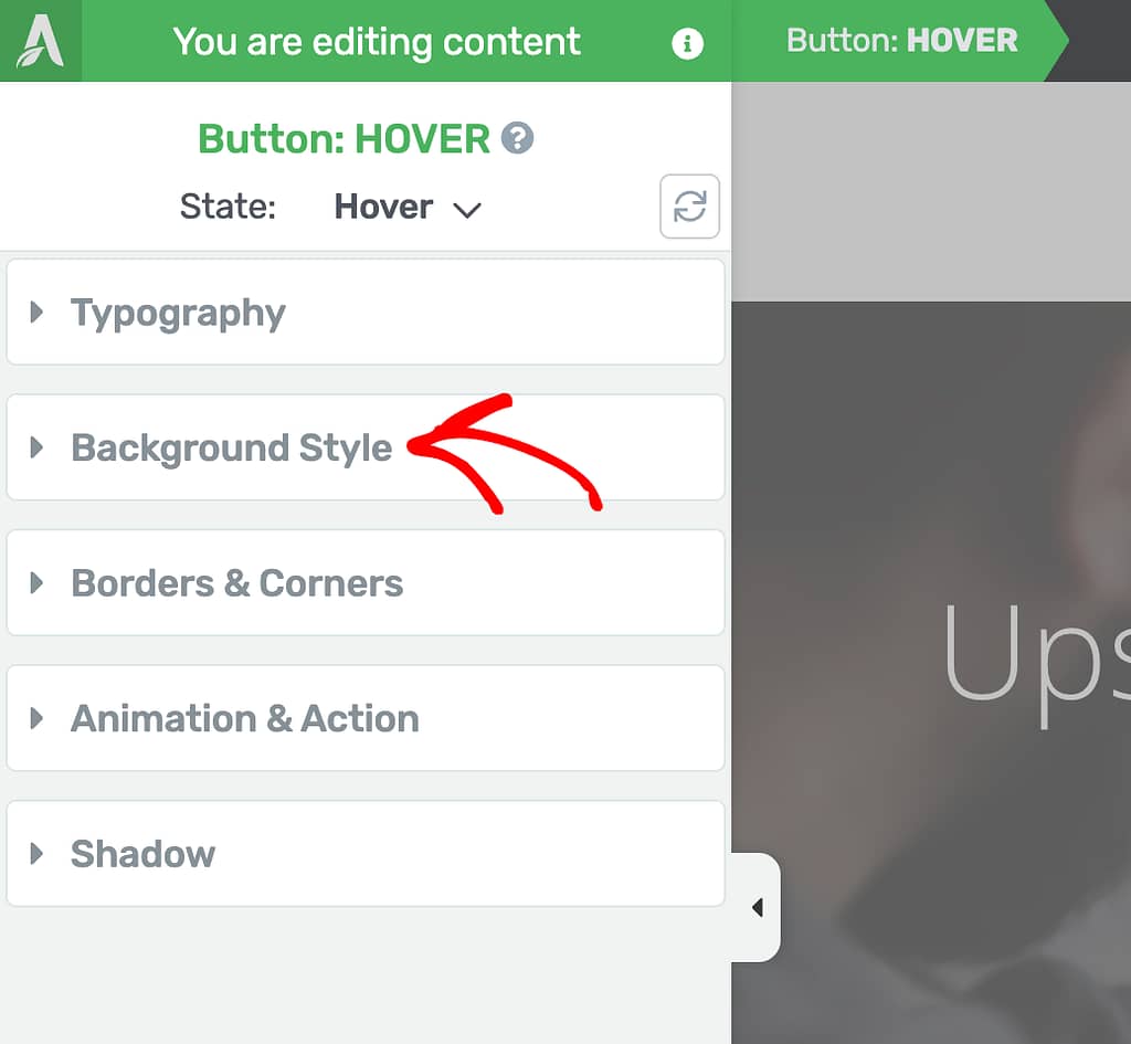
To change the button color, while in the Hover state, click to open the Background Style settings in the left column.
Under the Background Style settings, you can select the type of background style you want to apply to the button.
In this example, we’ll proceed with selecting a Solid color.
When you have a solid color background style selected for a button, click on the tab showing solid color.
After you click to change the color, select a color from the color-picker and click the Apply button.
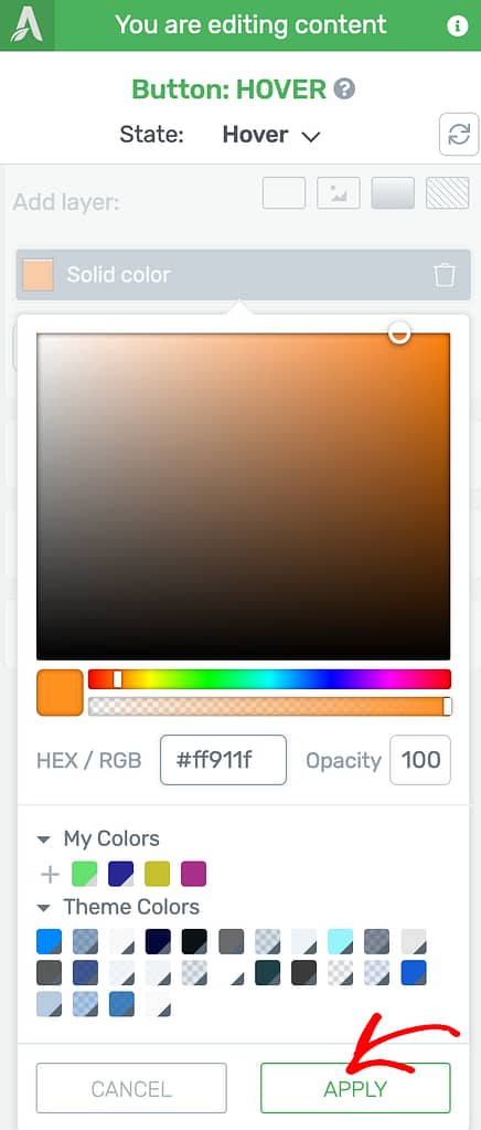
Applying different colors to the button in the hover state will change the colors when a user hovers on the button.

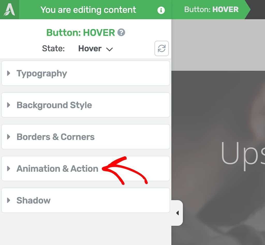
Adding a Hover Effect Animation
To add an Hover effect animation to a button, while in the hover state, click on Animation & Action.
Under the Animation & Action tab, click on the animation icon.
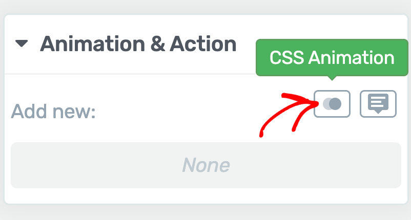
Clicking to add a button animation will open a popup with a dropdown to select the animation you want to apply. To select a button animation, click the dropdown field.
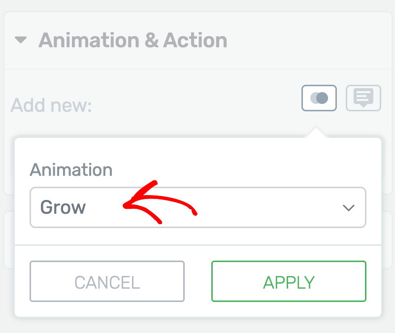
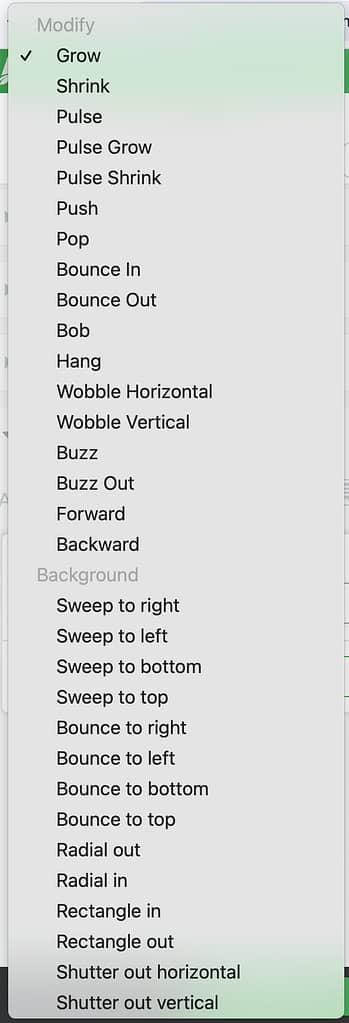
Clicking the dropdown will show up a list of animations you can select from.
After selecting the animation in the dropdown, click the Apply button.
When you apply the hover animation to the button, you’ll see that added under the Animation & Action tab. Here, you can edit and remove the hover animation when you want.
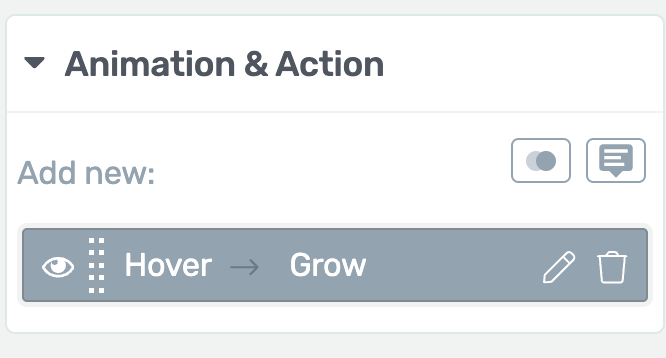
After you add the hover animation to the button, you’ll see it in effect when the user hovers on the button on the page.

We’ve just seen how you can add animations to the hover effect on a button using Thrive Architect. You can either choose to change the colors or add an effect like we did following the process above.
Next, do you want to understand the hover effects for Thrive Architect elements in depth? Here’s our document that’ll help.