When you are building your website, it’s important to make sure that it’s mobile responsive. This means that the pages and posts will be displayed okay, regardless of the screen size they are viewed on (desktop, tablet or mobile).
In this tutorial we’ll check out some guidelines that might be useful to you when you are working with columns on various screen sizes.
Columns come in handy when you want to create a neat looking layout, in which all elements are aligned just as you want them to be. Thus, you are able to place two or more elements next to each other while keeping them aligned across all screen sizes:

Columns present a unique challenge when it comes to responsive editing. Nevertheless, you can use some of the options available in the Thrive editor to make sure your columns are staked properly.
Here are some of the features and tweaks that might help you with that:
- column breakpoints
- reverse column order
Important!
Always make sure you are on the mobile view when applying this changes to your columns:
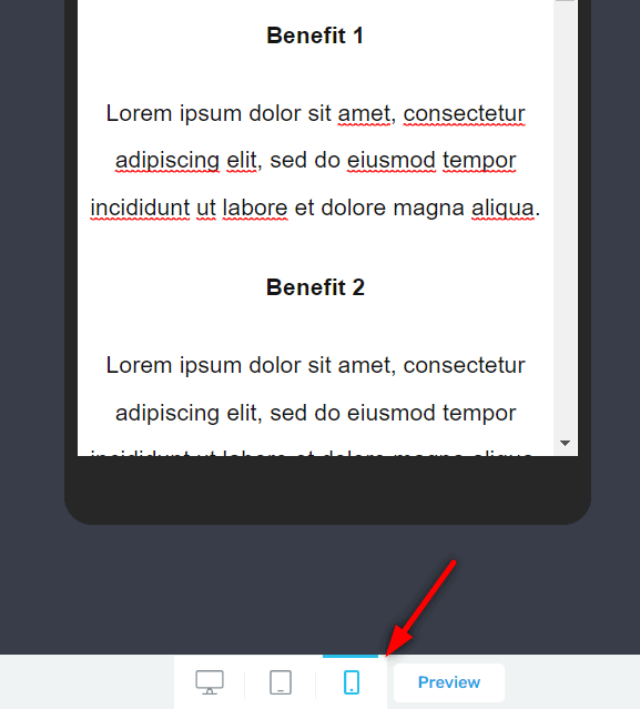
The Thrive visual editor opens by default in the desktop mode, but you can view and edit your page layout on two additional screen sizes: tablet, and mobile. They are located at the bottom of the screen:
Column breakpoints
Breakpoints are set pixel numbers at which a website will switch from displaying one version of a page to a another one. There’s a breakpoint between the desktop and tablet layout, and there’s also one between the tablet and mobile layout.
The breakpoints in Thrive Architect and Thrive Theme Builder are as follows:
- Any viewport wider than 1025px will display the desktop version of your page.
- Any viewport narrower than 1025px but wider than 768px will show the tablet version.
- Any viewport narrower than 768px will show the mobile layout.
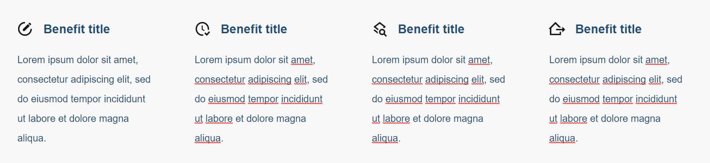
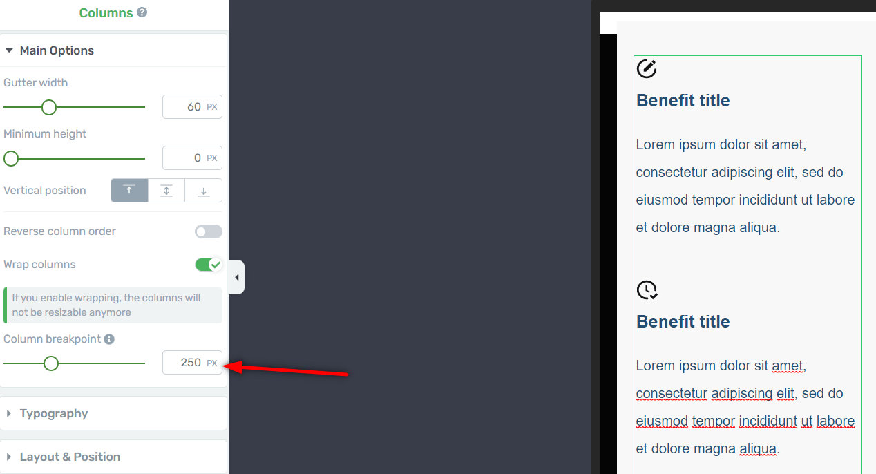
In addition to website breakpoints, the “Columns” element has breakpoints as well. This means that the columns will stack on top of each other only when the specified minimum pixel number is met.
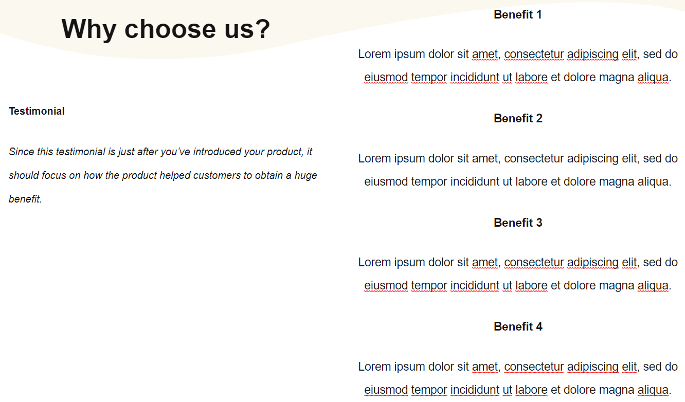
For example, you might have a 4 columns layout on your website that looks okay when viewed on a desktop:
This is a horizontal format for the columns, when displayed on desktops and tablets. However, when viewed on a mobile device, they might look something like this:
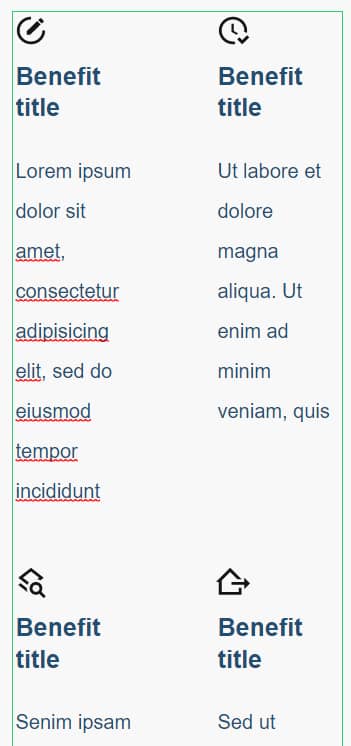
A better way of arranging them would be vertically – one column stacked on top of another. You can control when columns wrap by adjusting the Column breakpoint.
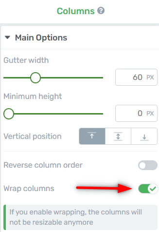
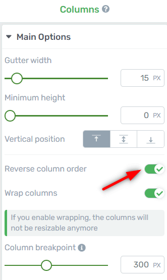
With your “Columns” element selected, activate the “Wrap columns” toggle from the left sidebar:
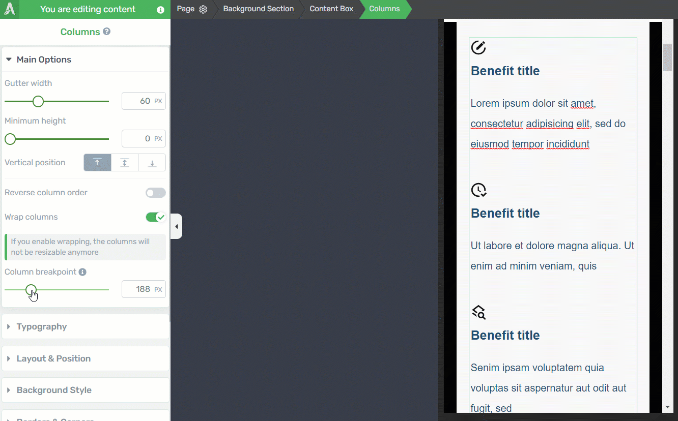
And increase the value of the column breakpoint until your columns are arranged as you want them to:
You will notice that the columns will shift as you are dragging the slider left and right:
So the column breakpoint is the minimum width a column will shrink to, before it will stack vertically.
Reverse Column Order
Another option you can use here is the reverse column order.
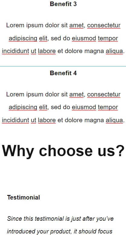
You might have a layout like this one, that displays nicely on a desktop:
But on a mobile you will have the columns all mixed up:
To remedy this, you can reverse the column order on mobile. From the same left sidebar list options, find and enable the toggle button next to “Reverse column order”:
Your columns should now be arranged in a proper manner:
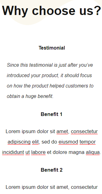
So the reverse column order might be a small tweak you can make, for a better result on mobile devices. You might still have to work with the positioning options and the layout, but it’s still a quick fix that you can use on smaller screen sizes.